Maybe you have a point. Maybe it feels like they built the assets and the layout properly but then forgot to color grade it and set a proper mood for the environment.
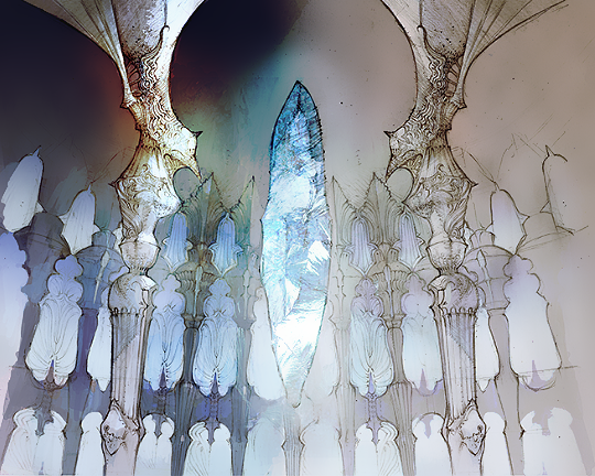
The first image(concept art) makes me feel like I'm entering a city of ice or a crystal-eqsue city. Everything is reflecting that giant object's color giving the entire city a blue/cool hue, yet it's also not cold as in bleak, but cold as in refreshing since it's near a mountainous/desert area. It looks like an interesting and refreshing place to stay at after fighting monsters in the nearby desert area for hours and even the sky is itself is reflecting this. I'd love to see this imagery after a long journey of exploration and fighting.
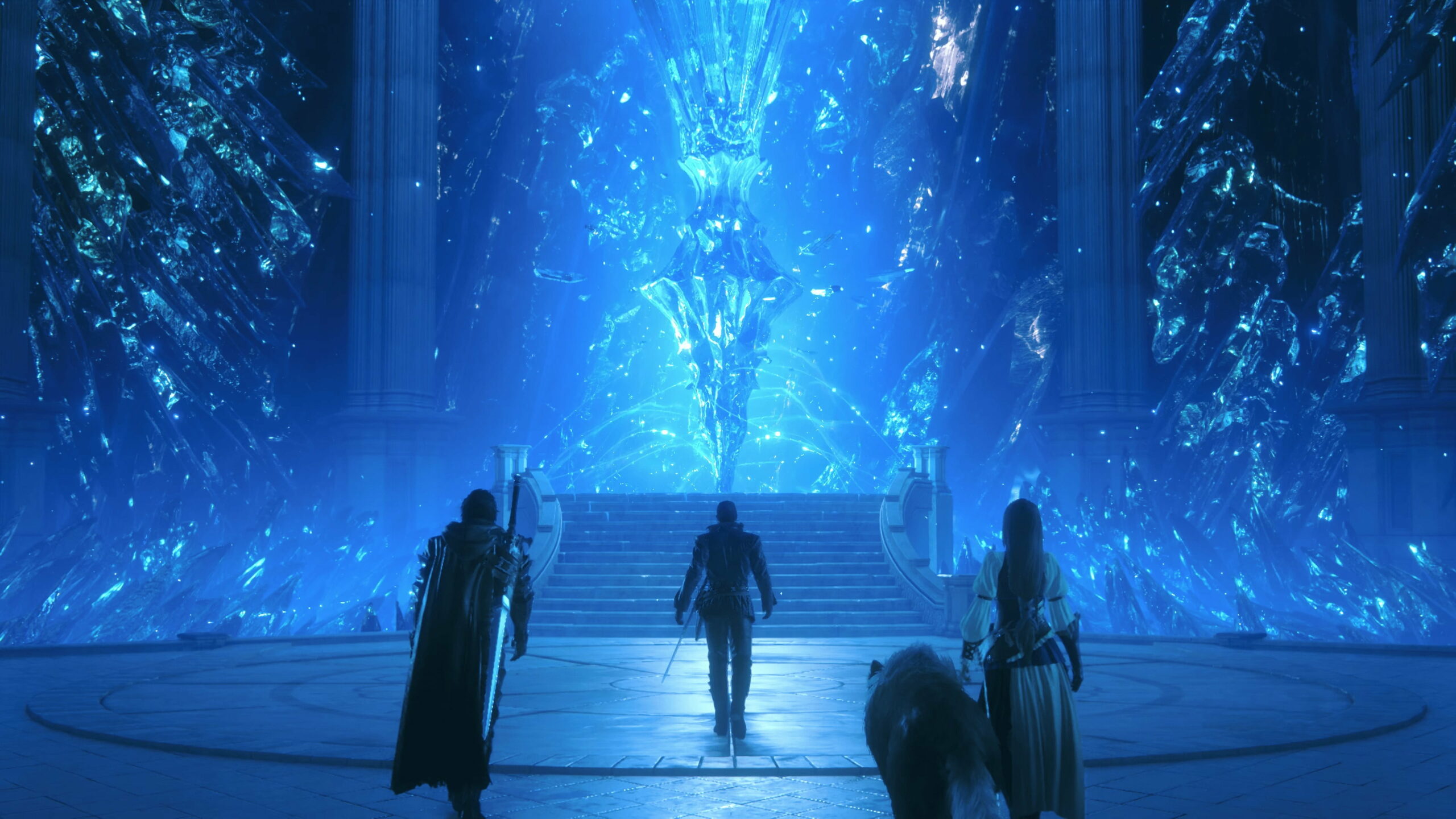
In contrast, the second image(screenshot) makes me feel like I'm entering a city near the ocean with a giant ice cube in the water. There's no feeling of coldness in the air aside from the big ice cube. There's no blue hue or reflections happening on the city itself so it makes this big ice cube stand out in a worse, more jarring way.
And before anyone brings it up, I'm not saying the game should simply up the contrast. There's a way to do color and mood yet still keep things muted and serious.
In some scenes in FF16, they
do reflect this. In others, where it should matter the most (like the above screenshot), they don't. It's just odd.