Zero Spooks
Member
This isn't the release version HUD either.
Notice how the weapon icons are white in the release version.
The. Point. Remains.
This isn't the release version HUD either.
Notice how the weapon icons are white in the release version.
Man if only they would do that.The Assassin's creed Hud is really so shameful. They're sort of trying to improve it by giving you options to turn of elements, but what those games need is a complete revamp from the ground up.
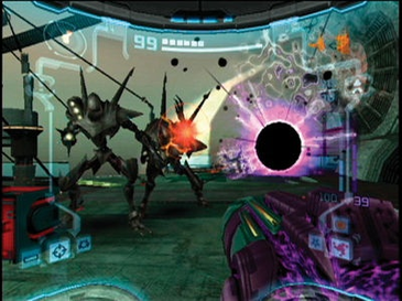
I'm gonna disagree.ALways been a fan of the Prime series helmet hud:
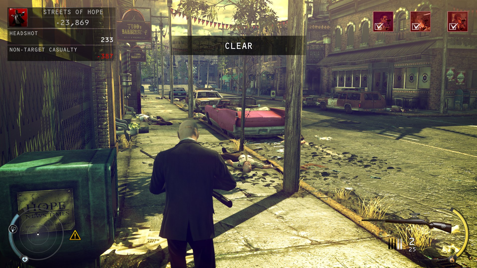
Example of bad HUD: Hitman Absolution, this one speaks for itself.
I'm gonna disagree.
It's too claustrophobic for me. It intrudes into the playing space far too much. I don't like Halo 5's helmet HUD either.
Thankfully there's a lot of customisation options so it's not an issue.
Brutal Legend is one of my favourites.

I love a good HUD, don't know about anyone else, but more and more I'm wishing games did away the damn things altogether. Not always possible of course, but the less information cluttering up the screen, the better as far as I'm concerned. I'm also partial to HUD elements that fade in and out as and when the player needs them.
That said, some devs do a great job of designing their HUDs... and some don't. But both are worth discussing.
This has to be a joke, right?
Boo to the oversized button zone and "mini"-map.
Oh God, that game was terrible. Even worse, that's not all there is. There's also the disguise status, indicated by a little version of 47 to the right of the map and the enemy alert radial menu... thing... in the middle in bright yellow.
I remember them bragging that their 'Purist' mode disabled the HUD for a 'classic' Hitman experience in the run-up to launch as well. "Spiteful" is how I saw someone describe that mode, and I honestly can't think of a better word for it.
It was an example of the "not so good". The HD version looks much better.
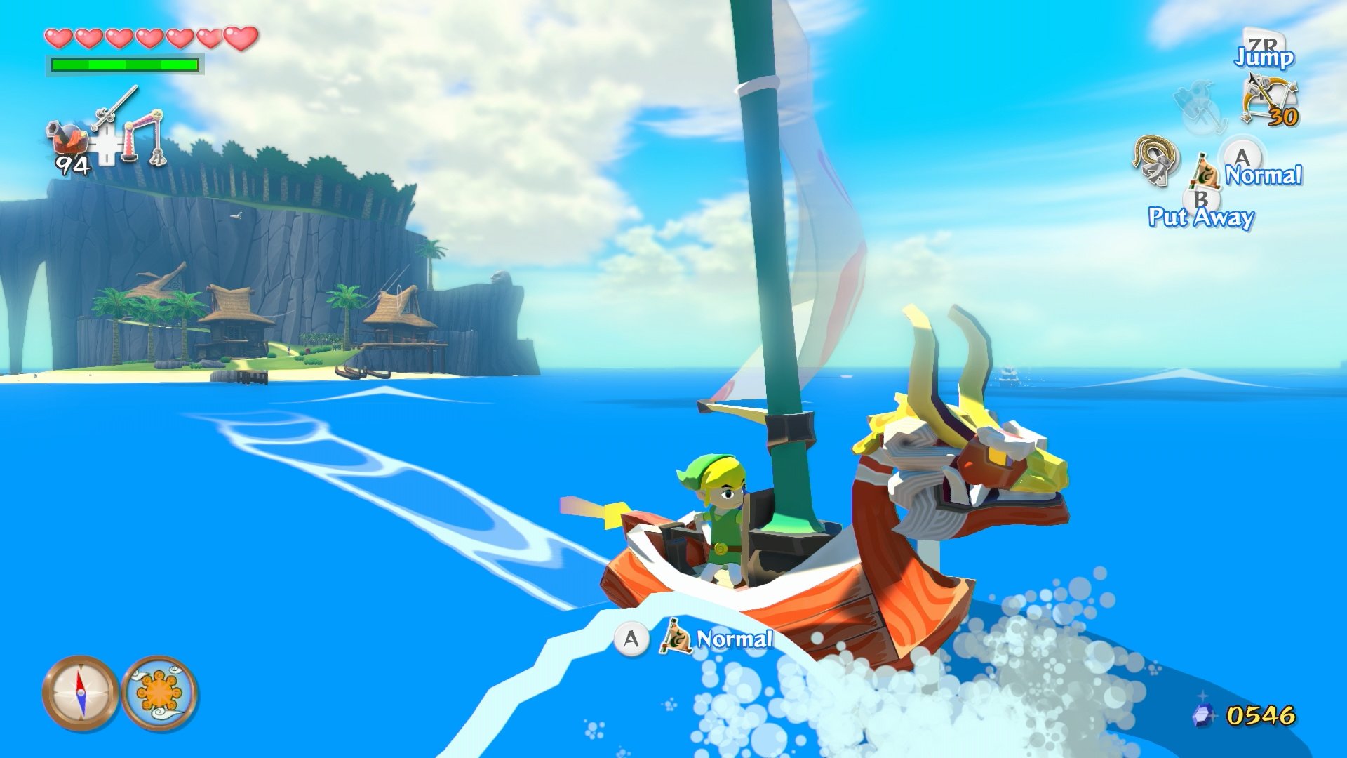
It sure has potential. Wind Waker HD had some nice looking HUD.

Came to say this.The way objectives were displayed in Splinter Cell Conviction were pretty neat.
I love FC2's HUD. Replacing the ubiquitous radar with a pull-out map was a stroke of genius.

Technically that's all menu, not heads-up display. Still, really great aesthetic there.
The RTS HUD can get kind of busy during some of the more intense fights, but never really a problem.
i think it would look even better running on anything better than a darn potato


Bad: Dissidia Final Fantasy 2015


I forgot how much I love the HUD in this game. I need to play it again soon.The way objectives were displayed in Splinter Cell Conviction were pretty neat.
Dishonored and DXHR have great, simple and clean huds.


I don't get people who post games without any hud as "best hud".
That's not even a hud.
The cries against huds in videogames have already brought forward cancers like regenerative health, it's really not helping gameplay any.
I always had a soft-spot for WoW mod - SpartanUI:
Ah, and since we're there, the undisputable champion of bad huds:
You're posting images of player-made addons, and not even like a single one, but several combined by a single user who saw fit to use all of those. Not sure this makes any sense. Might as well start photoshopping the UIs of multiple games together and calling that bad as well.I don't get people who post games without any hud as "best hud".
That's not even a hud.
The cries against huds in videogames have already brought forward cancers like regenerative health, it's really not helping gameplay any.
I always had a soft-spot for WoW mod - SpartanUI:
Ah, and since we're there, the undisputable champion of bad huds:
Is that how the game looks all the time?I hate the over bearing HUD in Halo 5's campaign. I just want a seamless window into the universe, instead they put the actual helmet on the screen, blocking off the game, and then put way too much visual clutter on top of that. It does nothing but make the game feel claustrophobic and detached to me. The game is gorgeous. I just wish my window into it wasn't so restrictive.
ALways been a fan of the Prime series helmet hud:
You're posting images of player-made addons, and not even like a single one, but several combined by a single user who saw fit to use all of those. Not sure this makes any sense. Might as well start photoshopping the UIs of multiple games together and calling that bad as well.
And there are mods for several recent games like The Witcher 3 that attempt HUD-less UIs by making aspects of the UI dynamically appear based on whether or not the player needs it.
For me, nothing tops DS1-2 and 3s HUD!
Looks like Ios versionWhere is this screenshot from....?
It looks horrible. A Wii version? PC low settings?
Dem textures
Seriously though, I liked Tresspasser's attempt at a HUD-less game. Pretty ahead of its time.
ALways been a fan of the Prime series helmet hud:
Dem textures
Where is this screenshot from....?
It looks horrible. A Wii version? PC low settings?
I watched the GB Quick Look of Xenoblade, and the HUD is terrible. Too much on screen.
I think Bloodborne has a very good HUD.
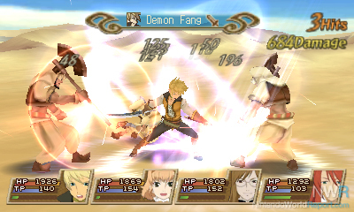
Just something about this HUD looks nice. It may be in other JRPGs other than the Tales Series at this point, but the first time I've seen it was Tales of Symphonia, and it's just so clean and nice.
Edit: This is a 3DS screen. PS2 is a lot less crowded.
2 greats HUDs from 2013. Nice and simple
The Last of Us