Mr Fahrenheit
Member
Even though I'm not a huge fan of the game compared to For Answer, I liked the Armored Core 5/Verdict Day HUD.
Looks like Ios version
Looks like the mobile version, maybe.

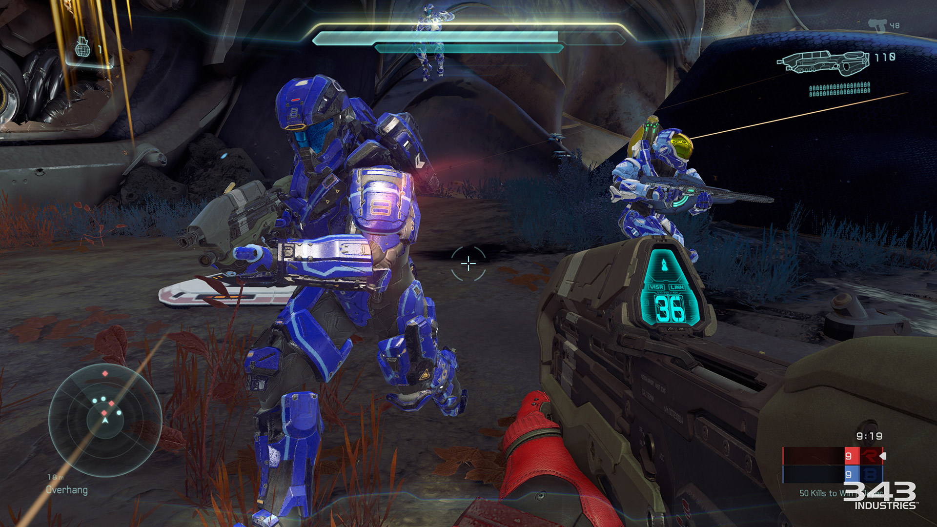
I hate the over bearing HUD in Halo 5's campaign. I just want a seamless window into the universe, instead they put the actual helmet on the screen, blocking off the game, and then put way too much visual clutter on top of that. It does nothing but make the game feel claustrophobic and detached to me. The game is gorgeous. I just wish my window into it wasn't so restrictive.

There's a skull that turns the HUD off so I doubt it makes any meaningful impact. It's an artistic decision.i wonder if this helps with performance. It's not much space taken up, does the game have to render anything blocked by the helmet?
guess you could ask the same question about The Order and Evil Within. do those games also benefit from obstructed views imposed by the letterboxing?
i wonder if this helps with performance. It's not much space taken up, does the game have to render anything blocked by the helmet?
guess you could ask the same question about The Order and Evil Within. do those games also benefit from obstructed views imposed by the letterboxing?
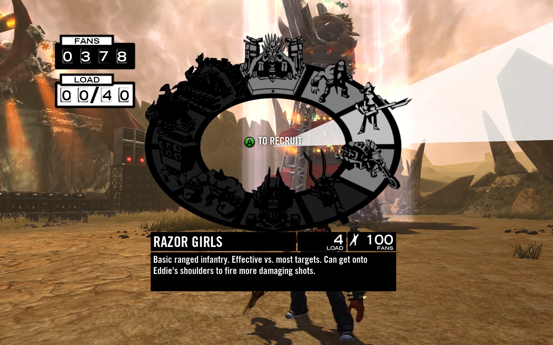
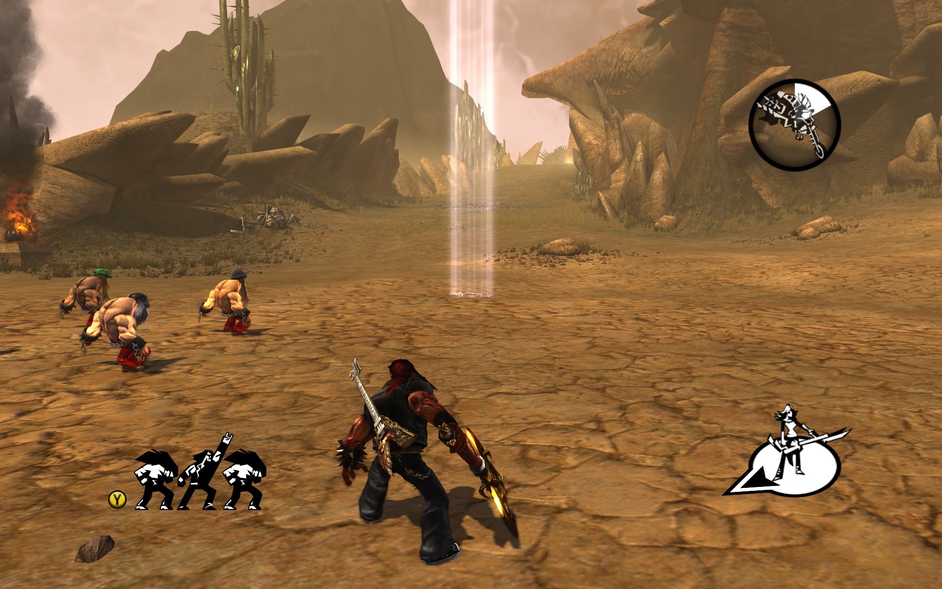
Just look at this huge fucking thing. It also changed depending on whose campaign you were playing, with some elements even changing places.
Revelations 2 took a page from The Last of Us for its hud (and admittedly, lots of other things as well) and was all the much better for it.
I hope you're joking.A raid-ready UI used most of these frames, even if arranged somewhat differently. On a small 4:3 screen.... that's how raid-wow looked.
that HUD is gross. And I'm not just talking about the resolution. The fonts are just all completely wrong. Seems like all the texture stuff is right there in the steamapps folder, I'm seriously thinking about going in and replacing everything with something that doesn't look like HUD roulette.
Worst HUD ever: Far Cry 3 pre-patch.
Technically that's all menu, not heads-up display. Still, really great aesthetic there.

The RTS HUD can get kind of busy during some of the more intense fights, but never really a problem.

Deadspace 1 devs put that hud style into cod aw if anyone noticed.
Thats why i enjoyed aw so much. Sound was amazing too.
The only good HUD is a HUD that can be completely turned off.
Where is this screenshot from....?
It looks horrible. A Wii version? PC low settings?
Extraction was entirely first-person. This is the mobile version of Dead Space, which had its own story and armor design.Dead Space Extraction? The Wii light gun game that got ported to PS Move and came with Dead Space 2. I think its that at least.
You're posting images of player-made addons, and not even like a single one, but several combined by a single user who saw fit to use all of those. Not sure this makes any sense. Might as well start photoshopping the UIs of multiple games together and calling that bad as well.
And there are mods for several recent games like The Witcher 3 that attempt HUD-less UIs by making aspects of the UI dynamically appear based on whether or not the player needs it.
Apart from the caption where is the text coming from? Your helmet, or in world?Deadspace 1 devs put that hud style into cod aw if anyone noticed.
Thats why i enjoyed aw so much. Sound was amazing too.
Apart from the caption where is the text coming from? Your helmet, or in world?
Dead space's appeal is that all info was generated from a source wether it's the suit or a console. Floating text in AW is what DS got away from.
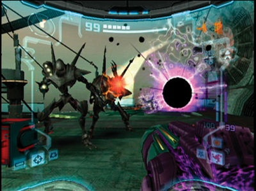
You're kidding. You're kidding right? That is a cluttered mess.ALways been a fan of the Prime series helmet hud:
Assassin's Creed HUDS are the worst. A big reason why I don't play them.
Apart from the caption where is the text coming from? Your helmet, or in world?
Dead space's appeal is that all info was generated from a source wether it's the suit or a console. Floating text in AW is what DS got away from.

You're kidding. You're kidding right? That is a cluttered mess.
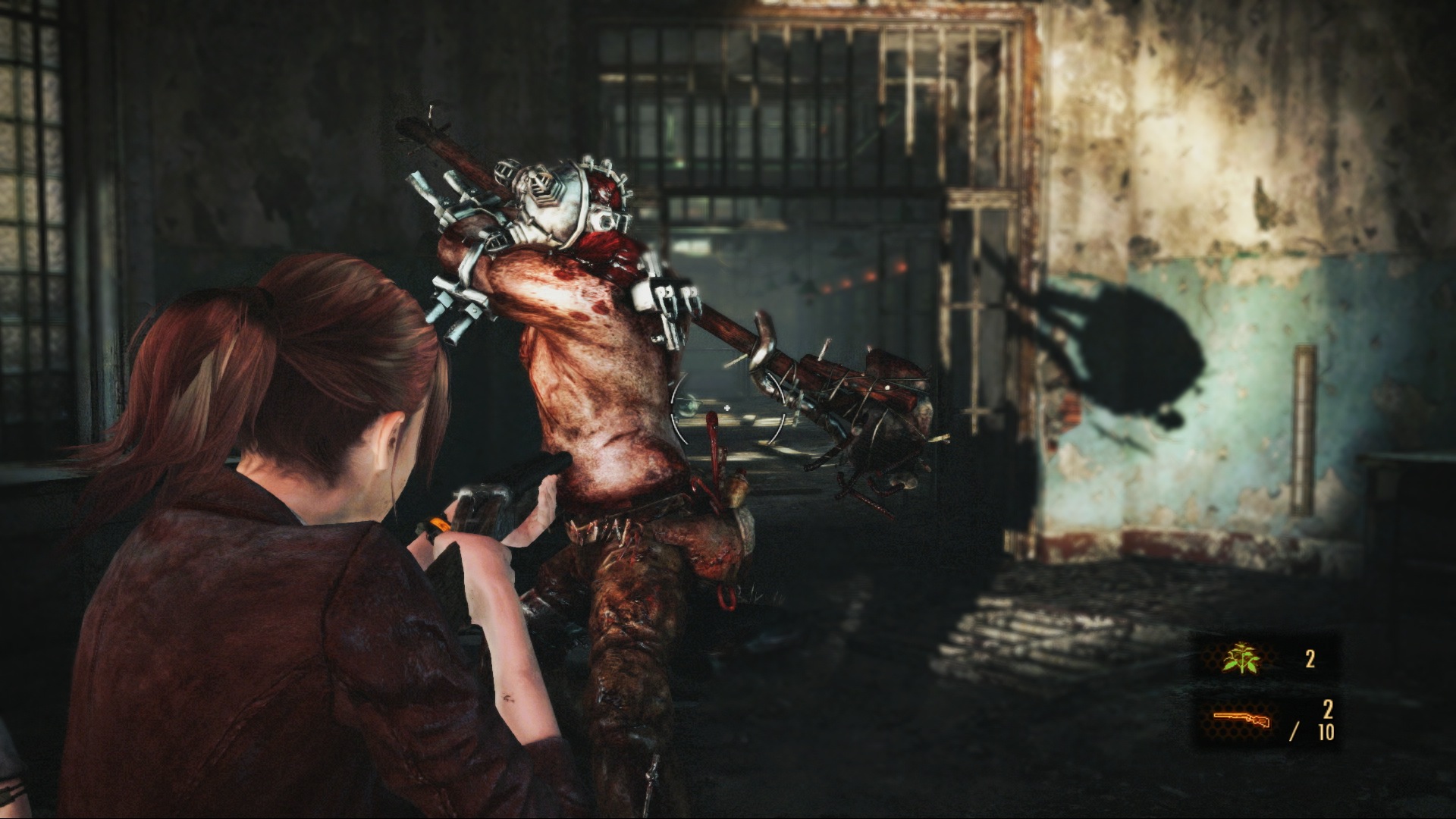
Is that how the game looks all the time?
Notice how the weapon icons are white in the release version.

I think subtitles typically deserve a pass for accessibility's sake.
I enjoy MGS V's HUD. Pretty simple
Battlefield 3's HUD is a mess though....
Was it Modern Warfare 2 that had like 10 different fonts on the screen?
Too bad though when games are designed with the HUD in mind. Take Witcher 3, for example. People were always saying "turn off the HUD for maximum immersion!". That may be true but only very rarely do the quest descriptions contain enough information about the locations. They mostly rely on the disappointing "go to point x on the map" way of quest-design.The only good HUD is a HUD that can be completely turned off.