-
Hey, guest user. Hope you're enjoying NeoGAF! Have you considered registering for an account? Come join us and add your take to the daily discourse.
You are using an out of date browser. It may not display this or other websites correctly.
You should upgrade or use an alternative browser.
You should upgrade or use an alternative browser.
Ken Kutaragi was the one who decided to use the Spider-Man font for the PS3
- Thread starter ManaByte
- Start date
Black_Mamba
Member
Ugly font that would be better suited for a men's deodorant brand. The original console was also ugly af and the lowest point in PlayStation's history. No wonder Kutaragi was fired and they fixed most of his mistakes.
TGO
Hype Train conductor. Works harder than it steams.
They actually gave it away with the PS3 later and some store's did a bundleNever knew Sony gave away a Bond movie with PS3!!! As a Bond Fan and a PS3 owner I wonder how this escaped me!!!
But I think mine was this situation and I think you could sign up before the PS3 released


Last edited:
Days like these...
Have a Blessed Day
I jumped ship to NintendoYou poor thing, nearly 30 years is a long time to go without playing decent games.

Loomy
Thinks Microaggressions are Real
This might be the dumbest thing I've read on here. And I've read some dumb fucking things on here.....lolI hated that font that's why I didn't get a PS3 well that and I've always been a Sega fanboy. I can never own a Sony console. I'd give up gaming before owning a Sony
mansoor1980
Gold Member
spider-man saved ps3

ReBurn
Gold Member
I got two Blu-Ray movies with my PS3 but I don't remember what they were.Never knew Sony gave away a Bond movie with PS3!!! As a Bond Fan and a PS3 owner I wonder how this escaped me!!!

ManaByte
Gold Member
Mine came with a vanilla Talladega Nights disc.I got two Blu-Ray movies with my PS3 but I don't remember what they were.
aclar00
Member
Man, OG 60GB PS3 was the greatest, especially before the advent of digital music and video. It did everything and i loved it for that.
I ripped CDs to it, used the memory card reader for Photos and videos, watched Blu-rays, had it connected wirelessly to my computer HDD to access photos, videos and more....and the Web Browser. Shit, it was closer to a computer than any console today, yet still maintained that console feel.
Only thing i didnt use was the Linux OS.
WitchHunter
Banned
They fired him because he slapped his stomach and said to the IBM engineers: put 8 cores in that cell cpu... because he liked that number : DDD.Ugly font that would be better suited for a men's deodorant brand. The original console was also ugly af and the lowest point in PlayStation's history. No wonder Kutaragi was fired and they fixed most of his mistakes.
I only saw that font when I bought the console, and put it behind the monitor then a few years later when I replaced it with the PS4.
Last edited:
Sushi_Combo
Member
It definitely felt that it was a near perfect multi-media machine . The blockbuster games came abit later, but I still find some enjoyment from some of the launch games .Man, OG 60GB PS3 was the greatest, especially before the advent of digital music and video. It did everything and i loved it for that.
I ripped CDs to it, used the memory card reader for Photos and videos, watched Blu-rays, had it connected wirelessly to my computer HDD to access photos, videos and more....and the Web Browser. Shit, it was closer to a computer than any console today, yet still maintained that console feel.
Only thing i didnt use was the Linux OS.
What's wrong with Playstation?I hated that font that's why I didn't get a PS3 well that and I've always been a Sega fanboy. I can never own a Sony console. I'd give up gaming before owning a Sony
Days like these...
Have a Blessed Day
NothingWhat's wrong with Playstation?
Cause you're a Sega fanboy, that's why you exclude anything but sega, such a simple mindset to be a fanboy.Nothing
cireza
Member
Do Sony have the exclusivity of decent games ?You poor thing, nearly 30 years is a long time to go without playing decent games.
existensmaximum
Member
That font looked like trash, it's the opposite of timeless. After that, they learned 
Shin-Ra
Junior Member
Not sure that’s the full story, there was also a Sony Pictures Imageworks collab for the Alfred Molina 3D model demo.
I’m no ‘font historian’ but the earliest example of the typeface in use seems to be 1979
1995/96 The Smashing Pumpkins single ‘1979’ (dated vinyl – HUT records/Virgin)
2001 The original Xbox logotype is sort of an inverted (or ‘exhale’) version of ‘1979’ with curved vertical strokes and straight horizontals
2002 The Spider-Man movie
2005 The silver PLAYSTATION 3 reveal
They’re all subtly and not so subtly different though.
Shin-Ra
Junior Member
There’s a direct comparison here: https://fontsinuse.com/uses/46982/playstation-3-logo-2006-2009
According to Sony's Teyū Gōto, "If you really look at the PS3 contour carefully, it is rounded when viewing the console in profile. Rather than creating a typography with all the risks that entails, it was wiser to use the one from Spider-Man, for which Sony has the rights."
Search for Frank Olinsky for more on his graphic design. The rabbit hole goes deeeep.Both the Mellon Collie album art and the “1979” single were designed by Frank Olinsky. When Olinsky asked band leader Billy Corgan why he had chosen him, “he said he owned quite a few CDs that I had art directed/designed and he liked that I didn’t have one style that I imposed on all my projects. Rather, he felt that each was a good design that fit the particular recording.” [2009 interview] These releases are a case in point.
Last edited:
KuraiShidosha
Member
Take notes kids, this is what soul looks like.
DonkeyPunchJr
World’s Biggest Weeb
I’m just now realizing it’s all caps except the last letter. From now on we need to call it PLAYSTATIOn 3Nothing wrong with it other then being the Spider Man Font.
people act like other things don't use other fonts

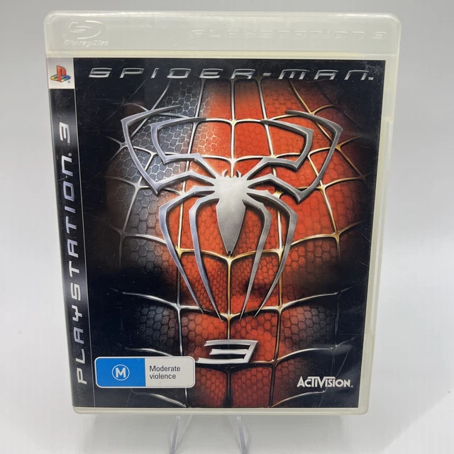
Although it stand out more when they was giving Spider Man 3 on Blu-ray away with it
HeisenbergFX4
Gold Member
True story my very young nephew was visiting and loved Spiderman and even though he couldn't read yet he asked my why it said Spiderman 3 on it
TGO
Hype Train conductor. Works harder than it steams.
Other than size there's nothing to differentiate them with that FontI’m just now realizing it’s all caps except the last letter. From now on we need to call it PLAYSTATIOn 3


Last edited:
BlackTron
Member
I hated that font that's why I didn't get a PS3 well that and I've always been a Sega fanboy. I can never own a Sony console. I'd give up gaming before owning a Sony
Reasons I didn't buy PS3:
I would rather give up gaming first than buy Sony
The font
Is that all? Sure you didn't have a problem with the texture on the plastic or anything?
Days like these...
Have a Blessed Day
Now that you mention. I hated the shape of it. Seriously what in the George Foreman grill hell was that?Reasons I didn't buy PS3:
I would rather give up gaming first than buy Sony
The font
Is that all? Sure you didn't have a problem with the texture on the plastic or anything?
Last edited:
SimTourist
Member
Perfection.
cartman414
Member
*sogood.gif*
Mexen
Member
Perfection.

LostDonkey
Member
It's a ugly ass font, but because they basically created it, I can see why..
They didn't.
It's called Mata. It's been around for years.
Nothing to do with Sony or Spiderman.
It's just a font
Horseganador
Member

NeoIkaruGAF
Gold Member
The only thing he did right with the PS3.
That was basically the only thing I didn't like about the PlayStation 3

Krappadizzle
Member
Looking back at the PS3, I remember getting mine and thinking it felt so far ahead of it's time but nothing on it was really worth playing in the first few years and my focused switched almost to using it only as a blu-ray player and the occasional "exclusive" machine instead of my intended "main console". Still, I did play the shit out of that Motorstorm demo on it. That game was bad ass at launch.
Last edited:

Audiophile
Gold Member
Still got the font from a backup folder of a laptop I had 15yrs back. Comes under "Homoarakhn"; not sure if that was official or some knock-off I found on dafont.

Even though it was peculiar and polarising I think it kinda worked out and became iconic. The only part I'd consider particularly ropey was the bit on the game case spine that looked something like this:

The updated rebrand of the "PS3" logo was better, but I always thought the "3" in it looked kinda off-kilter. The "PS4" rehash of it looked really cool though. As for the "PS5" one, it's ok but I would've liked a bit more of an evolution. I do find it still looks a bit off, the spacing and alignment on multiple parts looks just a little rough. The transitions from thick to thin are quite jarring and the "PS" -- particularly the "P" -- despite being straight have the slight illusion of leaning off to the left a bit. It gets even worse when scaled down and the pixels aren't mapping cleanly.
Even though it was peculiar and polarising I think it kinda worked out and became iconic. The only part I'd consider particularly ropey was the bit on the game case spine that looked something like this:
The updated rebrand of the "PS3" logo was better, but I always thought the "3" in it looked kinda off-kilter. The "PS4" rehash of it looked really cool though. As for the "PS5" one, it's ok but I would've liked a bit more of an evolution. I do find it still looks a bit off, the spacing and alignment on multiple parts looks just a little rough. The transitions from thick to thin are quite jarring and the "PS" -- particularly the "P" -- despite being straight have the slight illusion of leaning off to the left a bit. It gets even worse when scaled down and the pixels aren't mapping cleanly.
Last edited:
cortadew
Member
I agreeGreatest console ever made (launch model only). The font is beautiful.
When they switched from PLAYSTATION 3 to gay ‘ps3’ branding, they lost their way.
S0ULZB0URNE
Member
We knew about this since after they showed the launch consoles.
PS3 was a sexy and shiny beast!
PS3 was a sexy and shiny beast!