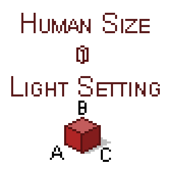
-- DESIGN REFERENCE --
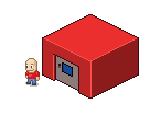
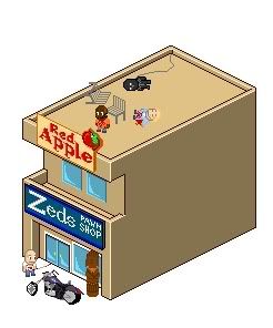
We have two buildings here, right? A and B. I guess probably everybody will agree on the fact that A looks tons better than B. And I want all you guys to do buildings that look as similar to A as possible.
Here are some tips:
* Have some kind of roof on your building or other details.
* Don't make a roof 1 pixel thin, but 3 or 4 like on the A building.
* Try to use nice colors that match and the difference isn't very huge.
* Try to pick up colors already on the image (look for the newest one I posted) instead of using new colors if you can't get a nice matching.
* Add shadows!. 25% opacity!.
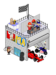
* Details!. Details will help A LOT. Even the A building is lacking some details on the right side, but that can be fixed easily.
* Don't make ultra-small details that look ugly!. If you are going to add stuff, don't do them 1 pixel thin unless they are paintings or stuff like that, or tubes, etc..
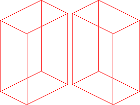
* Don't make the buildings with incredibly weird shapes, but don't make them like a perfect cube either. Add some architecture details every now and then and make those big and easy to understand their shapes.
Thanks!
")