-
Hey, guest user. Hope you're enjoying NeoGAF! Have you considered registering for an account? Come join us and add your take to the daily discourse.
You are using an out of date browser. It may not display this or other websites correctly.
You should upgrade or use an alternative browser.
You should upgrade or use an alternative browser.
Nintendo going red - a rebranding in progress?
- Thread starter Zalman
- Start date


balladofwindfishes
Member
I can't believe of all the Mario art out there, they're still using Game Cube Mario Party art for displays and stuff.
What the hell?
What the hell?
Theanine3D
Member
It suits them better. They're the Mario company after all.
Wasn't a fan of the blue on Wii U boxes. NSMB Wii had a red one, and it looked great.
Wasn't a fan of the blue on Wii U boxes. NSMB Wii had a red one, and it looked great.
Sheriff_Battlesnake
Banned
I see what you did there.
mhm. took me a second.
I can't believe of all the Mario art out there, they're still using Game Cube Mario Party art for displays and stuff.
What the hell?
If it aint broke
Stilton Disco
Member
Much better than the silver. Really hope the red extends to everything they do with branding and design from now on.
shotgunbob04
Member
I doubt this means much, but I can still have a small bit of hope that this means good things are ahead.
Although blue is my favorite color, I guess I'll now associate a white and baby-blue Nintendo logo with the Wii. *shudders*
Although blue is my favorite color, I guess I'll now associate a white and baby-blue Nintendo logo with the Wii. *shudders*
J
JeremyEtcetera
Unconfirmed Member
I can't believe of all the Mario art out there, they're still using Game Cube Mario Party art for displays and stuff.
What the hell?
I think that version of Mario looks the least insane. Some of the official art for the newer titles have him looking a bit odd with his expressions.
balladofwindfishes
Member
But it is, Mario has had subtle design changes since the early 2000s and there's piles of quality official art from various Wii and Wii U games they could use.If it aint broke
This for example, which is an excellent updated pose from NSMB, used for Mario Party 10.
Rösti;200136234 said:I don't think the logo itself is turning red, that will likely continue to feature it's profile gray (on light/non-red surfaces anyway). But the red background is nice.
The gray logo was adopted in 2008.
Hope they keep the white logo at least for game packaging/boxarts.
I always found the red/white ones pre-Wii era tacky as hell.
Pancakes R Us
Member
Holy sh...

Although it's not the same, my favourite is where the Nintendo text is in red. Oh well, close enough.
Stilton Disco
Member
Whoops, odd double post. Never mind.
To be honest, as Rösti touched on, I don't think they're removing the gray. They're just adding red to the existing Nintendo-branding of white and gray. Their old business strategy with Wii/DS was "expand the gaming population"; more recently they've adjusted that strategy to "expand the gaming population that has access to Nintendo IP" which is what the red (Mario) is probably supposed to symbolize.

Wandering Robot
Member
Nice. I remember how it surprised me when I learned they went with gray, since it's so lifeless in comparison. Even if its just "adding" red instead of removing gray, it's more vibrant as it should be.
PotionBleue
Member
Maybe NX game cases will have a red background.
R
Rösti
Unconfirmed Member
I was under the impression that the gray logo wasn't brought into official/corporate use until 2008. Twilight Princess box has red logo for example.
King Gilga
Member
It's a good look.
Charmander is orange...
So.. red for Nintendo, blue for Sony, green for Microsoft..
What will you choose?
Charmander is orange...
LordOcidax
Member
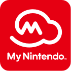
A Cloud, Mario Hat, Game and Watch... Thats an amazing Nintendo logo.
Nintendo, Microsoft, and Sony almost too coincidental with their choices of brand color.

Mass Effect Andromeda going to have a different ending for each platform?
The bushes in SMB are also clouds. Follow the moneywhy do they have a bush for their logo?
To be honest, as Rösti touched on, I don't think they're removing the gray. They're just adding red to the existing Nintendo-branding of white and gray. Their old business strategy with Wii/DS was "expand the gaming population"; more recently they've adjusted that strategy to "expand the gaming population that has access to Nintendo IP" which is what the red (Mario) is probably supposed to symbolize.
That's a possibility.
It's just very nice to look at now. The red is striking and noticeable compared to grey and white.
Davey Cakes
Member
Wow. This logo just keeps on giving.A Cloud, Mario Hat, Game and Watch... Thats an amazing Nintendo logo.
A Cloud, Mario Hat, Game and Watch... Thats an amazing Nintendo logo.
Oh shit
Much prefer red Nintendo over the bland grey.
I really have the firm belief that the 2006+ era of white/gray simplicity had something to do with Apple.
Anythings better than this logo though
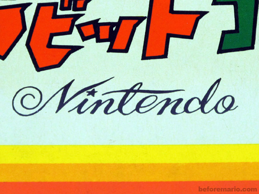
Rösti;200137830 said:I was under the impression that the gray logo wasn't brought into official/corporate use until 2008. Twilight Princess box has red logo for example.
Oh wow, that's true. Looked at some of my Wii-boxes again, and even stuff like Wii Sports has red logo. Maybe they made the switch once all their old product lines were discontinued in all their major markets (GBA was discontinued in NA in 2008, for example), who knows.
GustyGardens
Banned
Rösti;200137830 said:I was under the impression that the gray logo wasn't brought into official/corporate use until 2008. Twilight Princess box has red logo for example.
Yeah, I think most of the launch Wii games used the red logo. I think that was mostly carried over from the Gamecube generation. The gray logo made it's first retail appearance on the Wii box.
I can't think of the exact game that started using the gray logo on the box art, but by the time Wii Fit came out in 2007, they had already adopted it.
EDIT: A bit of research tells me that they were using the red logo on their games as far in as October 2007. Wii Fit came out in December.
A Cloud, Mario Hat, Game and Watch... Thats an amazing Nintendo logo.
Took me some time to get you were talking about Mr. Game & Watch but now... the deepest lore?
Mysterious
Banned
I really have the firm belief that the 2006+ era of white/gray simplicity had something to do with Apple.
They've already outright said it. DS and Wii aesthetic was Apple influenced as well.
Wow. This logo just keeps on giving.
Oh shit
I'm not seeing it. Care to point it out to us unobservant lessers?
I really have the firm belief that the 2006+ era of white/gray simplicity had something to do with Apple.
Well, Nintendo directly and fiercely went after Apple's market of young 20 somethings with the simple design and form of play. And it worked too. That's Nintendo when they're completely focused on the goal and not half-assing something.
Although the Nintendo logo still appeared on the back/side of boxes and on start-up screens in white and grey, I wouldn't classify white and grey as still being their primary marketing colors for the 3DS/Wii U gen. They used solid reds/magentas for a lot of 3DS branding and that solid electric blue for almost all their Wii U stuff.
people are reading too much into it, it's just Mario's hat
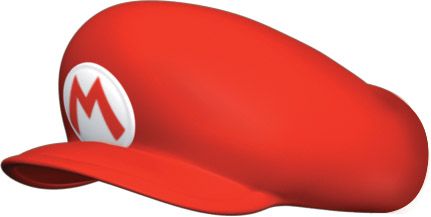
people are reading too much into it, it's just Mario's hat
For real. It's just his hat.
A Cloud, Mario Hat, Game and Watch... Thats an amazing Nintendo logo.
Ok, good.
Anyone helping me to unsee it? I just need this favour.
God, what a great logo.
I'm not seeing it. Care to point it out to us unobservant lessers?
It looks like Mr. Game & Watch's head. The back of Mario's hat looks like his nose.
Whether that's intention or not, who knows.
I'm not seeing it. Care to point it out to us unobservant lessers?
There's a picture of Zelda Wii U hidden in the 40th pixel from the left.
I'm not seeing it. Care to point it out to us unobservant lessers?
It's shaped like game & watch's head facing the right.
A Cloud, Mario Hat, Game and Watch... Thats an amazing Nintendo logo.
How far does the rabbit hole go?