neopokekun said:

That's a joke... right... right?
neopokekun said:
neopokekun said:
MehsterChief said:Wow, Conduit boxart looks incredibly bad. The logo of the developer makes it even worse.
Who's gonna walk into a store and say: "Man, that looks like an interesting game. I always wanted to play as an idiotic dude with stupid sunglasses who has a floating laserball and is kinds of badass!"
Probably not that many.


But without the colours, how would people know that 3 means good and 18 means bad?-viper- said:The coloured age rating logos look pretty bad. They looked better when black or white.
Same thing happened last gen.Android18a said:It's not the fact the new age ratings are coloured that bothers me so much, as the fact it's coming halfway through a generation. Now my boxes will lose a visual consistency!! This is an absolute travesty! Couldn't they have waited til the next generation?
McBacon said:

McBacon said:
:lolFireflu said:
E-DuB said:
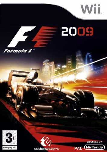
I....don't.....know.....why....but I want to play this......
faridmon said:props to EA, I never thought Rooney could get uglier than he was in former FIFA games. i was proven wrong.
bitter Everton fan
Spiegel said:
-Winnie- said:
Hmm, I wonder what happened to the normal PLAYSTATION 3 logo on the side...
And that bloody circle... every time I see it, it fills me with rage.
Some sources say this is the new box-art for PS3 Slim announcement.
LRB1983 said:Some sources say this is the new box-art for PS3 Slim announcement.
neopokekun said:
neopokekun said: