
• Hey Guest. Check out your NeoGAF Wrapped 2025 results here!

PCGamesN: "Why I'm uninstalling Windows 8"

If you're into app-store style games then that is reason. I imagine the app store will be pretty popular with indy game developers as well. If you only want to play your traditional PC game then there isn't much of a difference

Someone into indie games would just stay with W7 and Steam.
 
The loss of the start button menu seems to me to be so incredibly overblown.

As a Windows 7 user... I can observe how often I use the start button. It's not never. It's not even infrequent. But there's nothing about it that makes it magical.

I click on control panel, I click on a couple pinned apps. Sometimes I navigate to a folder of an app I've installed.

I don't think Metro will replicate all that functionality - it'll take some getting use to from my part.

But from what I see, it provides a whole new layer of easily accessible functionality that seems intriguing if not compelling in its own right.

You might not like the idea of metro as the primary user paradigm - in that case, I encourage you to think of it as the secondary user paradigm.

When you trade the current start menu with the Windows 8 start screen... it seems like a pretty good gain.

The desktop is still there - we're not losing that. And I don't think we'll be losing legacy applications. I imagine many developers will still be developing desktop programs.

Instead, we gain a new class of full screen applications. We've taken that idea for granted for a long time as gamers... but it's like every other program going from windowed mode gaming to full screen gaming.

And if we don't like full screen gaming? There's still the option for windowed mode!


If it was up to me... I'd have the option of moving all the icons off my quick launch bar - and only having programs that I currently have open on there. The icons that are on my quicklaunch now would simply go into the start screen. I don't know if that's what happens now, but if it is, then I'll be more than happy to switch over to W8.
 
Only thing that could make me jump is a way to get a start menu of some acceptable form back and the spreading of DX11.1/DX12 compatible games that would be better with win8...
Worst future.
What do you actually use the start menu for? In my case, I really only ever bring it up to get to a "run" prompt for certain tasks. The programs list is useless and most of the other functions are replicated on the task bar. In Windows 8 if you right click in the lower left portion you get a quick menu providing all of the things that you could possibly need.

The start menu, as it is in Windows 7, just isn't that useful. Same deal with the desktop itself. 90% of my desktop is empty space so if they can figure out how to make better use of this empty space I'm OK with it.
 
The taskbar is not close to big enough to pin the number of programs I deal with professionally and for leisure.
Jesus, how many programs do you use?

At the very least you could add all of them to the Metro start screen as opposed to hiding them in that awful Windows 7 programs section in the start menu.
 
Regarding this whole lack of a start button....what happens when you push the Windows key now?
I rarely use the start menu but when I do, Its usually to run a quick search for something. Hit the Windows key and just start typing...its great. This feature still there?
 
I love whenever a Windows 8 thread pops up in the Gaming section, then the Off-topic Windows 8 thread blows up with a bunch of people crying, "Oh no they are stupid, they are talking FUD, glad we can pat each others back".
 
Regarding this whole lack of a start button....what happens when you push the Windows key now?
I rarely use the start menu but when I do, Its usually to run a quick search for something. Hit the Windows key and just start typing...its great. This feature still there?
It goes to the start screen and all of your searching is done in full screen. And you have to choose from three sections in your search. Apps, Settings and something else. For some reason there isn't an "All" section.
 
Regarding this whole lack of a start button....what happens when you push the Windows key now?
I rarely use the start menu but when I do, Its usually to run a quick search for something. Hit the Windows key and just start typing...its great. This feature still there?
Yes, now it brings up the start screen to immediately search, although you're going to have to click once more because search is separated in into three categories.
I love whenever a Windows 8 thread pops up in the Gaming section, then the Off-topic Windows 8 thread blows up with a bunch of people crying, "Oh no they are stupid, they are talking FUD, glad we can pat each others back".
It's fucking hilarious, especially when people say it's so stupid, I'm not wasting my time, then come in anyway.
 
It goes to the start screen and all of your searching is done in full screen. And you have to choose from three sections in your search. Apps, Settings and something else. For some reason there isn't an "All" section.

Works for me.
It sounds stupid but its probably the one Windows 7 feature that I use the most.

Another question. I tend to avoid desktop/taskbar clutter and only throw icons on there that I need. Chrome, Steam, Origin, Dropbox, etc. In addition to these, I also have icons on the taskbar that take me directly to my Downloads folder. This still possible?

Can I also still have the OS on C: but still set the default photos/videos/music to D:?

I guess what Im really asking is: Is there anything notable that was removed or Windows 8 basically Windows 7 + Metro?
I plan on getting it for my laptop to see if I like it enough for my desktop but, in the meantime, I have a lot of questions...
 
Yes, now it brings up the start screen to immediately search, although you're going to have to click once more because search is separated in into three categories.

Depending on what hotkey you press, you can immediately filter between apps, settings, and files when searching. Instead of pressing the Windows key and typing to search among apps by default, you can press Win + Q for a global search, Win + F to search for files only, or Win + W to search for system settings only. I linked it in another post, but some really handy lists exist out there of the new hotkey functionality:

http://www.addictivetips.com/windows-tips/30-new-hotkeys-for-windows-8/

There are a ton of useful shortcuts that make navigating the new UI a breeze, and that list doesn't even include all of them (or the ones carried over from Windows 7). I find it really fluid to slide back and forth between the start screen and the desktop for file searches, apps, etc. - I don't even have to have the folder icon on my task bar anymore, since I can just hit Win + E to open explorer. It's a pretty seamless experience, and I'll be surprised and rather disappointed if the OS doesn't feature a tutorial or archive of all the available shortcuts. This stuff needs to be offered up front for folks to learn, because it takes the user experience from "what is going on here?" to "oh snap, this is great!". It does for me, anyway.
 
I love Windows 8 outside of Metro, and I've got my copy of the RP setup exactly how I prefer to use it. I use Classic Shell to give me the start menu and the Charms bar on the side to access search and Metro (if I need to access it).

This, IMO, is more of what MS should have done.

I get the complaints with Metro, I really do, but I have to agree with what MS is trying to accomplish with 8 (and it could be huge if they pull it off).
 
What do you actually use the start menu for? In my case, I really only ever bring it up to get to a "run" prompt for certain tasks. The programs list is useless and most of the other functions are replicated on the task bar. In Windows 8 if you right click in the lower left portion you get a quick menu providing all of the things that you could possibly need.

In Win7 the start menu keeps track of every program that you commonly use and within those programs common tasks and documents that you work on. It keeps common folders and support settings. It has a run bar if none of the above applies. All done automatically without having to pin anything.

The start menu, as it is in Windows 7, just isn't that useful. Same deal with the desktop itself. 90% of my desktop is empty space so if they can figure out how to make better use of this empty space I'm OK with it.

I never see my desktop. What I do see is my browser window open with perhaps downloads occurring, a chat window on the side, maybe a temperature sensor or task monitor and whatever other stuff I may need to have visible. Letting me run additional programs or open files without interrupting or hiding the other "background" jobs has been and still is a good idea since the start button in Windows 95. Taking that away is dumb.
 
Just so we're absolutely clear on this, pressing an arrow key in the start menu will go from one pane to the next, correct?

Yes, that's exactly what happens.

Works for me.
It sounds stupid but its probably the one Windows 7 feature that I use the most.

Another question. I tend to avoid desktop/taskbar clutter and only throw icons on there that I need. Chrome, Steam, Origin, Dropbox, etc. In addition to these, I also have icons on the taskbar that take me directly to my Downloads folder. This still possible?

Can I also still have the OS on C: but still set the default photos/videos/music to D:?

I guess what Im really asking is: Is there anything notable that was removed or Windows 8 basically Windows 7 + Metro?
I plan on getting it for my laptop to see if I like it enough for my desktop but, in the meantime, I have a lot of questions...

No. Everything you do in Windows 7, you can do in Windows 8. Only you'll have the improvements that Windows 8 brings.
 
Depending on what hotkey you press, you can immediately filter between apps, settings, and files when searching. Instead of pressing the Windows key and typing to search among apps by default, you can press Win + Q for a global search, Win + F to search for files only, or Win + W to search for system settings only. I linked it in another post, but there are some handy lists out there of the new hotkey functionality:

http://www.addictivetips.com/windows-tips/30-new-hotkeys-for-windows-8/

There are a ton of useful shortcuts that make navigating the new UI a breeze, and that list doesn't even include all of them (or the ones carried over from Windows 7). I find it really fluid to slide back and forth between the start screen and the desktop for file searches, apps, etc. - I don't even have to have the folder icon on my task bar anymore, since I can just hit Win + E to open explorer. It's a pretty seamless experience.

I think for the more tech savvy crowd like your typical GAF poster, the difference from 7 to 8 will be minimal. Most will simply get rid of Metro where possible. I prefer 7 personally and I'd rather wait for Win9 for MS to fine tune, but different strokes for different folks.

Where I think MS is in huge trouble is going to be the "grandparent" crowd who simply wants to get on, check their email accounts, and do a little web surfing. The vast majority of that crowd don't even know your absolute basic shortcuts. Win key, Ctrl+C/Ctrl+V, Alt+Tab, Alt+F4, etc.......and now MS expects people to memorize a bunch of hotkey combinations with the Windows key? It has the potential to be an absolute disaster.
 
I would argue just the opposite.

Bringing up a launch environment tells my brain "you are to be focused on launching something".

Having all the other clutter of the workflow on-screen just confuses the process. "Was I launching... or....?" And the other elements on the screen don't necessarily inform as to what you should be launching. "Was I launching... or was I going to keep browsing that GAF chrome tab out of the corner of my eye?"

But of course, perhaps not everyone is the same. Maybe a start menu is more conducive to fast work for some.

I don't think the person was talking about you forgetting what programme you were launching, it's about forgetting whatever else you were doing. If you're working on something (or even just having a chat to someone) and you remember you want to keep seeding a torrent, you don't really want to have to open a full screen menu just to open up uTorrent. It's not conducive to continuing your train of thought on your work or your conversation. I think anyone that forgets what application they're going to launch between pressing the start button and locating the app needs more help than a full screen start menu can offer.
 
Windows 8 is an upgraded, faster performing Windows 7 with a replacement of start menu as a full screen thing that your grandmother will love.

I agree some of the apps need work but thankfully they are very easily updated by the store. There will be dramatic changes to those apps very consistently upgraded...something that was a bigger deal for something like Messenger they can now just push an update to the Store and expect that most people will upgrade it without a big fuss. Many of the apps are not final versions (even now), teams are polishing them until the last second (last second is not when MSDN subscribers can download it...)
 
I think for the more tech savvy crowd like your typical GAF poster, the difference from 7 to 8 will be minimal. Most will simply get rid of Metro where possible. I prefer 7 personally and I'd rather wait for Win9 for MS to fine tune, but different strokes for different folks.

Where I think MS is in huge trouble is going to be the "grandparent" crowd who simply wants to get on, check their email accounts, and do a little web surfing. The vast majority of that crowd don't even know your absolute basic shortcuts. Win key, Ctrl+C/Ctrl+V, Alt+Tab, Alt+F4, etc.......and now MS expects people to memorize a bunch of hotkey combinations with the Windows key? It has the potential to be an absolute disaster.

There is definitely potential for that, I agree. A small tutorial video plays on first use of the consumer preview that explains the hot corners and what the Windows key does, but it should cover the basics more extensively. I honestly do believe that casual and power users will benefit from Windows 8, and the OS is modular and straightforward enough to please "grandparent" and "enterprise" crowds alike. The only stepping stone is the acclimation period, and it doesn't have to be a big one. If you're tech-savvy, memorize the hotkeys you'll use often. If you're not tech-savvy, simply point your mouse in different corners of the screen and learn that the big, friendly Windows key is there to help you.

From what I've heard, there will be a detailed tutorial offered out of the box in the retail release, so I'm interested to see what it covers and how folks react to it.
 
I have always been a pc Windows guy but that looks like crap. I will probably not upgrade unless they have a classic win-7 mode.
 
I think for the more tech savvy crowd like your typical GAF poster, the difference from 7 to 8 will be minimal. Most will simply get rid of Metro where possible. I prefer 7 personally and I'd rather wait for Win9 for MS to fine tune, but different strokes for different folks.

Where I think MS is in huge trouble is going to be the "grandparent" crowd who simply wants to get on, check their email accounts, and do a little web surfing. The vast majority of that crowd don't even know your absolute basic shortcuts. Win key, Ctrl+C/Ctrl+V, Alt+Tab, Alt+F4, etc.......and now MS expects people to memorize a bunch of hotkey combinations with the Windows key? It has the potential to be an absolute disaster.

I don't think so. If all they need to do is open up Chrome or something, then whoever sets up the PC for them can just customise the start menu to look something like this.

startmenuyxkng.png


Then all they need to do is click the icon, and they're browsing.
 
It just seems to me like MS is constantly trying to reinvent the wheel. They keep making a new identity and then forcing that identity on everyone, then invariably trashing it when they see Apple has done something simpler and usually better.

In the time OS X 10.0 came out until now, it's barely changed at all from a user interface standpoint. There are tweaks and enhancements but they've never turned the desktop on its head and said "okay this is how you're using your computer now." Likewise for iOS, where the interface has improved with adding wallpapers, app folders, customizability, etc. but they've never felt the need to erase the whole thing and start from scratch.

I'm a big fan of Windows XP but my main computer is a Mac, and I find it rather telling that I upgrade excitedly at every iteration of OS X, but I'm extremely reluctant to jump into new Windows OS's because I have to re-learn how to use my computer every god damn time.
 
I don't think so. If all they need to do is open up Chrome or something, then whoever sets up the PC for them can just customise the start menu to look something like this.

startmenuyxkng.png


Then all they need to do is click the icon, and they're browsing.

I already know what my family members that typically ask for help will ask me to do.

"Can you make it work like it used to?"

*Reinstalls Windows 7*
 
Seriously.

Putting someone infront of something news without any explanation is not a fair assessment of it's usability.

I would not want to recommend something to my friends and family if I have to train them how to use it first. "Stick with the older windows 'ma and leave me alone!"
 
Let's not kid ourselves win7 win 8 osx iOS. Doesn't matter. Wont stop the grandpa from calling you asking why the mouse isnt working ( it's unplugged!) or how to clear the browser history.

It does seem teaching someone just metro might be an easier task than classic windows.
 
I actually kinda love to bring up the start screen in Windows 8. The animation is really smooth, and even when I'm playing a full-screen game like Dark Souls or Guild Wars 2, it materializes in less than a second. I click what I need to click or check what I need to check (do I have a new email? did someone message me on Facebook? oh god what time is it?!), and then I'm back to whatever I was doing before just as quickly. Sometimes I even press the Windows key to slide back and forth between my desktop and the start screen just for the giddy little thrill of it all. It's a thief in the night, and it's stolen my digital heart.

Yes, I am in fact easy to please.
 
So what would be the appeal of W8 for a PC gamer? Why would I upgrade?, because at the moment I am seeing very little reason to part with my money for a new OS.

At this point in time and with the info we have so far, you shouldn't upgrade. For an X360 gamer I guess it might be a worthwhile investment, what with the Xbox Live integration and Xbox Smartglass. For a PC gamer there's nothing of value there, since game performance is largely the same as Win 7.

Maybe things will change if Microsoft decides to release some 360 exclusives through the Windows Store, then I could someone wanting to upgrade in order to play them. As it is now, in my opinion your money would be better spent elsewhere.
 
I just read the article. It's harsh from beginning to end.

Unless I'm reading a different article, that's hardly a review of the OS at all. It starts with "oh, everyone will hate it", then talks about the background themes, then goes in to a review of some metro apps, some paragraphs about some minor features, and then concludes with information on pricing and such.

You must be joking. Maybe my sarcasm meter is broken.
 
Computing newbies probably won't upgrade but it's gonna be awful when they buy a new computer.

There's no doubt that it's fairly tough to pick up and if savvy people find it difficult newbies have no chance.
 
its optional because you don't have to use the extras, the new start menu (metro screen) is functionally the same as the start menu in previous iterations of windows, but if the apps, store and other new things annoy you you can remove them.

you do have the start menu it just looks different :)

It is not.

That much is a fact about Windows 8.
 
I would not want to recommend something to my friends and family if I have to train them how to use it first. "Stick with the older windows 'ma and leave me alone!"

your family had to learn how to use classic windows too. why customise your start screen with an explorer link (as the guy who put this video out did) and then refuse to tell him how to get back to the start screen (which if you'd let him log in for the first time, instead of leaving it logged in when he sat down, he'd have been shown how to do it)?

instead he's pushed into trying 'windows explorer' and then just told 'you figure it out'.
 
I already know what my family members that typically ask for help will ask me to do.

"Can you make it work like it used to?"

*Reinstalls Windows 7*

Computing newbies probably won't upgrade but it's gonna be awful when they buy a new computer.

There's no doubt that it's fairly tough to pick up and if savvy people find it difficult newbies have no chance.

Pretty much. If I needed like 15 minutes to find where the fuck was the shutdown button (behind a hidden hotspot nobody ever told me about no less) and another 10 more wondering where the fuck was the shortcut to launch Chrome (which I had just installed) before I tried right clicking in a blank spot of Metro and saw it showed yet another completely different hidden menu from where I could click "Show all programs", this is going to be a nightmare for most users.

I also fear the calls telling me "please, could you get rid of this hellspawn or downgrade this shit back to 7" from friends and family getting a new PC. My only hope is backlash being so bad that stores themselves start advertising the new PCs as "Win7 downgradable" like it happened with Vista, where offering a free XP downgrade was actually a highly requested feature.
 

The (+) is the button to create a new email, seems pretty obvious to me. To send an email is also obvious. This is what it looks like on my screen right now.

iYzOpqErPRsit.png


I'm sure you can figure out what button you select to send the email.
 
Seriously.

Putting someone infront of something news without any explanation is not a fair assessment of it's usability.

Actually, it is.

I learned every version of windows without ever consulting a manual

Actually, I never read manuals for the express purpose of gauging its usability and intuitiveness

Even dos was more intuitive. If you ran into a problem, you could just type "help" which is how I learned how to use DOS as a 4 year old.

In windows 8, you make one wrong move and you can become absolutely lost and some peoples only avenue will be to reboot their PC because it will be the only way they will know it will get them to the start screen.

If you design an interface that has to be explained, detailed, taught and you have to convince people it's good... Then it's likely terrible (see: windows 8)

This is basic Ux principles here. You fail on UI, you fail on Ux. windows 8 shouldn't have the assumption that people use the windows key... Or people know shortcuts... Or if something is hidden, someone can find it.

The idea with UI and UX is that it makes things easy on the person. If I know what I have to do, it should be somewhat obvious as how to perform that task, where I need to go to perform that task. Nothing should be buried left for someone to find- EVER. Microsoft has obsufacted windows in their attempt to simplify its use. Is it intuitive? No.

In every version up to including windows 7, stuff wasn't hidden. It was just segmented. Everything accessible depending on how deep you wanted to go- it was your choice. All program critical commands were available on the window, multiple times. Now in metro? It's a confusing mash of a thoughtless approach to achieve a lofty (and unattainable) goal.

I bought a playbook, and kept forgetting about the application pane because it was hidden. The keyboard and status bar swipes? Average user won't remember this stuff. They need stimulus in order to acknowledge actions that are available to them. People see - react - see - react. One tutorial is going to do... What? It doesn't solve anything. I can tell you after 20 years of experience in helping people understand their computers that if there wasn't something there that they could reference as a next step... They will eventually forget about the next step unless they use their computers every single day of their life and utilize that specific task frequently. Most people don't learn after the first lesson. It's a fact of life.

You want people to type out programs in metro to run them? A lot of people write down their passwords because they can't remember them. You assume people will remember how to close a metro app? How to back out of it? How to switch apps? There is two entire layers to the operating system that conform to two entirely different philosophies that have different actions and different results. People who struggle on PC now are going to struggle far more now.

Windows 8 should have been a streamline of core functions, fixed things to operate easier and assisted people to not make common mistakes... Refined approachability... Condensed redundancies and define lines inbetween configurable and operating environments.

Right now it performs "ok" as a tablet OS for accessibility and approachability. not great because of hidden interfaces which is something that plagues playbook too (and to a very minor extent iPad - hidden app bar which isn't exactly priority operation due to app exclusivity)

As a desktop OS, Windows 8 is such a disaster on so many levels.
 
The (+) is the button to create a new email, seems pretty obvious to me. To send an email is also obvious. This is what it looks like on my screen right now.

iYzOpqErPRsit.png


I'm sure you can figure out what button you select to send the email.
(+) doesn't make sense to me for creating a new email, and though I'm assuming the left button on the top right is send mail, even that doesn't seem super clear to me.

And especially if it's a touch interface, why put the button to send the email so close to the button to (I'm guessing) delete the email?

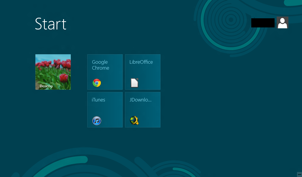
I also don't understand the reasoning behind the Metro screenshot on the previous page. Why are the icons so small, when a lot of people probably recognize things by their icons on the desktop? Why is there so much empty space in the square? Why is it a square, so even a short label like "JDownloader" or whatever that was supposed to be is cut off?
 
All his issues seem to be with the easily ignorable Metro start screen. I skimmed the article and didn't see anything about performance issues so whatever.
 
All his issues seem to be with the easily ignorable Metro start screen. I skimmed the article and didn't see anything about performance issues so whatever.

You can't ignore it when it replaces a core OS function - it's the crux of the issue.
 
Actually, it is.

I learned every version of windows without ever consulting a manual

Actually, I never read manuals for the express purpose of gauging its usability and intuitiveness

Even dos was more intuitive. If you ran into a problem, you could just type "help" which is how I learned how to use DOS as a 4 year old.

In windows 8, you make one wrong move and you can become absolutely lost and some peoples only avenue will be to reboot their PC because it will be the only way they will know it will get them to the start screen.

If you design an interface that has to be explained, detailed, taught and you have to convince people it's good... Then it's likely terrible (see: windows 8)

This is basic Ux principles here. You fail on UI, you fail on Ux. windows 8 shouldn't have the assumption that people use the windows key... Or people know shortcuts... Or if something is hidden, someone can find it.

The idea with UI and UX is that it makes things easy on the person. If I know what I have to do, it should be somewhat obvious as how to perform that task, where I need to go to perform that task. Nothing should be buried left for someone to find- EVER. Microsoft has obsufacted windows in their attempt to simplify its use. Is it intuitive? No.

In every version up to including windows 7, stuff wasn't hidden. It was just segmented. Everything accessible depending on how deep you wanted to go- it was your choice. All program critical commands were available on the window, multiple times. Now in metro? It's a confusing mash of a thoughtless approach to achieve a lofty (and unattainable) goal.

I bought a playbook, and kept forgetting about the application pane because it was hidden. The keyboard and status bar swipes? Average user won't remember this stuff. They need stimulus in order to acknowledge actions that are available to them. People see - react - see - react. One tutorial is going to do... What? It doesn't solve anything. I can tell you after 20 years of experience in helping people understand their computers that if there wasn't something there that they could reference as a next step... They will eventually forget about the next step unless they use their computers every single day of their life and utilize that specific task frequently. Most people don't learn after the first lesson. It's a fact of life.

You want people to type out programs in metro to run them? A lot of people write down their passwords because they can't remember them. You assume people will remember how to close a metro app? How to back out of it? How to switch apps? There is two entire layers to the operating system that conform to two entirely different philosophies that have different actions and different results. People who struggle on PC now are going to struggle far more now.

Windows 8 should have been a streamline of core functions, fixed things to operate easier and assisted people to not make common mistakes... Refined approachability... Condensed redundancies and define lines inbetween configurable and operating environments.

Right now it performs "ok" as a tablet OS for accessibility and approachability. not great because of hidden interfaces which is something that plagues playbook too (and to a very minor extent iPad - hidden app bar which isn't exactly priority operation due to app exclusivity)

As a desktop OS, Windows 8 is such a disaster on so many levels.

Needs to be quoted on the new page.
 
Top Bottom
