Nooooooooooooooooo!
(Do Not Want)
Edit: seriously, color is awesome, but the offset faces looks strange. Should have gone for the direct side-by-side.
It shows the difference between their power levels.
Nooooooooooooooooo!
(Do Not Want)
Edit: seriously, color is awesome, but the offset faces looks strange. Should have gone for the direct side-by-side.
Is that Anakin or Kylo? I can't tell.
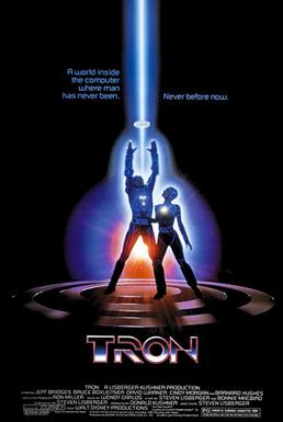
There is so much going on in each of those posters, while this one barely has anything to see in it. The posters for the original trilogy were works of art... this isn't
Is that Anakin or Kylo? I can't tell.
This is a teaser poster.
Also a "work of art" isn't dictated by how much content is in it.
Are you missing a decade of your memory?
i'm a fucking idiot
People saying it's Rey, lol.
Also, it reminds me of:
Captain Command confirmed for MvsC4
Is there a higher res version of the poster anywhere?

Full High Res poster in the linked post.
http://www.neogaf.com/forum/showpost.php?p=233927158&postcount=49
I cut the bottom off and the curved sides for this one below. Nothing fancy so it might not fit phones perfectly.
I'll leave the curved edges bit to personal taste, but the white frame is an obvious throwback to vintage Star Wars posters in terms of design. You even included one of them in your original post.
[IMG]http://i.imgur.com/usMBZbk.jpg?1[/IMG]Code:[img]http://i.imgur.com/IxBHjnt.gif[/img]
Guys I'm seeing a Death Star here
Naw that's definitely Pac-ManCode:[IMG]http://i.imgur.com/usMBZbk.jpg?1[/IMG]
Guys I'm seeing a Death Star here
Naw that's definitely Pac-Man
Code:[IMG]http://i.imgur.com/usMBZbk.jpg?1[/IMG]
Guys I'm seeing a Death Star here

Edit: seriously, color is awesome, but the offset faces looks strange. Should have gone for the direct side-by-side.
Code:[IMG]http://i.imgur.com/usMBZbk.jpg?1[/IMG]
Guys I'm seeing a Death Star here
Code:[IMG]http://i.imgur.com/usMBZbk.jpg?1[/IMG]
Guys I'm seeing a Death Star here
.
Symmetry would imply they are equals.
They are NOT equals.
"Curved edges? White background? Nothing but an Apple ripoff!"I should have specified, but I have no problem with the white background itself. It's the combination with the curved edges that makes the entire thing feel "off" to me. It kind of feels like they're trying to sell me an Apple product.
Code:[IMG]http://i.imgur.com/usMBZbk.jpg?1[/IMG]
Guys I'm seeing a Death Star here


"Curved edges? White background? Nothing but an Apple ripoff!"
This is you right now. Just... stop, LOL.
The amount of people mistaking Kylo for Rey is amusing.
It not only evokes the original poster for A New Hope, it also has the rounded edges, white background, and red tint of promotional art done by Ralph McQuarrie from 1975:
Bonus fact: That's not Luke. That's a woman. This is from the brief period when Lucas was toying with making the primary protagonist female.
It doesn't look like an Apple ad at all unless you associate anything with curves with an Apple ad.Oh come on, if you're going to use a strawman, try better at least. Nowhere in my post did I say it was an Apple ripoff; I just said that it felt like an Apple ad. It was the first thing I thought of when I saw the poster.
Nooooooooooooooooo!
(Do Not Want)
Edit: seriously, color is awesome, but the offset faces looks strange. Should have gone for the direct side-by-side.