• Hey Guest. Check out your NeoGAF Wrapped 2025 results here!

Video game series with the most disappointing graphical evolution?

Huh? Here are some actual TS4 screenshots.

The shot you quoted is a massively pre-release screenshot and I doubt the person who posted it knew that. The final UI is white and completely different, so no doubt the rest of the stuff in that shot is far from final as well.
 
Monster Hunter PS2:
1894402-monhun1.jpg


Monster Hunter 4
monsterhunter4.jpg

I love monster hunter... BUT FREAK they've used the same assets for 15 years now... one of these days they'll HAVE to start from the ground up right?

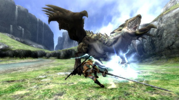
to be fair though Monster Hunter tri on the Wii Looked as good or better than the PS2 game... best fire and water I had ever seen at the time.

But yeah
Monster-Hunter-tri.jpg

first-look-monster-hunter-3-20071010082255737.jpg

monster_hunter_tri.png
 
I love monster hunter... BUT FREAK they've used the same assets for 15 years now... one of these days they'll HAVE to start from the ground up right?

to be fair though Monster Hunter tri on the Wii Looked as good or better than the PS2 game... best fire and water I had ever seen at the time.

But yeah

How's the world like in 2019?
But yeah, Capcom has only been reusing assets for 11 years.
Monster Hunter Online already looks pretty good, and it's very likely they will move on from 3DS, so assets like that are not going to fly wherever MH5 lands.
 
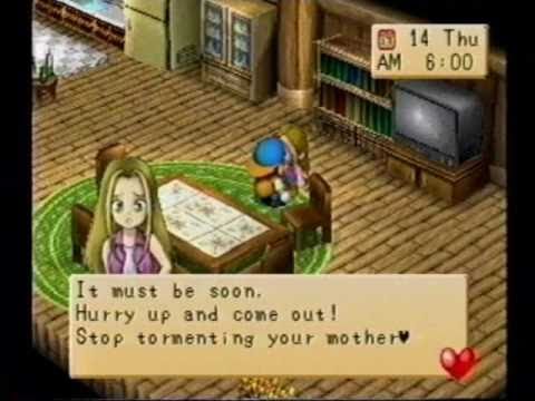
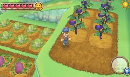
Harvest Moon. Loved the look and charm of it on SNES, and the progression to PS1 was great. After that it has gone insane, with everything out of proportion and insanely bright. The 3DS years are among the worst looking of them all.

The Golden Years (SNES, PS1)

harvest-moon-virtual-console-20080210090410096-000.jpg


hqdefault.jpg


WTF 3DS

harvestmoon06.jpg


Harvest-Moon-3DS-Ann_10-09.jpg
 
Harvest Moon. Loved the look and charm of it on SNES, and the progression to PS1 was great. After that it has gone insane, with everything out of proportion and insanely bright. The 3DS years are among the worst looking of them all.

The Golden Years (SNES, PS1)

WTF 3DS

Agreed, I'm not a huge fan of the super chibi characters, but the bright neon colors bother me way more. I'd like to see something like A Wonderful Life's art style on a modern system.
74cf1354fd.jpg


I love monster hunter... BUT FREAK they've used the same assets for 15 years now... one of these days they'll HAVE to start from the ground up right?

To be fair, MH Tri had almost entirely new assets. Rathalos and Rathian got a complete make over.
 
I think Pokemon still needs work in how the games look in the "explortion" part. But combat, IMO the most important part, got a massive upgrade with X/Y and looks great now.

I'll have to agree with the people saying DragonBall. Burst Limit is still the best this gen. Even if it's not the best one in technical terms, they tried to make it look like the anime. All the recent games just look like "videogame 3D models" at best and plastic at worst. And I agree with a comment in the last page, it's mostly the weird use of "plastic" shaders.
 
Sadly, Pokémon is the first example that came to my mind as well. Game Freaks really need to step up their game, performance on 3DS titles is not acceptable, especially seeing how they aren't that great looking. There are far better looking games that perform far better than X/Y and AR/OS on 3DS.

Zelda.

From Twilighat Princess to Skyward Sword to the beautiful Tech Demo to the okay Zelda U.

Mario actually improves over time while Zelda can't figure out what their doing for a whole year a new game is being thought out.

I assume you're talking about art consistency here, but that's the beauty of Zelda: each game has a different tone represented by a different artstyle. You can disagree with this but that's why they do it, suggesting that they don't know what to do with the saga is a bit unfair and doesn't really make sense seeing how every Zelda game is a beautiful, consistent, captivating work of art (and some elements like an enemy or an npc here and there can be a bit ugly, yes, but every game has its low points). If you're saying instead that SS is technically worse than TP and Zelda U is worse than the tech demo then that's simply not true at all, SS and TP have different scopes and are developed accordingly, while the Wii U game is far, far better than the tech demo: has better lighting, shaders, animations, textures (e.g. Link's clothes), particles and physics too (Link's hair, the grass that reacts to wind and Epona), that's without considering that all this stuff is in a huge open world opposed to a single, tiny room. Also release date is probably in more than a year, that's a lot of time to further polish and improve how the game looks, like Nintendo always does with its titles. Don't be fooled by artstyle guys, "realistic" or darker doesn't necessarily mean more demanding or more advanced.

All Nintendo games...
Except New Zelda, Xeno, and Bayo 2...
Mario, Mario Kart, Smash and Yoshi look worse than before?
 
While I agree that the animation and models were pretty good, the framerate can be really jarring. I don't get why there was like 0 improvement in that area between the 2 3ds games. Also, what's up with the textures in these games? They look pixelated, but not DS/32bit pixelated since they seem to be filtered anyway

My understanding is that the Pokemon models that the Gen VI games use are actually super high-poly for a 3DS game. Naturally this tends to lead to performance issues. One might assume that the reason they did this is so the models are detailed enough that they don't have to remake them all for Gen VII, but that's just speculation.
 
The Witcher 3 isn't the graphical upgrade from the Witcher 2 that I was expecting which is slightly disappointing.
 
Agreed, I'm not a huge fan of the super chibi characters, but the bright neon colors bother me way more. I'd like to see something like A Wonderful Life's art style on a modern system.
74cf1354fd.jpg


To be fair, MH Tri had almost entirely new assets. Rathalos and Rathian got a complete make over.

A Wonderful Life is one of the relaxing games I've played. The subdued colors and the fact that I'd almost exclusively play it at the crack of dawn on Saturday mornings helped a lot.
 
Think the OP is exaggerating a bit. When I look at Pokemon Green and then I look at Pokemon X/Y, I see massive upgrades all around - especially when it comes to battling.
 
Digimon World. While the first was a bit of a mess as a game, I thoroughly enjoyed the visuals and atmosphere of the world as a child, still do, actually. The rest were gross.

Also, Halo. CE looked great. Halo 2 was a huge step forward. Then next-gen came, and somehow Halo 3 looked worse than 2, imo. Perhaps not from a technical standpoint, but it was "uglier", also the cutscenes seemed cheaper. Flood looked weird. I got past it of course, and it has its moments of beauty for sure, but it shocked me initially.

Then came Halo 4 with pretty amazing production values and great graphics, even if it meant taking shortcuts. Too bad I thought the new art direction was a poor replacement for Bungie's. Green and grey, green and grey and Promethean design looked stupid, imo. Not really the weapons, but the THREE new enemies we got. Smh.

And perhaps the worst:
2511451-banjo+(1).jpg


No, Banjo, no we can't
 
Zelda.

From Twilighat Princess to Skyward Sword to the beautiful Tech Demo to the okay Zelda U.

Mario actually improves over time while Zelda can't figure out what their doing for a whole year a new game is being thought out.

Oh, you have already played Zelda U? ;)

For Zelda games they often change the style completely. Naturally each change will upset some people.
 
I knew this would be about Pokémon. Yeah, the overworld graphics progression is glacially slow.

The battle graphics, on the other hand, have improved tremendously.

To be fair, only the most recent games made a noteworthy visual improvement (3D monsters), and even that was over a decade late.

Pokemonstadiumbox.jpg

Circa 1999
 
Megaman X.

The SNES games had a style and clarity to them that was lost on the PSone and PS2. MMX4 and beyond look overblown for lack of a better description. There's too much going on, and X's smaller sprite gets lost in the noise.
 
I personally dont get the street fighter hate. I thought the game looked great on ps3. I also think what they've shown of sf5 looks better and cleaner than sf4. Yes, its a different style and art direction, but i think the games look fine. Not like pokemon at all.

A complete side note, but some friends who havent jumped on this gen yet were playing mkx on my ps4 and it was the first time they were audibly impressed by a game this gen. I thought it was weird that of all the games, it was mkx that impressed them. Its a clean, nice looking game, but that's it imo. Maybe ive become spoiled.
 
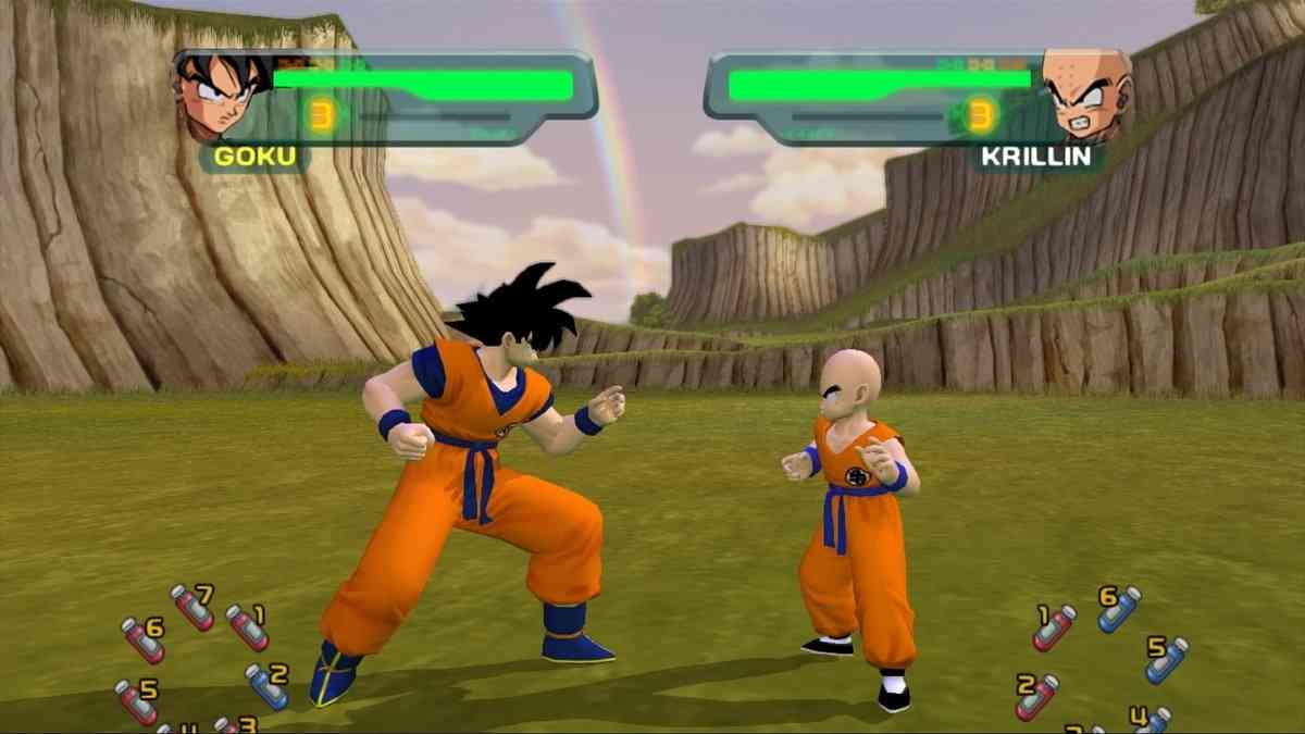
I guess DBZ fighting games.

There's been like 5-7 games after it, but I still think Burst Limit looks the best, and it's gone downhill from there.
People might think I'm crazy, but I think the 1st Budokai still looks the best. Obviously I don't mean a PS2 game looks better than a PS3/4 game, but the character models were ON POINT. Every character looked like they were ripped straight out of the manga/anime. It's beautiful and not a single DBZ game looks as good. It also didn't have that weird cel-shading. I don't think DBZ games ever got cel-shading right. Burst Limit was good (2nd best-looking game). Xenoverse isn't bad either IIRC.
 
Why has nobody mentioned Bomberman? why? It was an abombination when it "upgraded" to Xbox 360 graphics

Bomberman-Act-Zero-XBOX-360.jpg

all these years of seeing the game cover and this is the first time I ever seen an actual gameplay screenshot

I had no idea there were gratuitous ass shots in this game too
 
Pokemon was my first thought too, then immediately replaced by Diablo. Diablo 3 was a huge let down for me graphically, the cartoon style removed almost all of the horror atmosphere of the first two games.

I remember people laughing at the rainbow and the WoW style in the demo, but I though they were overreacting.

Then I played it, even with that awful DRM, and the whole tone of the game was cartoony, from the graphics to the jokes and monsters letters. Add to that the stale gameplay, terrible loot progression and the auction house and you have the biggest gaming disappointment.

While they apparently fixed the gameplay, I still can`t get over the cartoony style.
 
Does Final Fantasy Tactics to Final Fantasy Tactics Advance count?

Final Fantasy Tactics Advance and A2, while similar in a few ways to Final Fantasy Tactics, feel more like their own series rather than trying to be a continuation of the original. So, I personally wouldn't count them.
 
This :

855987-gfs_28182_2_5_mid.jpg


to this :

sbk_05.jpg


Story of how Atlus outsourced and worked on IP that they own but were not the original creators of it.

It went from cartoony colorful game to anime game with Atlus being in the pilot seat.I am not even getting into how the game is broken and made with having IOS port in mind.Atlus didn't even claim the game as theirs as I remember , it never even got a spot on their forums to be talked about.

First Game is Snowboard kids and second is its later successor SBK DS.
 
People might think I'm crazy, but I think the 1st Budokai still looks the best. Obviously I don't mean a PS2 game looks better than a PS3/4 game, but the character models were ON POINT. Every character looked like they were ripped straight out of the manga/anime. It's beautiful and not a single DBZ game looks as good. It also didn't have that weird cel-shading. I don't think DBZ games ever got cel-shading right. Burst Limit was good (2nd best-looking game). Xenoverse isn't bad either IIRC.

I'm gonna have to go with your crazy. ;)

But seriously, I actually feel that switching to cell shaded was a really good decision. The games I mentioned earlier took a step back, but the style is still good. Even when I played Budokai 1 as a kid, I didn't think it looked great. Budokai 2's cel shading was like a revelation.


This is B1 from the HD collection to bring it up to speed a bit. Obviously a game made ground up in this style in 2015 would look a lot better, but I'd still take good cell shading over the action-figure-esque 3Dness. I guess a thing it has going for it is that it's clean and not busy. But that's about it imo.
 
Simon the Sorcerer 3D has to be the worst downgrade ever. Goddamn my eyes. Quite probably the ugliest game I've ever seen.
Monster Hunter PS2:
1894402-monhun1.jpg


Monster Hunter 4
monsterhunter4.jpg
Well, MH4 is on the 3DS. Is the 3DS more powerful than a PS2? I'm not entirely sure but I'm guessing not quite, or just barely stronger and the smaller screen/resolution hurts the graphics a lot.

But I do agree generally about MH. That PS2 shot looks almost as good as MH Tri on Wii, geez. xD 3U certainly looked better, but still clearly looks like a past-gen title.

What I wouldn't do for a fully new-gen PS4 MH from the ground up...

I'm also tempted to nominate Phantasy Star II, it seems like a downgrade from the original which had fully coloured backgrounds during battles. But, Phantasy Star IV had amazing graphics, so in the end it definitely improved greatly series-wise.

But then came Phantasy Star online and boooo
 
I think Fire Emblem still looks pretty bad. The GameCube and Wii versions look like ass considering the hardware.

I know it's not the main draw for something like FE, but damn.

fire-emblem-radiant-dawn--20071102020851742.jpg


fire-emblem-radiant-dawn--20080408004035098.jpg


That's a Wii game...
 
Tales abandoning cel shading is super disappointing. Symphonia still looks better even at 480p/60FPS than anything after it except Vesperia.
 

I'm glad I wasn't the only one to notice this immediately. I need to know his workout.

Also The Sims 2 to the Sims 3 was really awful graphically. Everything had this quasi-realism/fake look to it and the faces where terrible with dough like physiques. It was really hard to make slight exaggerations to the face to make different looking sims without setting sliders all the way to min/max or just changing hair.

The Sims 4 is much, much better in this regard. Also I just googled and they finally got a mac version. Lets do this!
 
To Pokemon's credit, the battles made a significant leap this generation. Framerate aside, I love how all the character models look and move.


Pxywikibattle2.png


tumblr_inline_mv8x0ymll81qcy1wq.gif


The Rocket Knight/Sparkster games became progressively uglier.

From this:
Rocket_Knight_Adventures.png


To this:
Sparkster%20-%20Rocket%20Knight%20Adventures%202%20(J).png


To this abomination:
1284624-977248_20100409_010.jpg

Yeah, I came to post this too. I have no idea why 2 sucked so badly. It went from this really cool steampunk style to just looking like a generic Megadrive platformer. At least the SNES version was better.

sparkstersnes-5.png


No substitute for this though

gfs_93252_2_12.jpg
 
I think Fire Emblem still looks pretty bad. The GameCube and Wii versions look like ass considering the hardware.

I know it's not the main draw for something like FE, but damn.

fire-emblem-radiant-dawn--20071102020851742.jpg


fire-emblem-radiant-dawn--20080408004035098.jpg


That's a Wii game...
I came in to say Fire Emblem. Now here is the best part for that particular game the Japanese version was not in 16:9. Also given how near the Wii launch it came out (in Japan) it is very clear that it is a Gamecube port, 4:3 only made that clearer so maybe it is best to see it for what it really is, a Gamecube game moved platforms last minute.

Totally agree about graphics not being the main draw of the games but it can sometimes be a bit off-putting.

In general Fire Emblem has never been the best looking game on the block in the genre. Comparing FE3 on the SNES to FEDA the Emblem of justice is a good example. Let's see a battle scene...:
gfs_17360_2_1.jpg
gfs_5013_2_10.jpg

A still image is not really working here to convey things...sorry :(

Later SNES FE games were better with lots of dynamic animations (and especially the maps) but other franchises tend to go SD (like Super Robot Taisen) for allowing characters to be told apart.

The GBA games are where the sprites started to feel good with somewhat exaggerated animation, yeah these are good but even then animation-wise Super Robot Taisen really destroyed them:
gfs_44133_2_13.jpg
gfs_57559_2_7.jpg

Again still images is not doing it. But I happen to have a SRT video handy (maybe that is slightly unfair as the GBA SRT really evolved in animation capabilities while FE was stagnant).

Shadow Dragon was a low point though. The pre-renders sprites sure were smooth but:
gfs_97071_2_1.jpg

They just felt bland like the FE3 sprites were.

Awakening is starting to go places (portrait cut-ins for critical hits), camera angles in battle and the like:
gfs_301509_2_5.jpg

Still feels like it is somewhere between DS and 3DS though...

 
Top Bottom