-
Hey Guest. Check out your NeoGAF Wrapped 2025 results here!
You are using an out of date browser. It may not display this or other websites correctly.
You should upgrade or use an alternative browser.
You should upgrade or use an alternative browser.
Wind Waker HD trailer
- Thread starter CrazyDude
- Start date
Looks great, can't believe people thought they were going to ruin the artstyle. 1080p confirmed too, daaaayum.
Everyone probably thought that because the first screens they showed off looked like they did.
darkpaladinmfc
Member
StreetsAhead
Member
59,999 yen...
Game & Wario was 48,000 yen (about $50) and is 39.99 US, so it's possible they'll have it cheaper in the states if they think they need to.
Hmm i wonder what they changed.
The Horror the horror
Banned
lwilliams3
Member
Thanks for the link.
What?!
Tell me more!
Eiji was not specific on what was changed.
Earthpainting
Member
I imagine it being a rather small tweak. Like lowering the amount of shards or the amount of money required to decipher them. I don't see them making an entirely new dungeon in its place or something.
phalestine
aka iby.h
when he mentions they made changes, I could of swore he was going to say we added a water temple :/
D.Lo
Member
Well, the English version already cut down the triforce hunt from the Japanese version, believe it or not.I imagine it being a rather small tweak. Like lowering the amount of shards or the amount of money required to decipher them. I don't see them making an entirely new dungeon in its place or something.
Maybe they're just giving the Japanese version the English Triforce hunt?
that said I was never bothered by it, I had heaps of pieces already by the time I needed them because I was exploring the whole time. Like the artifacts in Metroid Prime.
I was expecting 30 fps to be honest. Depending on how the animation and engine works, increasing the framerate to 60 fps might be a lot more complicated than just unlocking the framerate, if you get what I mean. It could cause all sorts of unexpected results. Does it run at 60 in Dolphin? Honest question.
Anyways, I think it looks beautiful. The bloom is exactly where and when it should be. It makes the bright sunny moments look bright and sunny. Given the dynamic weather in the game that's a huge plus imho. When the clouds break after a storm is going to be an even cooler moment than before.
And remember the early stuff we saw wasn't Wind Waker HD. It was an environment test done for the *next* Zelda game to see if the Wind Waker artstyle looked good in HD. They were never going to make a Wind Waker with Link's eyebrows behind his hair.
Emulators don't usually increase framerates like that, so it's just 30fps. Unless the framerate is unlocked in the original, but this is not the case with WW.
And I agree that the game looks nice as-is. Despite some changes, it has retained the look of the original and even improved several assets.
when he mentions they made changes, I could of swore he was going to say we added a water temple :/
He said they were making a change to help the game's TEMPO. Close but no cigar.
The problem always was them not being able to really FILL the otherwise beautiful world. Huge seas with scattered, tiny, meaningless "islands"? This game could have been so much more.Looks like a great update. They really captured the feeling of being out on the sea.
So yeah, I would have approved a sequel that improved on that regard (Triforce hunt was NOT the problem for me, rather a symptom of one of the big problems (too few dungeons)) rather than a remake...
Does anyone have a better quality, full-size version of this picture? This is the best one I've been able to find.
EDIT: OK, found one. Here it is in case anyone wants to check it out: http://img.gawkerassets.com/img/18qjph5jaxjmbjpg/original.jpg

EDIT: OK, found one. Here it is in case anyone wants to check it out: http://img.gawkerassets.com/img/18qjph5jaxjmbjpg/original.jpg
It looks exactly the same as I remember playing it. That must be my memory, but it still doesn't make me wanna buy this version.
It definitely is your memory


Does anyone have a better quality, full-size version of this picture? This is the best one I've been able to find.
EDIT: OK, found one. Here it is in case anyone wants to check it out: http://img.gawkerassets.com/img/18qjph5jaxjmbjpg/original.jpg
thanks man!
Zoramon089
Banned
It looks exactly the same as I remember playing it. That must be my memory, but it still doesn't make me wanna buy this version.
That's some serious Alzheimer's you've got there, my friend
ElectricKaibutsu
Member
Not to be one of those jerks that corrects people but 48,000 yen is like $500Game & Wario was 48,000 yen (about $50) and is 39.99 US, so it's possible they'll have it cheaper in the states if they think they need to.
") .
.FlashbladeGAF
Member
It looks exactly the same as I remember playing it. That must be my memory, but it still doesn't make me wanna buy this version.
funny how memory works
Looks like they caved and toned diwn the new lighting in favor of the old. Such a shame.
")
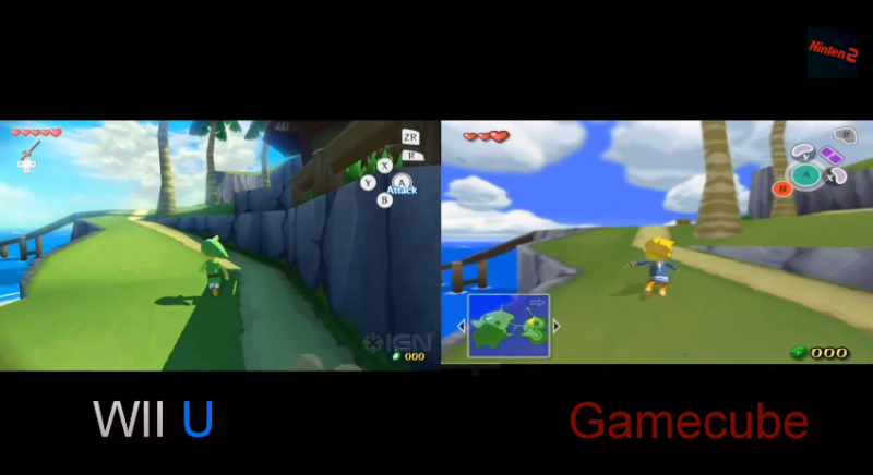
Zelda Wind Waker Wii U/GameCube comparison video
JimboJones
Member
They did.
The at-sea segments during the day are still intolerable. The blue, overbearing hazy bloom is so blinding it looks like you're sailing through a turquoise fog the entire game.
WTF is wrong with Nintendo? FIX THE BLOOM. And what's with putting the ugly blue fog on the islands too??

Not sure if it's intentional or just a side effect of bloom slider set to high but they might be trying to imitate rayleigh or atmospheric scattering. This is when objects takes on the color of the atmosphere the further away you are from it.
There should be a thread with links to all the developer directs, they were pretty informative. I cant believe why they weren't able to make the boat faster in the original!
Damn, Gamecube version looks SO much better.
bishopcruz
Member
Looks better than the early shots, but honestly the new lighting kinda kills it for me. Comparing this to 1080p dolphin WW, the original just looks better for the art style to me. THe biggest issue I have is that the new lighting makes all the characters look more 3-d than they did before, and that's NOT good for cell shading. Instead of the hand drawn look, in a lot of the scenes in the trailer it looks kinda I dunno, claymation. You lose a lot of the stark differentiation between characters and background that you had in the original.
Technically the lighting is way better, but for the art style of the game, it just doesn't fit in most of the outdoor areas. Indoor areas are a lot better though, and the sailing scenes on the whole aren't too bad either.
Technically the lighting is way better, but for the art style of the game, it just doesn't fit in most of the outdoor areas. Indoor areas are a lot better though, and the sailing scenes on the whole aren't too bad either.
Wafflecakes
Member
Looks great. Day 1.
I never played the original on GC, so my opinion is probably mismatched, but I like the new art FAR better than the GC version.
I never played the original on GC, so my opinion is probably mismatched, but I like the new art FAR better than the GC version.
I Stalk Alone
Member
Damn, Gamecube version looks SO much better.
especially that stretched out from 4:3 to 16:9?
the video on the right has incorrect aspect ratio
also the bloom works as it is a tropical island setting. i actually like it when the sun is beating down on me but then again i grew up at the beach.
metalslimer
Member
God it would looks so good if they just turned that eye bleeding bloom down.
I Stalk Alone
Member
for those complaining about bloom is your monitor brightness all set to high or something?
bishopcruz
Member

Here's an image that shows what I mean, the characters don't look that round in this HD render from Dolphin. It looks amazing in high res, but that new lighting just loses a lot of the charm.

Of the images I found this one showcases the problem the best. Link's sister looks round with the textures just painted on to her.
Oddly enough the problem is only REALLY bad during daytime and sunset scenes. Nighttime scenes, and interiors are nowhere near as bad, though not perfect.
for those complaining about bloom is your monitor brightness all set to high or something?
How is it their fault when they themselves said they want players to "feel" the heat in WW HD?
I absolutely love dof. Especially for wind waker. You nuts.I wonder if they took out that horrible depth of field effect the original game had? DOF just does not belong with cartoon graphics like these.
Damn, Gamecube version looks SO much better.
The new lighting is pretty nice at parts, but they did go a bit overboard on the bloom.
ThatsMytrunks
Member
The bloom is a little overbearing, but as long as it's not more than $39.99, I'll probably bite.
Crazyballs speculation: The game is going to be free for the Wii U Ambassador program.
Crazyballs speculation: The game is going to be free for the Wii U Ambassador program.
I actually really enjoyed the bloom in the demo and agree that the setting makes it fitting. Is only heavily used in the Islands, not in interior sections. The sun would be overpowering in these settings.Watching the Developer Direct, I think the HD version does look really nice. The ocean looks beautiful. I have to agree that the bloom seems overpowering, but generally Nintendo has done a good job.
The skylines in this game are incredible. They nailed the beauty that we all imagined while playing the original without making it something different and maintaining its identity. Orchestrated soundtrack would make it perfect.
Liberty4all
Banned
I never played the gamecube version so I'm hyped for this.
I'm so jealous. This game is special man. Enjoy it.I never played the gamecube version so I'm hyped for this.
Heart Attack
Member
GC Version - a living, breathing cartoon
Wii U Version - someone discovering the bloom effect in Maya for the first time and putting it everywhere
so true. I'll keep playing my GC Version.
Well, the English version already cut down the triforce hunt from the Japanese version, believe it or not.
Maybe they're just giving the Japanese version the English Triforce hunt?
I have never heard of this before. Please tell me more.