-
Hey, guest user. Hope you're enjoying NeoGAF! Have you considered registering for an account? Come join us and add your take to the daily discourse.
You are using an out of date browser. It may not display this or other websites correctly.
You should upgrade or use an alternative browser.
You should upgrade or use an alternative browser.
Which console's home screen has been the most clean and least cluttered?
- Thread starter Kadin
- Start date
Where'd you get that background? Link?Depends on how you organise it. This is how I have my PS4 setup.
Store
What's new
Apps
Games
Media
Library
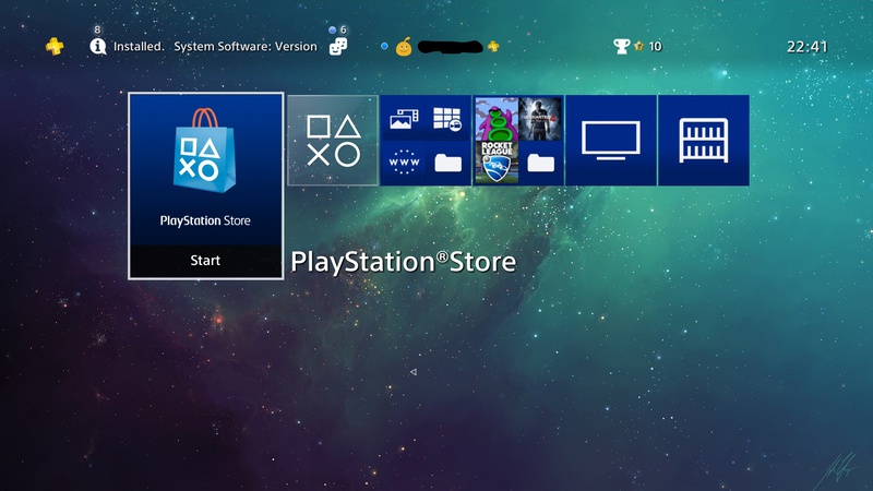
But Sony, for the love of god let met change the colour of the tiles with the next update. That stuff drives me crazy.
ChronotriggerJM
Member
Yeah PS4 is my pic. Folders and xmb functionality is just great.
Themes are great as well if they're simple in design.
Themes are great as well if they're simple in design.
Sword Of Doom
Member
I really liked the ps3's XMB menu. Looked clean and professional.
Ps2's towers representing memory card storage was pretty cool too, but a little off topic
The XMB still looks clean and modern when I turn on my PS3.
The Switch is clean but it sacrifices so much functionality for it.
pinkurocket
Member
Oh the Wii UI is iconic and really well designed. The entire console is designed around the idea of the Wiimore, and the UI being themed like a TV with 'channels' showing is absolutely genius. The channels also showed live information in the thumbnail, which gave you a nice overview without having to click open some of the 'informative' channels.

This really shouldn't be controversial.
Added features and information require screen real estate. What conclusion am I jumping to? That if Switch UI had more features, those features would be displayed on the screen in some fashion?
who said controversial? just said you're jumping to conclusions which you were
what features would take up screen real estate in a way that would make the UI less clean? if it gets a browser it goes with the circular icons on the bottom and stuff like netflix, hulu, etc. will be apps that will be on tiles like everything else. figure video capture will get bundled with the screen grabs when that gets added.
I remember the Xbox 360 menu being HORRIBLE. Like, if there are 9 icons on the screen, 6 or so would be ads.
Probably the most bland, soulless shit thats ever come out of Redmond short of Kinect Joyride
There are clean ways to do stuff, and less clean ways to do stuff.This really shouldn't be controversial.
Added features and information require screen real estate. What conclusion am I jumping to? That if Switch UI had more features, those features would be displayed on the screen in some fashion?
For example, all of that extra Knack information that is seen in the PS4 shot, if wanted, could be in a sub-menu that you only see when entering the "options" menu for the game, in the menu. (I believe you press Y to enter the options menu of a game to update it, etc). The UI would be just as clean, yet you have these features. Magic!
In any case, I insist on my point: The reason why an UI is the cleanest, doesn't make it any less clean.
civilstrife
Member
I give you that a big part of the Switch UI being so clean is that it lacks some features. But it's still the cleanest design.
Then honestly, we agree. And you agree (though in a less incendiary way) with this person:
Sure it is clean, it doesnt have anything
I do agree about the color scheme. The Switch UI looks great, and its not just about the paring down of features. Though I do wish it displayed at 1080p in docked mode.
No, i'd say your gripe is the thing that's pretty unconventional.
The game is installed on your harddrive. Therefore it's shown in your list of games.
That way you can still manage your saves, your HDD space or your install or do whatever without having to insert any specific game discs. And it's one more reason why digital is simply more convenient, seeing as the discs are only there for authentication.
If you remove the disc from your console, the game doesn't vanish. It's still on your harddrive and will be represented by the icon.
The way it's done right now is pretty much the only way that makes any sense.
The way the PS3 handled it, by hiding this in your save data folder, made much more sense. You're right though, it is trying to streamline everything towards the all digital experience, which is a big part of why it irks me.
BocoDragon
or, How I Learned to Stop Worrying and Realize This Assgrab is Delicious
Oh the Wii UI is iconic and really well designed. The entire console is designed around the idea of the Wiimore, and the UI being themed like a TV with 'channels' showing is absolutely genius. The channels also showed live information in the thumbnail, which gave you a nice overview without having to click open some of the 'informative' channels.
It's funny to reflect that Nintendo basically invented the "home screen" model now seen on iPhones and Androids.
I don't think it's a 1:1 inspiration... it's just a grid of icons after all. But Nintendo did get there first.
Switch doesnt have a functional OS right now so it shouldnt count.
What?
Depends on how you organise it. This is how I have my PS4 setup.
Store
What's new
Apps
Games
Media
Library
But Sony, for the love of god let met change the colour of the tiles with the next update. That stuff drives me crazy.
This looks sick!
This really shouldn't be controversial.
Added features and information require screen real estate. What conclusion am I jumping to? That if Switch UI had more features, those features would be displayed on the screen in some fashion?
those same features could be tied to a button press for optional display for one. the default UI would be still cleaner than the PS4s with that simple change. we wont know how Ninty does it until they... well... do it. That's the conclusion I see you jumping, if that helps.
All that excess stuff only appears when you scroll down with the d-pad. It's pretty minimalistic otherwise.Yeah, since you mention it that isn't what it looks like right now. This is:

Which, again, doesn't really need to have the extra fluff at the bottom. Why do I need to see the most viewed video, DLC announcements and more?
RichiRamjag
Member
Switch doesnt have a functional OS right now so it shouldnt count.
My vote goes to PS3 as well.
and my absolute shit vote goes to PS VITA
Lol. How doesn't it have a functional OS? It may not be as full featured as you'd like, but that's a silly statement.
What?
People lose their damn minds when switch is brought up.
It's funny to reflect that Nintendo basically invented the "home screen" model now seen on iPhones and Androids.
I don't think it's a 1:1 inspiration... it's just a grid of icons after all. But Nintendo did get there first.
it's clean, simple, and functional. for all the shit the Wii U got about its OS being slow most everything you needed was a single input away.
civilstrife
Member
who said controversial? just said you're jumping to conclusions which you were
what features would take up screen real estate in a way that would make the UI less clean? if it gets a browser it goes with the circular icons on the bottom and stuff like netflix, hulu, etc. will be apps that will be on tiles like everything else. figure video capture will get bundled with the screen grabs when that gets added.
Please refer to my conversation with the other guy. Summary: It's not just about apps.
TeamLeftMatch
Member
The only answer:

I'd probably say the os4 but that's just because I used it a lot. I don't have a switch and the wiiu menu is only good for the quick select option on the gamepad.
nismopower
Member
Ps4 ui for sure. Love it and is just perfect. Everything is very intuitive. Also have an x1 and had too google alot to find it. Its really a big mess.
Also the reason ps4 pro is my main console and the x1 is hardly used.
Also ps3 is right behind it really good ui.
Behind that its the first ui from xbox 360. That was good looking fast and easy.
Not that metro crap it has now...
Also the reason ps4 pro is my main console and the x1 is hardly used.
Also ps3 is right behind it really good ui.
Behind that its the first ui from xbox 360. That was good looking fast and easy.
Not that metro crap it has now...
The way the PS3 handled it, by hiding this in your save data folder, made much more sense.
Fair point. I loved the minimalism of the PS3 XMB a lot.
I'd rather not have a 'save data folder' at all though, that was always a clusterfuck. So I like the fact that everything of a single game is represented by a single clean icon.
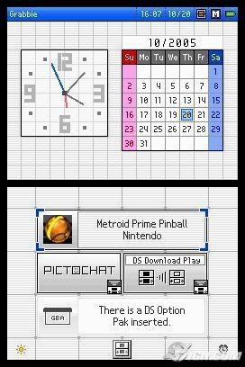
This is good too. I forgot how simple and clean the DS's UI was.
Please refer to my conversation with the other guy. Summary: It's not just about apps.
your conversation isn't really that clear, can you clarify what you're talking about and maybe respond to some of the points I brought up
really not seeing where you're coming from here

I don't know how people can stand to use that.
It has more functionality then any other UI in my experience (which I strongly prefer), the most recent update has made it quite zippy too. My only gripe is it lacks the minimalist approach Sony has, but then you have to sacrifice specific funtions and bury them deeper.
I also like the motion backgrounds on PS4, they are beautiful.
civilstrife
Member
those same features could be tied to a button press for optional display for one. the default UI would be still cleaner than the PS4s with that simple change. we wont know how Ninty does it until they... well... do it. That's the conclusion I see you jumping, if that helps.
Using that logic, assuming that Nintendo would come up with a better solution is also jumping to conclusions.
your conversation isn't really that clear, can you clarify what you're talking about and maybe respond to some of the points I brought up
really not seeing where you're coming from here
What questions do you have in particular?
I guess I agree, I just thought of stuff like Netflix and a web browser when they said it "doesn't have anything". I just don't see it as a reason to invalidate the Switch's design, if that was their goal.Then honestly, we agree. And you agree (though in a less incendiary way) with this person:
I do agree about the color scheme. The Switch UI looks great, and its not just about the paring down of features. Though I do wish it displayed at 1080p in docked mode.
titiklabingapat
Member
I liked the Wii's TV channel homescreen. Navigating via IR was the simplest. You literally point and click.
Fair point. I loved the minimalism of the PS3 XMB a lot.
I'd rather not have a 'save data folder' at all though, that was always a clusterfuck. So I like the fact that everything of a single game is represented by a single clean icon.
Yeah, I admit I'm being kind of "old man yelling at clouds" about this, but basically any UI discussion boils down to people ardently asserting that their one completely personal edge-case is the most important thing in the world, so I guess that just goes with the territory

Hugh Swank
Member
Depends on how you organise it. This is how I have my PS4 setup.
Store
What's new
Apps
Games
Media
Library
But Sony, for the love of god let met change the colour of the tiles with the next update. That stuff drives me crazy.
I like the new Avatar...much better than smug Ryan.
On Topic: I'm in the Xbox beta program and the UI has been getting better & better. They're constantly making improvements. I think they're getting close to something very good.
All that excess stuff only appears when you scroll down with the d-pad. It's pretty minimalistic otherwise.
It's transparent before you press down, isn't it? I'd check myself but I'd need to change some cables around and ain't nobody got time for that.
Switch.
Wait. The Switch's grey menu is the same grey as NeoGAF's dark grey in the dark theme?
Mind = blown.
killatopak
Gold Member
Used to be PS4 and now it's Switch.
It's not necessarily good though. In Switch's case, I feel that it actually lacks functions and a bit too simple.
Personally, I need more entertainment apps such as crunchyroll or netflix.
It's not necessarily good though. In Switch's case, I feel that it actually lacks functions and a bit too simple.
Personally, I need more entertainment apps such as crunchyroll or netflix.
Juke Joint Jezebel
Member
Switch easily. The thing that matters, the games are all in big tabs at the top and all of the fluff is in little circular tabs at the bottom. Perfection.
Yeah, I admit I'm being kind of "old man yelling at clouds" about this, but basically any UI discussion boils down to people ardently asserting that their one completely personal edge-case is the most important thing in the world, so I guess that just goes with the territory
I'm that way with the coloured tiles.
What the fuck were you thinking, Playstation UI team? *shakes fist*
It has more functionality then any other UI in my experience (which I strongly prefer), the most recent update has made it quite zippy too. My only gripe is it lacks the minimalist approach Sony has, but then you have to sacrifice specific funtions and bury them deeper.
I also like the motion backgrounds on PS4, they are beautiful.
Different strokes I guess. I'm sure I'd get used to it eventually if I had an Xbox One.
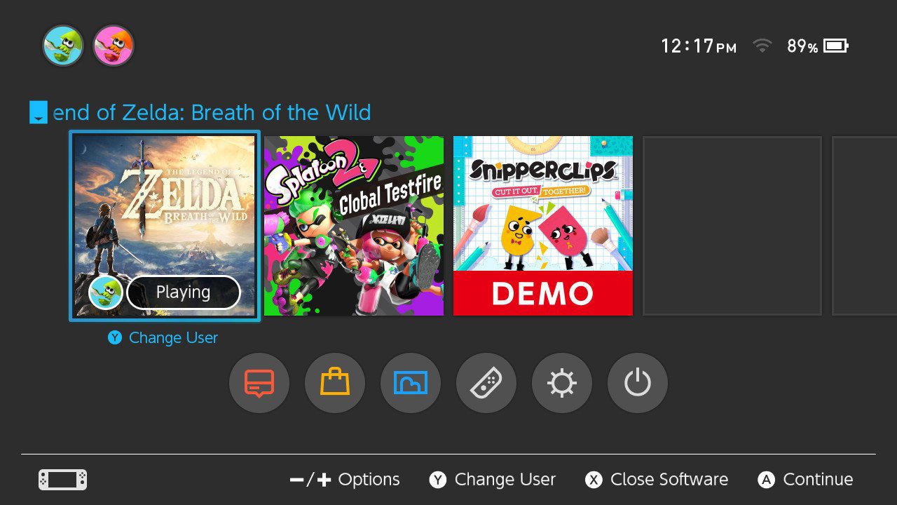
Really like the Switch's home screen.
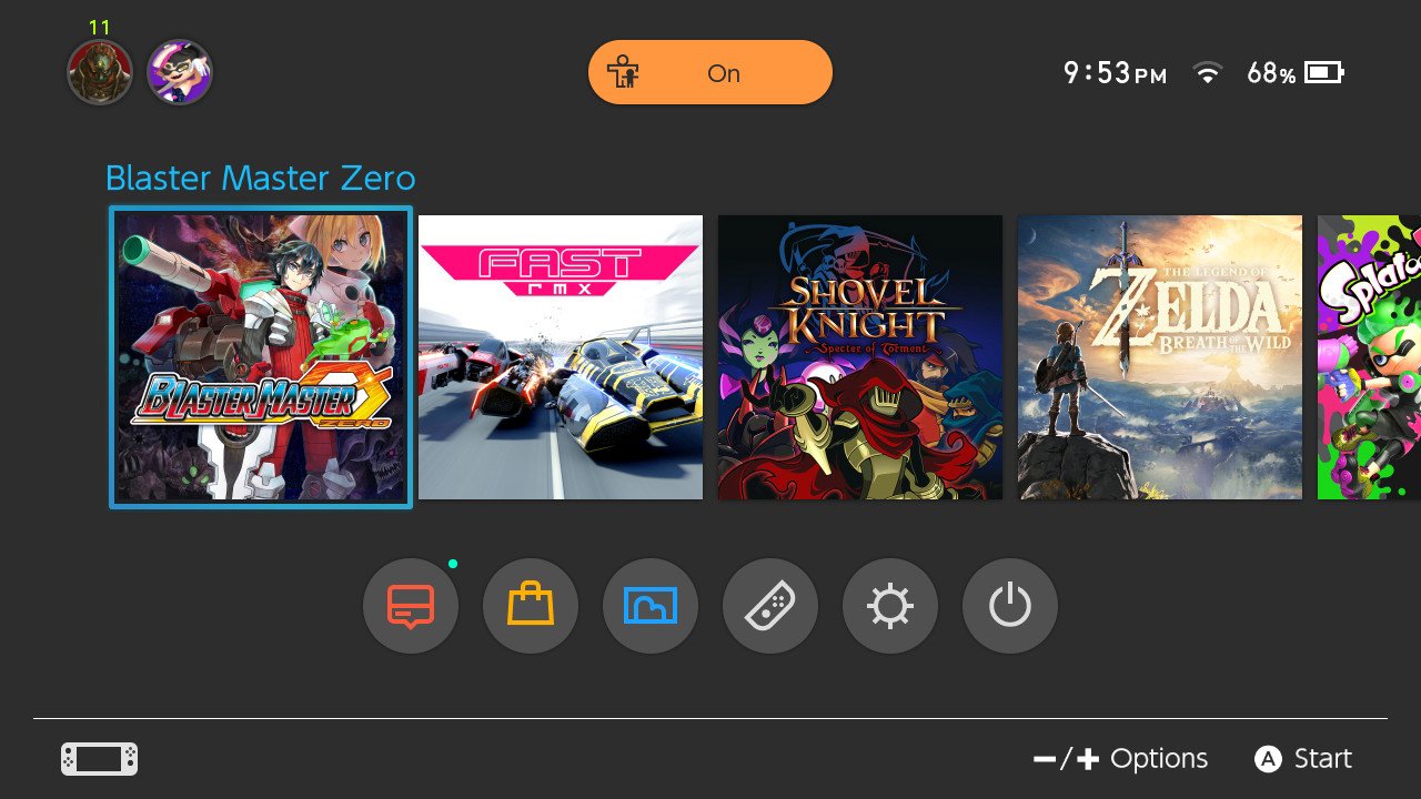
This screen must be fake. thekiddfran said Switch has no games.
And another thread to worship the Nintendo Switch...
You mean another thread to say "It has no features, of course it looks clean"
Yes, add a web browser and youtube app and all of sudden its a cluttered mess.
It had more features when it came out.The PS4 and Switch UI are basically the same. Only difference is the PS4's has more features, since it has been out longer.
Used to be PS4 and now it's Switch.
It's not necessarily good though. In Switch's case, I feel that it actually lacks functions and a bit too simple.
Personally, I need more entertainment apps such as crunchyroll or netflix.
I believe it was confirmed that entertainment apps were on the way.
The way it works now is when you highlight a square, it displays the trophy info below it. Pushing down on the dpad at that point opens up all the other stuff.It's transparent before you press down, isn't it? I'd check myself but I'd need to change some cables around and ain't nobody got time for that.
Dr.brain64
Member
PS4 is without a doubt the best one. With all the things it has and does - it's a clear winner in my book.
You mean another thread to say "It has no features, of course it looks clean"
Yes, add a web browser and youtube app and all of sudden its a cluttered mess.
It's a horizontal row of squares, which was the main complaint about the old PS4 UI. At some point things will have to change because it simply won't be practical anymore if you're storing a lot of games.
So while I love the clean minimalist look of the Switch UI, at some point they will have to add some organisation/folders or whatever else if they want to keep it uncluttered.
Kadin
Member
Which would you rather have, all the options on the screen or buried within the menus for when you want to access them?If your home screen is cleaner then it likely means your console is less feature-rich, or is hiding everything in menus.
I don't agree that cleaner == simpler
For me, I'd much rather have the latter. I typically play games >90% of the time and for those few occasions where I want to access the community of a game to watch clips, etc., I'll gladly go menu hopping to do it. Splatter all that crap on my screen 100% of the time and I'll avoid it at all cost.
WordsintheWater
Member
Switch UI is great, but so is PS4's. It's a toss up for me between those two.