• Hey, guest user. Hope you're enjoying NeoGAF! Have you considered registering for an account? Come join us and add your take to the daily discourse.

Which console's home screen has been the most clean and least cluttered?

jroc74

Phone reception is more important to me than human rights
i liked the PS3 XMB before they put a bunch of extra icons on it that you couldn't opt out of

never had a 360 before blades went away but it seemed clean, yeah

This here.

The Wii's was nice n clean too.

I cant remember the Wii U's... :-(
 

shiyrley

Banned
Made another half assed gimmicky under powered console. I have nothing against Nintendo just wished they made a fully fledged console and I'm sick of every thread going switch or Zelda route.
I'm sorry not everybody has the same tastes or preferences as you do.

Also I conclude you are deliberately ignoring this post.

The Switch UI is still clean tho. Have a nice day.
 

El Sabroso

Member
I see that the style of minimalistic graphic design looks similar to PS4/XB1 but as of how it is arranged, it works exactly as Wii U / 3DS design, having games with the bigger icons/boxes, access to some options/features via little icons and some other access to user features, XB1 and PS4 load more news and stuff around those instead of just the access via de little icons, like news regarding the game for PS4, friends activity which Nintendo only makes markers for the icons before accessing those, and XB1 even gets you offers from the very beginning displayed from the OS

Seriously, I'm confused. What features does the Switch OS lack (aside from Online Party/Chats)? It seems to be fully functional to me...

slow startup
/jk
 

Falchion

Member
The Switch is the 'cleanest' but the Xbox's is my favorite by far. You're always one movement away from getting to what you want.
 

jroc74

Phone reception is more important to me than human rights
A mess? :/ I see an horizontal list of icons. What exactly is it a mess?

Exactly. Unless that was sarcasm.

I forgot to mention the Vita's too.

Most clean I have to give it to PS4 or PS3. Or Wii.

Looking up the Switch's now....it gets my vote too. Probably the cleanest.
 

J@hranimo

Banned
This made me notice that the background color of the Switch is exactly the same of Neogaf's dark theme lol

...You're right.

Superior theme is always superior.

With that said...definitely the Switch's. PS4 home screen is a close second, mainly due to how the Switch's screen takes some UI cues from it.
 

schopaia

Member
One thing a hated about the later UI for the 360 and the One is how they pushed ads on your home screen. At least Sony keeps it in the storefront.

The media section on the home screen is littered with ads on ps4. They may not seem like obvious ads, but a huge icon for hulu and other paid streaming apps - they're definitely ads.
 

Nightbird

Member
The ops question is Which console's home screen has been the most clean and least cluttered? And people are voting a console that has been out 3 weeks it's fucking rediculous, half the forum is switch this switch that it's sad tbh. If Nintendo had a dick y'all would be suckin it.

Is this your first console launch on gaf? Because that post does sound like that

Edit: I just checked, and this actually is your first console launch on gaf!

Dude, the Forum was like that when the PS4/XB1 launched as well
 
The ops question is Which console's home screen has been the most clean and least cluttered? And people are voting a console that has been out 3 weeks it's fucking rediculous, half the forum is switch this switch that it's sad tbh. If Nintendo had a dick y'all would be suckin it.

What the hell? Yes, the Switch has been out for three weeks, and in that time, its UI has been the cleanest and least cluttered. Could Nintendo fuck it up in a later update? Sure, but the same goes for the PS4 and Xbox One then. So far, there are no indications that the addition of the missing features will make it any less clean or more cluttered. The web browser will most likely go with the bottom icons, the video recording will most likely go in the existing album icon, and Netflix, YouTube etc. will just be new tiles. When you reach 12 tiles, you can change to a grid view. Additional Friend List features will either go where the rest currently are (on your profile) or be an extra bottom icon. The Switch already has "ads" - in the News section, which has its own bottom icon. No clutter.

Maybe if threads often go Switch this Switch that is because there aren't many major platforms. It's a new one so of course people will talk about it. By the way, the purchase is already justified by the system being great. And one of the many reasons why is, indeed, a slick, clean and quick UI.
 
Switch for sure, although that definitely comes down to the fact that the OS is sorely lacking features. Will be interesting to see how it evolves as Nintendo gets their shit together over the coming months.
 

jroc74

Phone reception is more important to me than human rights
Switch for sure, although that definitely comes down to the fact that the OS is sorely lacking features. Will be interesting to see how it evolves as Nintendo gets their shit together over the coming months.

Yeah, I do wonder what it will look like when they are all done updating

Even then if you look at Nintendo console UI's (home and handheld) from Wii to now they all look so similar it probably wont change much.

Its a safe bet to say the Switch will look like it does now.
 

Tudor

Member
Of the consoles I have owned or used more than just once or twice, I agree with a few others here that the PS3 is the best overall; layout, design and 'feel' are all spot on.

In order of best to worst IMO:
1. PS3
1.5 (PSP by default, I had a CXMB theme to skin it like the PS3 with smaller than normal icons)
2. Nintendo DS
3. Nintendo 3DS tied with the original Wii (aside from the horrible pseudo skeuomorphism with the old TV look)
4. PS4
5. Switch as it's basically the same as the PS4 from a usage POV.
5. XBOX360 in its most recent incarnation
6. Xbone
...
99. PSVita. Who the bloody hell thought this was a good way to do a UI after the smooth perfection of the XMB. Doesn't matter which is best as long as we can all agree this is at least bottom 3.
 

PantsuJo

Member
I'd say the XMB interface, really. PS3 and PSP. Really clean.

I'd like Steam BigPicture UI too but I wouldn't call it "clean".
 

Mega

Banned
Because games and apps have icons which will clutter the home screen. Give Nintendo time to push ads and stuff plus features will be added and need entry's, it's too early to vote it a clean UI.
If we are going this route the surely the SNES had the cleanest UI

Made another half assed gimmicky under powered console. I have nothing against Nintendo just wished they made a fully fledged console and I'm sick of every thread going switch or Zelda route.

LOL what

So what you're saying is the Switch console is the cleanest confirmed and has snatched an early win? 200 million sales incoming? And other ugly babby console UIs cannot hope to compete?

Playing a big open world games on the go with standard controls = gimmick. Nintendoomed?

The SNES didn't have a UI... Are you okay?
 
Switch. No amount of features added will make it any less so. Games and apps will fill the blocks, and new functionality like messaging friends and what have you will be a circle below the games and apps like what's currently there with news, setting, and photos etc. Don't see how anything will make it less clean.

Chances are when tons of software is on the system they will allow columns like with the 3Ds for your software.
 
I think it's a bit early to say Switch.

The question says "has been," not "will forever be." The answer can change. It could be updated for the worse and the PS4's and Xbox One's could be updated for the better, but saying it's been the cleanest so far isn't wrong, and it is built in a way that should keep it clean and relatively clutter-free even with additional features if Nintendo doesn't fuck it up.
 
I always loved the original Xbox dashboard

Xbox-Dashboard-1.jpg
 

BigEmil

Junior Member
Depends on how you organise it. This is how I have my PS4 setup.

Store
What's new
Apps
Games
Media
Library

20170203224140_livujxm.jpg


But Sony, for the love of god let met change the colour of the tiles with the next update. That stuff drives me crazy.
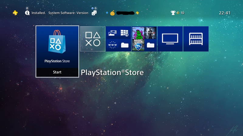
Good balance between relevant info and good placement of everything here, shouldn't be too barebones where relevant text info needs to be shown by clicking on that section, i like how the bottom space is reserved for additional info regarding the game when you hover over one and it displays the deets of the game
 

Kthulhu

Member
The media section on the home screen is littered with ads on ps4. They may not seem like obvious ads, but a huge icon for hulu and other paid streaming apps - they're definitely ads.

Those do bother me, but not as much as ads for stuff that was completely unrelated to my 360.
 

MikeyB

Member
The Switch sure seems clean. So is my desk if I'm not working on anything complex. It isn't an apples to apples comparison at this point.
 

Black_Stride

do not tempt fate do not contrain Wonder Woman's thighs do not do not
MainMenu3.jpg


I get warm and fuzzy feelings just by staring at that menu. Then again, I'm a bit of a SEGA fanboy.

Thats it.
Cant get any cleaner/ simpler than that.

DC was wins....think ill boot up my DC and Skies of Arcadia just to hear the lost voices.

But also to hear the DC seek sound pre fight.
 
I mean... it's kind of easy to be uncluttered with next to no extraneous features.

I totally agree; it's genuinely beautiful. I really love that my Switch just plays games. Instant boot, click on square, done. It's perfectly minimal and does it's job better than any console UI. Flawless execution.

I really hope they don't add dumb "features" to it later. I don't even want shitty streaming apps.

Get the hell out'a here with that bullshit. Dont even want streaming apps. Be happy wihtout your apps somewhere else. Guess you still rockin cable television exclusively.
 
I totally agree; it's genuinely beautiful. I really love that my Switch just plays games. Instant boot, click on square, done. It's perfectly minimal and does it's job better than any console UI. Flawless execution.

I really hope they don't add dumb "features" to it later. I don't even want shitty streaming apps.

Adding new apps won't take anything away from its clean UI or functionality.
 

RootCause

Member
I totally agree; it's genuinely beautiful. I really love that my Switch just plays games. Instant boot, click on square, done. It's perfectly minimal and does it's job better than any console UI. Flawless execution.

I really hope they don't add dumb "features" to it later. I don't even want shitty streaming apps.
They can add features without making it cluttered, or behave slow. Also, those streaming apps would be handled like the games(tiles), and will be up to each user to download them.

I really do not understand people saying this. It makes no sense. The wiiu was slow as hell because Nintendo made a horrible clunky ass os, not because of streaming apps, or icons.
 
The ops question is Which console's home screen has been the most clean and least cluttered? And people are voting a console that has been out 3 weeks it's fucking rediculous, half the forum is switch this switch that it's sad tbh. If Nintendo had a dick y'all would be suckin it.

If the system is the least cluttered, then what does it's age have to do with anything. You just have a stick up your ass about Nintendo obviously. You're just making yourself look bad.

The question says "has been," not "will forever be." The answer can change. It could be updated for the worse and the PS4's and Xbox One's could be updated for the better, but saying it's been the cleanest so far isn't wrong, and it is built in a way that should keep it clean and relatively clutter-free even with additional features if Nintendo doesn't fuck it up.

This. I'm not sure why people don't get it.
 
Ps4 UI for me. I really dislike the xb1 UI with what little time I spent on it. As for the switch, it looks like a Ps4 UI with way less features so let's see how it looks when all the apps and features come.
 
Yeah PS4 for me.

Mine is set up just like Hoo-doo except that I have the internet browser separate as I watch Giant Bomb premium content on it a lot.
 

kraspkibble

Permabanned.
I actually like PS4 but the menus are bad.

Switch looks great too. Not used it so can't really say much about it. Can't wait to get one.
 

Caayn

Member
I really liked the GameCube's menu, simple, elegant and fast. It did everything you needed while staying minimalistic and one with the design language of the hardware.

I also enjoyed the PS3's XMB. If it had no ads and was faster it might have been higher on my list.

Switch feels like a sleeker/minimalistic version of the PS4 UI. I wonder how Nintendo will handle the UI when more games become available.

Xbox always had a feature packed UI that feels like it's aimed at a power user.
Because games and apps have icons which will clutter the home screen. Give Nintendo time to push ads and stuff plus features will be added and need entry's, it's too early to vote it a clean UI.
If we are going this route the surely the SNES had the cleanest UI
Ads? On a Nintendo platform?
 
Top Bottom