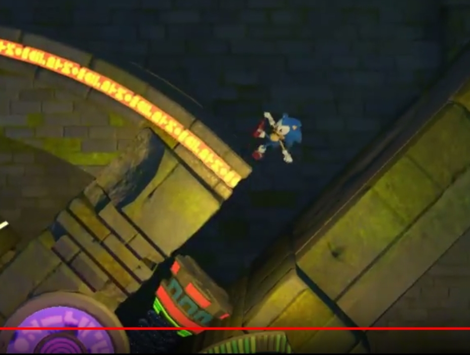
• Hey, guest user. Hope you're enjoying NeoGAF! Have you considered registering for an account? Come join us and add your take to the daily discourse.

Sonic Forces - Casino Forest gameplay

killroy87

Member
Looks super lifeless coming off of Mania. And that music was annoying as hell.

Shame, I thought this was just Generations 2? How hard is that?
 
The scale just seems really off, and the visual noise that's going on in really jarring and makes just looking at things hard. I love the level concept, but it's just empty and barren.

I'm hoping they have the HUD hidden because they're redesigning it - what we've seen so far is just abnormally large and taking up way too much screen real estate. (also inspector gadget theme Kappa)

Edit: There are zero enemies in this. Also what's going on here?


c37f97bb8ae4937a06d8bb8fc6018044.jpg
 
At least the Casino Night motif isn't blatantly reused as Green Hill was

That being said, asthetic wise it makes me think of the unused Wood Zone crossed with Casino Night

Edit: Idea, EggmanLand Remastered as a tag team act, Custom Character for the Werehog sections
 

Spukc

always chasing the next thrill
I just want sega to understand 16 bit sonic is better.
Sonic mania 2 here we go.
 
It feels bland after Mania

It's an attempt at mixing seemingly disparate aesthetic ideas - "What if we had a casino level in a deep jungle?" - that just don't blend as well as they thought it would. Plus, I realise, with the way the 3D level design obviously has to stick out from the environment, it does feel more obviously like a course just dumped in the location. Mania's levels feel more 'filled in'.
 

Fireblend

Banned
I know the background art style of Mania and the other 2D games wouldn't translate well to this 3D style, but holy shit, it's like night and day. This looks awful.
 

MrBadger

Member
I was excited by the concept and I really like how it looks (that's a first for Forces), but all the gimmicks are just lifted from Casino Night. Hard to get excited after Sonic 4 and Sonic Generations 3DS already did that. I'm just not into Sonic Team's surface-level Classic Sonic clones, especially after Mania nailed it, but his gameplay still looks more fun than the other 2D levels in this game.

It looks just as bad as Mania.

Surely this won't derail the thread
 

Eumi

Member
This looks like a level made by an in-game level creator. Floating, bland blocks dotted with preset interactables drifting by a background that doesn’t quite mesh with the levels art style.

Complete with ‘just spam rings all over’ section.
 

Zomba13

Member
I loved Generations but this one just isn't doing ANYTHING for me.

When first things were coming out I was all "eh, it's just a few seconds of clips of one stage, it won't all be like that" but the more I see the more it just looks bland and boring.
 

Dusk Golem

A 21st Century Rockefeller
I actually personally like the look of this stage and the music. Though the objects seem kind of big compared to Sonic.

I dig it though.
 
This looks like a level made by an in-game level creator. Floating, bland blocks dotted with preset interactables drifting by a background that doesn’t quite mesh with the levels art style.

Complete with ‘just spam rings all over’ section.

That's... actually a good summary for it I'd say.
 

Yukinari

Member
The music still isnt winning any awards out of all the songs ive heard.

Sonic 4 had an atrocious casino song so its not quite that bad.
 
Yeah I wasn't feeling it that much either. It definitely looks better than classic Green Hill but it still just feels kind of automated with all the dash panels. I was never big on Casino Night anyway.

The music isn't great either, though it's better than the grating Green Hill theme that they're using.
 

Jofamo

Member
It's a nice idea for a stage theme, but I didn't catch any new gimmicks. This is just Spring Yard/Casino Night zone with a new look.

The 2D Generations/Forces style just looks bland now that we have Mania. The camera is panned out way too far back. The level and obstacles look way too... big, in comparison to Sonic. Like everythings 2X the size it should be. I'm also seeing a lot of generic floating platforms, and boxes instead of natural level geometry which just makes everything look bland.

It's a shame :(
 
Feels like Tropical Resort got mashed with the Silent Forest stage with the mecha Owl in Lost World, and then they randomly put Casino Night tropes all over it.

I don't dislike it, but man it's a hodgepodge of aesthetics.
 
I was excited by the concept and I really like how it looks (that's a first for Forces), but all the gimmicks are just lifted from Casino Night. Hard to get excited after Sonic 4 and Sonic Generations 3DS already did that. I'm just not into Sonic Team's surface-level Classic Sonic clones, especially after Mania nailed it, but his gameplay still looks more fun than the other 2D levels in this game.


Surely this won't derail the thread
Why would it derail but everybody else can do the opposite?
 
Ugh, scripted speed boosts everywhere and i'm only half way into the footage.

Generations classic sonic was great in 2011 when we had nothing like it for ages but now it's terrible to look at especially after mania came out.

Right after the spring launch half way in you land directly on a boost pad at the top of a slope, they have no trust in their physics because there is hardly any.
 
A bud pointed out that this stage has the sound design of Sonic 4, and he's absolutely right.

This seems like such a poorly thought out video. The person playing it isn't even particularly good at it, and it shows that the wonky 2D-mode physics of Generations haven't been significantly improved.

I'm gonna pick it up eventually, but I guess I'll wait to hear if the PC Port's any good at launch.
 

Cipherr

Member
Sonic himself doesnt pop enough compared to the level background/setting. Maybe its the lighting or something but meh
 
Only seen the level didnt hear the music, but the reason it looks.. "bland" as some of you put it is cause they are going for a sense of realism but at the same time its suppose to be a casino so yea there are some bright lights but its not going to be as colorful as the sprite work we seen in mania... i will give you guys this though they could have put neon lights on the pathway but it might have been too distracting to the players. My complaint though is where are the badnicks?? and this level design is ok but they really should have took some notes from mania for 2d sonic. cant wait to see some modern sonic gameplay.
 
Looks okay. I'm more interested to see what they do with the levels using modern Sonic.

A lot of the sections I've seen so far seem like they could secondary missions. I'm wondering if that's the case and they're just holding back the full levels. Unlikely, but one can hope.
 
That lighting is absolute shite, you can barely make out the foreground. The music sucks as well.

I'm sorry, but can we just compare this to Tropical Resort from Sonic Colours? A 7 year old Wii game is visually far more impressive.

DIFyLDQ.jpg
 

OmegaFax

Member
There's no animation in the trees or environment other than what Sonic directly interacts with or the casino lighting. It's bland overall.
 

Zyrox

Member
I get that they're doing it to pad out the game length but man after Mania those 2D only Classic Sonic stages just come off as redundant.
 

Yukinari

Member
That lighting is absolute shite, you can barely make out the foreground. The music sucks as well.

I'm sorry, but can we just compare this to Tropical Resort from Sonic Colours? A 7 year old Wii game is visually far more impressive.

DIFyLDQ.jpg

Colors on Dolphin at 60FPS absolutely trashes Forces.

Not just musically but visually. Even if you dont like Colors gameplay.
 
Jumping looks like it has that annoying delay like in Generations. Why is it so hard for every modern Sonic game outside of Mania to get basic controls and physics right?
 

JoeInky

Member
I'm guessing this is a zone where they thought they had a really cool idea and made a great modern sonic level, but then when they got round to making a classic level they had no idea how to translate into 2D in an appealing way, so they just made a forest level and stuck some neon bumpers in and a few casinos in the background.
 
Top Bottom