• Hey, guest user. Hope you're enjoying NeoGAF! Have you considered registering for an account? Come join us and add your take to the daily discourse.

Arts & Farts

zoukka said:
Not too shabby! Just remember to adjust the head/body ratio because the head is HUUGE!


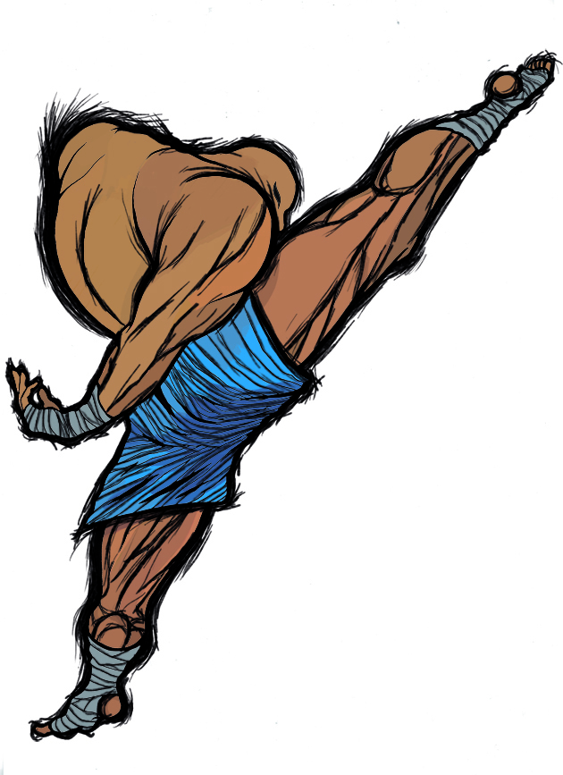
Here's my work in progress. Inspired from Street Fighter (still waiting my order goddammit), though I've never played any of the games. The visuals from SF are really strong in pop-culture though.

potku.jpg


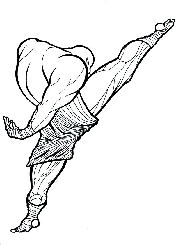
I'm stuck wondering if to colour this or leave it be. I'm afraid it might turn to shit due to my lack of colouring skills...

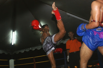
And again done with a brush. The finer lines with Pentel Stylo.

What type of brush are you using? If it's a sable hair you should be able to coax finer lines out of it. Also try varying your line weight on longer strokes like a cartoonist. It can add a lot to the image, nevermind using line weight to express light and shadow.
 

captive

Joe Six-Pack: posting for the common man


There is a lot of very impressive stuff in here, from the clay, to the paintings and drawings and digital art. Makes me not really want to post some measly photos.
Here are some crappy scans of some pictures i developed a while back. My scanner sucks so they look better in person.
 

zoukka

Member
The Take Out Bandit said:
What type of brush are you using? If it's a sable hair you should be able to coax finer lines out of it. Also try varying your line weight on longer strokes like a cartoonist. It can add a lot to the image, nevermind using line weight to express light and shadow.

For that I used a brushpen actually because it would've been a pain with the traditional brush. And usually I vary with my line, but I wanted this one to have standard weight on the line.

I only own crappy synthetic brushes :(
 

dfyb

Banned
is it okay to request opinion/critique of incomplete work in this thread?


http://blog.dfyb.net/?p=225


working (incomplete) concept sketch for a 2D game character (waist and above shown). I’m currently deciding whether to have it be dark with bright accents or bright with dark accents. The decision there will likely decide the general appearance of the game’s background. For now, I think I’m leaning toward the bright one — I think it’s simply more interesting.
 

Mik2121

Member
dfyb said:
is it okay to request opinion/critique of incomplete work in this thread?


http://blog.dfyb.net/?p=225


working (incomplete) concept sketch for a 2D game character (waist and above shown). I’m currently deciding whether to have it be dark with bright accents or bright with dark accents. The decision there will likely decide the general appearance of the game’s background. For now, I think I’m leaning toward the bright one — I think it’s simply more interesting.
Can't see why not.

Anyway, regarding the designs, I think the dark one with bright accents is a bit too 'typical' and feels like "been there, done that", if you know what I mean.
So I'd say go with the bright one with dark accents, but maybe add a few more dark details?

How is this character going to look in-game? Typical sprites? Drawing ala Monkey Island 3?
 

dfyb

Banned
Mik2121 said:
Can't see why not.

Anyway, regarding the designs, I think the dark one with bright accents is a bit too 'typical' and feels like "been there, done that", if you know what I mean.
So I'd say go with the bright one with dark accents, but maybe add a few more dark details?

How is this character going to look in-game? Typical sprites? Drawing ala Monkey Island 3?
they will be HD sprites drawn very much like this concept sketch (though less sketchy and more 'finished'), but relatively small compared to screen size so they'll be smaller and not be able to have super fine details. and i've been leaning toward the bright one with dark accents for the very same reason you listed :)

and yeah, the designs aren't finalized -- just put a single accent line in there to test :)
 

zoukka

Member
Looks pretty sharp. You might want to think about the looks and how they "speak" with the enviroments. Though maybe cool the long neck and tv-like face may prove to be tricky when animating the sprite. Do other characters have faces like that? Is there a reason for the long neck?

Popeye hands also might prove to be tricky to animate. Will they "hang" when he moves? If not careful they might seem comical...

I'm not saying you should change anything but make sure you know the answers to all these things before animating it. Can't wait for the sprites!
 

dfyb

Banned
zoukka said:
Looks pretty sharp. You might want to think about the looks and how they "speak" with the enviroments. Though maybe cool the long neck and tv-like face may prove to be tricky when animating the sprite. Do other characters have faces like that? Is there a reason for the long neck?

Popeye hands also might prove to be tricky to animate. Will they "hang" when he moves? If not careful they might seem comical...

I'm not saying you should change anything but make sure you know the answers to all these things before animating it. Can't wait for the sprites!
it's a player controlled character. there aren't really other characters yet. the characters don't obey gravity at all and don't really interact with a physical environment (more about dodging projectiles from other players). the TV face will give feedback for different player actions/reactions (i'm thinking it'll be more expressive for small sprites). the big hand is only on that one arm and serves a purpose with the theme of the game and a core gameplay element -- it's a throwing arm (vaguely similar to a the head of a lacrosse stick, but i may very well end up giving it fingers).
 

zoukka

Member
Here's the first colouring experiment of that kickboxer.

viivapotku.jpg


I'm a noob at photoshop colours as you can see, but the IV-esque linework really worked imo. Now maybe a background (or not) and tuning for those colours...
 

dfyb

Banned
i like the graphical aspect of your original kickboxer. the SFIV style outlines bring it to a hybrid rendered style, which i like for different reasons. :)
 

DrBo42

Member
zoukka said:
Here's the first colouring experiment of that kickboxer.

I'm a noob at photoshop colours as you can see, but the IV-esque linework really worked imo. Now maybe a background (or not) and tuning for those colours...
I think the colors actually worked out pretty cool, so did the IV linework. 1 thing I didn't notice before, how can that leg be upside down? Am I just not understanding what's going on here?
 

zoukka

Member
Nice! You might want to spice the colours up a bit. The heavy shadows eat some of the life out of it now.

And if you want to please the "common folk" try flipping it horizontally ;)
 
zoukka said:
For that I used a brushpen actually because it would've been a pain with the traditional brush. And usually I vary with my line, but I wanted this one to have standard weight on the line.

I only own crappy synthetic brushes :(

ARGH!

Buy a decent brush dude.

I know some folks swear by those fuckin' brush pens; but let me tell you in all my experience with them -- they all fucking suck. I mean they can get a job done; but there's no way in hell they will ever be a replacement for a sable hair brush.

Kuretake brush pens are nice; but unfortunately those are only available in HUGE and it takes a lot of focus to ink fine work with one, so it's just easier to whip out the sable hair sex machine.
 
DM_Uselink said:
That looks great Arcipello! If you squint it looks like a photograph, cool.
Here's a drawing I edited on PS:
Wow, that dark blue/purple (I'm slightly colour blind) really fits nicely. Lovely drawing too.

Heres another image for the mural I'm working on:

Panel2Timenet.jpg
 

Epcott

Member
Took an old picture I painted using Corel Painter XI (of the girl) and added a background using Photoshop CS3.

I was really only trying to emulate woodblock and Chinese watercolor. It actually came out better than I hoped, but I'd like more variety.

2a619j8.jpg


Sorry it's so big, had trouble resizing it
 
This is a comic I'm working on (I've posted some sketches of it earlier in this thread)
WALMoment1-4.jpg

The panel layout needs a little work but I'm not really taking this project seriously, it's just something I'm doing in my spare time.
 

Arcipello

Member
heres one i did ages ago using corel Painter...its sketchy enough to fit this thread i feel plus i get bonus points for it being game related:p

sketch_of_the_colossus_by_arcipello.jpg
 

Epcott

Member
Love the work Arcipello.

Question: Maybe I've never used Photoshop CS to it's full potential (and I have no idea how to use Illustrator), but do you feel Corel Painter does a better job at replicating oil, acrylic, and watercolors than Photoshop?

That's the impression I get, yet I feel that I might be mistaken since Adobe is the industry standard. Just curious of your opinion
 

Darkpen

Banned
Arcipello said:
heres one i did ages ago using corel Painter...its sketchy enough to fit this thread i feel plus i get bonus points for it being game related:p

http://fc43.deviantart.com/fs8/i/2005/291/5/c/sketch_of_the_colossus_by_arcipello.jpg[/QUOTE]
o-ho, that's pretty epic D:
 
Arcipello said:
heres one i did ages ago using corel Painter...its sketchy enough to fit this thread i feel plus i get bonus points for it being game related:p

sketch_of_the_colossus_by_arcipello.jpg
I've always loved SOTC fan art, and this is no exception. Please do more!
 

Arcipello

Member
Epcott said:
Love the work Arcipello.

Question: Maybe I've never used Photoshop CS to it's full potential (and I have no idea how to use Illustrator), but do you feel Corel Painter does a better job at replicating oil, acrylic, and watercolors than Photoshop?

That's the impression I get, yet I feel that I might be mistaken since Adobe is the industry standard. Just curious of your opinion

yeah Painter was created with painting and illustration in mind...where as photoshop was not really. Painter replicates oils and every other medium really well and the blending of colours is natural and way better than anything photoshop can do!

heres another only i did a while back and you can see how nicely the brushes blend

Inhale_Apple_by_arcipello.jpg
 

zoukka

Member
The Take Out Bandit said:
ARGH!

Buy a decent brush dude.

I know some folks swear by those fuckin' brush pens; but let me tell you in all my experience with them -- they all fucking suck. I mean they can get a job done; but there's no way in hell they will ever be a replacement for a sable hair brush.

Kuretake brush pens are nice; but unfortunately those are only available in HUGE and it takes a lot of focus to ink fine work with one, so it's just easier to whip out the sable hair sex machine.

Yeah you are right on this. They are just so fucking expensive and brushpen is pretty handy when it's always on you. And for my (poor) defence I gotta say the Pentel one really is the best brushpen I've ever seen.
 

Ether_Snake

安安安安安安安安安安安安安安安
Sorry for the big Work In Progress text on top, but that's cause it's not finished:p Haven't had much time to work on it, too lazy too. I reverted to grayscale for now so I don't waste time with colors until the end.

middle.jpg
 

Mik2121

Member
Ether_Snake said:
Sorry for the big Work In Progress text on top, but that's cause it's not finished:p Haven't had much time to work on it, too lazy too. I reverted to grayscale for now so I don't waste time with colors until the end.

middle.jpg
? I could swear I saw that SAME thing a very long time ago, and with colors.


err..
 
Mik2121 said:
? I could swear I saw that SAME thing a very long time ago, and with colors.


err..

Yeah, it looks really familiar to me as well. Can't say for sure if it's something I have seen before, or just similar to it.
 

Arcipello

Member
Manabanana said:
Hold up, are you Daniel Conway? I've had your site bookmarked for a long time. I was browsing through my bookmarks and saw "Arcipello - Daniel Conway" and I remembered some dope posts in here by you.

my dark secret is revealed!
 

Alpha_eX

Member
Arcipello said:
heres one i did ages ago using corel Painter...its sketchy enough to fit this thread i feel plus i get bonus points for it being game related:p

sketch_of_the_colossus_by_arcipello.jpg

That's amazing, love the colors. Do you have that in a higher res, would make a great poster.
 

Ether_Snake

安安安安安安安安安安安安安安安
Mik2121 said:
? I could swear I saw that SAME thing a very long time ago, and with colors.


err..

:lol I guess the progression is not really noticeable:p Been too lazy. Used to be in color, turned it to grayscale so I don't waste time balancing things out until it's all done.

Awesome work Arcipello.
 
Arcipello said:
heres one i did ages ago using corel Painter...its sketchy enough to fit this thread i feel plus i get bonus points for it being game related:p

sketch_of_the_colossus_by_arcipello.jpg
fuuuuuuuuuu...

now I have to make some SOTC art when my tests are all over.

actually, I'm gonna make some God Hand art.
 

orioto

Good Art™
Arcipello said:
my dark secret is revealed!

You can't hide anymore:lol

I have the SOTC faved on deviant since forever, that's exactly the style of reference i love for brushes and dynamism !
 
Top Bottom