GifGafIsTheBestGaf
Member
I like it, really clean. Getting ready for that Spider-Man info blowout
I like the new one, but on black it reminds me of something else but i cant think what it is?
The old one looked like they made video games. The new one looks like they distribute pharmaceuticals.
Do people really think this type of logo design is a new trend? Look up any logo redesign from the last half decade at least. This is them catching up with the times.
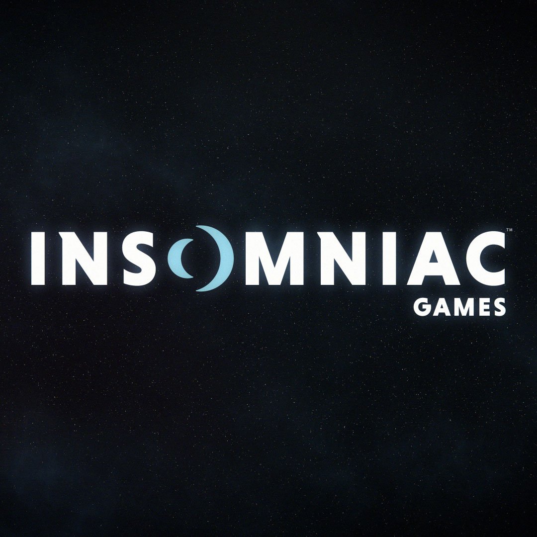
Fantastic redesign, btw. Professional, unique, and the O is a great concept giving them a simple icon to identify with, that also calls back to the old moon.
Do people in this thread miss the old iPhone skeuomorphism too?
I prefer their old one.
I prefer their new one.

It's not unique. That's the entire point. I am not saying previous logo was perfect and couldn't use a refresh, but "lowly detailed smooth sans serif letters with no background at all and geometric spin on some of them" is the opposite of identifiable. It isn't "name AND image", right, but these tend to have distinguishable images. The O, which is the only non-template part of the whole thing, looks like it could have been a currency symbol for Canadian cent or reduced copyright designator, which is the sort of thing only the biggest brands can sometimes get away with, and even then it's rare. Insomniac is not McDonald's, so such a simple shape is forgettable if anything.
...Its got a lunar theme, with what appear to be two crescent moons facing each other as the O reminiscent of our past and future...
Observant fans will see the subtle callbacks to our previous Insomniac Games logo, including the oversized O, serif lettering on the N and the positioning of Games as a core part of our identity.
Yeah, it looks great!