Erebus
Member
Everyone is talking about the notch now. Maybe the notch is there to make us forget about the price.
Everyone is talking about the notch now. Maybe the notch is there to make us forget about the price.
People call Apple geniuses but they couldnt think of something this simple?
Call me crazy, but I kinda like the notch.
It's kind of stupid in landscape moves and stuff though, so hopefully there's a good solution for those kinds of use cases. i think 80% of the time, it won't actually matter.
")
People call Apple geniuses but they couldnt think of something this simple?
Ever find that video?
to disparage the iphone X. See his post about apple admitting on video that they need to fix a supposed FaceID bug, but then "not caring enough" to provide the link.What is your endgame here, dude.
you don't have to "stare" for face ID to work. It's literally just a glance at your phone when you're using it and that's it. People are overthinking Face ID. The whole point of it I think is it just removes you from ever having to do something. It'll just be unlocked when you're using it, and authentication within apps and whatnot will just be this natural occurrence as you use your phone.
Ever find that video?
You're crazy!
I'm just worried app UI is going to be messy for a while.
Didnt say Apple admit to it. The guy filming and testing it did.the video of the horrors of FaceID that was so damning, with apple admitting to problems, yet he can't be bothered to provide the link?
no, he never found that video.
to disparage the iphone X. See his post about apple admitting on video that they need to fix a supposed FaceID bug, but then "not caring enough" to provide the link.
People call Apple geniuses but they couldnt think of something this simple?
Never said i was looking for it.
Didnt say Apple admit to it. The guy filming and testing it did.
Thanks for beta testing.
you're one salty dude.. how do you have so much time in your day to post about a phone you aren't even interested in?
Anyone else think this is how apple should have used the notch?

It should look more like a seemless status bar rather than how they're doing it now.
Anyone else think this is how apple should have used the notch?
It should look more like a seemless status bar rather than how they're doing it now.

much like literally everything else in the past 5-7 years of smartphones, webOS already did it
https://www.blogcdn.com/www.engadget.com/media/2009/01/pre_open_close.jpg[IMG]
wait till i tell you about all the swipe gestures you could do at the bottom of the screen too[/QUOTE]
It's the Dreamcast of mobile OS.
I like this better too.
much like literally everything else in the past 5-7 years of smartphones, webOS already did it
wait till i tell you about all the swipe gestures you could do at the bottom of the screen too
Huh? All I see in that pic is a normal status bar like every other phone
Really wanted to own one of thesemuch like literally everything else in the past 5-7 years of smartphones, webOS already did it
wait till i tell you about all the swipe gestures you could do at the bottom of the screen too
The rounded edges of the "desktop" and black background gave the illusion of the status bar blending in seamlessly with the bezel of the phone, much like that iPhone X mockup. It wasn't as convincing an illusion as a modern display because it wasn't OLED, but in the right lighting it looked pretty cool.
It would be make absolutely no sense for Samsung to copy this when they arguably have the better full screen edge to edge design.I think the other reason Apple took this route is that it's distinctive. If every new phone is a glass screen, Apple probably wanted some way for people to immediately distinguish "iPhone" from everything else. And they chose this because it'd be pretty blatant for Samsung to rip it off.
It would be make absolutely no sense for Samsung to copy this when they arguably have the better full screen edge to edge design.
And yes, apple has put out a great phone. It's just that the price is incredibly high .
I did. Briefly. All I remember from using it is that it had an incredibly sharp edge on its back portion of the screen, where the phone split in two for the sliding mechanism.Really wanted to own one of these
Thats me, sitting here eating 2 donuts and some cheese puffs with my glass of milk being all salty.
Day 2 and I still really like the notch.
I think we are all going to get used to the notch, and that it's going to lead to more full screen content that takes advantage of the real estate up top.
I think the other reason Apple took this route is that it's distinctive. If every new phone is a glass screen, Apple probably wanted some way for people to immediately distinguish "iPhone" from everything else. And they chose this because it'd be pretty blatant for Samsung to rip it off.
People call Apple geniuses but they couldnt think of something this simple?
They could solve this by simply putting a "Dark Status Bar" toggle under Accessibility -> Display Accommodations or whatever.
Have the current "embrace the notch" look as the default and the one used in all the marketing images, but just have a toggle for people who don't like it.
Mmm donuts.
Really.. you don't think they thought of that?
The iPhone has had an iconic look with the home button/bezels since it was released.
This is their attempt at a new iconic look. I think it sucks.. but Apple knows exactly what they are doing.
I think the notch is fine in portrait mode but looks like crap in landscape mode. I agree with those that said the "ears" should be used for status info and blacked out when in landscape.
Only Apple is revolutionary enough to turn a hardware limitation into a iconic look.
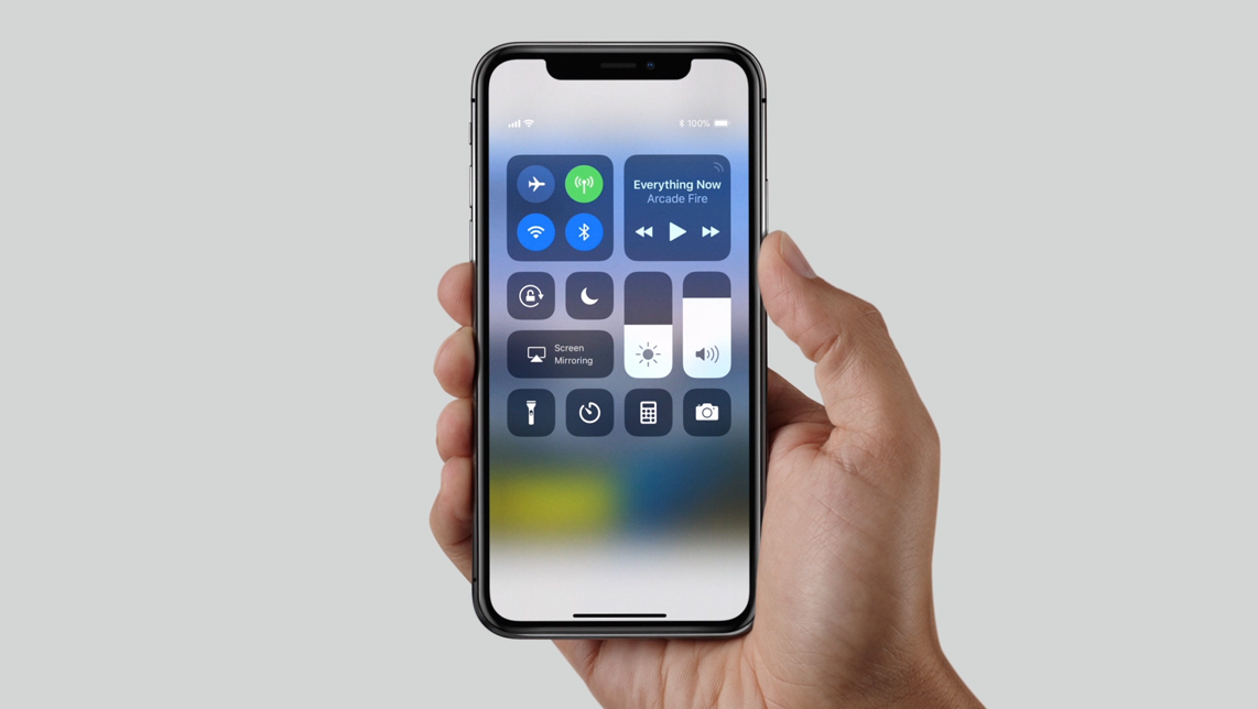
In the Control Center.Where is the bluetooth indicator going to display? The notches are are filled up with the time / cell signal/ wifi/ battery indicators as far as i can tell.
Where is the bluetooth indicator going to display? The notches are are filled up with the time / cell signal/ wifi/ battery indicators as far as i can tell.
Just watching some video's now.. looks like the bluetooth indicator is gone from the top even when turned on. Sucks. Now you wont have a battery indicator for Bluetooth either.. unless you go to the control panel i assume.
Really.. you don't think they thought of that?
The iPhone has had an iconic look with the home button/bezels since it was released.
This is their attempt at a new iconic look. I think it sucks.. but Apple knows exactly what they are doing.
Yes please. But then how do we propose that handles everything else like apps and videos that use the ears? Does it simply cut off that entire edge of a video or does it treat the status bar as unusable space and zoom to fit underneath it?
You have no idea how an ice cold glass of milk, 2 donuts, and finish off with some cheese doodles hit the spot after a long hard day of work. No one can phase me right now.
not sure if posted but AT&T to offer buy one get one free for iphone 8
https://www.dallasnews.com/business...war-solvo-buy-one-get-one-free-iphone-8-offer
You think they didn't consider this?People call Apple geniuses but they couldnt think of something this simple?
Anyone else think this is how apple should have used the notch?
It should look more like a seemless status bar rather than how they're doing it now.
"Your app or game should always fill the display that it runs on. Placing black bars on the top or bottom of the screen makes your app feel small, cramped, and inconsistent with other apps on iPhone X."