• Hey, guest user. Hope you're enjoying NeoGAF! Have you considered registering for an account? Come join us and add your take to the daily discourse.

Marvel vs. Capcom: Infinite |OT| Marvel vs. Capcom: 4 Female Characters

patchday

Member
VtvW1Zs.jpg


The DLC characters should be centered. The empty space looks awful.

somehow the UI has gotten worse. Why not do something like Injustice 2 and show a shadowy figure esp since the characters are announced. In Art- you are taught to occupy space. I'm not a very good artist but I know that much!!!
 

Neoxon

Junior Member
somehow the UI has gotten worse. Why not do something like Injustice 2 and show a shadowy figure esp since the characters are announced. In Art- you are taught to occupy space. I'm not a very good artist but I know that much!!!
It’s the same thing that they do for SFV.
 

Sigmaah

Member
Let's hope they release one more capcom char that no one knows about yet so that the screen doesn't look odd.

SIKE we know capcom ain't bout that life.
 

kikiribu

Member
The SFV news makes me feel like Capcom is just going to forget about Marvel and just really stay focusing on SFV.

So much more work has gone into SFV compared to Marvel. Maybe they thought they could half ass a Marvel game and still make a profit? Everything MvC is so half assed that it doesn't even make sense.

Hope I'm wrong but...I don't see Capcom supporting both games.
Funnily enough, SF players thought the same about MVCI when it was announced. Thought, "SFV isn't even acceptable yet and you're already hyping up MVCI?! WTF CAPCOM"

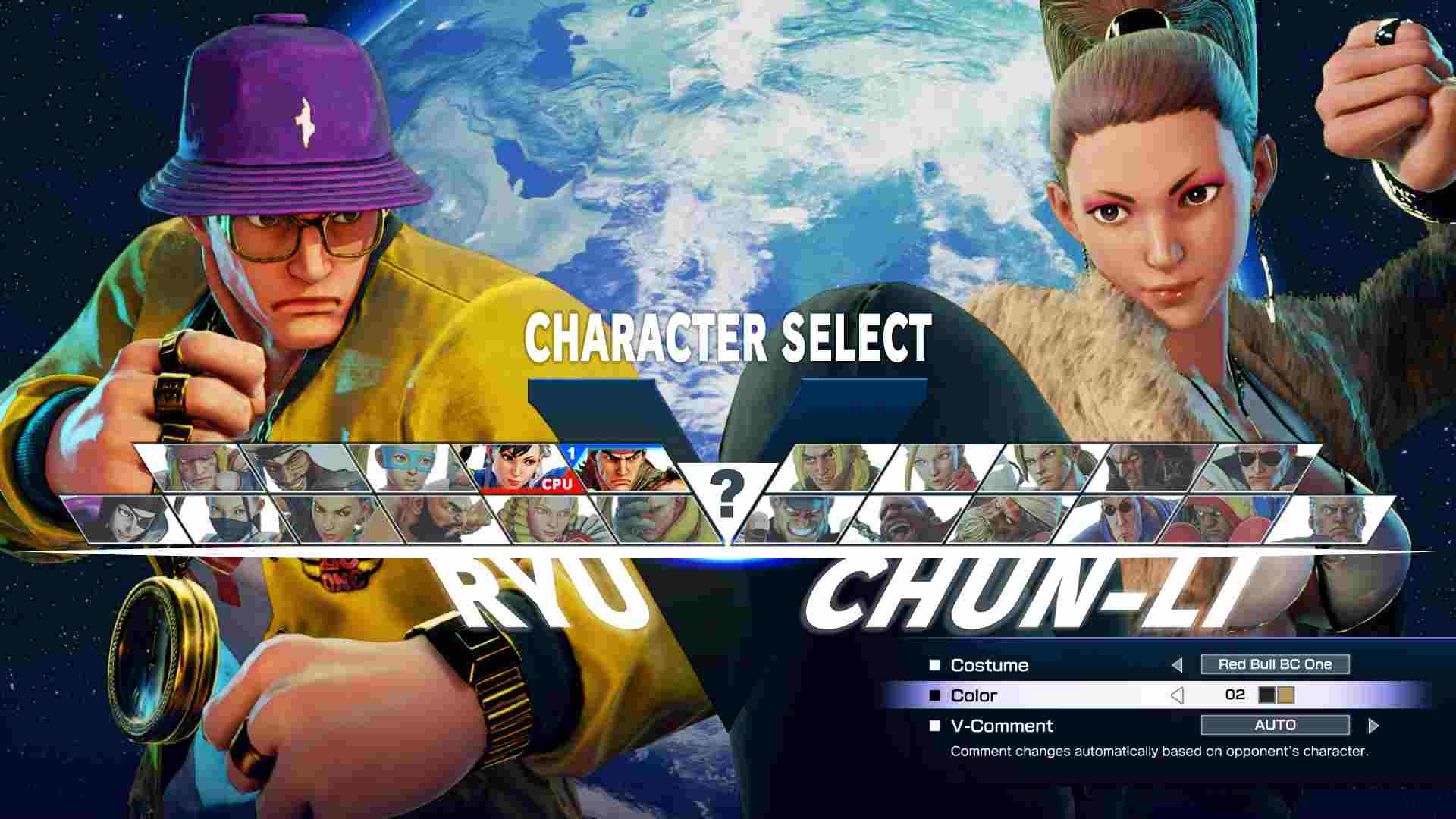
MVCI actually got upgrades that SFV doesn't have yet, such as Arcade mode (finally coming to SFV) with a cool final boss, enhanced netcode that hasn't been applied to SFV yet, character art gallery (finally coming to SFV), a convenient way to listen to the game's soundtrack unlike SFV's irritating "check the list and exit out to main menu" way, etc. I wouldn't worry about it yet. If anything, this is proof that you should probably look forward to big updates coming for MVCI too.

Some people probably know how vocal I've been about MVCI in other threads by now and it seems kinda harsh but it's the only way Capcom will hopefully notice their mistakes. Kind of. Sometimes bashing things is good, though I do most of my bashing via Capcom email support, not on forums. Too much negativity makes this place unbearable most of the time, tbh. I complained about Witcher 3's (lack of) PS4 Pro support to CDPR more times than I'd care to admit but complained very little on forums because frankly I don't think they read anything here

The two games will coexist
 

ZeroCDR

Member
Let's hope they release one more capcom char that no one knows about yet so that the screen doesn't look odd.

SIKE we know capcom ain't bout that life.

You'd need two more Capcom characters to balance this.. and even then it would still look bad with another row of only two.
 

Seesaw15

Member
somehow the UI has gotten worse. Why not do something like Injustice 2 and show a shadowy figure esp since the characters are announced. In Art- you are taught to occupy space. I'm not a very good artist but I know that much!!!

Negative space is a concept you're supposed to use in design as well but this isn't doing that either.
 

nded

Member
I'm assuming they'll fill the empty spaces with more recycled UMvC3 characters.

Question is are Capcom going to try and charge me $8 for Viewtiful Joe.
 

Weiss

Banned
So I'm digging into the game's OST for the first time and, well, why does everything sound the exact same?

The Capcom side is okay I guess. Decent enough electronic remixes, but every single Marvel character sounds like they have the same theme. It's terrible.
 
So, uh, I've finally started playing the game.

''Tis quite fun.

Do I play Arcade mode again for the 4th color? The final boss was quite the ordeal.

So I'm digging into the game's OST for the first time and, well, why does everything sound the exact same?

The Capcom side is okay I guess. Decent enough electronic remixes, but every single Marvel character sounds like they have the same theme. It's terrible.
I kinda like Ghost Rider's new theme. Though, there is some generic movie orchestra thing going on with a lot of the other Marvel characters.
 

Durden77

Member
So, uh, I've finally started playing the game.

''Tis quite fun.

Do I play Arcade mode again for the 4th color? The final boss was quite the ordeal.

Colors can be unlocked by yeah running through arcade mode with a character, or playing that character 5 time in any online mach. Once you get the hang of the final boss' patterns it's actually extremely manageable.
 

nded

Member
So I'm digging into the game's OST for the first time and, well, why does everything sound the exact same?

The Capcom side is okay I guess. Decent enough electronic remixes, but every single Marvel character sounds like they have the same theme. It's terrible.

Probably a Marvel decision. All of their major MCU characters' themes are some variation on "string section plays vaguely heroic theme". Really annoying to play this game without Captain America's real theme.
 

I've always wanted another Sonic fighting game. Sonic the Fighters was a decent Virtua Fighter spin-off but like other early 3D fighters it hasn't aged well in terms of controls.

A fast-paced 2D Sonic fighting game would be lit af.

Edit: Also noticed that this fake roster has better female representation.
 

Zero-ELEC

Banned
I can just play 3 matches and quit?

I'm not entirely sure if you can just quit. I just ran arcade mode switching teams every three matches (having cleared it with every character once before) and got the fourth colours for every characters. You might be able to just quit after clearing the battles though.
 
It seems like you just need to play a certain number of matches with a character, either in Arcade mode or online. Super weird how it works...
 

Zero-ELEC

Banned
The sad thing is the CSS looks better in the fucking sonic mock up

It's the little things: the fact that it's bezeled, that it's not using a shitty cheap looking gradient, that it seems to be two parts that meet at the middle instead of having a weird fade from one colour to another.

Notice how selected characters are marked as selected? Notice how both above and below the character portraits there's a larger gutter, rather than only above? Notice how you the edges of the portraits don't mix into the background gradient? Notice how it's better organized?

Shit, notice the better female to male ratio?
 
Top Bottom