GravityInsanity
Member
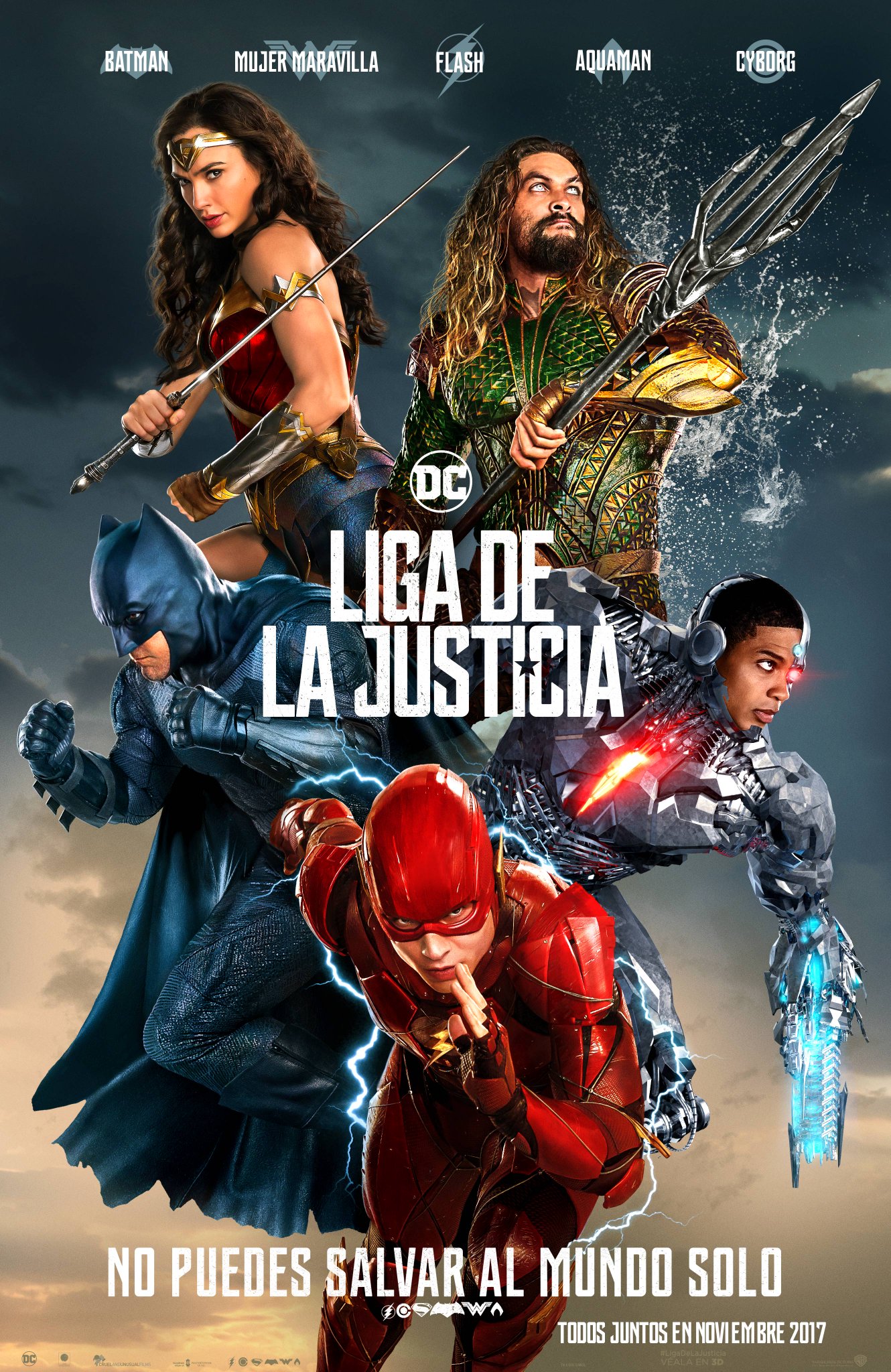
Justice League |OT| A Zack Snyder movie with color, fun, and rotten tomatoes for everyone
Looks bad for me. WW has a good pose. What is Aquaman looking for up there?
Looks bad for me. WW has a good pose. What is Aquaman looking for up there?
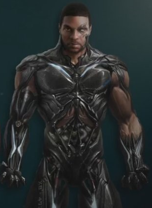
Ohh that looks nice. Movie Cyborg looks like a toy/figure.Cyborg was a mistake, or at least his terrible design. Don't know why they didn't stick with his concept art look.
Lmao! Wow that is just horrendous. This movie is going to suck isn't it? *sigh*
The sheer horror when you realize these people don't know the character they are using
http://comicbook.com/dc/2016/06/21/the-flash-costume-in-justice-league-is-148-pieces/

If he was still alive wonder if Marvel or DC would have inked him to a contract...maybe even Fox..
Paul Walker auditioned or was up for Superman Flyby, or one of those early-2000 Superman projects. iirc he didnt want to wear the suit.
Wh... why would anyone ever want to play a super hero, especially one as iconic as Superman, and not want to wear the fucking suit!?! *boggle*
I love this one.

Wh... why would anyone ever want to play a super hero, especially one as iconic as Superman, and not want to wear the fucking suit!?! *boggle*
I have no idea why they didn't stick with this one. The one in the OP looks like a student's photoshop project
I guess it was period of "I'm too cool for costume".
This movie so far has ZERO identity.
U c@n7 $@v3 7h3 w0r1d @10n3That text at the bottom lol.
I have no idea why they didn't stick with this one. The one in the OP looks like a student's photoshop project
I have no idea why they didn't stick with this one. The one in the OP looks like a student's photoshop project
I love this one.
The flash's suit looks like complete shit... why does it have to be so angular and mechanical? He's not Iron-man, for heaven's sake!
The cyborg in that poster (at least) looks like a Bay-former combined with early 2000 era CG. From a design perspective, it's an absolute mess.
I honestly, don't understand who signs off on a lot of these modern Hollywood movie designs. Everything seems to have been designed by the same dude, these days, with next to no visual identity or uniqueness at all.
I honestly think, Hollywood needs to start hiring videogame artists to model and design some of the more sci-fi and fantastical elements in their movies.
Yeah? You think this is them saying nothing?I just spent like five minutes looking for a good "what the fuck" gif but I think this might sum it up for me the best
Honestly that reads like something Donald Trump would say when explaining it. Just a mish mash of nothing and nonsense trying to sound smart.
"It's a prototype suit. It's something that is designed to protect him when he moves incredibly fast through space. And so we studied aerodynamics and vehicle design. What moves through space the fastest? We have this sense of rigid pieces at the front that deflect towards the back....There's a sense of a blade like in a plane wing here, and then venting back here. So it all feels very aerodynamic.
Those fonts look like Wingdings
I didn't know Flash was a Transformer.Yeah? You think this is them saying nothing?
This line is full of insights on design for the Flash suit that shows they put a lot of thought into it.
This movie so far has ZERO identity.
The water splashing around Aquaman.
The oversaturated colors.
Batman doing a 1930s PUT EM UP! pose.
Cyborg.
Flash.
The more we see of it, the more I worry about this film.
I love the vanishing legs of Wonder Woman and Aquaman.