the black pearl
Member
Probably the best recent example


To be fair, the NTSC boxart for Resident Evil 4 sucks compared to the PAL version.

This was much better:
Not necessarily bad, but not worthy of the great title. 1 and 3's were much better IMO.

http://img.gamefaqs.net/box/6/4/6/6646_front.jp/IMG]
[IMG]http://img.gamefaqs.net/box/6/4/5/6645_front.jpg
That shadow of the colossus one is amazing.
My pick. Only redeeming thing is there is reversible Shinkawa art.
Hmm, that's an improvement. Not perfect, but better.This was much better:
*ME2*
Wth, Shadow of Colossus has amazing boxart and I'm not even a fan of that game
Ugly.
That SotC one is fantastic.
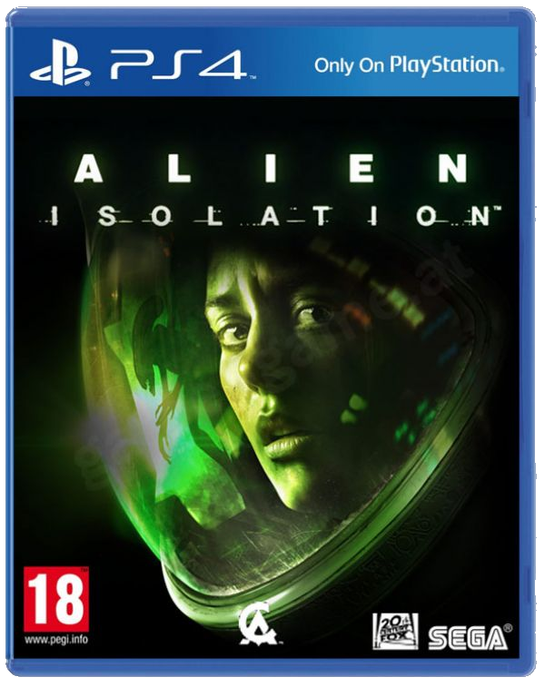
The limited edition art is cool, though.I actually really like the one for Alien Isolation.
The NTSC boxart for Metal Gear Solid 4 is really crappy, especially compared to the boxart for other regions.

Again I don't agree. I don't really like art thats on big character model taking up most of the box, and that color grade is a turn off. I wish it was truer to the way the game actually looked.
Alien and Shadow bad? No way. I mean nothing mindblowing or anything but far, far from bad. Alien is decent and shadow is good.
to this:


Thread is off to a bad start it seems.
Anyway, here's a shitty trend in a lot of great game's boxarts: Dude standing walking towards you (or away) to look like a badass.
You dont like that the collosus is so big on the cover of a game about fighting giants that often take up the entire screen?
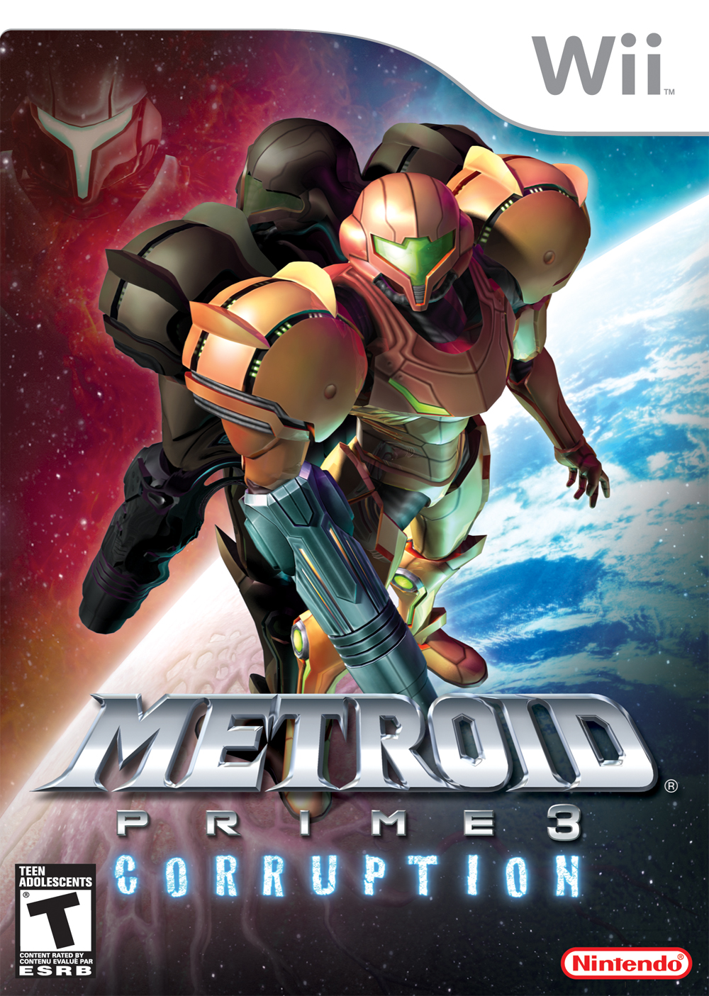
Metroid Prime 3's box art is especially atrocious. Why must there be a floating head?

Oh man, I hated this compared to the alternative.