-
Hey, guest user. Hope you're enjoying NeoGAF! Have you considered registering for an account? Come join us and add your take to the daily discourse.
You are using an out of date browser. It may not display this or other websites correctly.
You should upgrade or use an alternative browser.
You should upgrade or use an alternative browser.
Halo |OT7| You may leave, Juices. And take Team Downer with you.
- Thread starter GhaleonEB
- Start date
- Status
- Not open for further replies.
xxjuicesxx
Member
You can make clean/simple still more gritty and serious. I just played Viva Pinata last night. Medals look more in line for that game than H4.
Reach did gritty and I get it it was about a planet being destroyed and lots of people died and it carried a more depressing tone in its theme. Whys this Halo 4 gotta be gritty and darker though? We don't really know whats going to happen but I assume it'll end on a decently positive note. In that case shouldn't we have solid/straight lined non gritty medals like H2+3? Whats the reason for this darker feeling you want?
Deadly Cyclone
Pride of Iowa State

I half agree, i wish that 343 would use more colors, perhaps based on the extremity of the feat you preform, like what they did with commendations; Iron, Bronze, Silver, Gold, Onyx, not necessarily those colors, but something like that that relays additional information. I'm not sure how they would go about doing that while making the medals distinct and unique, but it's an idea.
It's not a bad one either... I liked the addition of "Legendary" medals in Reach. I made a personal goal of getting all of them, but that Unfrigginbelievable was just out of Reach (lol).
StalkerUKCG
Banned
Reach did gritty and I get it it was about a planet being destroyed and lots of people died and it carried a more depressing tone in its theme. Whys this Halo 4 gotta be gritty and darker though? We don't really know whats going to happen but I assume it'll end on a decently positive note. In that case shouldn't we have solid/straight lined non gritty medals like H2+3? Whats the reason for this darker feeling you want?
I'm not going to speak for Devo but i personally want them grittier than they currently are, Not saying i want razor blades and tombstones on the emblems but they are currently really happy looking and a more serious look would go a long way for me.
Halo Italy
Neo Member
StalkerUKCG
Banned
GAF > Internet > GAF
Hypertrooper
Member
Old these images are.
Halo Italy
Neo Member
LoL
Aggrotek
Member
OH SWEET MOTHER THOSE TEXTURES
But yeah, they're old. At least he didn't promise us BRAND NEW LEAKS like that other guy.
You're going to be a valuable member for HaloGAF, delivering these hot scoops. Keep it up!
I'd hardly call them old
On the internet, when someone posts something identical to something that was posted even one minute ago, it's old.
No exceptions.
dangerbyrnes
Member
The medals seem kind of out of place with the rest of the theme. I hope those are placeholders.
ah ha! found it.
So I assume it goes like this for the UI team?
1. Fix Medals
2. Fix Medals
3. Fix Medals
...
99. Option to turn off text
I don't mind the medals or the custom games lobby.
Ha ha, actually the medals have already changed since the E3 build.
FUNKNOWN iXi
Member
2) BK Halo 4 propipe scrapped in favor of bringing Reach propipe back
Scrapped? Nah.. Just reskin the Reach GL into a Forerunner-themed weapon and boom!
My proposal for the Sticky Detonator:
If no 'Nade Launcher returns
----Acts like it does now and the mini screen is put to use
-Press R-Trigger for Proximity Mine
----Leave it armed in your secondary slot (Halo 3 Trip Mine/Goldeneye Promixity Mines)
As we've seen, the Sticky Detonator seems like it's going to be another fluff weapon because the reason you'd want to use it is almost negated by the flashing lights and beeping noises it makes, not to mention it doesn't look too powerful.
They can be computery and still be more dark. Just because it's a computer doesn't negate the color palette expressed visually.
I prefer Halo 3's medal art design over Reach/gritty medals any day. Halo 4's medals are way too cotton candy for me.. Halo 3 had great colors/vibrancy while some of Reach's medals were too dull for my taste.
MaximumFlipFlop
Banned
Yo Halo lore nerds, I just had this crazy idea about Requiem. Crytum and Primordium spoilers ahead.
So Requiem is essentially a shell around a world, correct? We learned that the firing of a Halo destroys Precursor structures and tech. What if Requiem was built around a Precursor world to protect it from the Halo effect? Just an idea I had. Would be awesome to explore Precursor architecture.
heh, don't even recognize that guy. was he just picking random people or was there a reason?lol
Dax01, Tunavi...
http://www.neogaf.com/forum/showthread.php?t=485412
Not sure if any other HaloGaffers are on the list.
I missed everything after the SQ and Carbon series. Is there anywhere I can watch VoD?
You can watch them still on twitch.tv and Cyren said, that he's going to upload some VoD's.
Hypertrooper
Member
You can find out if your theory is right:Yo Halo lore nerds, I just had this crazy idea. Crytum and Primordium spoilers ahead.
So Requiem is essentially a shell around a world, correct? We learned that the firing of a Halo destroys Precursor structures and tech. What if Requiem was built around a Precursor world to protect it from the Halo effect? Just an idea I had. Would be awesome to explore Precursor architecture.
If the Chief is within the Dyson sphere, where does the light come from? And then if you find out the source of the light, is there still some place for your theory?
We are assuming that Requiem is a Dyson sphere.
User 73932
Banned
lol
Dax01, Tunavi...
http://www.neogaf.com/forum/showthread.php?t=485412
Not sure if any other HaloGaffers are on the list.
I spy a Sai.
StalkerUKCG
Banned
heh, don't even recognize that guy. was he just picking random people or was there a reason?
Shake Appeal and Sai-Kun
Halo Italy
Neo Member
OH SWEET MOTHER THOSE TEXTURES
But yeah, they're old. At least he didn't promise us BRAND NEW LEAKS like that other guy.
You're going to be a valuable member for HaloGAF, delivering these hot scoops. Keep it up!
I'd hardly call them old
ah ha! found it.
Mine was a question because I had not seen in the topic ;D
so freaking cocky, i was pissed at him last olympics cause he could of destroyed the world record by even more time if he didn't let up.
lol
Dax01, Tunavi...
http://www.neogaf.com/forum/showthread.php?t=485412
Not sure if any other HaloGaffers are on the list.
I like how he goes in an alphabetical order and then just gives up.
You can watch them still on twitch.tv and Cyren said, that he's going to upload some VoD's.
Thank you.
dangerbyrnes
Member
Yo Halo lore nerds, I just had this crazy idea. Crytum and Primordium spoilers ahead.
So Requiem is essentially a shell around a world, correct? We learned that the firing of a Halo destroys Precursor structures and tech. What if Requiem was built around a Precursor world to protect it from the Halo effect? Just an idea I had. Would be awesome to explore Precursor architecture.
i dont think we know if requieum is a actual world inside the planet, or the planet the forward unto dawn goes to is a portal to the actual place. but your second point could be possible, which would be really awesome.
also, aren't sandtrap and sandbox precursor ruins? the forerunner guard towers protecting the precursor tech. maybe i'm wrong.
*crazy conspiracy theory time*
maybe, sandtrap and sandbox are on requiem, the aegis fate is one of infinities frigates. since brutes set up those mines around sandtrap maybe brutes are in halo 4. also, elephants are on sandtrap, those giant vehicles in halo 4 are elephants. zomg, master chief visits sandtrap in halo 4. i have unlocked the code
Devolution
Member
I prefer Halo 3's medal art design over Reach/gritty medals any day. Halo 4's medals are way too cotton candy for me.. Halo 3 had great colors/vibrancy while some of Reach's medals were too dull for my taste.
They've been pretty gritty each game. The ones posted look like Viva Pinata shit.
NobleGundam
Banned
off-topic: GAF, I have found that RE: ORC is f*cking annoying... One Big problem is when your teammate(s) are down you must simply press and hold the "A" button until the meter is full in order for them to be revived. Well, now my teammate has fallen and a weapon happens to be right next to him... I can only pick-up the damn weapon and not my teammate!! FUKNDAMNITY?!?! /endrant.
They've been pretty gritty each game. The ones posted look like Viva Pinata shit.
Andy Xiao was one the artist who made the medals. To me what was interesting is he seems to have started in a 3d program rather than Illustrator or PS. Is that common in graphic design? I think they may have wanted to do something 3d with them that may have ended up getting cut.

The Librarian
Banned
Not to toot my own work, but I'm doing this because I think Fuchsdh forgot to. NMPD HQ for Hindsight: ODST has been up since August 1st.
I hope you all enjoy.
I hope you all enjoy.
so freaking cocky, i was pissed at him last olympics cause he could of destroyed the world record by even more time if he didn't let up.
He went all out at the world championship in '09. So you should be satisfied.
Devolution
Member
Andy Xiao was one the artist who made the medals. To me what was interesting is he seems to have started in a 3d program rather than Illustrator or PS. Is that common in graphic design?
Usually it's sketches -> 2d -> 3d. You can cut out some time going from sketch to 3d but if the 2d stuff is adequate someone else can render it.
Also I miss Squad Slayer for its non-I live 24 hours on halo MLG-ness but still competitive.
Usually it's sketches -> 2d -> 3d. You can cut out some time going from sketch to 3d but if the 2d stuff is adequate someone else can render it.
Isn't a lot of your work made and submitted as vector format?
I don't really see the point of using 3d when you are just going to end up with something in 2d.
Devolution
Member
Isn't a lot of your work submitted as vector format?
I don't really see the point of using 3d when you are just going to end up with something in 2d.
I don't know how it works with games but yeah in mobile and web stuff it's going to be 2d usually, unless you're doing a motion piece where you want 3d effects.
FUNKNOWN iXi
Member
They've been pretty gritty each game. The ones posted look like Viva Pinata shit.
Though I agree with the new ones not looking too good, here are the past medals we've seen before:
Halo 3 - Too bright, less detailed now that I look at it again
Reach (Beta) - Too dark/gritty
Reach (Final) - That detail with less grit/rust (on some medals) and that's what I choose
I don't know how it works with games but yeah in mobile and web stuff it's going to be 2d usually, unless you're doing a motion piece where you want 3d effects.
Hmmm. I am trying to decide whether it's worth diving in and learning Illustrator, so this is interesting.
NobleGundam
Banned
HyperTrooper & GHouse = HaloLoreNerdz<3You can find out if your theory is right:
If the Chief is within the Dyson sphere, where does the light come from? And then if you find out the source of the light, is there still some place for your theory?
We are assuming that Requiem is a Dyson sphere.
jklol
Devolution
Member
Hmmm. I am trying to decide whether it's worth diving in and learning Illustrator, so this is interesting.
For graphic design illustrator is pretty much a must. Photoshop you have to design at the largest possible size, takes up file space. Not to mention typography work in photoshop is awful.
Steelyuhas
Member
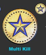
This medal isn't in the game is it?
Hypertrooper
Member
Aren't you getting this medal for One Kill?This medal isn't in the game is it?
StalkerUKCG
Banned
For graphic design illustrator is pretty much a must. Photoshop you have to design at the largest possible size, takes up file space. Not to mention typography work in photoshop is awful.
Id agree with this, Illustrator is a really valuable tool.
This medal isn't in the game is it?
Campaign
Steelyuhas
Member
Aren't you getting this medal for One Kill?
I don't understand the concept of just one kill.
Ah, what action is it actually for?Campaign
EDIT: You sure about that? It's not on the campaign medals stats page on Bnet.
Devolution
Member
Id agree with this, Illustrator is a really valuable tool.
I have pretty much done all of my work that doesn't use footage or images in illustrator. There's no point to limiting yourself to pixels unless you have to or want to use specific effects.
- Status
- Not open for further replies.