HowardRoark
Member
The fucking worst.
Fuck that racist pos character though.
The fucking worst.
Best dad!Sends his son off to die.
Did no one post Chris Redfield from remake to re5 yet?
Awful.

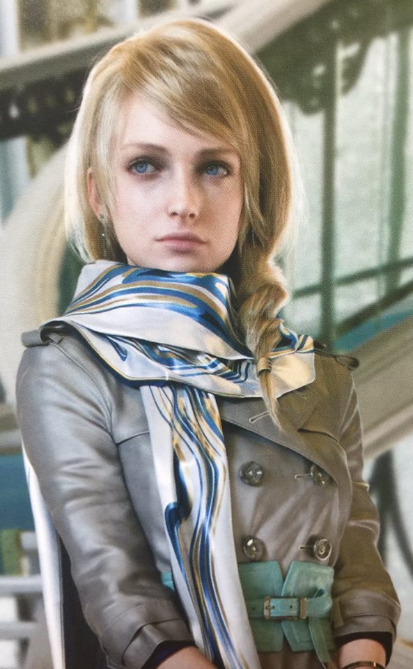
Kingsglaive Luna actually looks naturally human. I love her pale skin and dark circles. They certainly make her peircing blue eyes pop. Her outfit is way more impressive as well. She reminds me of a young French woman.
I admired how all of the Kingsglaive characters had unique facial features and bone structure. By comparison, their game counterparts look far less emotive and more like flawless mannequins. Which is no longer interesting to me, as far as character designing goes.
You're joking, right?
This is a joke post, right?
Apparently sex appeal = strings of fabric and comical beach ball tits.
Fuck that racist pos character though.
I can show you a picture of a 30 something Japanese singer that will blow your world view wide openGoing to get my flameshield ready:
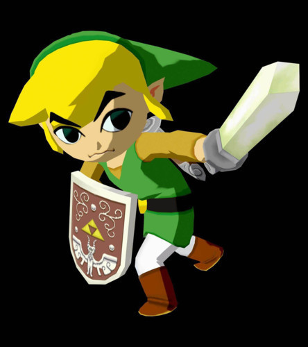
This guy has more personality than all the other Links combined.
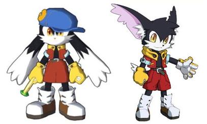
Not that I think that it should be his default design or aything. I like how the game changes art style every time.
Different Characters.
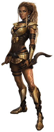
If anything, I like her Kingsglaive design the best:

She actually looks her age in Kingsglaive, as in, she looks more like a woman.
Her 3D model in the game looks like she is 14

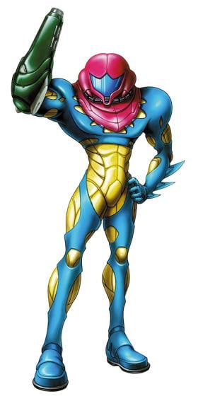
Samus armor was always made to be super fast as well as bulky, in that instance the smash 4 armor makes the most senseI can't stand any variation of AC Tifa. It's such a boring design. You can gripe about how revealing the original FF7 design is for Tifa, but it has spunk and personality. The all black apron is just lame as hell with no spark to it at all. AC Cloud is a little better, but still shitty. I'm really not a fan of any of the AC redesigns.
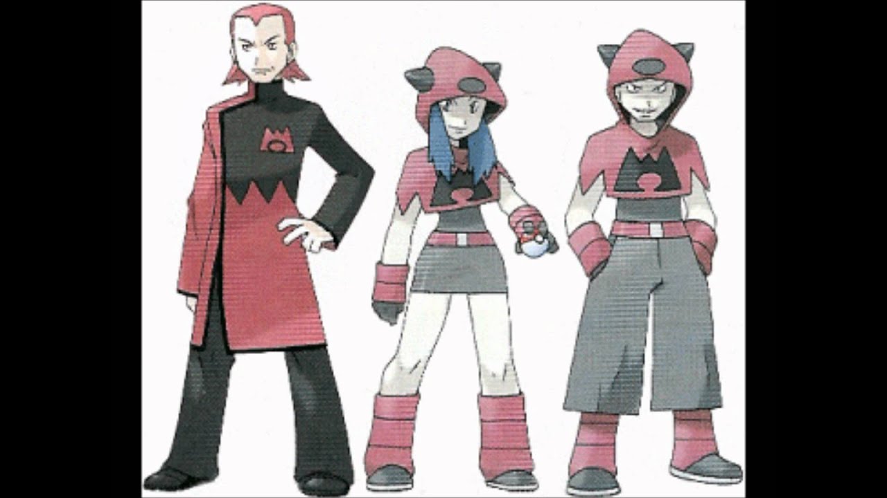
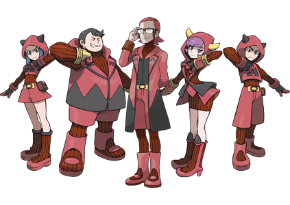
Team Magma and Aqua in ORAS are pretty awful too.
Maxie went from a threat to a nerd. All of the grunts were made too over the top and silly. I don't like how pointlessly complex the Team Aqua admin outfits were made to be either. The Team Magma grunts look like jokes too.
Also can't stand the changes to Samus's varia suit (and Zero suit) from Prime to Other M (and Smash 4 to a lesser extent). The ridges on the shoulders are a huge part of the design, and the overall streamlining is just obnoxious. Samus is a tank not a ninja, that's what the Zero suit is for. And then the damn heels added to the zero suit in Other M are just trash.
And then of course Sakurai adapted the Other M designs out of some bizarre sense of game developer loyalty instead of the ones from the actually good games. Instead of just reverting the Zero suit design he "fixed" it with the stupid power heels. And then Link, Zelda, and Ganon all stuck with the TP designs despite newer games having design seniority. Always so consistent Sakurai.
That's a good one tooI'm surprised this one hasn't been mentioned.
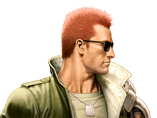
The updated Nathan "Rad" Spencer design for Bionic Commando Rearmed was awesome.
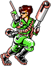
Bionic Commando NES:
Bionic Commando Rearmed
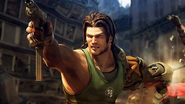
Their next two efforts, on the other hand...
Bionic Commando 360/PS3:
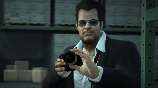
Bionic Commando Rearmed 2


to
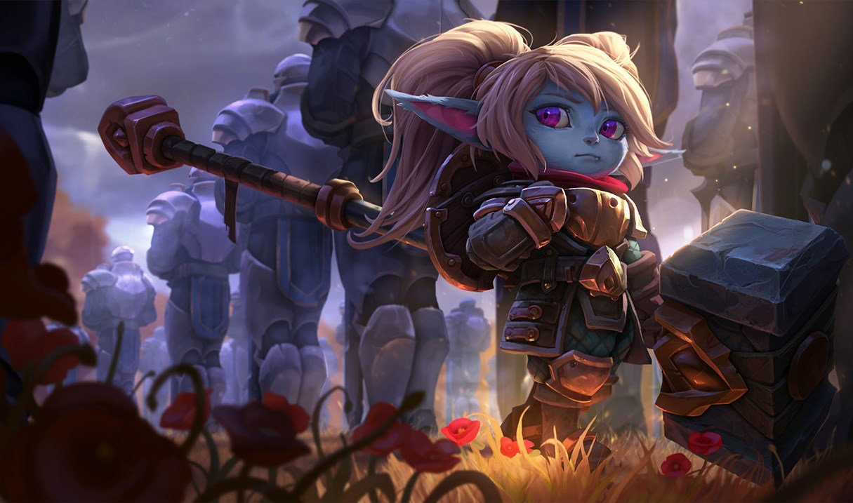
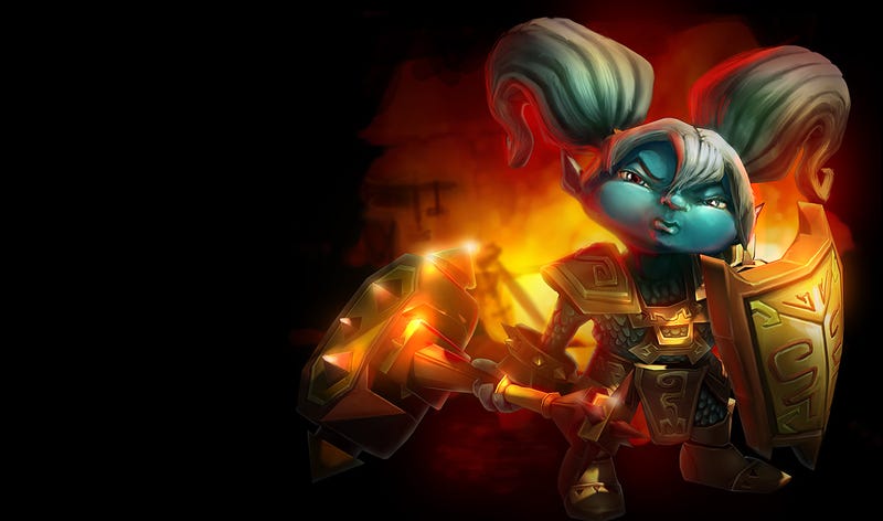
League is full of old champions with busted art, but Poppy was in every respect the most improved by her visual rework.
How big is that spoiler lol, highlighted it by accidentBest dad!Sends his son off to die.
...to worse:
MegaMan/Rockman from Rockman Xover for BAD redesigns
Why does a robot have a fur collar?
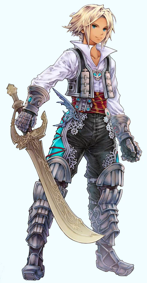
Here is Vaan, wearing a shirt.

That is disgusting
Worst
Almooost forgot about bronze god Geralt.
Almost.
Maya is just so damn beautiful...
...You do realize that a scene from when noctis is still a kid right? Of course you don't.
And how old do you need to be to have a kid again?
worst
Dead Rising 1
into fat boy Frank in DR2 Off the record
And the best Ganondorf!Hyrule warriors also has my favorite zelda

I guess this one divides people, but I just think it's leagues better than any previous version. Nothing else to really say about it.


I fail to see how Blood Omen 2 kain is a bad character design. Blood omen 2 failed in many aspects but it's human vampire characters definetely were on point/consistent with the pre-corrupted vampire liutenants in SR.No way, the worst is this piece of trash. *shudders*
Worst

I can show you a picture of a 30 something Japanese singer that will blow your world view wide open
SC4 Ivy....good lord. They just completely stopped giving a shit, didn't they?
I understand the hate red hair Simon gets, but I love this redesign so much. Keeps the barbarian look while also making him look like Kojima's designs for the later Belmonts. Judgement design is absolutely terrible, however.Or maybe you're more of a fan of his more modern post-Symphony of the Night design:

This
To this

My favorite is 18th century Ivy:

Maria in Symphony Of The Night:

Maria in Judgment:


I'm surprised it took this long, but Castlevania Judgment is a graveyard of absolutely shitty redesigns outside of Cornell.
For example, let's take Simon Belmont. If you like him as Conan the Barbarian, here you go.
Or maybe you're more of a fan of his more modern post-Symphony of the Night design:
Or maybe you just want someone to just fuck his shit up and look less like a badass vampire hunter, and more like Light fucking Yagami attending a hard leather BDSM bar.
The redesign of Team Aqua and Magma from the originals (Pokémon Ruby and Sapphire) to the remakes was honestly gross.
His avatar will easily explain everythingYou're joking, right?
This is a joke post, right?
Apparently sex appeal = strings of fabric and comical beach ball tits.
")
Pretty funny how people go apeshit at some shirtless dude but don't bat an eyelash at the ridiculous female outfits you see all the time.Damn, wonder how the internet would have felt in 2006 if this was the Vaan you played as.
lolClass Lara is best, new Lara is garbage. I've said my piece on this before, but Lara from Tomb Raider 2013 and ROTR is an absolute garbage character and a complete desecration of one of my favorite characters in gaming growing up.
He looks stupid and generic, instead of badass and unique, like a goth emo douchebag out of an Anne Rice novel.I fail to see how Blood Omen 2 kain is a bad character design. Blood omen 2 failed in many aspects but it's human vampire characters definetely were on point/consistent with the pre-corrupted vampire liutenants in SR.
HRUH?
EXCUSE ME?
Alright, so first of all... The original designs looked like this
And the new designs look like this...
The old designs aren't even 1/1000000th of as good!
that, and her voice. i really liked patricia ja lee, her VA in RE5. shame they couldn't get her back.
jill in revelations just feels like a completely different person, tbh
daisy's n64-era design vs. her modern design starting with mario party 4. i personally prefer the old design


Best
Worst
This
To this
His avatar will easily explain everything
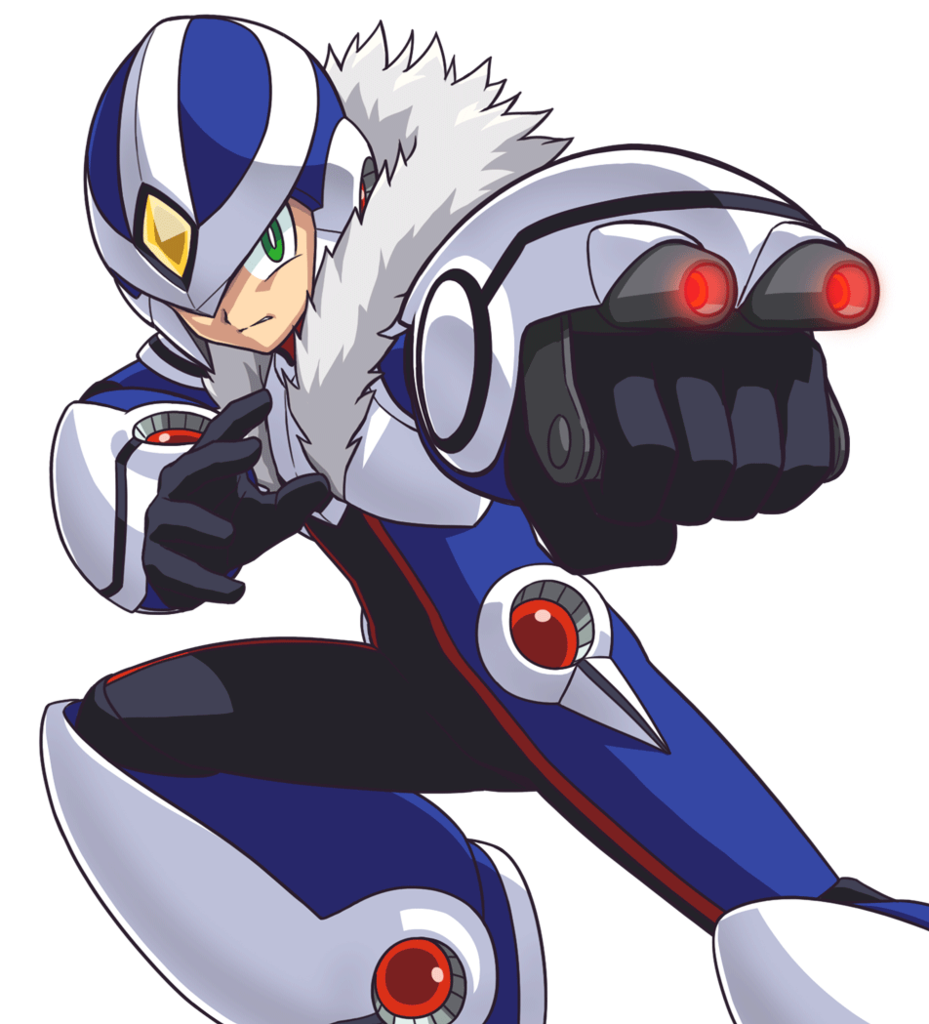
I also thing Smash 4 Zero Suit is the best one.


Ashley from Mass Effect