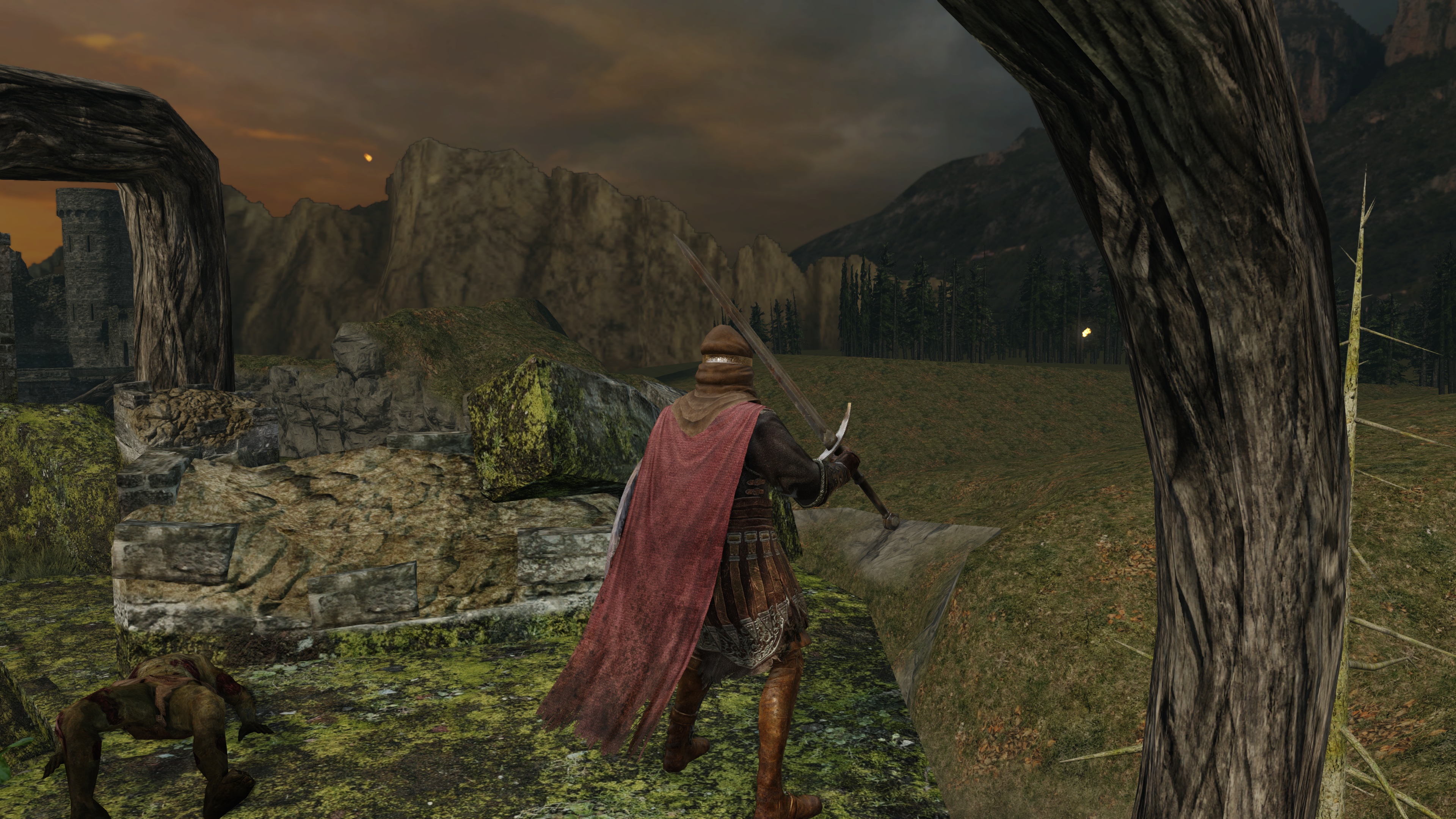
Location? Most of the shots seem to be near the sea which would allude to a damp environment.
It's old ancient castle ruins, so I guess that means lots of moss.
Oh i thought they were from more than one area, my mistake.
Location? Most of the shots seem to be near the sea which would allude to a damp environment.
It's old ancient castle ruins, so I guess that means lots of moss.
I like how they suddely stop with the stone texture and have it turn to that endlessly repedetive and flat grass."amazing"? I mean a turd would look good in 4k, but those hardly look amazing to me.
Aside from the sea shots, that water looks sweet.
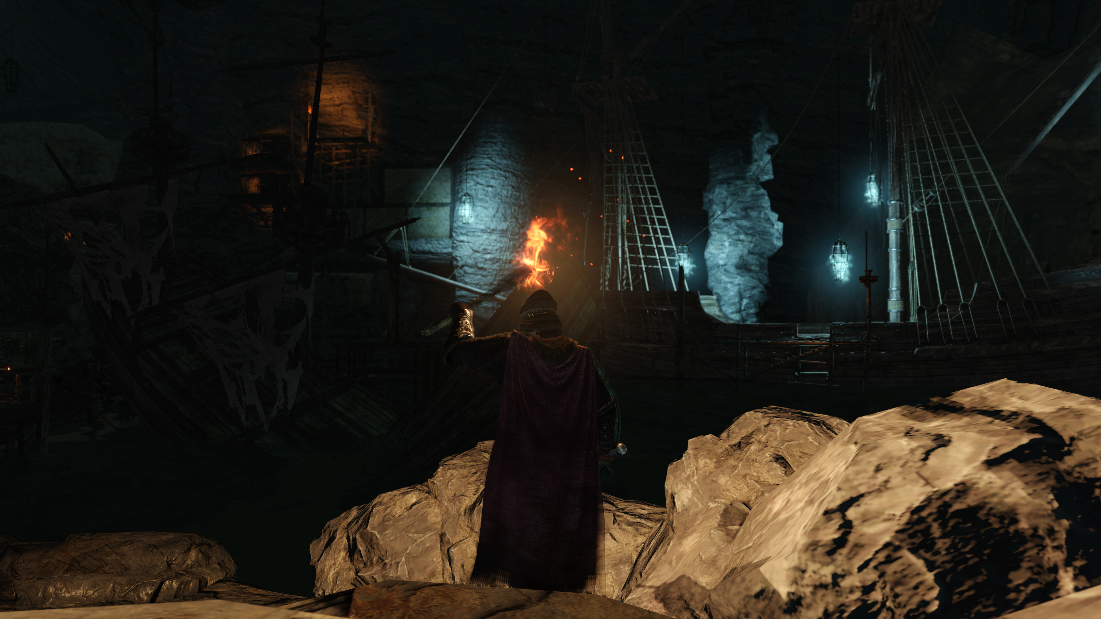
What in the hell is this?
I seem to have jumped some of these and also added a 6th.
- Denial - PC version won't look that shitty, they said it's developed for PC this time.
- Anger - It fucking better not be downgraded or people will just boycott them. PC can handle the lighting ffs. I'm not supporting lying devs.
- Bargaining - If the PC version has lighting in-tact then it'll sell well. In fact if it's not downgraded I'll buy two copies.
- Depression - Guys, please tell me the rumors are all untrue and it'll still look like it did in the demos. Please? Anyone? FROM? Namco?
- Acceptance - It looks better than the console version, but nothing like the demos.
It was planned for publication tomorrow since 2 days ago")
Speaking of 4K, is there a guide around here to setup 4k?
Are there going to be screenshots taken by you in the article?
It was planned for publication tomorrow since 2 days ago
Apparently there are, he said he also has a ton of screenshots for us as well.


Just a few for illustrative purposes, but once it is live I can post more.Are there going to be screenshots taken by you in the article?
Just a few for illustrative purposes, but once it is live I can post more.
Just a few for illustrative purposes, but once it is live I can post more.
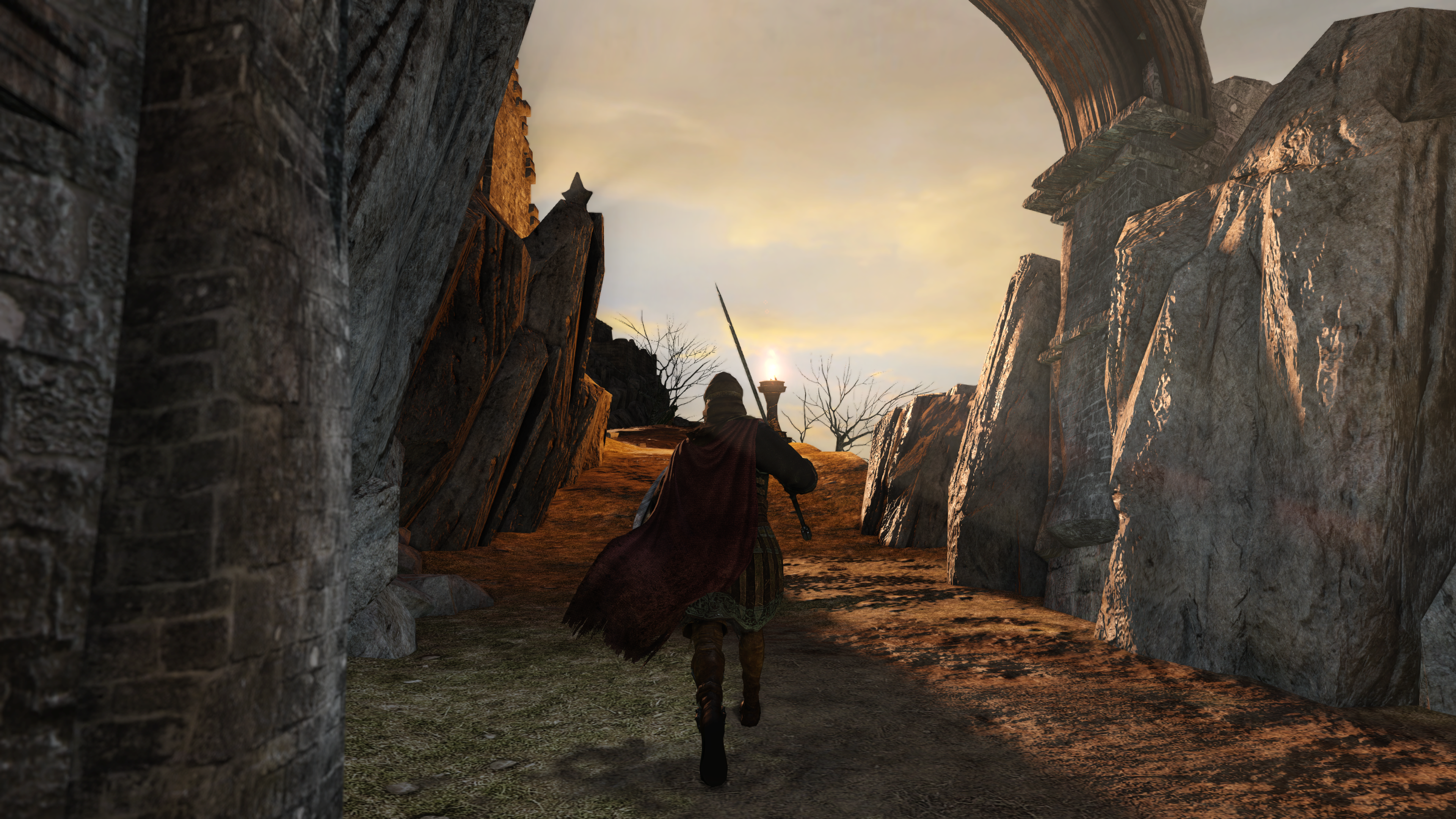
Yeah, that specific background is just nasty. Really ugly stuff. I can't imagine why they thought it looked OK.Yikes 4K Edition.
The rest looks amazing tho.
"amazing"? I mean a turd would look good in 4k, but those hardly look amazing to me.
Aside from the sea shots, that water looks sweet.
What in the hell is this?
Yeah, that specific background is just nasty. Really ugly stuff. I can't imagine why they thought it looked OK.
Absolutely. You can find those in almost every game. Maybe not Witcher 2You can find areas where Dark Souls looks like absolute shit too, but I guess the weird DoF helps hide some of that stuff.

I couldn't disagree more. It's a better-looking game than Dark Souls 1 -- and what other reputation would the series have been building?I wanna say that if the game was just being judged on graphics this would be a 2/10 considering the kind of rep this series has been building.
Absolutely. You can find those in almost every game. Maybe not Witcher 2
I couldn't disagree more. It's a better-looking game than Dark Souls 1 -- and what other reputation would the series have been building?
The sales and ardent following warrant a better effort. There is no excuse after the mistakes made with the first PC port. Good love 'em for the rep they've built on the core game but visually, this isn't stunning other than the art. Let's not delude ourselves.
Ehhh those are opinions man. Some people do find the game stunning as it is despite some shortcomings on some areas.
Arguing about this without actually being able to post everything I could to argue about it is excruciating, so let's pick this up again tomorrow.
Game definitely has gorgeous areas, but the pc shots so far only drive home how inconsistent the game is for me visually.120fps was just not really playable. When sprinting on any inclines you would move even slower than if you were walking. Rolls could end up being REALLY short.
It basically changes from buggy to broken, when a fundamental thing like "running" doesn't work properly, and rolling being almost useless in some spots.
I'm sure we will see some more flattering shots in 4k but this is already a taste of what to expect and I'm sure there will some more pleasing visual areas but the texture work and visuals on display as it stands are still disgraceful given the growing praise slapped upon the series. It's time to care about the visuals a little more as they seem to have the game play down pat.
I'm sure we will see some more flattering shots in 4k but this is already a taste of what to expect and I'm sure there will some more pleasing visual areas but the texture work and visuals on display as it stands are still disgraceful given the growing praise slapped upon the series. It's time to care about the visuals a little more as they seem to have the game play down pat.
I just want to say, I am absolutely excited for the most mundane of things:
The armor.
The one thing I didn't like in Dark Souls was how many of the armors behaved, particular around the leg area. But I snuck a peak and noticed that they now have actual cloth physics!!! Yes!!! You guys have no idea how much that excites me. Seriously.
")
There's like 40 screenshots in that link and that is probably the worst one of them all.
Excited to read the article as I'm wondering what words could make the screenshots magically look great
I thought the first Dark Souls had widely inconsistent visuals as well.
Even a little more tlc would be good. The west has basically given this series life as it doesn't make the impact even in Japan so they should really start considering catering to our needs as we're the ones who've supported them and made the franchise into what it is thanks to word of mouth and even support for shoddy port jobs like DS on PC.It looks good enough to me, I see nothing "disgraceful" about it. We don't need another developer that gets a taste of success then decides to burn up its entire budget on improving visuals and adding spectacle.
You winTranslation: Nah nah nah. I can't here you. My mind is made up. Any evidence you provide is moot.
Yikes 4K Edition.
The rest looks amazing tho.
"amazing"? I mean a turd would look good in 4k, but those hardly look amazing to me.
Aside from the sea shots, that water looks sweet.
What in the hell is this?
It's just really weird how inconsistent everything is. You have a bunch of things that look nice and a recurring statement of "that looks okay" and then a "what the fuck is that?" at least twice an image.
That's mostly the consensus for the console release as well: some areas in this game look incredible, others look like they're lifted from a PS2 game, like Shaded Woods. In general every forest area in the game looks like shit.
That's mostly the consensus for the console release as well: some areas in this game look incredible, others look like they're lifted from a PS2 game, like Shaded Woods. In general every forest area in the game looks like shit.
Never forget


WebM version:
REVEAL:
http://fat.gfycat.com/CarefreeNewHornet.webm
RETAIL:
http://fat.gfycat.com/FatalWhirlwindKissingbug.webm

Even for being downgraded, it still looks pretty nice. <3
It's more important that the game is mechanically running good and stable than actual graphical elements but it's just weird
Like this:
Looks great except:
high res leaves on the left, but other textures that look like a low res photograph of a forest floor. Why is the textures not higher quality if they're very clearly photographed? It's like getting out of bed and stopping just outside your door.
Right next to it is a low as fuck res 2D sprite vine.
Everything looks really flat in general, but the player model looks great.
Looking at the sword hilt, something is fucked up about the DOF in that it doesn't have the halo of the console versions, but it's still not correct.
Also look at the horrible banding on the skybox.
literally everything in this shot wouldn't be so bad if there were more shadows.
This really nails it in. I feel like crying
It's an entire pallete color and tonally mood change. I don't get the part about people being upset. It seems arbitrary and stupid.
Yes the original version is more of a technical accomplishment. But it isn't like the second version is just a downgraded version. The washed out pallet clearly indicates a different tone and feel. It's not just like they removed some effects. They changed the tone and feel of the area. That's an artistic decision as much as a technical one.
It's pretty blatantly obvious that the transition from a sepia tone to a grey tone is not a technical one. It's a choice.