LemmingWithaParachute
Banned
All the bright neon colors, picks ups flying out of enemies and busyness of the hud look out of place and tacky.
Doom looks more like Serious Sam 2 than it does Doom these days. I wish the art team behind Quake 3s aesthetic were the ones designing Doom these days.
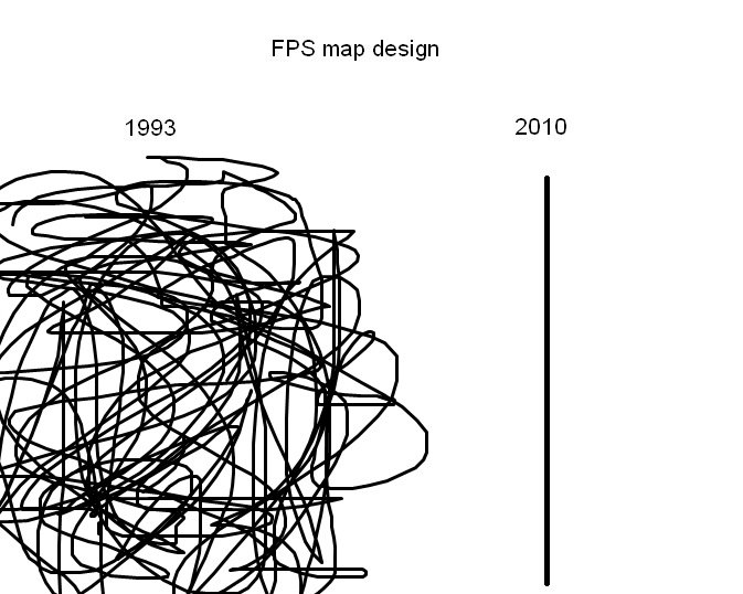
The latest Dooms now suffer from the thing that COD use to get made fun of (in terms of map design):

Doom looks more like Serious Sam 2 than it does Doom these days. I wish the art team behind Quake 3s aesthetic were the ones designing Doom these days.
The latest Dooms now suffer from the thing that COD use to get made fun of (in terms of map design):
Last edited: