somecrazymember
Banned
Don't like it. This would be better imho:

Better but still fugly. The 3 is just absolutely abysmal.
Don't like it. This would be better imho:
Better but still fugly. The 3 is just absolutely abysmal.
Someone got paid for that shit. It disappoints me.
That sign is redundant.
Its funny that people are not catching that the lip on the E is creating this cute little 3D effect on the 3.
I don't know, even though the execution is sloppy, it seems pretty deliberate to me and it falls right in line with both the event thematic and the logo heritage. So...Lmao that's reaching
I'm no designer, but I think a concept like this is better:

.
No, it's not. The curvature is all wrong if that's what they've been going for. The curvature there is actually really bad, no matter what they've been going for. It just looks amateurish, and the more I look at it, the more it annoys me.It's funny that people are not catching that the lip on the E is creating this cute little 3D effect on the 3.
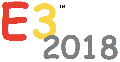
Really guys? This thing is a graphic design nightmare.
- That uneven stroke separating the bottom of 'E' and '3'
- The top separation stroke is a different width from the bottom between 'E' and '3'
- That weird lip they decided to tack onto the 'E'
- Having the '2018' Just sit on top of the '3,' creating an inconsistency between how the letters interact with each other (The 'E' is clearly separated from the '3')
- Altogether, that awkward stair shape is going to be so annoying for a designer to place anywhere.
I'm sure somebody got paid a shit ton for this too. I truly wonder where these humongous companies are getting their graphic designers.
Is it me or is the 2018 not level?
I already agreed on the execution not being the best, but while the curvatures don't match on a closer look, the 3D effect when watching from a distance is still pretty apparent to me. Can't just unsee it because of a technicality.No, it's not. The curvature is all wrong if that's what they've been going for. The curvature there is actually really bad, no matter what they've been going for. It just looks amateurish, and the more I look at it, the more it annoys me.
Someone was actually paid to spend 30 seconds to come up with that.
This. Graphic designers are getting hella lazy.

What? yes

Better than the boring, generic crap they've just put out.Finally. The old logo looked like something straight from 2003.