-
Hey, guest user. Hope you're enjoying NeoGAF! Have you considered registering for an account? Come join us and add your take to the daily discourse.
You are using an out of date browser. It may not display this or other websites correctly.
You should upgrade or use an alternative browser.
You should upgrade or use an alternative browser.
Lazy Box art
- Thread starter PAULINK
- Start date


Classic.
valkillmore
Member
Less is more.
Keep it simple stupid.
What is the video game world's version of the 'White Album' cover?

This is as close as I can think of.What is the video game world's version of the 'White Album' cover?

EDIT: Holy shit, there's detail there! I never noticed.
themagicalkitsune
Member
I always thought the God Hand cover was a homage to this game. I had the game and it had crap hit detection and was just crap overall.
You saying God Hand is crap?
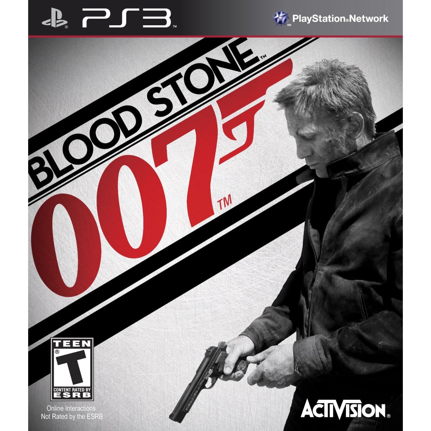
Good job, interns. That was piss easy. All you had to do was cut out a render of Daniel Craig on Photoshop, slap him against a background of grey nothingness and slap on the logo in the biggest font it can allow, big enough just in case a regular shopper notices it.
I think that's a pretty nice cover
")
I hate this cover with passion of a thousand suns, but it's not really lazy

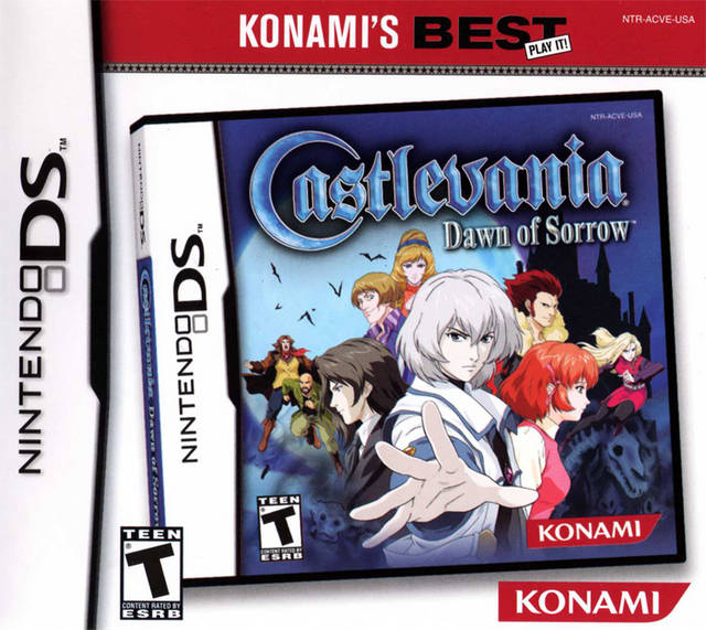
This is lazy. Just the character stuck on a plain background with a logo in the top right. I like minimilistic like the MGS Cover , but this just screams laziness to me.


ITT: People confusing bad with lazy.
.
Ganondorfo
Junior Member
Edit: I read the title wrong, I thought it said best.
Appollowexx
Member
Y'all need to Come off it with those Master System covers. I love those things

It's not hard. Just google "Master System covers".
You saying God Hand is crap?
My Hero was crap. I loved God Hand and the cover is what made me pick it up because I assumed it would be a game that makes fun of 8 bit brawlers.
This is really a Master System thread

These are awesome.
Bunch of master system haters.
I'll pick any animu looking covers as they're usually lazy.
wcoreysmith
Banned
ITT: People confusing bad with lazy.
This is what I was thinking. Though I also don't have anything to contribute so I will probably just sit back and silently judge.
I don't get it, it's a cool little Viking guy, it's awesome!
themagicalkitsune
Member
^^ I think Great Soccer wins. It's literally a pic of someone holding the cartridge.
Edit: apparently there's a bunch of them...
Edit: apparently there's a bunch of them...
DarkJedi24
Member

This isn't even real. It's The Forgotten Sands image with The Sands of Time title. Also that box art shouldn't have a PS2 banner on it.

This isn't even real. It's The Forgotten Sands image with The Sands of Time title. Also that box art shouldn't have a PS2 banner on it.
Ubi actually did reissue the PS2 Sands of Time using Forgotten Sands artwork for some reason.


MDSLKTR
Member

maybe not lazy? but man....it's something.
This one shall forever be brought up in any box art thread
BouncyFrag
Member
I always thought the grid design on Master System games looked cool.
Jimnymebob
Member
This isn't even real. It's The Forgotten Sands image with The Sands of Time title. Also that box art shouldn't have a PS2 banner on it.
Nope, I think it is.
DarkJedi24
Member
Ubi actually did reissue the PS2 Sands of Time using Forgotten Sands artwork for some reason.
Wow are you serious? That's pretty much the most irrational thing for Ubisoft to do. Why would they use boxart from a different game in the series. Just seems like it would confuse people unnecessarily haha.
Man that's crazy. Ubisoft actually was wanting to confuse people into thinking they got The Forgotten Sands for PS2. My apologies friend.
Done in one.

Not to mention that the art has NOTHING to do with the shmup...
Pseudo_Sam
Survives without air, food, or water
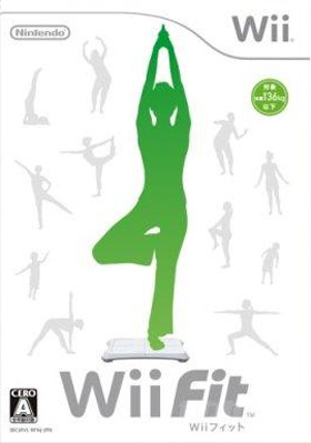
A lot of people appear to be confusing simple with lazy. Just because there isn't a custom-designed intricately detailed piece of concept art on the box doesn't mean it isn't a good cover. Like the Trauma Center one with the big red cross on it, I think that's quite effective.
Spiffy_1st
Member
This is lazy. Just the character stuck on a plain background with a logo in the top right. I like minimilistic like the MGS Cover , but this just screams laziness to me.
Whhhyyy did this have to be the PAL boxart too!? It broke the pretty tradition of plain white and a logo. XIII sucks in so many ways.
Winterfang
Banned
Done in one.
HOLY SHIT!! now that's lazy.


Spring-Loaded
Member
I always thought the grid design on Master System games looked cool.
I think it comes from a time when games were considered like software for a specific brand of computer, not like individual movies/books/Etc.
SenorArdilla
Member
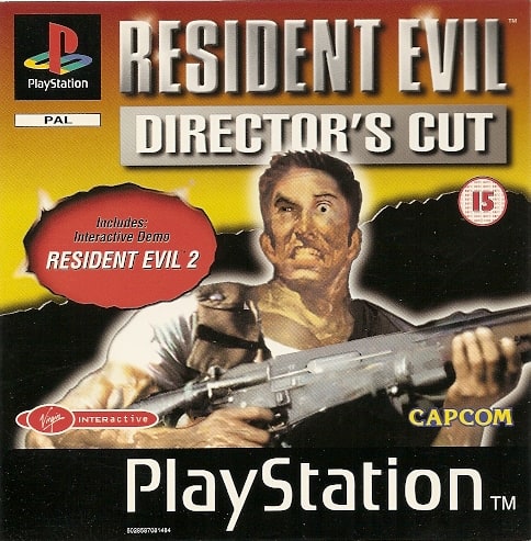
There are two things I never understood from this art.
1- That face... really? Is that a brain stroke?
2- What is that freaking gun?! Is like a mix of M4, BAR and Remington...
Rhomega Beta
Member
maybe not lazy? but man....it's something.
I wouldn't call it lazy, just outright bad.
Game was fucken amazing though. The music brings tears of nostalgia to my eye.


I know it's kitschy as hell, but I still would like my little kids to enjoy these games better than your average badass war game.


Uh, there are some actual good boxarts being posted in here.
All of these are good.
jp wii version. even lazier
All of these are good.
I like the minimalist, clean look. The intriguing title is all you need. Just because it's simple doesn't mean it's lazy.
Just because it's simple doesn't mean it's not lazy, though. I mean you can create a "minimalist, simple, clean, and to the point" box art of every game ever by putting its logo on a white background. But not every game has the same impact.