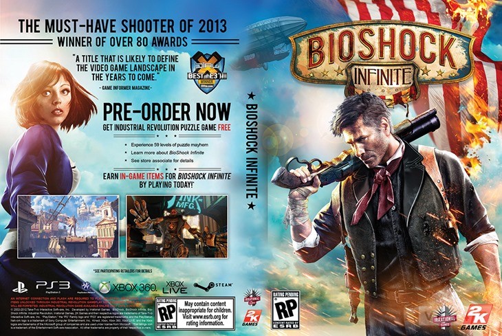
I want to say Bioshock Infinite but I dunno.
it's pretty fucking lazy, I can't believe people defended it as good.
I want to say Bioshock Infinite but I dunno.

But I think this is lazier.

it's pretty fucking lazy, I can't believe people defended it as good.

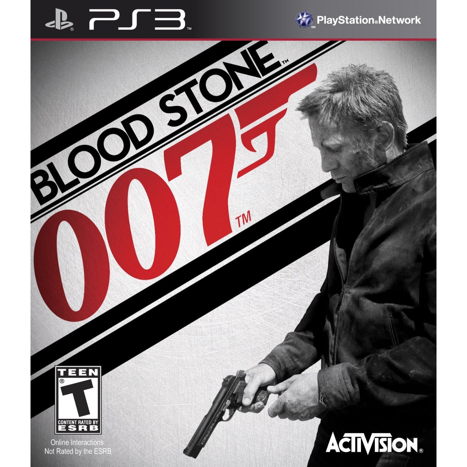
Good job, interns. That was piss easy. All you had to do was cut out a render of Daniel Craig on Photoshop, slap him against a background of grey nothingness and slap on the logo in the biggest font it can allow, big enough just in case a regular shopper notices it.
Just paste together the box arts of DMC 1, 2 & 3
a picture of the balance board and the trainer

Speaking of collections, I guess the PS2 MGS collection box could be considered kind of lazy although the individual boxes for the games are really nice.

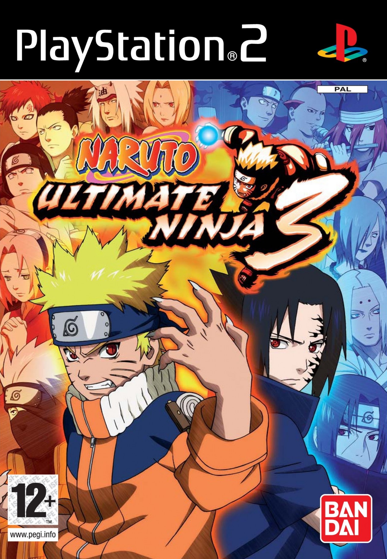
How many characters can you copy+paste onto one piece of boxart?
This is as close as I can think of.
[Ultima VII: The Black Gate cover]
I want to say Bioshock Infinite but I dunno.

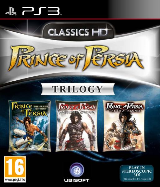
I think this is one of the better examples of collection box arts.
The layout/typography (and strangely masked zeppelin) or the front cover? If the latter, awesome box art is another thread
Dissidia NA+EU art (reversible covers):

Dissidia 012 NA art:

Dissidia 012 EU art:

I would actually like a even more "lazy" cover far better. Just make it a white background and the logo on the center. I think it works well and it's more aesthetically pleasing than this.I hate this cover with passion of a thousand suns, but it's not really lazy

This is lazy. Just the character stuck on a plain background with a logo in the top right. I like minimilistic like the MGS Cover , but this just screams laziness to me.
I like to shit on FFXIII as much as the next person, BUT there is a bit of thought that's gone into that cover. The FF logo is on the same level as her eyes. So you follow the logo to her face and follow her face down her arm to the SquareEnix logo. It makes sense
This is lazy. Just the character stuck on a plain background with a logo in the top right. I like minimilistic like the MGS Cover , but this just screams laziness to me.
iconic
But I think this is lazier.
Mario is looking at Pikachu as they rush towards each other, right?
I mean Mario isn't even looking at the characters he's fighting. Come on, Ninty.
That's not a good example of lazy box art. That must have taken a while to put together lol
Also...


I'd say this is a possibility:
It just re-uses the official renders from the website and puts them on a boring background. Also Ratchet's render on the EU release is from All 4 One.
It's not the only game to do stuff like this though. The Dissidia Final Fantasy games also did this by just pasting the renders or artwork from the websites onto backgrounds:
It's just a personal preference though, I'm not a fan of cover art and posters that's just renders pasted onto a background.

Just paste together the box arts of DMC 1, 2 & 3
This was a huge step down from other Mario Kart games.

yeah, people are confusing BAD, with lazy.
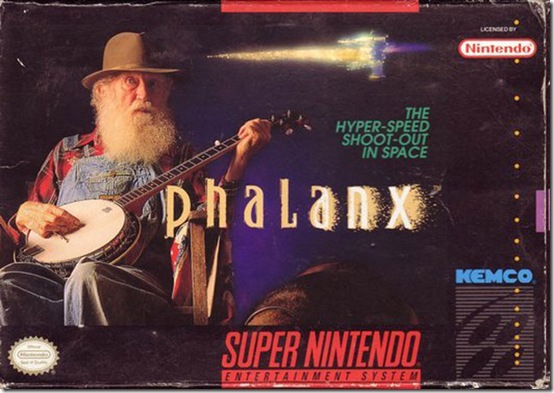
this one is definitly lazy. but awesome.
Holy shit. It's like something outta Windows 95 MS-paint.