Infernal Monkey
Member
Another one I don't entirely understand.

Haha oh god, I'd forgotten about this. They could have at least put some actual Bubble Bobble art on the TV screen and not just 'random_toxic_waste_wallpaper.jpg'.
Another one I don't entirely understand.
That quote lol
Actually I have the game (pal version) and the cover is different. It's similar to the japanese one. Maybe they discarded this one when people started laughing at it.
Just paste together the box arts of DMC 1, 2 & 3


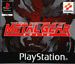
This is lazy. Just the character stuck on a plain background with a logo in the top right. I like minimilistic like the MGS Cover , but this just screams laziness to me.
Who voted for this as the alternate cover?...Its ass.
Looks like a shitty deviantart drawing.How is that ass?


Every modern shooter for copy pasting the other one and just adding a filter.
the first one is much prettier. not being cluttered doesn't make it lazy.
I can't say I agree with these. I think it's a simple, cohesive design that is immediately recognizable to fans of the series. I like that consistency from game to game. You look at it and there's no question it's an Ace Attorney game.
The games are about their characters, first and foremost, and I always felt the covers did a good job of reflecting that.
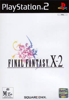
EU box-art of the HD remaster. Always thought it was a placeholder until I actually saw a real copy.
It's kind of unfair putting RB6 Vegas in there. It precedes CoD4 and the whole "modern warfare" copycat syndrom.
")
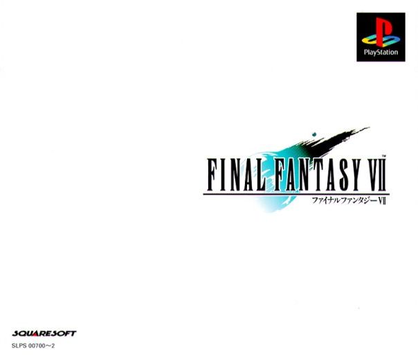
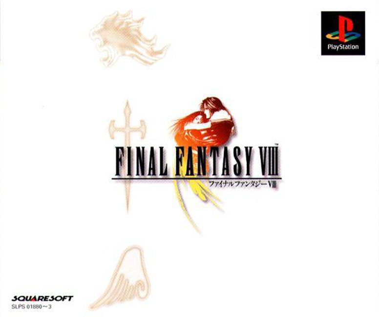
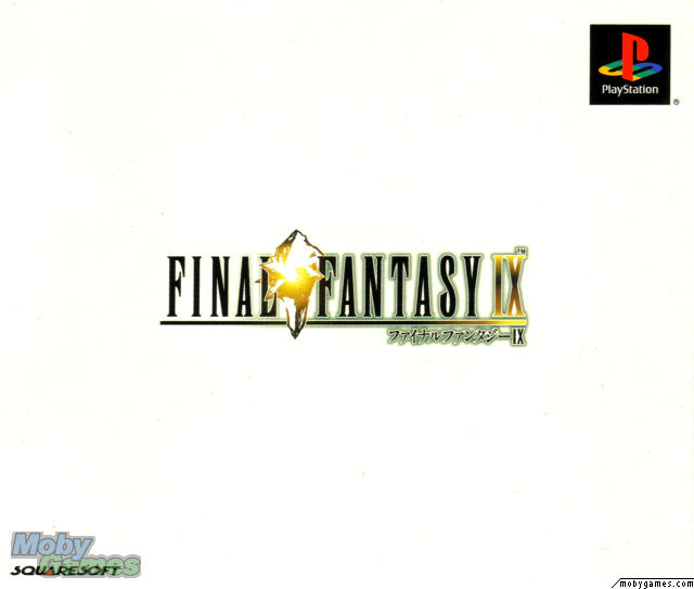
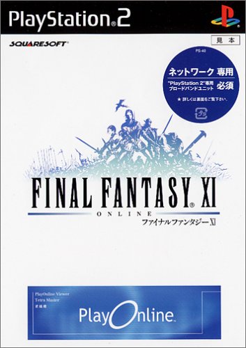
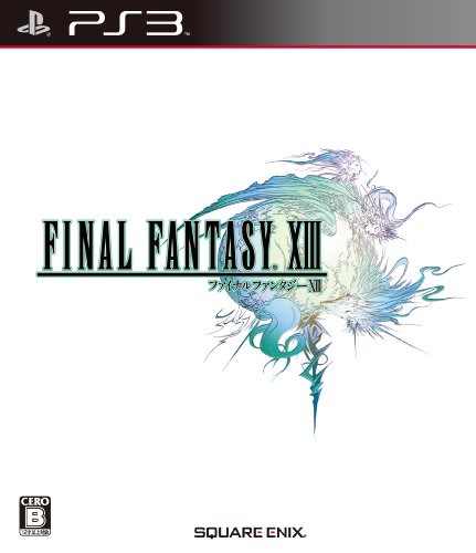
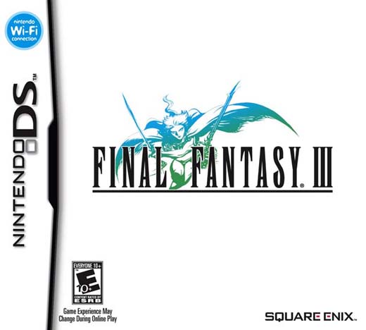
The Final Fantasy logo over white background is somewhat a tradition of the series in Europe going back all the way to the PSOne.
I love Japanese FF covers by the way.
EU box-art of the HD remaster. Always thought it was a placeholder until I actually saw a real copy.


Yeah, that and most Master System boxes. How the fuck did somebody actually say "yeah this is good, let's go with this" in an era of awesome over-the-top paintings as boxart?


"Let's make it really edgy and do that thing that all the FPS games are doing!"
How are these "lazy"? I mean, they're using drop shadow and outer glow!
The sequel!!
I'm not 100% sure, but I think that's just the UK cover. The game can get quite pricey now and I remember looking around and noticing a different cover from sellers in mainland Europe.