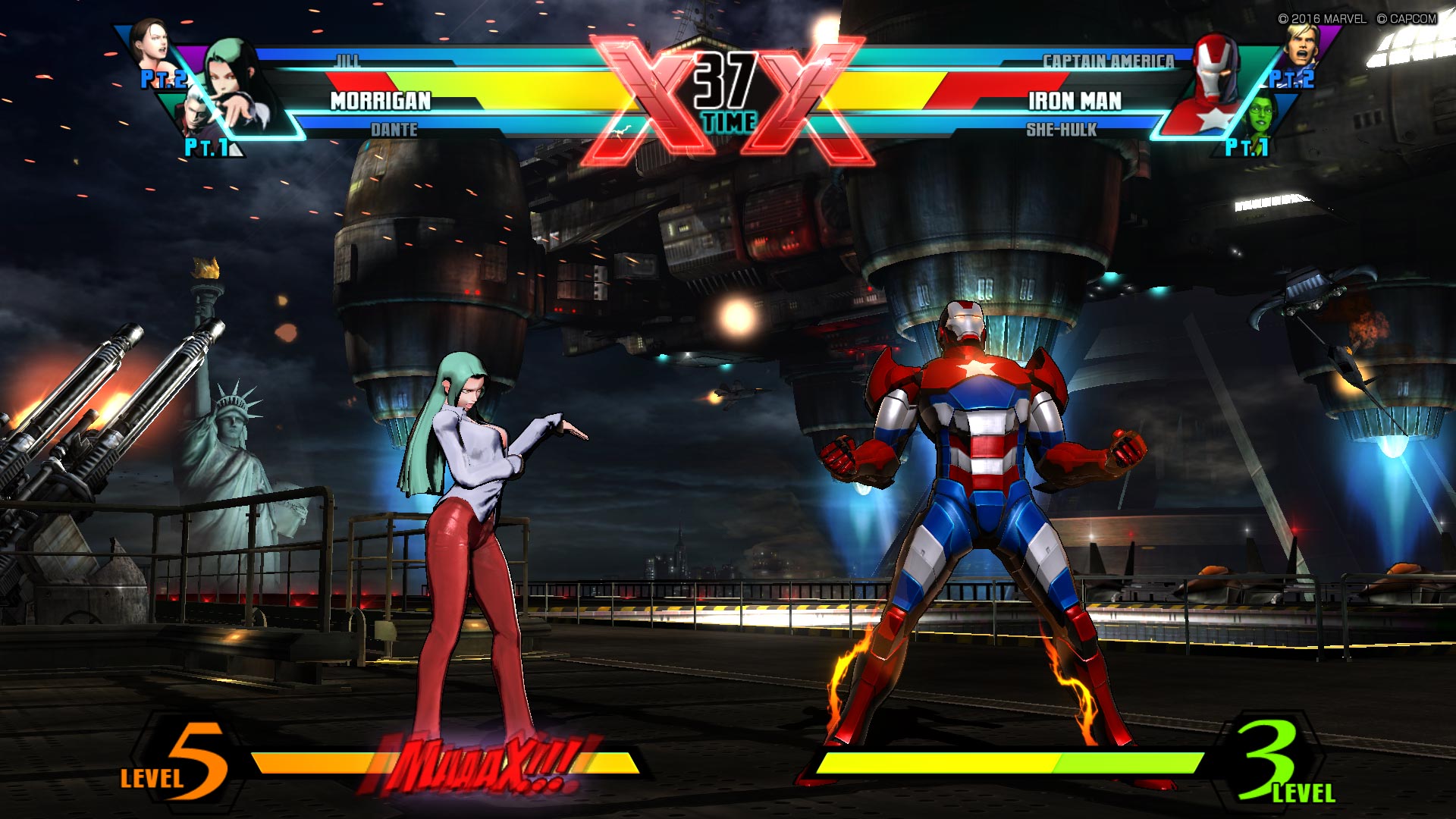
I suggest you look back at UMvC3's interface because it was not only plain AF it was also a confusing step down from vanilla's.
Current character in the center, partner two on the bottom row, partner three on the top row? Who the hell thought that was a good order? Don't forget the gigantic X in case you might have missed X-Factor otherwise! And let's not forget the beauty of their portraits there, too.
the only thing pretty bad is the ordering. mind you, that shit mega sucks.
otherwise the ui actually displays a bunch of relevant information really quickly; you can immediately tell what characters are available for assist calling, what assists they have, whether the other guy has XF and how much meter they have without having to lose track of the match.
morrigan's team is shadow blade, dante crystal and jill somersault kick
iron man's team is repulsor blast, cap's shield slash and she-hulk's somersault kick
in knowing their assists you also know their THC option as well without having them ever do it or call their assist b/c it changes based on assists.
you can also glean this information at the vs. screen, which is a really nice touch given round starts are often littered w assist + button OS
yes, vanilla marvel's ui is more slick (holy shit it's slick), but i cannot say it's
better at the purpose of actually conveying information
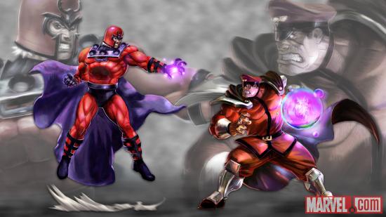
tell me, how much of that information can you glean from this still?
can you tell me whether these teams have xfactor or not? that shit is a basic, vital thing to know given how xfactor centric the game.


 .
.