I NEED SCISSORS
Banned
1-D_FTW said:Pretty much anyone who sells online still has their pre-orders available.
That's pretty amazing actually. I had expected them to be completely allocated in the first week.

1-D_FTW said:Pretty much anyone who sells online still has their pre-orders available.
Done.jarosh said:while they are just press shots, you could at least give me credit. you're linking to my photobucket and i had just posted them in the other thread. obviously you took them from there.

Willy105 said:How?
Not many people have 3D glasses, and I imagine even less can cross their eyes. And the animated gif method would be odd at best.

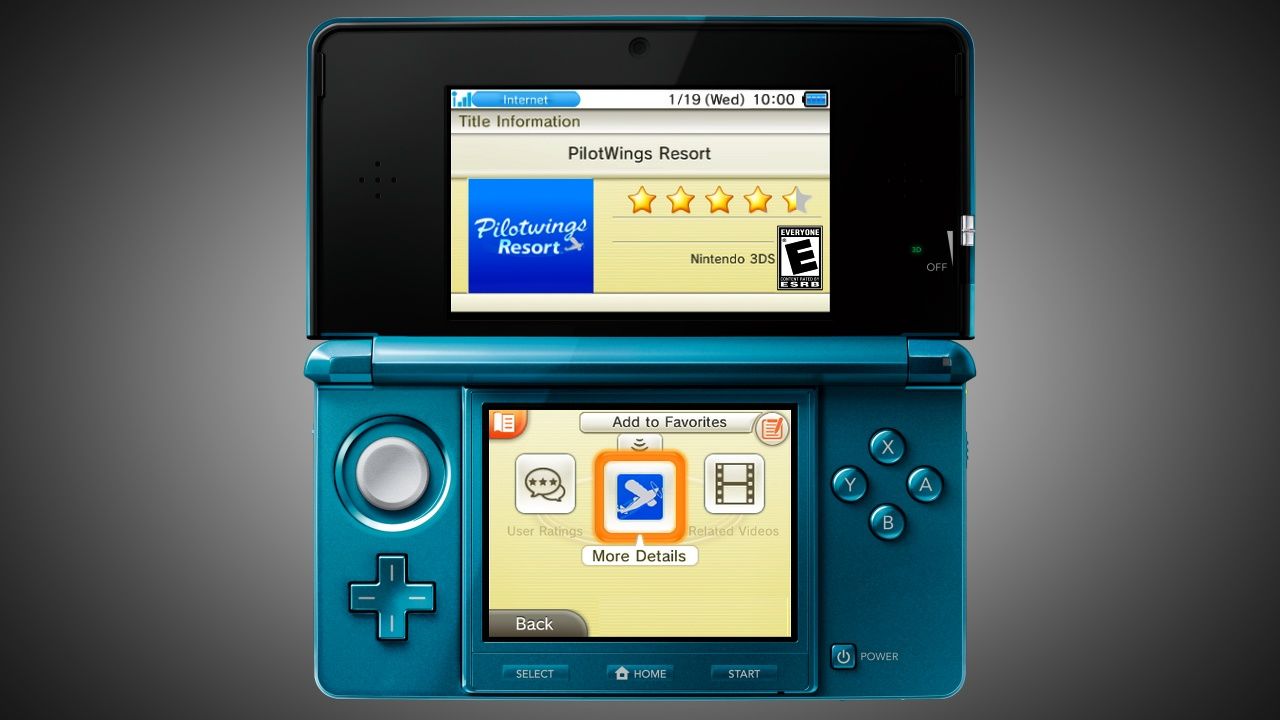
God's Beard said:Everything looks off-centered and too big.
Teetris said:With the Wii, you could have your 12 favorite things on the first page and then easily pick whatever you wanted, I want something like that. What the DSi however improved on was removing the splash screen, you could instantly pick your thing. If they combined these 2 with 3DS it would be all I'd ever need in an interface. Or basically just the ipod touch thing. Everything looking so big could mean the screen resolution is too low for it too happen, but still. They could make it easier on the user.
Now it seems they added a lot of nonsense (to people like me). Why would I want to rate my games?
Xelinis said:Sony's interfaces don't do too great a job of presenting content, but damn they're clean.

Teetris said:With the Wii, you could have your 12 favorite things on the first page and then easily pick whatever you wanted, I want something like that. What the DSi however improved on was removing the splash screen, you could instantly pick your thing. If they combined these 2 with 3DS it would be all I'd ever need in an interface. Or basically just the ipod touch thing. Everything looking so big could mean the screen resolution is too low for it too happen, but still. They could make it easier on the user.
Now it seems they added a lot of nonsense (to people like me). Why would I want to rate my games?

Xelinis said:The graphics are all too big and there is waaaaay too much visual information in there.
Sony's interfaces don't do too great a job of presenting content, but damn they're clean.
Xelinis said:The graphics are all too big and there is waaaaay too much visual information in there.
Sony's interfaces don't do too great a job of presenting content, but damn they're clean.

Xelinis said:The graphics are all too big and there is waaaaay too much visual information in there.
Sony's interfaces don't do too great a job of presenting content, but damn they're clean.
Teetris said:With the Wii, you could have your 12 favorite things on the first page and then easily pick whatever you wanted, I want something like that. What the DSi however improved on was removing the splash screen, you could instantly pick your thing. If they combined these 2 with 3DS it would be all I'd ever need in an interface. Or basically just the ipod touch thing. Everything looking so big could mean the screen resolution is too low for it too happen, but still. They could make it easier on the user.
Now it seems they added a lot of nonsense (to people like me). Why would I want to rate my games?
Xelinis said:The graphics are all too big and there is waaaaay too much visual information in there.
Sony's interfaces don't do too great a job of presenting content, but damn they're clean.
JimboJones said:The screen is fairly low resolution and it's a resistive touch screen, big chunky buttons will make things easier to press with your fingers.
Barkley's Justice said:http://www.blogcdn.com/www.engadget.com/media/2011/01/sony-tokyo-event-1444.jpg[IMG][/QUOTE]
mehhh don't really like 3ds interface, don't really like ngp interface
maybe they'll grow on me
JimboJones said:The screen is fairly low resolution and it's a resistive touch screen, big chunky buttons will make things easier to press with your fingers.
Xelinis said:The buttons on my iPhone are much smaller and it works just fine.
What's the maximum rows? Any pic of that?Willy105 said:You can change the size of your channels on the screen, just like on Steam. You can enlarge them to have only one row (like the DSi), or make them smaller and have a couple of rows (as seen on the screen in this thread).
But I guess it's not exactly what you wanted.
That 'clean' look always came off as empty to me, but it's probably because of the limited amount of colors the XMB uses by default. Just grey and a background.
Nintendo has a problem of making things too 'layered' (as in you first go here, and then go here, and then here), but everything always looked big and great to the eye.
Big is good, less things to hunt down. But that also means there's less stuff to see at once.
Yeah, the shop in particular looks atrocious, just like the DSi one. Maybe if they used the space for text and game descriptions instead of huge, ugly, shaded blocks...hyp said:everything looks cramped. did the UI designers learn anything in their graphic design classes?
risk said:so wait, the VC will be BC with the current Wii ones? Or will it be seperate, only 3DS VC?
Teetris said:What's the maximum rows? Any pic of that?
Now it seems they added a lot of nonsense (to people like me). Why would I want to rate my games?
Gravijah said:ooh it has a search feature!
I bought a Cosmos Black 3DS with Pilotwings and Ridge Racer....Gravijah said:Oooh, that's why it's called cosmo black.
[Nintex] said:I bought a Cosmos Black 3DS with Pilotwings and Ridge Racer....
I regret nothing(so far).
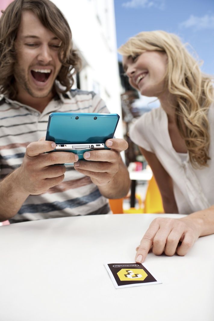
Kenka said:They do a good job at showing everyday people in normal situations.
Which is a good appreciation.