• Hey Guest. Check out your NeoGAF Wrapped 2025 results here!

New Yoshi's Island announced for 3DS!

It looks nothing like those games at all...and you guys are overexaggerating the "mismatch" of styles. At most we get Yoshi and Baby Mario slightly clashing with some of the more exotic backgrounds but you guys are acting like they just slapped a bunch of stuff together. I had a feeling the CDi comparisons were, for the most part, unfounded...
 
I wouldn't say 'incredible', but I think those shots tie-in nicely to my whole point where throwing in all these different art styles into one screen gives a cheap thrown-together look. The drawn landscapes are serviceable and even nice in some areas, but jesus those sprites. Not to mention whenever those hilarious awful animated cut-scenes pop up they're in a completely different style to the rest of the game. I think I may have confused Zelda's Adventure (that's the FMV one, right?) as being a part of the other CDi Zelda games though.

Those drawn landscapes. Serviceable. Does not compute. The attention to detail is insane, you can't be serious.

But yeah you are right that the backgrounds are so damn good compared to the mediocre sprites that they can clash.

And Zelda's Adventure is the one you are thinking of for sure, it looks terrible. It's the overhead one.

Edit: The heck, I thought I was editing but I somehow made a new post. Amazing.

Dat serviceable background work -


And the irony of them being serviceable is that they aren't; they're drawn only to look good and hardly work at all for navigating in a game.

And here is the almighty Zelda's Adventure, lol

 
It looks nothing like those games at all...and you guys are overexaggerating the "mismatch" of styles. At most we get Yoshi and Baby Mario slightly clashing with some of the more exotic backgrounds but you guys are acting like they just slapped a bunch of stuff together. I had a feeling the CDi comparisons were, for the most part, unfounded...
I wasn't the one saying it looked like a CDi game, just that I can see where those observations are coming from when you get a clashing of art styles, which you at least acknowledge yourself. I don't think it makes it look terrible (and I said earlier I like how they've updated the original SNES environments), but it's noticeable enough where you have to at least wonder if it would have been better fully committing to either a hand-drawn style (Yoshi's Island) or a pre-rendered style (Yoshi's Story). I don't think it helps when it's a followup to a game known for being one of the SNES' visual showcases; people are naturally going to scrutinize art styles and techniques far more than they would for something like another main-line Mario platformer.

All of this may be mute though since like Good-Feel's Yoshi game I'm getting the feeling these Yoshi games are still really early in development. I don't expect to see either before 2014 at least.
 
I recorded a little bit of gameplay to try and get a comparison as close as I could

y1y8yt9.gif

y25nxmv.gif

Man it's embarrassing how much better the 18-year-old game looks. Especially when you consider the probable cost difference in art assets.
 
Man it's embarrassing how much better the 18-year-old game looks. Especially when you consider the probable cost difference in art assets.
I showed the comparison post to 4 people at work, all of them thought the second one looked miles better. They all somewhat liked both of them, though.
 
Man it's embarrassing how much better the 18-year-old game looks. Especially when you consider the probable cost difference in art assets.

the new game is likely cheaper to make. nintendo is using it's 3D art assets to render out ugly 2D. it's faster, cheaper and lazier than creating sprites from scratch.
 
Man it's embarrassing how much better the 18-year-old game looks. Especially when you consider the probable cost difference in art assets.

Yoshi's Island does not look better. It has a different art style and if you prefer the old one that's fine. Personally, I prefer the new art style.
 
Man it's embarrassing how much better the 18-year-old game looks. Especially when you consider the probable cost difference in art assets.

You can't even begin to evaluate how much it would cost to recreate those old 16-bit art styles and match the quality. The talent just doesn't exist anymore like it used to.
 
the new game is likely cheaper to make. nintendo is using it's 3D art assets to render out ugly 2D. it's faster, cheaper and lazier than creating sprites from scratch.

I'd say in that current form, the 3ds game has zero graphical budget.
 
One thing: in the original, red coins were hidden between normal ones, but were actually recognizable because the were coloured differently. In the 3DS game they all appear to be exactly the same.

That's true, but the shade difference was so slight, it was pretty hard to tell anyway.
 
One thing: in the original, red coins were hidden between normal ones, but were actually recognizable because the were coloured differently. In the 3DS game they all appear to be exactly the same.

Interesting. It's funny how little 'new' stuff they've shown off in the trailer.

Hopefully at E3 we get Baby Waluigi.

Yes yes, clearly 0 budget, its all blank onscreen....

Let him have his hyperbole.
 
Not even an hyperbole. I'm convinced this is stock holder, not done by a dedicated graphic team. Sure, it took time still.

Weird to see you say this. When I saw the first footage of this, I thought it looked a lot like your art, and I totally mean that in a good way.
 
Man it's embarrassing how much better the 18-year-old game looks. Especially when you consider the probable cost difference in art assets.

I strongly disagree. You seem to be coming from a perspective of not accepting anything that is not the original art style. These two gifs show that the new style is a reinterpretation of the old one with similar sensibilities. Not saying the old style suddenly looks bad but by no means does the new one look "embarrassingly" worse.
 
Honestly the only major problems with the art style seem to be how everything blends together (to the point where it seems hard to see enemies/objects that blend into the background) and how Yoshi seems to look really weird (reminds me of Donkey Kong Country's sprites).

Oh, and the lack of parallax scrolling for objects in front (like the flowers) is pretty shitty, since the original Yoshi's Island had great parallax scrolling on objects in front.
 
Everyone has his own taste, and everything looks like anything for most people. I mean i even heard people say the new Lttp looks like my art, or that my art in general look like braid. People don't specially discern differences..

Now if the art direction of this Yoshi is not that bad actually, i mean it works in term of colors, the real problem, that is not debatable and not a subjective matter, is that it represents a lot less work than the original. That's the problem here, Nintendo being cheap.

But Yoshi island was a AAA for its time, while this game is a quick cash in for a niche market..
 
I recorded a little bit of gameplay to try and get a comparison as close as I could

y25nxmv.gif
yoshi-s-universal-gravitation.2282843.jpg


I find it very similar to GBA's Yoshi's Universal Gravitation... and I don't know if I like that...

The should made another Super Mario World with lovely pixels and stop trying to 3Ding every franchise :(
 
Everyone has his own taste, and everything looks like anything for most people. I mean i even heard people say the new Lttp looks like my art, or that my art in general look like braid. People don't specially discern differences..

Now if the art direction of this Yoshi is not that bad actually, i mean it works in term of colors, the real problem, that is not debatable and not a subjective matter, is that it represents a lot less work than the original. That's the problem here, Nintendo being cheap.

But Yoshi island was a AAA for its time, while this game is a quick cash in for a niche market..
It releases next year...
 
Everyone has his own taste, and everything looks like anything for most people. I mean i even heard people say the new Lttp looks like my art, or that my art in general look like braid. People don't specially discern differences..

Now if the art direction of this Yoshi is not that bad actually, i mean it works in term of colors, the real problem, that is not debatable and not a subjective matter, is that it represents a lot less work than the original. That's the problem here, Nintendo being cheap.

But Yoshi island was a AAA for its time, while this game is a quick cash in for a niche market..

Do you have any evidence, any what so ever. To back up this claim?
 
Do you have any evidence, any what so ever. To back up this claim?

I did that two pages ago :

While I have no idea about anything you're saying lol and I think it looks great, there is something that irks me about your comparison.

You're using a YouTube video screen. If you could use one of these for a comparison, it would be much better since they are official screenshots.

m0r3nKz.png
]
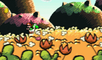
Those trees/bushes.. i don't know if it's meant to be really water paintish but this honestly look like somoene took the lasso, filled a shape with green, then painted in 5 secondes some orange on it. Then he copied that on the whole level as a background.

The cream mountain is one of the ugliest thing i've ever seen in a videogame. A clueless shape with a texture applied to it. And why are the coins that contrasted and almost not discernible ? Actualyl i begin to think they applied some kind of bloom with ultra contrast on top of their screens for whatever reasons...

JoawDs0.png

The crystals (is that crystals ?) are heavily blurred/median filttered or i don't know why from something with no details it seems. Too contrasted, with a creamy puky overlighted area.. This is on top of a similar green poo with a 2D texture on top of it as a "material".
The coins omg.. we can see the cutout, the badly erased edge of them, like if they actually took something somewhere and quickly paste it as game graphics.

The yellow bridge, if you look at it well, seems to have some rest of pixel or something liek that. It's clearly filtered to hide something, and doesn't look the same render as the rest..

xiaQ79X.png


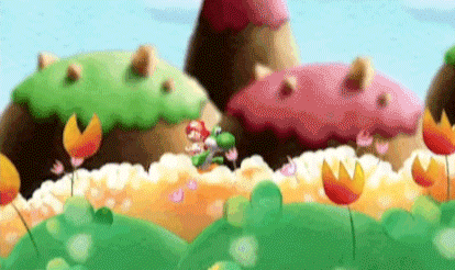
I cannot physically determine the shape of Yoshi in that shot. Talk about visual ergonomics in 2D platformer nowadays. In the first level gif you can also see a yellow flower on top of a yellow background, almost invisible. Nice.
Oh wait i didn't see that fiiiine green to orange to brown shade in the thing at the bottom :p

3D3roHh.png


Wow that screen i don't know where to start...
Just look at the tree for christ sake.. Someting heavily blurred it seems.. The grass has not the same style as the rest, as it has a line that makes it stand out on top of everything liek it has nothing to do there.

Oh and in that other gif, the way this same cloud pop up 3 times in a row hyper quick in the background.. really ? It's like it's not a professional job.

Actually, the more i think about it, the more it seems Nintendo just showed us a demo project..
 
in the case of both this and the link to the past sequel, i think the chief concern was making sure both stood out in 3d as well as 2d. i had a chance to see the snes yoshi's island in motion at e3 2010, and while the game looked as good as ever, there's just way too much shit going on the screen at the same time to reasonably understand what the focus should be. i imagine that an isometric sprite-based zelda would be similarly disorienting for many people, or the effect simply wouldn't work well at all.

while i prefer the look of the snes games, i don't dislike the new direction. plus, i believe it was mostly an intentional design choice.
 
I think you have to do some pretty crazy mental loops to imagine these 5 minute hack job sprites are better than the 16bit counterparts. Seriously, all they did was take some 3d models, pose em, and then sprite them. They clash with so much of the environmental art (some of which is also created in this manner).

Looks not too pretty.

The big rock is the funniest part to me. In the original it looks cool with the different tones of color. In the new one it is just one big textured (barely) block sitting there.
 
I'd say in that current form, the 3ds game has zero graphical budget.
Not even an hyperbole. I'm convinced this is stock holder, not done by a dedicated graphic team. Sure, it took time still.
Now if the art direction of this Yoshi is not that bad actually, i mean it works in term of colors, the real problem, that is not debatable and not a subjective matter, is that it represents a lot less work than the original. That's the problem here, Nintendo being cheap.

I'm sorry man, your art is cool but I'm getting the "ultimate authority on art" vibes from you in this thread. I'm a designer/artist myself and I honestly cant understand how you say some of the things you are saying.
Zero graphical budget? Stock assets? Factually less demanding than the SNES game?

What?

I think you have to do some pretty crazy mental loops to imagine these 5 minute hack job sprites are better than the 16bit counterparts. Seriously, all they did was take some 3d models, pose em, and then sprite them. They clash with so much of the environmental art (some of which is also created in this manner).

Looks not too pretty.

All they did? You say that as if its a 2 minute cakewalk of a job.
 
I'm sorry man, your art is cool but I'm getting the "ultimate authority on art" vibes from you in this thread. I'm a designer/artist myself and I honestly cant understand how you say some of the things you are saying.
Zero graphical budget? Stock assets? Factually less demanding than the SNES game?

What?


All they did? You say that as if its a 2 minute cakewalk of a job.


I would have said the same about the "ultimate authority on art", but since orioto had a lot of arguments, I doubt this is the case. While I highly disagree with people saying it looks bad or inferior to the SNES game, I think he kinda have a point, or at least, something with solid arguments.
 
I definitely like the older artstyle better... but I think it's getting a little hyperbolic. In motion on the 3DS it doesn't look bad, and certainly not bad enough that I won't play it.


I'm far more interested at this point in how it plays. Artoon's DS game was horrendous. I couldn't stomach playing it, and believe me I tried hard. I wanted to love that game like I loved the SNES title... but it just wasn't there.
 
The higher quality video of the game looks a lot better than that animated gif that keeps getting posted. The thick black lines and large chalk strokes of the original game's style simply look more readable when squeezed down to a tiny gif window.
 
I'm sorry man, your art is cool but I'm getting the "ultimate authority on art" vibes from you in this thread. I'm a designer/artist myself and I honestly cant understand how you say some of the things you are saying.
Zero graphical budget? Stock assets? Factually less demanding than the SNES game?

What?

You're just assuming things based on who i am there.. I post there like anyone, i have my opinion, and i believe in it, like anyone else :p I'm not referring to my art or anything, other people do.
And i'm not the only one thinking that about this game by the way! Look at the thread.
 
I think the backgrounds and environments look good. But those 3D models... and they move awkwardly :X

Also Yoshi's feet, damn.
 
I think people can justify their viewpoints in a multitude of ways, and quite often they will entail valid concerns. But there is one eternal truth behind it all: nostalgia is one hell of a drug.
 
I think the backgrounds and environments look good. But those 3D models... and they move awkwardly :X

Also Yoshi's feet, damn.

Yoshi's feet look similar to how it was in the opening cinema style of Yoshi's Island. I'm pretty sure they're going for that look.
 
Yoshi's feet look similar to how it was in the opening cinema style of Yoshi's Island. I'm pretty sure they're going for that look.
It still looks awkward. That model was pre-rendered in the opening. The 3D model used in this new game just looks out of place with the 2D backgrounds.

I think people can justify their viewpoints in a multitude of ways, and quite often they will entail valid concerns. But there is one eternal truth behind it all: nostalgia is one hell of a drug.
Stop pulling the nostalgia card. I have a group of friends that played Yoshi's Island for the first time ever last summer, and aside from thinking the game plays fantastic, they think the game looks fantastic too. And they think it looks far better than the 3DS game.

I'll admit that I certainly have a lot of nostalgia for the original, but that's not blinding me in the comparisons I make to the 3DS game. I never played the DS sequel, but from the looks of it, it looks just as good if not better than the SNES original. The 3DS version just doesn't look that good. It looks incredibly aged, even more so than Yoshi's Story. Either of the first 2 Yoshi's Island could release for the first time ever on the eShop today, and they'd still be praised for how good they look.
 
Top Bottom