-
Hey, guest user. Hope you're enjoying NeoGAF! Have you considered registering for an account? Come join us and add your take to the daily discourse.
You are using an out of date browser. It may not display this or other websites correctly.
You should upgrade or use an alternative browser.
You should upgrade or use an alternative browser.
New Yoshi's Island announced for 3DS!
- Thread starter Shadowlink
- Start date
Zoramon089
Banned
Edit: This is what a properly watercolored background looks like:
There's no such thing as "proper" watercolor. There isn't 1 particular way to paint in watercolor
KeeSomething
Banned
Why does it look worse than Yoshi's Island for SNES and Yoshi's Story?
I like that Nintendo are trying out a new art style with the game. A series like Yoshi ought to evolve with far more experimental art styles and try new things each time hence why I hope the Plush Yoshi game isn't an Epic Yarn pastiche.
It would be the perfect series Nintendo can bring experimental artistic innovation to, because the art is what almost always makes Yoshi games into the charming games they are.
Nibel has gone HD!
It would be the perfect series Nintendo can bring experimental artistic innovation to, because the art is what almost always makes Yoshi games into the charming games they are.

from the press site
Nibel has gone HD!
True Underdog
Member

Haha holy shit this looks great.
Jacksonlee
Member
damn... the 3d really took away nintendo magic from me
Dude, I'm somewhat perturbed by the fact that the 18 year old SNES predecessor looks considerably better than that.
ya
 looks ok... i guess. i hate that they cant have all old school style sprites for some reason, this at least looks a lil better than NSMB's art style blech.
Yeah I agree. The original had a had an drawn feeling to it but this......I dunno:
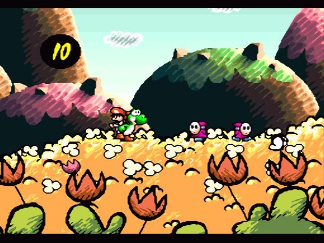
Yeah. This was also made with the Super FX 2 so it shows what good art and good tech (2D wise) can do together. The 3DS version looks a bit strange and flat. Not bad, just not as amazing.
WordAssassin
Member
Yeah, just a little muddy imo.Eh, "properly watercolored" or not, it still looks pretty great to me.
There's no such thing as "proper" watercolor. There isn't 1 particular way to paint in watercolor
Well, ok, yes. That's true, there isn't. I'm just referring to... I don't know how to word it. It's completely subjective, I'm just used to... "beautiful" watercolor things ala Chris Sanders, and these backgrounds, while nice, are very... 'amateur' looking. But it's totally personal opinion and I'm sure it's the look and style that Nintendo were going for.
One thing in particular that bothers me is that watercolors always tend to have soft edged, but since these are multi-plane levels with scrolling layers and backgrounds, everything has a very sharp harsh edge to it that makes it look like it was painted on thick paper and then cut out and layered. There's no way around this, especially on a 3DS, and again it was probably intentional. It just bothers my eye.
Edit: On another note, Yoshi clearly has no legs in this version. Yoshi from the intro movie to Yoshi's Island CONFIRMED.
Franklinator
Member
Looks pretty good, but I wish it were 2D sprites. But the art is interesting nonetheless. Ah well, I'm still pumped for another Yoshi's Island!
GiantBreadbug
Member
Kinda wish they'd stuck with a 2D sprite for Yoshi and Baby Mario, but I'm sure this looks better with the 3D turned on.
So damn hype for this. Love the Yoshi's Island series.
Now, I would like to hear more on Yarn Yoshi, please and thank you.
So damn hype for this. Love the Yoshi's Island series.
Now, I would like to hear more on Yarn Yoshi, please and thank you.
SupraDarky
Member
My biggest worry is, by far, the music. If what we hear in the trailer is any indication, Kondo's magic shall be missed. Yoshi's Island DS had 1, maybe 2 good tracks in total, and it's one of the main reasons I was so disappointed with it.
-Pyromaniac-
Member
Just like with LTTP, same thing here, the original definitely looks better. But whatever, hoping it's fun at least, which it should be.
Davey Cakes
Member
The game looks "painted" in a different way than the original. Or more of a combination of hand-drawn and painted on canvas.
Future PhaZe
Member
Looks pretty bad visually
Got SUPER HYPE until I saw the art..
I don't know, it's not bad but it's just not the same and I prefer the original. I would've preferred the same or the yarn style.
Some of the videos/screens look fairly inconsistent so I'll have to see it IRL to be the judge but right now I'm kinda iffy on this.
I don't know, it's not bad but it's just not the same and I prefer the original. I would've preferred the same or the yarn style.
Some of the videos/screens look fairly inconsistent so I'll have to see it IRL to be the judge but right now I'm kinda iffy on this.
Just looks like a whole mess of different styles. There's objects with and without outlines, there's different styles of shading, there's a water color look to certain parts, a canvas look to to others, and on some what looks like sponge paint. There's diagonal and horizontal strokes. Some backgrounds look like they just had a Photoshop filter applied, others like they were hand drawn, some look intentionally flat, others almost like clay. The shading is inconsistent, there's soft transitions and harsh shadows on objects on the same plane. And the combination of sprites and 3d objects certainly doesn't help.
It's all very odd.
It's all very odd.
TalesOfWin
Banned
If this is Artoon again...
tears will be had
I must be the only one who liked YIDS.
After seeing this and the new Zelda, it seems like Nintendo is starting to rely too heavily on the 3DS's graphic effects (since they are cheap to implement, from a processing point of view). I much prefer stylized art to realistic lighting and shading in my Nintendo games.
If this is Artoon again...
tears will be had
Artoon doesn't exist anymore.
I must be the only one who liked YIDS.
The partner gimmick was a drag but I'll be honest and say that the main reason I hate Yoshi's Island DS is because of the music.
It's so bad and the castle music in particular makes me mad listening to it.
TalesOfWin
Banned
The partner gimmick was a drag but I'll be honest and say that the main reason I hate Yoshi's Island DS is because of the music.
It's so bad and the castle music in particular makes me mad listening to it.
well it is not like the NSMB music is any better.
thecouncil
Banned
I must be the only one who liked YIDS.
it was great. people cant get past the music. it ruined their lives.
This looks hideous. Good thing, it's not a shot of the original game.
ConradCervantes
Banned
Yep, Yoshi's Island DS was a perfectly acceptable game. Hyperbole rules Gaming side with an iron fist, and don't believe any differently.
Electivirus
Member
Yoshi's Island DS was rad as hell, imo. Beyond the crazy difficulty later in the game, I had a blast.
GhaleonQ
Member
If it's the year of Luigi and Yoshi, it's a good year. I'm all over new Mario Versus Donkey Kong, too.
BOOOOOOOOOOOOOOOOOOOOOO!
It's the best "soundtrack-made-of-remixes-of-the-same-song" since Super Mario World.
http://www.youtube.com/watch?v=IXFiRjiPKEA That's what the New Super Mario Brothers subseries tries to do and fails at doing. WHAA, WHAA.
And the music. Such a disappointment compared to the first game's soundtrack.
The partner gimmick was a drag but I'll be honest and say that the main reason I hate Yoshi's Island DS is because of the music.
It's so bad and the castle music in particular makes me mad listening to it.
BOOOOOOOOOOOOOOOOOOOOOO!
It's the best "soundtrack-made-of-remixes-of-the-same-song" since Super Mario World.
http://www.youtube.com/watch?v=IXFiRjiPKEA That's what the New Super Mario Brothers subseries tries to do and fails at doing. WHAA, WHAA.
Chet Rippo
Member
I thought this was the year of Luigi. What gives?
I like what I see.
chickdigger802
Banned
Been wondering, did nintendo fire all their 2d sprite artist folks recently?
When was their last 2d sprites game? bowser inside story?
When was their last 2d sprites game? bowser inside story?
I must be the only one who liked YIDS.
I liked it, but didn't love it, mostly because I don't think it did anything particularly well. I can't remember any of its music, I can't remember any specific level... The whole thing was just competent and there was nothing memorable about it.
Incendiary
Banned
Ugh. Not everything has to be 3D character models Nintendo. I feel like they're applying New Super Mario Bros. to all their franchises. I guess maybe with the 3D effect, sprites don't work as well?
If this were a Yoshi's Island with the old art style I'd be there day one. As is....I don't know. I'll have to see more.
If this were a Yoshi's Island with the old art style I'd be there day one. As is....I don't know. I'll have to see more.
Zaraki_Kenpachi
Member
Looks kind of ugly... I'm glad another one is finally coming out though.
Vampirolol
Member
BOOOOOOOOOOOOOOOOOOOOOO!
It's the best "soundtrack-made-of-remixes-of-the-same-song" since Super Mario World.
YES! Totally agree man, the soundtrack is worse than the one in YS, but it's really cute and some remixes are pretty cool. Even the castle music isn't that bad to me.