Problem:
The U.K. charts that show the number of titles per week treat #1 equal to #40 (i.e. They both count 1 toward the total). This is obviously not a fair treatment as #1 is worth a lot more than #40.
However, how do we determine how much each position is worth without knowing the actual sales numbers? Answer: We can't ... exactly, but there may be a way to give a feel for how much weight each position actually holds. Hearkening back to a post I made many months ago in a PAL thread, I did some figuring.
Details for those interested:
1. Put the data into Excel.
2. Graphed it.
3. Added a power series trendline.
That came out with the equation y = 157472x^-0.828 with an R^2 value of 0.9846 (i.e. pretty close to the input data). Using that I came up with the following point system giving 20 points to #1 and 1 point to #40.
1. 20.00
2. 11.29
3. 8.09
4. 6.39
5. 5.32
6. 4.58
7. 4.04
8. 3.62
9. 3.29
10. 3.02
11. 2.80
12. 2.61
13. 2.44
14. 2.30
15. 2.18
16. 2.07
17. 1.97
18. 1.88
19. 1.80
20. 1.73
21. 1.66
22. 1.60
23. 1.55
24. 1.50
25. 1.45
26. 1.40
27. 1.36
28. 1.32
29. 1.29
30. 1.25
31. 1.22
32. 1.19
33. 1.16
34. 1.14
35. 1.11
36. 1.09
37. 1.06
38. 1.04
39. 1.02
40. 1.00
This is not an exact representation of the sales for positions 1-40. This is only meant as a, hopefully, better way to give weight to positions 1-40 than making them all worth the same. Take it as a guide and not an absolute.
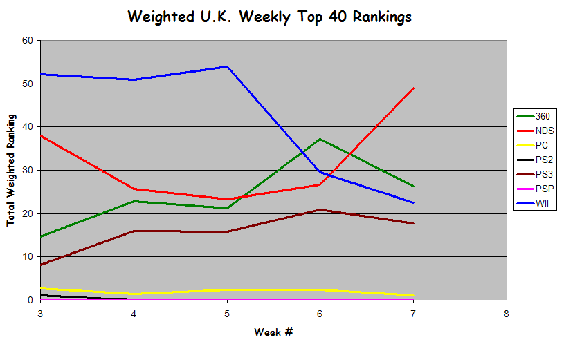
Using this point system, here's another take on how each system has done for the past five weeks.
If people think this is useful, I'll try to keep it up in the PAL threads. Otherwise, this'll be a one-off thing.
The U.K. charts that show the number of titles per week treat #1 equal to #40 (i.e. They both count 1 toward the total). This is obviously not a fair treatment as #1 is worth a lot more than #40.
However, how do we determine how much each position is worth without knowing the actual sales numbers? Answer: We can't ... exactly, but there may be a way to give a feel for how much weight each position actually holds. Hearkening back to a post I made many months ago in a PAL thread, I did some figuring.
Details for those interested:
1. Put the data into Excel.
2. Graphed it.
3. Added a power series trendline.
That came out with the equation y = 157472x^-0.828 with an R^2 value of 0.9846 (i.e. pretty close to the input data). Using that I came up with the following point system giving 20 points to #1 and 1 point to #40.
1. 20.00
2. 11.29
3. 8.09
4. 6.39
5. 5.32
6. 4.58
7. 4.04
8. 3.62
9. 3.29
10. 3.02
11. 2.80
12. 2.61
13. 2.44
14. 2.30
15. 2.18
16. 2.07
17. 1.97
18. 1.88
19. 1.80
20. 1.73
21. 1.66
22. 1.60
23. 1.55
24. 1.50
25. 1.45
26. 1.40
27. 1.36
28. 1.32
29. 1.29
30. 1.25
31. 1.22
32. 1.19
33. 1.16
34. 1.14
35. 1.11
36. 1.09
37. 1.06
38. 1.04
39. 1.02
40. 1.00
This is not an exact representation of the sales for positions 1-40. This is only meant as a, hopefully, better way to give weight to positions 1-40 than making them all worth the same. Take it as a guide and not an absolute.
Using this point system, here's another take on how each system has done for the past five weeks.
If people think this is useful, I'll try to keep it up in the PAL threads. Otherwise, this'll be a one-off thing.