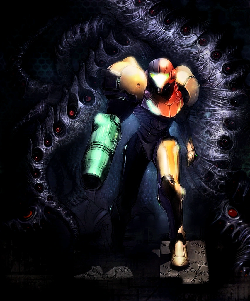
I enjoy the rare but always interesting fan art that indulges the "exoskeleton" suit theory of Samus body mechanics.
Here the concept is handled by Udon artist and hardcore game fan Robaato.
This way the anatomy of the suit, and her own comparative anatomy are not in obvious conflict. Also, it makes the morphball seem more practical, and it makes a suited up Samus seem all the more intimidating.
The drawing in the OP is pretty damn cool, but it does have some details that detract from it in my view.
I really like sexy pics of Samus and I have no problem with her nipples being rendered however the artist sees fit, I just think people should be honest about WHY the soft mound of her areolas are somehow visible beneath a layer of material.
To that end, I made a quick sketch of Solid Snake. He wears a tight suit, much like Samus.
Somehow I never before thought to draw his erect nipples through his sneaking suit.
Until now.
I cheated one of his nipples over a little bit, away from where it really ought to be, but LOL realism and all that.
Hey, if you notice his oddly erect nipples I think YOU HAVE THE PROBLEM
or your eyes and critical faculties actually work.
The big issue is physical appearance vs the actual character. Samus' personality and 'feel' was established by her games when she's in the suit. She's a serious, no nonsense, get the job done kind of person. No flair, no one-liners, just get straight to business, get in get out. She is in constant mortal danger, traversing the extremes of the galaxy. No crying, screaming, or fear. She is experienced, older, athletic, and a loner.
All this means she would not even think of wearing make up (let alone while in the suit, dear gott) and she would not have long hair (or if she did, it would be in a low pony tail). She'd have a thousand yard stare and would probably have scars or burns on her face/ body. The Zero Suit makes sense and could serve many purposes, so I'm not complaining about that, but high heels? come on. Raiden has high heels because he's a flamboyant cyborg and that fits into the MGS style and universe just fine, so don't bring that up.
But the argument is always 'why can't samus be cute/pretty and super sexy while being all those other things?" Because it makes no sense and is actually against her character. They made her sexy and whatever literally just to titillate players, ignoring anything about her personality or job. I don't care about feminists complaining and I hate white knights, this is just about an awesome character that was pooped on by her creators (from day one) because she happened to be a female- and sex sells.
Obviously she'd still be attractive, but with actual care and attention to her character. ZSS is just cliched, stereotypical sex appeal. She is oft compared to Cap Falcon, except Falcon's attire matches his work and personality.
I typed this all up so I can paste it into every metroid argument thread from now on. My will shall be known.
This is all ignoring fan art though, I firmly believe fan art should not have any limits/ hate for making a character how they want. So if you want overtly sexy samus, all the fanart is there.
Awful, awful artwork. I don't even care about the perky nipple (though it's stupid and pandering), it's the messed up proportions and posture that are godawful.
It's amazing how many artists have zero fucking clue about basic human anatomy. Well, female anatomy anyway. This is worthy of Escher Girls.
I hope this is a joke. This artwork is just as bad as the one in the OP, maybe even worse. It reminds me of Rob Liefeld and that's never, ever good. Why is her thigh and leg folded stupidly like that? Oh right, to imitate every idiotic American comic book design out there, right? And of course obligatory spine-twisting boobs-and-butt pose and ridiculous waist. Ugh, no. Another textbook Escher Girl. Too bad because the retro style had some potential charm to it.
I hope this is a joke. This artwork is just as bad as the one in the OP, maybe even worse. It reminds me of Rob Liefeld and that's never, ever good. Why is her thigh and leg folded stupidly like that? Oh right, to imitate every idiotic American comic book design out there, right? And of course obligatory spine-twisting boobs-and-butt pose and ridiculous waist. Ugh, no. Another textbook Escher Girl. Too bad because the retro style had some potential charm to it.
But that's exactly what I thought it was going for, right? Sort of like a Jetson's era (1960) style on animation/design that's sort of built on the foundations of stereotypical objectification of very cardboard like archetypes. At least that's what I hope it was going for, since it nailed it down to a tee. Or maybe I'm giving deviantart too much credit? =/
But yea, I like the other ones you've quoted more, since they match the tone that the franchise was built around.
Yeah, in the same way Boris Vallejo is really artistic. Yeah, yeah, some good artists actually post there as a promotional tool, but let's not kid ourselves. Deviant Art is mostly high school tier fantasy and hopelessly cheeseball Photoshop nightmares.
I hope this is a joke. This artwork is just as bad as the one in the OP, maybe even worse. It reminds me of Rob Liefeld and that's never, ever good. Why is her thigh and leg folded stupidly like that? Oh right, to imitate every idiotic American comic book design out there, right? And of course obligatory spine-twisting boobs-and-butt pose and ridiculous waist. Ugh, no. Another textbook Escher Girl. Too bad because the retro style had some potential charm to it.
But that's exactly what I thought it was going for, right? Sort of like a Jetson's era (1960) style on animation/design that's sort of built on the foundations of stereotypical objectification of very cardboard like archetypes. At least that's what I hope it was going for, since it nailed it down to a tee. Or maybe I'm giving deviantart too much credit? =/
No doubt that's what it was going for. But why not simply appropriate the old-school retro charming style, without the awful poses and objectification? That would have actually made the artwork stronger. Instead it's just yet another horrid Rob Liefeld wanna-be. Simply repeating an awful style because it's retro doesn't suddenly make it not-awful.
Unless they were going for extreme parody, but then I doubt it since people actually like it... -_-
Because the illustrator had an idea and wanted to stick to it? And it turned out very coherent in my opinion, unlike, say, the art in the OP.
Exaggeration is a thing in artwork, including exaggeration for sex appeal. It would have been troubling if the artist stuck that wasp waist into a realistic art style, but it fits right into what they were going for.
EDIT: I guess you do have a point the artist could have dropped the sexualization of the style being mimicked.
No doubt that's what it was going for. But why not simply appropriate the old-school retro charming style, without the awful poses and objectification? That would have actually made the artwork stronger. Instead it's just yet another horrid Rob Liefeld wanna-be. Simply repeating an awful style because it's retro doesn't suddenly make it not-awful.
Unless they were going for extreme parody, but then I doubt it since people actually like it... -_-
Yea, i feel you. I guess because I'm a guy I'm less affronted, and my brain nostalgias out like "oh cool, it's like those old timey cartoons," where as it probably causes girls to roll their eyes, because it really is as misogynistic as those toons.
Awful, awful artwork. I don't even care about the perky nipple (though it's stupid and pandering), it's the messed up proportions and posture that are godawful.
It's amazing how many artists have zero fucking clue about basic human anatomy. Well, female anatomy anyway. This is worthy of Escher Girls.
Lol oh my god some of the stuff on that site is ridiculous. I can't believe some people think that looks good. Specifically when your character is doing things humanly impossible to get the best ass/tits shot, making them way less sexy than they otherwise would have been anyway.
I really like the ones where he/she redraws the bad art to show what it should look like. That's really eye opening. Good stuff.
All of that said, I still think the Jetsons-Samus picture in this thread is pretty cute. The OP art is all sorts of messed up, but the Jetsons one is certainly one of the less-offensive pieces of fan art I've seen, so I'm cool with it.
The big issue is physical appearance vs the actual character. Samus' personality and 'feel' was established by her games when she's in the suit. She's a serious, no nonsense, get the job done kind of person. No flair, no one-liners, just get straight to business, get in get out. She is in constant mortal danger, traversing the extremes of the galaxy. No crying, screaming, or fear. She is experienced, older, athletic, and a loner.
All this means she would not even think of wearing make up (let alone while in the suit, dear gott) and she would not have long hair (or if she did, it would be in a low pony tail). She'd have a thousand yard stare and would probably have scars or burns on her face/ body. The Zero Suit makes sense and could serve many purposes, so I'm not complaining about that, but high heels? come on. Raiden has high heels because he's a flamboyant cyborg and that fits into the MGS style and universe just fine, so don't bring that up.
I absolutely do not agree with the bold at all. It's entirely unrelated. There's nothing about being a serious, strong, fearless individual that goes against the bolded.
The big issue is physical appearance vs the actual character. Samus' personality and 'feel' was established by her games when she's in the suit. She's a serious, no nonsense, get the job done kind of person. No flair, no one-liners, just get straight to business, get in get out. She is in constant mortal danger, traversing the extremes of the galaxy. No crying, screaming, or fear. She is experienced, older, athletic, and a loner.
All this means she would not even think of wearing make up (let alone while in the suit, dear gott) and she would not have long hair (or if she did, it would be in a low pony tail). She'd have a thousand yard stare and would probably have scars or burns on her face/ body. The Zero Suit makes sense and could serve many purposes, so I'm not complaining about that, but high heels? come on. Raiden has high heels because he's a flamboyant cyborg and that fits into the MGS style and universe just fine, so don't bring that up.
But the argument is always 'why can't samus be cute/pretty and super sexy while being all those other things?" Because it makes no sense and is actually against her character. They made her sexy and whatever literally just to titillate players, ignoring anything about her personality or job. I don't care about feminists complaining and I hate white knights, this is just about an awesome character that was pooped on by her creators (from day one) because she happened to be a female- and sex sells.
Obviously she'd still be attractive, but with actual care and attention to her character. ZSS is just cliched, stereotypical sex appeal. She is oft compared to Cap Falcon, except Falcon's attire matches his work and personality.
I typed this all up so I can paste it into every metroid argument thread from now on. My will shall be known.
This is all ignoring fan art though, I firmly believe fan art should not have any limits/ hate for making a character how they want. So if you want overtly sexy samus, all the fanart is there.
But. 1. Most ZSS designs do have her in a ponytail so yeah (even tho I love the design Dennis posted.) Her hair is all over the place in the OP piece because she more than likely is in a fight in which her suit it taking heavy damage so the hair probably is loosened by impact and stuff.
2. as for character? what Character? Samus pretty much a blank slate for a long time with any characterization coming from the manga and Other M ironically. Everything else was what fans came up with. Her basic character was "shoots Metroids and doesn't afraid of nothing" So what character. Samus has just as much character as any of Nintendo stars sans a few like Fox or someone. Very little as they are simply player avatars at a certain point.
3. Personally, I don't get the whole highheels rage but I will give you that. It seems to be a team Ninja standard at this point lol. At least Sakurai found use for them...right?
But in the end, I don't find any problem with her being sexy or whatever. It doesn't go against her being badass (it actual enhances it for me because she isn't the "realistic" version of what a female baddass is supposed to be). I think it was more so to go against what players of the time expected. Samus was created in a era where most videogame stars were Big Burly Macho men based off of the action stars of the time. The end game reveal came after many played the game with the idea that they were just that. Arnold or Sly in a suit...and then boom nope...you actually were a pretty lady in a suit. It was the contrast. I think that was the point from jump. The idea that a pretty lady was the one fighting off the most dangerous mofos in the galaxy was super new at that time as the few female protags were super girly and their games often the same. That is what made Samus special. I think that would have been lost (and perhaps impossible to show) with Samus was just Vasquez from Alien. Because that would be more expected at the time IMO. Samus's look is meant to contrast with her job and ability. It always has..thus the shocking reveal.
I hope this is a joke. This artwork is just as bad as the one in the OP, maybe even worse. It reminds me of Rob Liefeld and that's never, ever good. Why is her thigh and leg folded stupidly like that? Oh right, to imitate every idiotic American comic book design out there, right? And of course obligatory spine-twisting boobs-and-butt pose and ridiculous waist. Ugh, no. Another textbook Escher Girl. Too bad because the retro style had some potential charm to it.
Of course the proportions are out of whack. It's imitating the 50's/60's style cartoon pin-up which were never anatomically correct. It knows what it is and what it wants to be which is why the art style is easily identifiable, not leaving the viewer confused so that they can enjoy the work itself.
It's unlike the image OP posted, where awkward positioning and weird proportions to showcase her right breast conflict with the high depth-creating coloring and linework. Which will confuse many viewers who study the work. That's what brings the whole piece down.
I just find the idea that Samus cannot be pretty kinda dumb and ironic considering the reason oft given is that it makes her less awesome or something.
The drawing in the OP is pretty damn cool, but it does have some details that detract from it in my view.
I really like sexy pics of Samus and I have no problem with her nipples being rendered however the artist sees fit, I just think people should be honest about WHY the soft mound of her areolas are somehow visible beneath a layer of material.
To that end, I made a quick sketch of Solid Snake. He wears a tight suit, much like Samus.
Somehow I never before thought to draw his erect nipples through his sneaking suit.
Until now.
I cheated one of his nipples over a little bit, away from where it really ought to be, but LOL realism and all that.
Hey, if you notice his oddly erect nipples I think YOU HAVE THE PROBLEM
or your eyes and critical faculties actually work.
2. as for character? what Character? Samus pretty much a blank slate for a long time with any characterization coming from the manga and Other M ironically.
Because this didn't happen. Because wasting time acknowledging a dead soldier didn't happen. Because saving the Luminoth instead of just waiting for them to repair her ship didn't happen. Because sparing a baby Metroid against her mission orders and giving it to science didn't happen. Because rescuing a few animals while a planet was collapsing around her didn't happen. Because saying "Fuck the Federation, I'm wiping out this space station" didn't happen.
Could we just drop the whole stupid "Samus was a completely blank slate until Other M came and gave her personality" bullshit?
People are not mad because there is a nipple. People are mad because the nipple was only put there to make Samus look sexy. Samus is not a sex symbol. Plus it is just weird seeing Nentendo girls that a sexed up.
I was always under the impression that the Zero Suit was some sort of vinyl material because of how shiny it was but you can see her fingernails through her Zero Suit in recent this Smash Bros Wii U art, so maybe she's just been painted blue all along.
Absolutely. Meaning her left shoulder is probably dislocated and her actual left boob is nonexistent. Look at the shadows/lights and the way her suit is aligned at the left side of her torso; nothing in there indicates the presence of the left breast, especially if it were to be the same size as the right one.
And regardless, her head is WAY too huge compared to the torso. Almost twice too big.
The nipple isn't even the worst thing, the anatomy is all over the place in that fanart. Why is her right boob in the center of her chest. Why is her head so freaking huge. Why is her arm so thin? WHERE DID HER NECK GO?
The artist is crazy talented and the picture looks awesome, until you take a closer look and notice all the weird things.
I think one of the problematic aspects of discussions like this is the false dichotomy drawn between "strong" and "sexy" female characters, such that, on the one hand, you have aggressive, stoic, sex-less, take-no-shit characters, and, on the other, you have passive, erotic, sexy play-kittens. Samus being a strong female character should not prevent her from being presented as sexy, and vice versa.
The problem with the image in the OP, however, is that the sexualisation in it is just stupid. Apart from the issues I've raised before, I can't help but feel that an erect nipple isn't actually that sexy. The skin-tight nature of Samus' Zero Suit should be sexy enough without an out-of-place and illogical nipple.
I was always under the impression that the Zero Suit was some sort of vinyl material because of how shiny it was but you can see her fingernails through her Zero Suit in recent this Smash Bros Wii U art, so maybe she's just been painted blue all along.
Yep. I don't know why so many people seem to be all trying to be safe and "proper" or whatever. Like "Well I never!" lol. Stop. It's normal. It's not like she's even nude. That suit is skin tight and futuristic. Probably doesn't need a bra so there is not padding that would normally hide that.
I was always under the impression that the Zero Suit was some sort of vinyl material because of how shiny it was but you can see her fingernails through her Zero Suit in recent this Smash Bros Wii U art, so maybe she's just been painted blue all along.
If people still don't understand what the problem with the art is after reading the explanations sprinkled throughout the thread, I really have no idea what to say. I am just baffled.
You should recognize the difference between 'being sexy' and 'sexualization.' It has absolutely nothing to do with being a prude.
I see nothing wrong. It doesn't look like it's going for sexualization at all. Oh wow a nipple shape forming from the suit. Anything else making her look sexualized? Not that I can see. You can't even see her lower half or anything else. I doubt the guy was like "I want people to be like "oh yeah that's hot""
I was always under the impression that the Zero Suit was some sort of vinyl material because of how shiny it was but you can see her fingernails through her Zero Suit in recent this Smash Bros Wii U art, so maybe she's just been painted blue all along.
LOL. Well, even in that one, you don't see her nipples despite the skintight suit! Where is the "women have nipples! why can't we see her nipples" outrage from the biotruthers now? XD
Nevermind the costume, those ridiculous (and ugly) high heels are what's really offensive about this picture.
(And again with that stupid leg folding... why do they do this... no, women don't arbitrarily bend their knees in such manners! I know, shocking! XD)
Beat me to it. Interesting idea. But all the effects and stuff just get in the way. Which doesn't make much of a difference because I don't think the art itself is very good. basically to re-iterate what others have said about her posture, boobs, angle of shot I also don't get what the heck is happening? Is her armour breaking off? There's better art in this thread.
Oh and that Metroid 25th anniversary picture is pretty sad


")


.jpg)


