• Hey, guest user. Hope you're enjoying NeoGAF! Have you considered registering for an account? Come join us and add your take to the daily discourse.

YouTube has a new logo, redesigned desktop and mobile app

Vuze

Member
Just launched the app on my iPad after the update. Oh boy. What kind of bootleg-esque app is that? The font is awful and the overly bright red logo... ehhh

At least I can still use my channel unlike on a certain other device that they updated YouTube on.
 
I understand why they updated the logo. Now the icon they've been using all this time is actually part of the logo. It's also really iconic by now.
But the wordmark on its own doesn't seem unique enough to stand on its own. So it looks really strange now (but it will grow on you) and looks even more out of place in the embedded player. When Tube was in a box, it was a solid standalone logo that looked actionable. Now, not so much.
 

Cipherr

Member
This is literally the first time they've changed their logo in their 12 years of existence.

All the other small changes have been like minor stuff, this is one of the major changes.

But people just don't like changes in general. They just don't... Every time some logo change or something happens people bug out over it lol. It really is true what they say about getting old and reacting to change.
 

itwasTuesday

He wasn't alone.
ew man, chromecast support is all kinds of jacked up
playlist don't work
the control tab doesn't appear
even connecting seems to be sketchy when it chooses to work

it's also ugly

I can't find any official vertical videos so see if they actually encode for the resolution or just pillarbox and crop for vertical screens.

still ugly on desktop
 

VE3TRO

Formerly Gizmowned
I've discovered recently on mobile youtube you can double tap on the left or right side of the video to skip 10 seconds forward or back.

Don't know if that's new, but I love this feature.

If you keep tapping it increases the time added. Great to skip minutes through.
 
I've discovered recently on mobile youtube you can double tap on the left or right side of the video to skip 10 seconds forward or back.

Don't know if that's new, but I love this feature.

It's been in before this update, but still fairly new. It's so handy that I automatically try to do it on Desktop sometimes.
 

KtSlime

Member
The new logo is okay, a bit wide but will be easy to get used to, however the new interface is very very white, which does not help with navigation, and the webpage itself is buggier than ever using incorrect labels and putting graphics in the middle of text (and the font isn't very attractive) Worse update in a while.
 
The new layout for the desktop site is awful. Text and icons are needlessly big and the general layout is too streamlined. It's like the interface was made for a mobile device and was just copied and applied there.

The new logo is really uninspired too. It looks even more plain than the last logo. Not very professional in my book.
 

Zaventem

Member
Used an add on for black youtube so seeing it built in naturally is amazing.

Why aren't the thumbs up colored with you like something anymore? Don't really understand why they got rid of it
 

Evilisk

Member
I almost didn't notice the difference with the logo

Megaton right here for me.

It's about freaking time that this got added.

I've discovered recently on mobile youtube you can double tap on the left or right side of the video to skip 10 seconds forward or back.

Don't know if that's new, but I love this feature.

The article makes it sound like it was something from this year only

But yeah, it's a great feature
 

hirokazu

Member
New logo looks like a logical evolution since they've been using that icon for ages already anyway. Finally being able to choose playback speed on the mobile app is a great addition too.

I'm not liking that GIF of the new app though. I don't like any parts of the video to be cropped so to have it cropped by default depending on your viewing orientation and how much other content you want to view just annoys me.

I don't like vertical video because it's terrible on stationary displays but when a video is shot vertically, I can appreciate that I can watch it full screen on my phone or tablet. Depending on the view you choose, this new approach will crop all videos whether vertical or horizontal.
 

Rektash

Member
New desktop site layout is absolutely dreadful. Everything is spaced apart way too much, making elements feel disjointed. This is made even worse by the nearly invisible spacers between elements that completely fail to structure and group elements in a visually concise way.

I don't really care about the font or logo but man, the site itself doesn't feel like it has any structure anymore. Just a big white canvas plastered with shit. Hate it.
 

farisr

Member
I usually don't have problems with redesigns, but the desktop one for this is trash. So much wasted and empty space. Dark theme is almost a requirement now rather than an option.
 

Rootbeer

Banned
Thankfully, ImprovedTube on Chrome seems to work after the change even though the addon hasn't been updated in a while. Make sure to disable the dark theme mode and use the new built-in dark mode the redesign added (fucking FINALLY)
 
I hate the color. Saw it first last night and its such a loud tone of red. It was actually unpleasant on my eyes, looking at my Macbook screen in the dark and seeing this poppy red.
 

Caayn

Member
Modern "clean" UI design in a nutshell, make sure that less content is visible...

knipsel87s4j.png
 

Alienfan

Member
The tool bar at the bottom of the screen is such a terrible idea for Android phones. Most of the Android phones have touch sensitive buttons
 

Coreda

Member
The red color. My eyes. Taking the sample from the Subscribe button it's literally #FF0000, aka the most obnoxious, attention-grabbing red available.

PTJCtfn.jpg


Thankfully userstyles exist.
 

Asbel

Member
Was surprised how much I liked the cleaner ui on a tablet. Sleek and less eye sores now. One of the few times I praise ui design by Google. I hate busy ui as they distract you from your focus. Now where's dark mode for mobile..
 

Diabelli

Member
The red color. My eyes. Taking the sample from the Subscribe button it's literally #FF0000, aka the most obnoxious, attention-grabbing red available.

PTJCtfn.jpg


Thankfully userstyles exist.
Well, there's no where to go from here at least. Honestly, isn't that some kinda design faux pas? If it isn't it fucking should be.
 
I'm at work so I can't test/see, but did they update the Xbox or PS4 apps as well? I know there were a lot of requests for those to be updated with modern underpinnings (higher frame rate/resolution support, etc). Can anyone check/ see? Thanks!
Updates I noticed were preview of video while selected, overlays at end of videos etc actually appear now.
 

CS_Dan

Member
The tool bar at the bottom of the screen is such a terrible idea for Android phones. Most of the Android phones have touch sensitive buttons
I know what you mean but
1) I don't think that's actually true at this point, on-screen buttons are finally very common
2) Screens are now too big for it to be a good idea to have important navigation controls at the top of the screen, out of reach. Chrome is actually moving the address bar to the bottom, Windows Phone style.
 

Lucumo

Member
You still seem to have part of the old design.
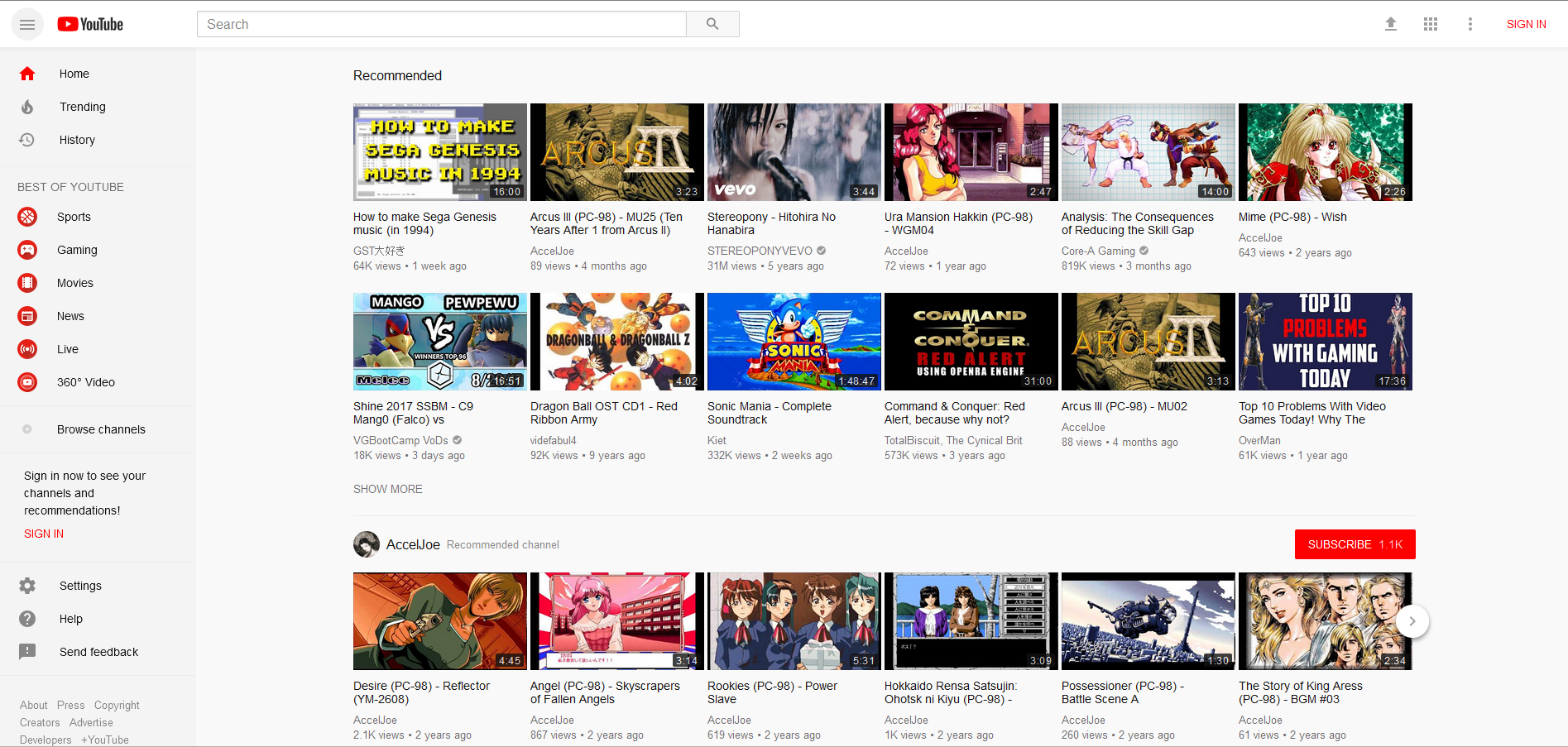
youtube4gsg7.png


Also, the stupid left bar always reappears now whenever I reload the page.
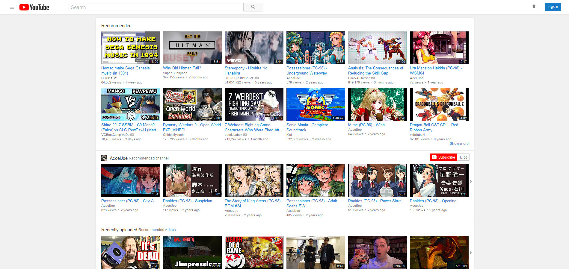
Looks like next to "sign in", there is an option where you can go back to the old design. No more stupid left bar, blue video names again and the site is way more responsive/faster.

youtube1bts9n.png
 
Top Bottom