• Hey, guest user. Hope you're enjoying NeoGAF! Have you considered registering for an account? Come join us and add your take to the daily discourse.

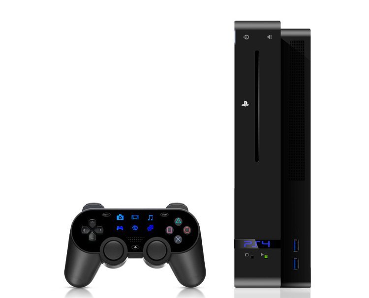
Destructoid: PS4 controller prototype & devkit photo, [Up: New Photo/Info In OP]

alr1ght

bish gets all the credit :)
PS2-4 uber alles
ps2-46us1g.png
 
It would still mean an order of magnitude increase in the price of the controller and a huge hit for the battery life, not to mention the negative public image that they're copying the GamePad. I do not see it happening.

Well that didn't stop them directly cloning the remote and nunchuck.

And it wouldn't be that expensive. LCD touchscreens are cheap, I can't understand the thinking of people that are convinced the GamePad is expensive to produce. It has a bog standard LCD resistive touchscreen, not an LED capacitive one like the Vita.

Unless this touchscreen/touchpad has some sort of haptic technology built in I can't see the point in having one so small.
 

Pachimari

Member
I don't understand those who are mentioning using the touchpad to look around when the right stick or LED bar would get in the way. Wouldn't it?
 
Made a few changes:

ps44459svv.jpg

I'll encompass your changes, though the senosr bar is there for Move not display (pretty much designed it based around what it known at the time.) That and the last thing you want to do with your products is constantly push the branding. People already know they bought a PS4, they don't need to be reminded at every possible moment (my pet peeve with most cellphones and is the one thing I like about iPhone over others. No extra amount of branding, I don't need a reminder I'm on <insert carrier> I don't need a reminder of who made the phone, I don't need a reminder of the phone's name on the front as well as the back, I don't care about the 4G and LTE badge, it's just gaudy). Though good call on the USB ports, I thought about 4 then thought about how much I truly use the four I have on my PS3 even with company over and it's not very much.
 
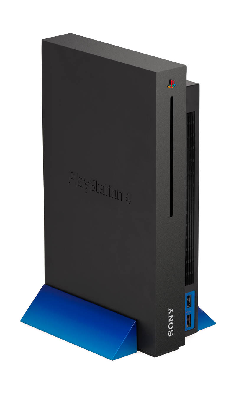
Whipped up something else. Based on Sony's current slogan but like I said going back to what made the PlayStation brand the dominate force that it was (and one can argue still is to a point).

It's read as red-e (Ready.Make.Believe). Paying homage to the original Playstation marketing, but injecting modernism into the entire thing. Giving it a high class feel but still realizing it's a videogame system.

ibbssLxrDVxgMR.jpg
 

Seep

Member
Whipped up something else. Based on Sony's current slogan but like I said going back to what made the PlayStation brand the dominate force that it was (and one can argue still is to a point).

It's read as red-e (Ready.Make.Believe). Paying homage to the original Playstation marketing, but injecting modernism into the entire thing. Giving it a high class feel but still realizing it's a videogame system.

ibbssLxrDVxgMR.jpg

Just needs the coloured PS logo and that is fantastic. Pity the real design won't be as good.
 
Just needs the coloured PS logo and that is fantastic. Pity the real design won't be as good.

I've been going back and forth on the colored logo haha. It's a clash of reasoning for me, I keep flip flopping. Though if Sony's current hardware designs are any indication and their designers are even 1/20th as good as I am. I think the actual model will amaze and make mine look like child's play (I'm a HUGE fan of Sony's product designers and they seem to be coming strong as of 2013, especially if you look at their TV models, Xperia Tablet Z, Odin, BR players).
 

Killthee

helped a brotha out on multiple separate occasions!
Whipped up something else. Based on Sony's current slogan but like I said going back to what made the PlayStation brand the dominate force that it was (and one can argue still is to a point).

It's read as red-e (Ready.Make.Believe). Paying homage to the original Playstation marketing, but injecting modernism into the entire thing. Giving it a high class feel but still realizing it's a videogame system.

ibbssLxrDVxgMR.jpg

What does the dot between "E.Make" stand for? The one in Make.Believe stands for "the place where great things begin. It is where inspiration meets creativity, where creativity meets reality."

MWfdtj4.jpg


God I hated that campaign.
 
What does the dot between "E.Make" stand for? The one in Make.Believe stands for "the place where great things begin. It is where inspiration meets creativity, where creativity meets reality."

MWfdtj4.jpg


God I hated that campaign.

Sony's role in bridging you, make and believe. The thought is you are ready because you purchased it. Likewise if you haven't purchased it, Sony is preparing you.

I have a love hate relationship with the campaign. I personally think each of their products needed their own tagline based on Make.Believe

Example

TVs = Watch.Make.Believe
Music Players = Listen.Make.Believe
Consoles could = Play.Make.Believe (actually like that better than E.Make.Believe)
PC/Tablets/Phones would have been tricky, especially PCs since you're already "making" on them and create.make.believe sounds...kind of dumb.

There are things I like about the campaign and there are things I hate about it. Which is why I was originally researching and creating a new campaign for Sony, but didn't get far because I was just getting anxious for the 20th so I decided to create a PS4 that I would like to see. I'm ADD like that D:
 

Seep

Member
I've been going back and forth on the colored logo haha. It's a clash of reasoning for me, I keep flip flopping. Though if Sony's current hardware designs are any indication and their designers are even 1/20th as good as I am. I think the actual model will amaze and make mine look like child's play (I'm a HUGE fan of Sony's product designers and they seem to be coming strong as of 2013, especially if you look at their TV models, Xperia Tablet Z, Odin, BR players).

T.V's Tablet and Phones look real classy but the Blu-ray players look a bit shit to be blunt, which is where I fear they'll take their design cues from. It'd have to be something special to top yours.
 
I just hope they take inspiration from the previous consoles, mostly from PS2. I truly think it's iconic and they need to incorporate it into the PS4 if they want to reinvigorate both gamers and non gamers alike. PS2 was a product design that on arrival was met with mixed feelings, but as time went on it aged amazingly wonderfully. Everything about it was just amazing to me, especially the packaging. Just having "PS2: Playstation 2" with nothing else was just perfect. No stupid stickers about "teh graphix!" just straight to the point.
 

Forsete

Gold Member
Please no "rounded" PS3 font. Never liked that.

PS4 should return to what works best, perpendicular. And black+blue.
 
Whipped up something else. Based on Sony's current slogan but like I said going back to what made the PlayStation brand the dominate force that it was (and one can argue still is to a point).

It's read as red-e (Ready.Make.Believe). Paying homage to the original Playstation marketing, but injecting modernism into the entire thing. Giving it a high class feel but still realizing it's a videogame system.
Looks a lot better than the terrible mock up I made a few weeks ago, I like it.
 

RoyalFool

Banned
Most of these designs are ideal for blu-ray players, but no way in hell are they going to have enough fans/vents in for what Sony are packing next-gen. You've all been spoilt with your PS3 Slims - come over here and lift up my PS3 fat to remember what 1st gen hardware feels like ;)
 
It wasn't until reading the mind blowing game facts thread that I found out those city blocks in the ps2 startup screen were procedurally generated based on, I think, the contents of your memory card.

Also, I have plans to make a new gif when I get in. I'll just say I've been inspired by my new Netflix membership.
 

Sky Chief

Member
These mock ups are still way too bland. They all look so boring, like an inkjet printer or a cable box or something. We need something crazy and futuristic. Less blah, more sex.
 

alr1ght

bish gets all the credit :)
Quick little one. obviously not totally done.

ps4aip8i.jpg


Not a huge fan of the design, but by judging past consoles, it will be something similar to this.
 

Norml

Member
I wouldn't mind if the devkit was the final hardware.The system looks better than all of the mockups.Something of this size and regular shape would be easier to cool and assemble too instead of some curvy thing that is packed tight.

OApDJJS.jpg
 
Most of these designs are ideal for blu-ray players, but no way in hell are they going to have enough fans/vents in for what Sony are packing next-gen. You've all been spoilt with your PS3 Slims - come over here and lift up my PS3 fat to remember what 1st gen hardware feels like ;)

PS3's case is actually pretty ideal for the hardware Sony is rumored to be using, wouldn't be shocked if the actual PS4/Orbis' dimensions mirror the PS3 slim (not Super slim). You need to remember that Sony's hardware is rumored to be based on mostly mobile parts. Which makes sense given for a console environment; thermals and power consumption haven't really moved much since 2005.
 

yurinka

Member
Needs Vita style buttons.

tried my best :p
2KNdy1Z.png
I really hate Select and Start in Vita because they are too flat, so sometimes is a pain in the ass trying to pause the game. So please bump them a bit more. Other than that, I see a great pad.

Quick little one. obviously not totally done.

ps4aip8i.jpg


Not a huge fan of the design, but by judging past consoles, it will be something similar to this.
Love it. But I would swap the position and size of the Sony and PS logos. So the PS one would be able to be bigger, so it would be more highlighted. And put 4 USBs please.
 

Y2Kev

TLG Fan Caretaker Est. 2009
Why do you guys like the split level design? I want one uniform box, basically. It doesn't have to be a square, but I don't understand the PS3 or PS2 style in the age of "sleek."

I'm predicting something rectangular and glassy, a la the new Sony phones.


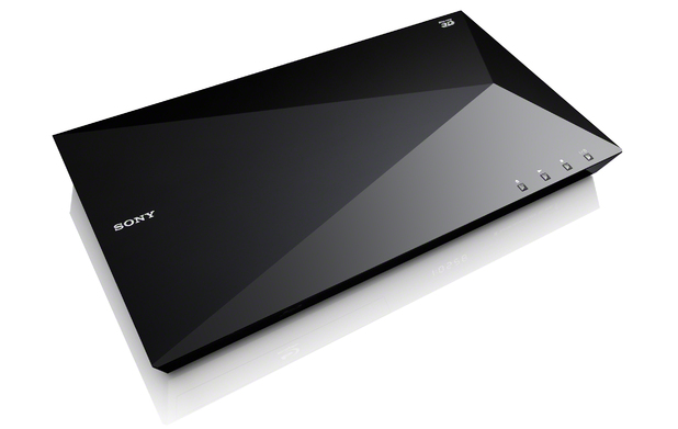
Since bluray players are being posted, I'll just leave this here

1340078586.jpg

I don't understand this design. The curvature of the lower part of the machine makes no sense to me (what function does it serve)? I don't like the way the top piece and bottom piece aren't really flush with one another at the left end.
 

vivftp

Member
I don't understand this design. The curvature of the lower part of the machine makes no sense to me (what function does it serve)? I don't like the way the top piece and bottom piece aren't really flush with one another at the left end.

I don't think it's a matter of the design being functional, but more an aesthetic choice that some may like, some may not.

Personally I like the design, but wonder how practical the side slot loading tray would be for most people.
 

Oppo

Member
I like the rounded slab mockups.

Although they look like they are an illegitimate sex baby between a PS3 and a Mac Mini.

I hope it doesn't stay long in shape (like an AV component), I like the micro tower type designs.
 
Whipped up something else. Based on Sony's current slogan but like I said going back to what made the PlayStation brand the dominate force that it was (and one can argue still is to a point).

It's read as red-e (Ready.Make.Believe). Paying homage to the original Playstation marketing, but injecting modernism into the entire thing. Giving it a high class feel but still realizing it's a videogame system.

ibbssLxrDVxgMR.jpg

Damn, well the actual controller lived up to the mockup hype, hopefully the console will too.
 
Why do you guys like the split level design? I want one uniform box, basically. It doesn't have to be a square, but I don't understand the PS3 or PS2 style in the age of "sleek."

I'm predicting something rectangular and glassy, a la the new Sony phones.


I don't understand this design. The curvature of the lower part of the machine makes no sense to me (what function does it serve)? I don't like the way the top piece and bottom piece aren't really flush with one another at the left end.

I concur for the same reasons. The PS3 seemed to have been designed to follow that shape first. I'd rather them start from scratch. Sony is still capable of making sleek sophisticated hardware designs when they really want to.
 
Top Bottom