Looks like a dashboard. Or a doorstop.
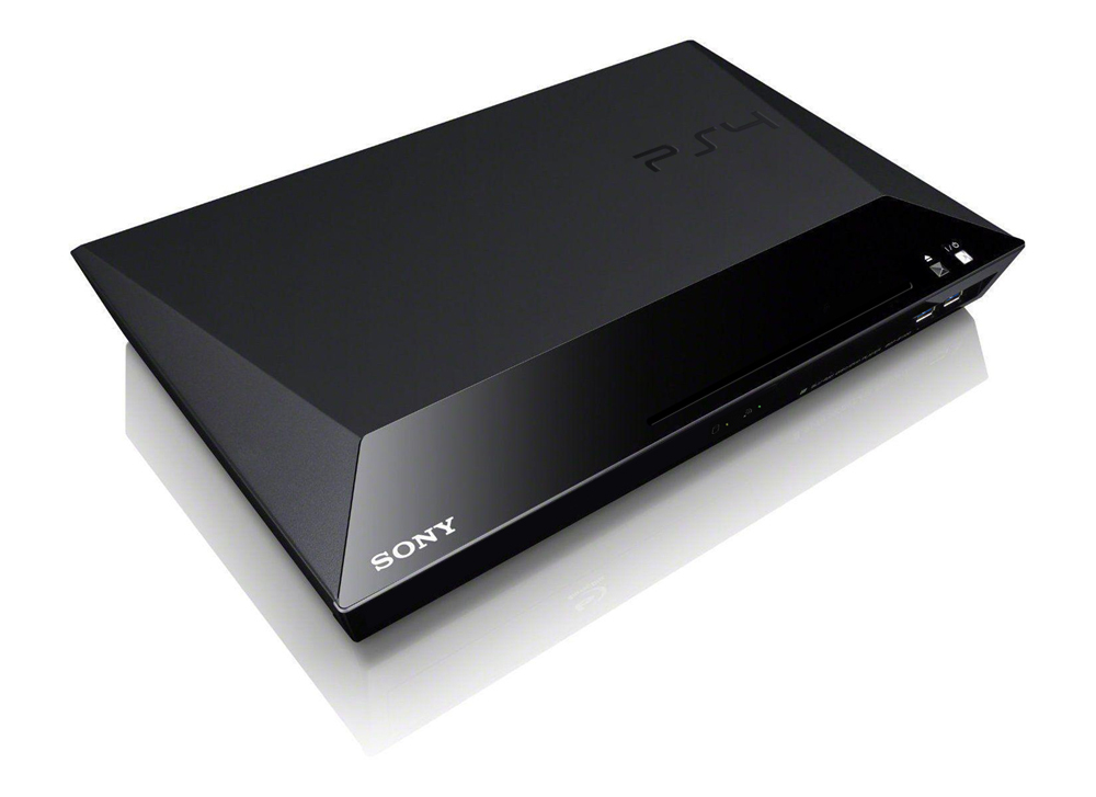
lol, it's actually a real Sony BLu-Ray Player I retrofitted to have console-like features.
Looks like a dashboard. Or a doorstop.
This looks the best. Would definitely love this design.Made a few changes:
Made a few changes:
It would still mean an order of magnitude increase in the price of the controller and a huge hit for the battery life, not to mention the negative public image that they're copying the GamePad. I do not see it happening.
Made a few changes:
PS2-4 uber alles
Made a few changes:

Looks like a giant sharpening stone...
yayYay, nay?
Yay, nay?

Whipped up something else. Based on Sony's current slogan but like I said going back to what made the PlayStation brand the dominate force that it was (and one can argue still is to a point).
It's read as red-e (Ready.Make.Believe). Paying homage to the original Playstation marketing, but injecting modernism into the entire thing. Giving it a high class feel but still realizing it's a videogame system.
Just needs the coloured PS logo and that is fantastic. Pity the real design won't be as good.
Whipped up something else. Based on Sony's current slogan but like I said going back to what made the PlayStation brand the dominate force that it was (and one can argue still is to a point).
It's read as red-e (Ready.Make.Believe). Paying homage to the original Playstation marketing, but injecting modernism into the entire thing. Giving it a high class feel but still realizing it's a videogame system.

Yes, please. Though I'd switch a few things around. The drive would be on the bottom next to all the inputs. Only buttons up top -- maybe a few more lights up top as well.
What does the dot between "E.Make" stand for? The one in Make.Believe stands for "the place where great things begin. It is where inspiration meets creativity, where creativity meets reality."
God I hated that campaign.
I've been going back and forth on the colored logo haha. It's a clash of reasoning for me, I keep flip flopping. Though if Sony's current hardware designs are any indication and their designers are even 1/20th as good as I am. I think the actual model will amaze and make mine look like child's play (I'm a HUGE fan of Sony's product designers and they seem to be coming strong as of 2013, especially if you look at their TV models, Xperia Tablet Z, Odin, BR players).
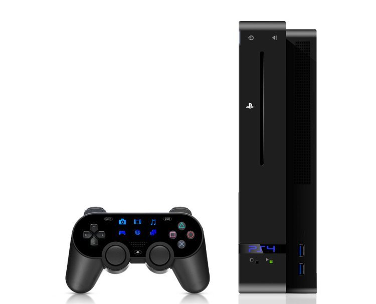
looks great but too bad there will be no screen on the controller for those icons
I like that design, just not for PS4.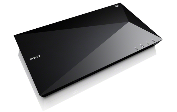
Too bad Sony wasted this design on a blu-ray player.
Please no "rounded" PS3 font. Never liked that.
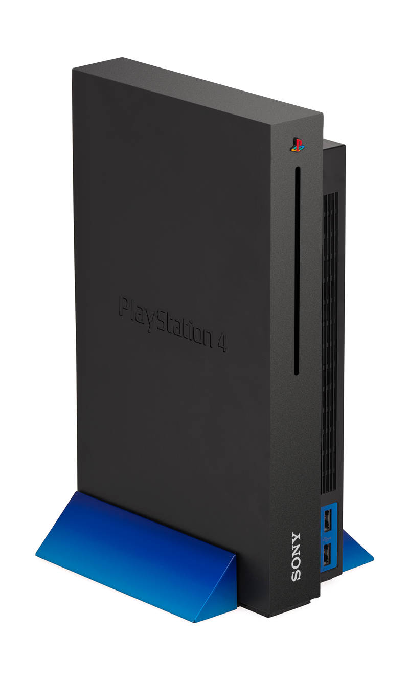
PS4 should return to what works best, perpendicular. And black+blue.
Whipped up something else. Based on Sony's current slogan but like I said going back to what made the PlayStation brand the dominate force that it was (and one can argue still is to a point).
It's read as red-e (Ready.Make.Believe). Paying homage to the original Playstation marketing, but injecting modernism into the entire thing. Giving it a high class feel but still realizing it's a videogame system.
Too bad Sony wasted this design on a blu-ray player.
PS4 Slim.it looks good now, but that seems like something that would look dated after a few years.
they need to go back to this, with the orignal sound effects. Soooo good everytime I started it up!
https://www.youtube.com/watch?v=ZE_iCgBUacQ
Made a few changes:
Quick little one. obviously not totally done.

Not a huge fan of the design, but by judging past consoles, it will be something similar to this.
Most of these designs are ideal for blu-ray players, but no way in hell are they going to have enough fans/vents in for what Sony are packing next-gen. You've all been spoilt with your PS3 Slims - come over here and lift up my PS3 fat to remember what 1st gen hardware feels like
I really hate Select and Start in Vita because they are too flat, so sometimes is a pain in the ass trying to pause the game. So please bump them a bit more. Other than that, I see a great pad.Needs Vita style buttons.
tried my best

Love it. But I would swap the position and size of the Sony and PS logos. So the PS one would be able to be bigger, so it would be more highlighted. And put 4 USBs please.Quick little one. obviously not totally done.
Not a huge fan of the design, but by judging past consoles, it will be something similar to this.
Since bluray players are being posted, I'll just leave this here

I don't understand this design. The curvature of the lower part of the machine makes no sense to me (what function does it serve)? I don't like the way the top piece and bottom piece aren't really flush with one another at the left end.
Whipped up something else. Based on Sony's current slogan but like I said going back to what made the PlayStation brand the dominate force that it was (and one can argue still is to a point).
It's read as red-e (Ready.Make.Believe). Paying homage to the original Playstation marketing, but injecting modernism into the entire thing. Giving it a high class feel but still realizing it's a videogame system.
Why do you guys like the split level design? I want one uniform box, basically. It doesn't have to be a square, but I don't understand the PS3 or PS2 style in the age of "sleek."
I'm predicting something rectangular and glassy, a la the new Sony phones.
I don't understand this design. The curvature of the lower part of the machine makes no sense to me (what function does it serve)? I don't like the way the top piece and bottom piece aren't really flush with one another at the left end.
Too bad Sony wasted this design on a blu-ray player.