• Hey, guest user. Hope you're enjoying NeoGAF! Have you considered registering for an account? Come join us and add your take to the daily discourse.

First Final Fantasy 5 (smartphones) screenshots

CorvoSol

Member
Many didn't care for the style they used in the FFIV/III remakes though. I liked them, and would appreciate FFV/FFVI remakes in that fashion.

Yoshida's art for FF3 and FF4 felt great for me, especially FF3. I've been saying this all along: Yoshida-Amano blends for the art styles of the SNES era games is the way to go.
 

fates

Member
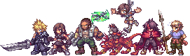
...people think this looks worse than the GBA game? Is the look of the sprites that revolting that you'd dip it below this?:

final-fantasy-v-advance-20060926103910946_640w.jpg


I'll take the crisp clear image of the new iOS version, coupled with (no-doubt) better sound, even if the art is facelifted in a bit of the wrong direction.

However, FFVI is a lot nearer and dearer to me; I wonder how I'll feel when I see that game facelifted this way. Might be right there with all of ya...

I think the issue is they are obviously capable of better. I'd be OK with a port of these games with FF2/FF4 PSP's sprite work. I thought it looked really good.

Instead they went with what looks like All the Bravest sprites, and given all the bad blood that game wound up, that was a horrible decision.
 

Rpgmonkey

Member
Everything else looks ok or is at least acceptable, but those character sprites are really lame. It's like they tried to copy the chibi artwork but ended up making something even more plain, so it's off-putting.

The old sprites had more attention to detail and they manage to resemble the chibi artwork more than the new sprites do.
 

Easy_D

never left the stone age
I'm not so upset about owning a Windows Phone anymore. At least the one FF on there (FF1) looks good. GBA version is still the definite version I guess.
 

Synless

Member
So as it stands these are only announced for tablets/phones? That's disappointing, also disappointing is that it is not a 3D remake ala FFIV.
 

Goli

Member
So did anyone notice how the tiny title screen screenshot has two watermarks?
It's like it was the same as the other screenshots but they resized it to cover a menu option (IAP? Unlockables? Achievements?) with ANOTHER watermark and forgot to remove the previous one.
 
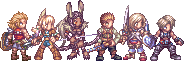
And for people who fear for FFVI, don't worry. It's clear that this was an intentional nod to the original artwork, which wasn't present on FFVI. I expect them to do something different with that. For comparison:

That exact art style is used in the manual of the Japanese version. Yes, I'm a giant nerd and imported the SFC version back in the day. Square even released little keychain and pencil topper figurines of the FFVI characters in that same art style. I think we all need to realize that this was the art style they were shooting for, it's just that 16bit graphics didn't have the resolution to pull it off. Harsh reality.
 
D

Deleted member 17706

Unconfirmed Member
Square Enix's take on high-res 2D is fucking ugly as hell.

This looks like some shitty fan-made project.
 

MagiusNecros

Gilgamesh Fan Annoyance
Square Enix's take on high-res 2D is fucking ugly as hell.

This looks like some shitty fan-made project.

Always a shame Square never took the time to go for good pixel art.

advent_by_abysswolf-dnteox.png


Final_Fantasy_X_by_AbyssWolf.png


Final_Fantasy_XII_by_AbyssWolf.gif


Just an example of what some can do like Abysswolf, whose pixel artwork is awesome.
 
Backgrounds look fine, character 'sprites' are dreadful. It's not even that the quality of them by themselves is that bad, it's that there's such a disparity between the gorgeous portrait art and the chibi sprite art. Also what is up with the UI design? Taking cues from Sega's PC ghetto perhaps:


?
 
D

Deleted member 17706

Unconfirmed Member
Always a shame Square never took the time to go for good pixel art.

advent_by_abysswolf-dnteox.png


Final_Fantasy_X_by_AbyssWolf.png


Final_Fantasy_XII_by_AbyssWolf.gif


Just an example of what some can do like Abysswolf, whose pixel artwork is awesome.

Yeah, that stuff looks amazing. It's like they don't understand that with higher resolution, you really need to have a bunch more detail or else it will look cheap and shitty.

Also, this is the first time I've seen the screenshots of the PSP version of FFIV. That actually looks pretty good. How did they go from that to this?
 
This looks ok to me. Not great, but I don't expect greatness from SE anymore. Just pleasantly surprised if/when there is greatness from them.

Man, I fucking love how FFIV:CC looks. And it stuns on Vita. Would kill for a FF5/6 in that style.
 

Goli

Member
Backgrounds look fine, character 'sprites' are dreadful. It's not even that the quality of them by themselves is that bad, it's that there's such a disparity between the gorgeous portrait art and the chibi sprite art. Also what is up with the UI design? Taking cues from Sega's PC ghetto perhaps:


?
I don't see what's wrong with the UI. It's definitely an improvement over what they did with FFD:
mzl.qqgpbrha.320x480-75.jpg

and FFIV:
mzl.muieesbu.480x480-75.jpg

Those are too rigid, but this one is less so.
Yeah, that stuff looks amazing. It's like they don't understand that with higher resolution, you really need to have a bunch more detail or else it will look cheap and shitty.

Also, this is the first time I've seen the screenshots of the PSP version of FFIV. That actually looks pretty good. How did they go from that to this?
Not developed by the same people, and probably on a smaller budget.
 
Yuuuuuch, high resolution pixel art in low resolution style never looks good, not once, not ever.

Long live Final Fantasy V GBA.
 
D

Deleted member 17706

Unconfirmed Member
Not developed by the same people, and probably on a smaller budget.

All of that may be true. Consumers should not give a damn about that, though.

I just don't understand how, as a company, Square Enix accepts such a huge drop in quality in one of their most famous and attractive titles.
 

turnbuckle

Member
So as it stands these are only announced for tablets/phones? That's disappointing, also disappointing is that it is not a 3D remake ala FFIV.

The cynical side of me thinks they're going to release it for smartphones/tablets first and then release it for Vita/3DS later on. Doing it that way will undoubtedly get more people to double (triple, quadruple, how man times have we bought this game?) dip than the other way around.

All of that may be true. Consumers should not give a damn about that, though.

I don't think Goli implied that consumers should be forgiving because of the likely smaller budget. I think it was just an explanation of the degradation in quality.
 

MagiusNecros

Gilgamesh Fan Annoyance
All of that may be true. Consumers should not give a damn about that, though.

I just don't understand how, as a company, Square Enix accepts such a huge drop in quality in one of their most famous and attractive titles.

FFV is one of the more underrated titles. They probably overlook it.
 

honorless

We don't have "get out of jail free" cards, but if we did, she'd have one.
Now I feel even worse about not picking up the GBA version before prices got absurd. Fucking damn it.

I was really hoping for a full 3DS remake like FFIV got for DS. I would have been perfectly content with the treatment FFIV:CC got. This, though...
I hope this is some kind of stopgap release.
 
I don't see what's wrong with the UI. It's definitely an improvement over what they did with FFD:
http://a243.phobos.apple.com/us/r1000/077/Purple/v4/4b/07/05/4b070586-de18-865c-9cdc-c6b874e5901e/mzl.qqgpbrha.320x480-75.jpg[/IM]
and FFIV:
[IMG]http://a1771.phobos.apple.com/us/r1000/111/Purple/v4/eb/a4/c8/eba4c822-e065-f1b5-f8f3-d652c8f42e8e/mzl.muieesbu.480x480-75.jpg[/MG]
Those are too rigid, but this one is less so.

Not developed by the same people, and probably on a smaller budget.[/QUOTE]

Font is terrible, the rounded corners make it look cheap, and to top it off the buttons still have that variable colour hue that you see on the Sega options (not sure what that's called exactly, but I hate it - makes it look like a 90s powerpoint presentation).

Just about the only thing they got right is the dialogue box.
 
why in god's name are they using the amano art and the sprites at the same time

just

why

(okay the answer is they're lazy but)


That's actually not a surprise at all, it's how the "sprites" used to be represented in the art, it's appealing to nostalgia for older Japanese fans
 
Looking over the screenshots again, I will admit that the bulk of the art looks okay. Those on-screen sprites really take me out of it, though. :(
 
The GBA versions used Amano art for portraits, too.

Did they? God I blanked that out. It still looks so doofy compared to the Anime Hair Color As Hell sprites.

(I actually prefer the sprite art, tbh, but the incongruity is crazy)

Also, just as a reminder that the "sprite-esque" promo art is in no way new and tbh probably dates from the release of the original game:

http://www.1up.com/do/blogEntry?bId=9033444

Looking over the screenshots again, I will admit that the bulk of the art looks okay. Those on-screen sprites really take me out of it, though. :(

I was going to say, the map work and the enemies aren't all that bad; sure the enemies are just up-rezzes, but they're very competently done and look good. But what is going on with those map sprites? Why do the men lead with their chests to the point of getting scoliosis?
 

grumpy

Member
I'll stick with the
Wii U
GBA
Virtual Console
version, thank you very much.

Seriously Square-Anux, do the 3DS remake already...
 

KtSlime

Member
So as it stands these are only announced for tablets/phones? That's disappointing, also disappointing is that it is not a 3D remake ala FFIV.

This is what I really wanted. I'd be willing to pay the price they are asking (maybe even more) had they done it, day one. But I will just hold out for when the game drops sub 10$ if I decide to ever pick this version up.
 

Burt

Member
Why are they so bad at this? It's gonna be even worse when they translate it with that miserable font they use in all their updates.
 
as another poster pointed out, it kind of reminds me of the Amano portraits in Kartia...

Kartia%20-%20The%20Word%20of%20Fate-PSX-NTSC-US.jpg


makes me wish they would release that game on the PSN. :/
 

Vamphuntr

Member
Faris and Lenna's sprites look so bad. They look like some generic female character models from some shovelware game.

With these screenshots I feel the character sprites are actually worse than in FF Dimensions.

The only good thing about this is the HQ Amano portraits and even them it seems weird since they are kinda floating over the text boxes.

as another poster pointed out, it kind of reminds me of the Amano portraits in Kartia...

[img.]http://www.mondemul.net/screens/roms/ps1am/Kartia%20-%20The%20Word%20of%20Fate-PSX-NTSC-US.jpg[/img]


makes me wish they would release that game on the PSN. :/

Oh yeah I really enjoyed this game too.
 
Yep, still don't like the character sprites. Thought the direct-feed shots might do them some justice, but their HD/Smooth-Filtered-look is still incredibly out-of-place when next to the significantly more detailed-looking backgrounds and enemies.

It's like if one of those HD Arcade ports activates the usually-hideous smoothing filter only on the main character sprites.
 

Pyrrhus

Member
why in god's name are they using the amano art and the sprites at the same time

...

That's actually not a surprise at all, it's how the "sprites" used to be represented in the art, it's appealing to nostalgia for older Japanese fans

Not even the actual Amano stuff. But yeah, I like the old chibi style because it's nostalgic. This new stuff where the characters all look like they're standing forward on tiptoes and thrusting their chests as far forward as possible while thrusting their shoulders back as far as possible looks completely awful. It's just bizarre that they used that stance as the basis for their character model. Issues with color, shading, and form merely compound the problem.
 
Top Bottom