Mr Reasonable
Completely Unreasonable
So Hyped.
The led on the front of the Pro is an absolute design disgrace. The buttons aren't much better. Triple stack design is ymmv for who likes it and who doesn't, personally, I think it's ugly. I'd rather just have a reasonably sized black slab with a sleekish front panel. The Pro isn't fat PS3 levels of bad, but it's still bad. Sony needs to reshuffle whatever high paid designers they have working on hardware.
Fat Ps3 was a beauty, you could say a fat princess heh
Ps4 Pro is just ugly, there is no worse console out there lol
The Spiderman font was one of the worst decisions of all time. A coming together of the completely shit-tastic Sony Movies wanting to infect Sony PlayStation. PlayStation signed off on it though.
Sony is just incredibly inconsistent with hardware designs. Some are good, others are trash. MS can be inconsistent too, but in the current moment, the One X is beating the Pro. Ultimately, I have no idea how corporations of these sizes can have all the money in the world and still somehow end up recruiting or signing off on abysmal hardware designs. Every time you see something terrible there is 6,000 mockups online made to fix it or show them what they should have done.
Mock-ups don't account for internal setup, cost inefficiencies of the materials needed, assembly time, etc.
Lastly, how much emphasis and importance is placed on industrial design at the leadership level. This is an extremely subjective thing, different people will have different visual valuations.
I edited that in above. When it comes to fonts on consoles, using gloss, ridiculous ergonomically offensive button designs or a stupid LED that cuts out halfway for no reason those are design decisions which have nothing to do with airflow/internals. The triple stack design isn't even needed either for airflow, the Pro could still be as big as it is with vents and do something a bit less dumb to differentiate itself from the standard PS4. The buttons and the LED are the worst design offenders on the Pro though, the triple stack is just ugly.
My second sentence was the nice way of putting it, but if you take it away...some designers are just bad at industrial design aesthetically, period. And execs who sign off on these stuff don't care enough about aesthetics to tell their designers to do a better job.
I can't keep my PS4 Pro in rest mode because the chimps that programmed its firmware didn't think to have it safely unmount external HDDs before turning off power to the USB ports and keeping power to the USB ports means the fan never goes off.
Wrong thread?
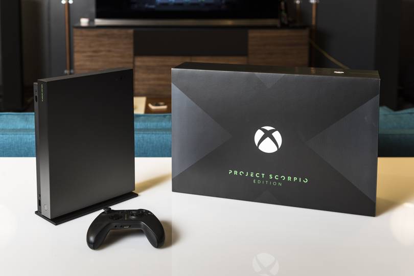
Its so beautiful. But I can't find any good reason to buy an Xbox anymoreHigher res pics:


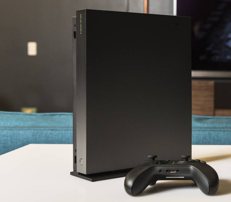
I really hate the type on the controller and console. Looks so Matrix, ruins the sleekness.
Its so beautiful. But I can't find any good reason to buy an Xbox anymore
Its so beautiful. But I can't find any good reason to buy an Xbox anymore
Yes, was it a joke? In my country we dont have doritos, never tried it...Have you seen the new doritos ?
Sooooo pretty. I need it.Higher res pics:
Higher res pics:
Yeah, this definitely is the surprise.
Thought maybe the surprise was that it's now 399.
Never cease to amaze me, that salt and hate.
I can't imagine the designer of that wonderful hardware signed off on this little addition
In any case, here's hoping there's a non-ruined version available at launch