The strip is fine. I agree that the spidey font is a bad call, but it's treated well (with the brushed steel look) and the branding is pretty non-intrusive. What will suck is how it's embedded in a case that has it's own horizontal strip across the top for the format (Blu-ray) branding. *That* is utter crap.
-
Hey, guest user. Hope you're enjoying NeoGAF! Have you considered registering for an account? Come join us and add your take to the daily discourse.
You are using an out of date browser. It may not display this or other websites correctly.
You should upgrade or use an alternative browser.
You should upgrade or use an alternative browser.
More PS3 box arts
- Thread starter Wario64
- Start date
Kangu said:Except the Playstation isn't a world renouned journalistic publication covering international affairs? It's a videogame console.

SolidSnakex said:The original cases they used for the system

They were the same cases that Saturn used, I even heard they bought them off Sega.
FunkyMunkey
Banned
EWWWWWWW.
HomerSimpson-Man
Member
Eh, it's alright.
Safe Bet said:
Not the same. Coca Cola doesn't have a logo, all they have is the font. Playstation has a logo and a font. Besides his original point was that people respect TIME because it has a particular font. The playstation doesn't need respect, it just needs a recognizable brand. It already has that with the name and the logo.
Another console with a recongnizable brand name is the xbox. Oddly enough they changed the font, the logo AND the naming structure and yet we still didn't get nearly as much shit about it as we've gotten over the spiderman font. You know why? Because it doesn't matter.
jamesinclair
Banned
New to me
plagiarize
Banned
puts the wii box art into his pants.omg rite said:
WIIIIIIIIIIIIIIIIIIIIIIIIIIIIIIIIIIIII
runs off over the horizon laughing
SolidSnakex
Member
Shig said:There won't be much room for the actual box-art on on those Tom Clancy games...
What a shame that'll be

Bad_Boy said:do all tom clancy games have that huge border on them? i swear ive seen some boxarts without that shit on there.
edit:


I dont see why they wont just take the border off for ps3 games.
Those are all PAL/Europe versions of Tom Clancy games. The US ones all have that huge, unneccessary strip on the left.
hmm, did not notice that. but still...is it really that hard for them to slightly change the boxart?hirokazu said:Those are all PAL/Europe versions of Tom Clancy games. The US ones all have that huge, unneccessary strip on the left.
they obviously did for the gameboy's strip..

Kangu said:Oddly enough they changed the font, the logo AND the naming structure and yet we still didn't get nearly as much shit about it as we've gotten over the spiderman font. You know why? Because it doesn't matter.
t's fairly obvious you don't get it.
they don't get shit because the font change wasn't BAD. you can't make fun of it and it wasn't cheaply thrown together using an obvious font from a huge movie franchise.
Not true about Coke. They have the font, and something they call the dynamic ribbon device if memory serves me right.Kangu said:Not the same. Coca Cola doesn't have a logo, all they have is the font. Playstation has a logo and a font. Besides his original point was that people respect TIME because it has a particular font. The playstation doesn't need respect, it just needs a recognizable brand. It already has that with the name and the logo.
Another console with a recongnizable brand name is the xbox. Oddly enough they changed the font, the logo AND the naming structure and yet we still didn't get nearly as much shit about it as we've gotten over the spiderman font. You know why? Because it doesn't matter.
You see it under the C, and in some cases another ribbon if I remember that correctly.
bumpkin
Member
I still have MK3, NBA Jam and that very game (ESPN Xtreme Games), all in the original large PlayStation cases.jamesinclair said:
New to me
bumpkin said:I still have MK3, NBA Jam and that very game (ESPN Xtreme Games), all in the original large PlayStation cases.
I don't have 'em anymore, but I had MK3 and Street Fighter Alpha in the original cardboard-ish cases.
omg rite said:t's fairly obvious you don't get it.
they don't get shit because the font change wasn't BAD. you can't make fun of it and it wasn't cheaply thrown together using an obvious font from a huge movie franchise.
If anyone cares about this 6 months after launch the admins can ban me for the remainder of 2007. This is a complete non issue, much like the name of your favorite wacky console. In fact, it's such a non issue I can't believe I'm having an argument on this, with a brick wall of all things.
And the font isn't from a movie franchise, hell, it's pretty close to the old Xbox font.
Callo Merlose
Banned
Ugh, Thor has a goatee? Not that goatees are bad, but on Thor! This pains me a great deal.
HomerSimpson-Man
Member
jamesinclair said:
New to me
Wasn't there a Playstation case that predated that big jewel case one? It was like cardboard or something and the left side had actual ridges on it instead of the picture insert to look like ridges near the spine of the case on the regular jewel cae.
HomerSimpson-Man said:Wasn't there a Playstation case that predated that big jewel case one? It was like cardboard or something and the left side had actual ridges on it instead of the picture insert to look like ridges near the spine of the case on the regular jewel cae.
yeah
HomerSimpson-Man
Member
mood said:yeah
Yeah, that's it!
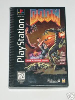
Huh, looking at my PS jewel cases, why did they have picture of ridges still on the side? It's complete with photo fake lighting and all making it look more three dimensional too. I mean on that old Doom box the ridges are actually there and not some picture.
davepoobond
you can't put a price on sparks
HomerSimpson-Man said:Yeah, that's it!
Huh, looking at my PS jewel cases, why did they have picture of ridges still on the side? It's complete with photo fake lighting and all making it look more three dimensional too. I mean on that old Doom box the ridges are actually there and not some picture.
probably to make it look X-Treme
Greenpanda
Banned
HomerSimpson-Man said:Yeah, that's it!
Huh, looking at my PS jewel cases, why did they have picture of ridges still on the side? It's complete with photo fake lighting and all making it look more three dimensional too. I mean on that old Doom box the ridges are actually there and not some picture.
I'm assuming the jewel cases have the "fake" ridges to look consistent with the prior cardboard boxes.
Mr. Spinnington
Banned
I just realized, Sony's boxart format sucks balls except for the PS2 era.
Here's what's claimed to be a first photo of an actual PS3 case:

Original story: http://www.ps3fanboy.com/2006/09/17/ps3-game-caught-in-the-wild/
Could be a fake, since Blu-ray cases are already out there. But if real it would answer the question of what the spine would be like.
Original story: http://www.ps3fanboy.com/2006/09/17/ps3-game-caught-in-the-wild/
Could be a fake, since Blu-ray cases are already out there. But if real it would answer the question of what the spine would be like.
monkeymagic
Banned
It looks nice actually

Yeah, that looks quite acceptable. I'll grow tired of the blu-ray branding soon enough though. Do the blu-ray cases have a more squareish form factor than DVD cases? Looks like that.
edit: Yeah, the spine text is layed out upside down. Definitely a fake mock-up then. Still looks okay though.")
edit: Yeah, the spine text is layed out upside down. Definitely a fake mock-up then. Still looks okay though.
Pretty fake -- look how the strip doesn't even go all the way to the bottom of the artwork. Looks like a fan-mockup. A nice one, to be sure!monkeymagic said:
REV 09 said:technically, isn't sonic the hedgehog on the spine written upside down? The cover art would be face down if you stacked the games.
True, might indicate a fake..
But if they use blue cases, I guess it gives a good idea of what they'll look like for real. I kind of hope they colour them black, though..probably won't, but i'll keep my fingers crossed.
monkeymagic
Banned
REV 09 said:Further proof that this system is more to Sony than gaming.
No shit Einstein.
Can't wait for your next revelation.
davepoobond
you can't put a price on sparks
REV 09 said:technically, isn't sonic the hedgehog on the spine written upside down? The cover art would be face down if you stacked the games. I'm ok w/ the font and sidestrip now, but the blu cases are just ugly. Further proof that this system is more to Sony than gaming.
amazing how you deduct all of this from a plastic CASE
monkeymagic
Banned
davepoobond said:amazing how you deduct all of this from a plastic CASE
Actually according to his post on OA, PS3 has nothing to do with gaming just from the case :lol
REV 09 said:it's sony's standard casing...further proof that the ps3 has nothing to do w/ gaming, and everything to do w/ pushing blu ray. I can't really blame the uniform branding of Blu Ray from a business perspective, even if it is ugly.
good god fanboys, it's called uniform branding...it's smart business. They're using an existing brand (Playstation) to market a new brand (Blu Ray). Blu cases are still ugly though, so are HD DVD's Red cases.davepoobond said:amazing how you deduct all of this from a plastic CASE
Forceatowulf
G***n S**n*bi
The case looks like utter ass. They should have made it black and taken off the top.
OA special...admittedly that comment is too extreme, and i don't really feel that way. I'm still buying a PS3 so what does it matter? I do feel that Sony is using the Playstation brand to push blu ray though, and i don't think it has much to do w/ gaming at all. That's my personal opinion though, but like i said, i'm still buying one and the branding is good business, the cost may not be.monkeymagic said:Actually according to his post on OA, PS3 has nothing to do with gaming just from the case :lol
EDIT: and of course i didn't form this opinion from a game case folks.
BenjaminBirdie
Banned
SolidSnakex said:What a shame that'll be
Holy god. I LOLed and LOLed and LOLed.
Thank you.
monkeymagic said:Actually according to his post on OA, PS3 has nothing to do with gaming just from the case :lol
Oh snap :lol
Anyway I think that spine screams fake,but we'll see.
He Wants Chalupas
Banned
The strips telling you what system a game is for ALWAYS look stupid, who cares?


Cosmonaut X
Member
If it is a fake, it's bloody well done...