DM_Uselink
Member
Came out great Orioto, love the lighting you achieved in it.
 :lol ! I will definitely check the cameraman's work to make sure i'm handsome !
You'll be my favourite person forever if this is Ecco.orioto said:A Genesis one, from Sega, with some water animal !
orioto said:
Jokey665 said:You'll be my favourite person forever if this is Ecco.

orioto's site said:Playing: Street Fighter IV (a lot)
RSTEIN said:DO IT.
I swear Id fucking hate you if I didnt love you so much. That is so beautiful, Im looking at it while listening to the endless ocean theme.orioto said:I'm now your favourite person forever !
abstract alien said:I swear Id fucking hate you if I didnt love you so much. That is so beautiful, Im looking at it while listening to the endless ocean theme.
Do it now!
http://www.youtube.com/watch?v=zsGWieSIxW8
orioto said:I did and it was meh. Maybe i'll retry one time.
Ken vs. Ryu or something classic like that would be awesome. There's amazing material there with the fireballs/flame uppercut. 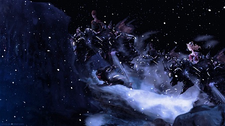 It's the exposure on NeoGAF that brings me most opportunity, clearly ! neoGAF has some weight !
 Fuu said:orioto, a bit OT but I also like your other works like Serious Monkey, Transformation age and Hero Simplicity a lot.
Do more of those in the future too if you have the chance.They're hot!
By the way, would the Jae Joong you said you used as reference in the Inu Yasha fanart be the one from DBSK?
orioto said:
At last !
Sorry it this is disappointing, my skills was not enough for this one^^
But i'm happy with it cause it's a good look at what i would like to sse as a FFVI remake, with side view all the way and original art in a Odin Sphere style shading !
The Kid Icarus one will be on IGN Insider shortly i guess.
Little note : When you're passing here and you like something, don't hesitate to bump it a little
adamma666 said:just to contribute in this thread: i really like all of your pics posted in this thread, some more some less. so it's time for a little bitching (sorry
orioto said:

Seriously dude, soooooooooo awesome! you>>>>>>>>>>>>>>>>>>>>>>>orioto said:I lighten the FFVI wall a bit, tell me if this is better please !
YYZ said:The FFVI one is great although the lack of mog is disturbing, especially considering your avatar.
orioto said:Thx guys, i knew the lemmings choice would suit you
orioto said:
Mik2121 said:I think the older ones (Donald and Mickey, the first Mario one, etc..) were a lot better than the newer ones. Specially the FF and Echo the Dolphin (I guess it's that game?) ones. The FF one looks weird because it's almost impossible to identify the mechas, and the characters seem pasted on top without retouches. The one for Echo the Dolphin is just not very eye-candy.. it looks a bit blurry overall?..
Also, if you are going to rush something or do some "crappy work", why don't you just spend a bit more time on it to make it a good piece like the Donald and Mickey one, instead of something forgettable?
