CrunchinJelly
formerly cjelly

Better version.
My developer account is ready.
Better version.
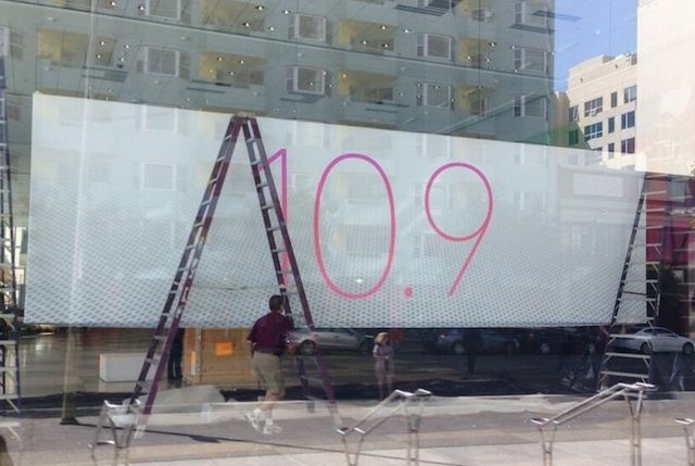
Interesting that it's 10.9 and not "OS X [Big Cat]"
what an increadibly skinny text, seems like a narrower text than what they've been using.
Apparently it's Helvetica Neue Pro Ultralight
People like saying "OS X" too much to bring out "OS X-Eye". OS X is a brand now and won't change for a while. If anything, the next big overhauled OS for Macs will probably be called iOS.Just out of curiosity, do you guys think the next desktop OS will be OS 11, or OS 10.10? I am assuming they will be saving the 11 moniker for when they do another huge overhaul of the OS, just wondering when you guys think that will be?
see:
The two core iOS fonts are HelveticaNeue and HelveticaNeue-Bold, this is superthin version.

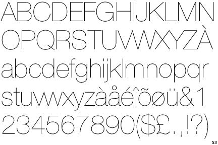

Hmm, why use a different font for the 7 and the 10.9?It's not. It's Avenir Ultra Light, which signals a pretty huge branding change for Apple
Avenir Ultra Light
Helvetica Ultra Light
Avenir is geometric while Helvetica is grotesque. Observe the stem of number 9.
My bet is that this is a design megaton of WWDC - Apple will begin to use Avenir in both marketing and UI, retiring Myriad (marketing) and Helvetica (UI). This would signal a big unification of design principles. You read it here first!
Hmm, why use a different font for the 7 and the 10.9?
It'll be 10.10. Version numbers aren't decimals. Unless they use the opportunity to overhaul it completely somehow. Merge OS X and iOS into Apple OS or something.Just out of curiosity, do you guys think the next desktop OS will be OS 11, or OS 10.10? I am assuming they will be saving the 11 moniker for when they do another huge overhaul of the OS, just wondering when you guys think that will be?
Maybe they want to keep the cat name under wraps until they announce it. Everyone knows that 10.9 is coming so they can talk about that without giving away anything.Interesting that it's 10.9 and not "OS X [Big Cat]"
But aren't both of those marketing?They currently use two different fonts for marketing and UI anyways. Read above.
Hmm, why use a different font for the 7 and the 10.9?
You are right - what an odd choice for a 7. It might be that they have developed a new proprietary typeface that has taken influence from Avenir. That new light font seems to be across the board. The other mobile companies have their own fonts too now.
Clearly they're dropping the iOS and OS X brand in favor of one: X.
It's not. It's Avenir Ultra Light, which signals a pretty huge branding change for Apple
 Thanks Chittagong. Definitely could be marketing only but would be an interesting change if they applied that OS-wide.
We are looking at a significant Apple rebrand here fellas.
- New typeface
Oh, and I had a feeling the design of this thing represented something:
Sorry, Microsoft. But I really really really don't like any of your design choices. They keep getting worse and worse. I love flat design, but yours is just terrible. I also would prefer Android's flat design over yours, but even they have some elements I don't like.So Microsoft posted this today: http://www.microsoft.com/en-us/news/stories/design/

this changes everything.
AGAIN.
I think it will work well on Retina devices. But not on non-retina. So they'll probably use a heavier font on non-retina but lighter on retina.I really hope Apple uses Ultra Light for iOS. I doubt it would work on the OSX devices, due to pixel density.
I wonder who at Apple championed those word art style chrome letters Apple used until now for OSX and iOS logos?


They're moving onto fish and this is the best way to transition.
Remember Jaguar? They got Pixar to use their Monsters Inc. fur rendering for the logo.I wonder who at Apple championed those word art style chrome letters Apple used until now for OSX and iOS logos?
I thought Metro was pretty great, until they butchered it in Windows 8.
I personally think Windows Phone 8 has a beautiful UI.
This is correct, but WP8 != Win 8