I have a great deal of respect for George Kamitani and his ragtag team of artists at Vanillaware. As a group, they continue to operate independently in a space that most developers and publishers have completely abandoned. Kamitani's unique painterly art style is recognizable instantly to anyone who has played any of Vanillaware's games, and the studio's dedication to hand-drawn 2D assets and RPG/action gameplay is unique to them in an industry where the race toward photo-realism in 3D worlds dominates the market.
Since I've been on a traditional 2D animation kick (inspired by my recent playthrough of Rayman Legends), I have been revisiting some Vanillaware games and marvelling at their artistry. Interestingly enough, all of their games manage to have their own aesthetic identity despite certain elements of Kamitani's artwork being unmistakable. All of their games are unequivocally gorgeous and largely unmatched in the 2D realm, but I'm interested to hear which of their games' art styles appealed to people the most.
I'll post a few pics of their most widely known games below to help refresh the memories of those of you who haven't played a Vanillaware game in a while.
Princess Crown (Sega Saturn)
This is the only Vanillaware game that I never got the chance to play, but I've see enough of it in motion to know that it was a gorgeously animated game for its time. Combining traditional pixel-art sprites with some 3D background elements, Princess Crown looks quite different from the Vanillaware games that would follow because they would go on to use hand-drawn artwork as opposed to pixels for all of their visual assets. This lends the game a very unique look that I can see fans of pixel art preferring over Vanillware's other offerings.
Odin Sphere (PS2)
This was my first exposure to Kamitami's exquisite hand-drawn artwork, and man did it leave an impression on me. As a fan of 2D gaming that lamented its decline in the face of 3D dominance, this game was like a dream come true. It's clear that this was a passion project for Kamitani, and its success allowed him to continue operating independently with his team and making the type of games that only they can produce. While this game suffered a bit from overuse of the same environments and enemies (as all Vanillaware games do to an extent), I still adored the huge bosses, painterly backdrops, and Kamitani's uniquely Japanese take on Norse Mythology.
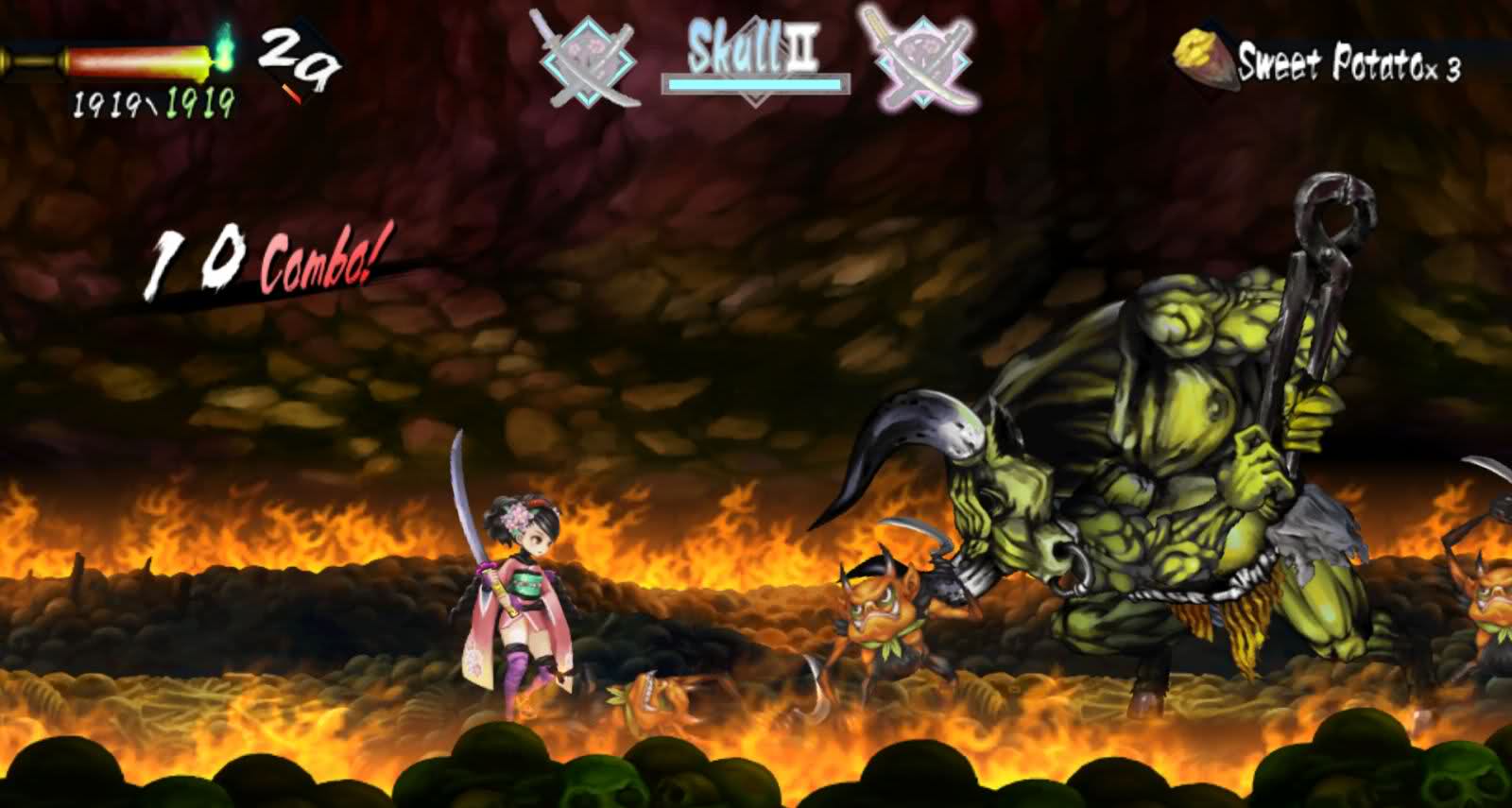
Muramasa: The Demon Blade (Wii/VITA)
For some reason, Muramasa didn't click with me when I first picked it up years ago. It must have been the mood I was in at the time, because I recently started a new playthrough and am loving every minute of it. This game was more firmly entrenched in Japanese culture and visual traditions than Odin Sphere, and from what I've seen so far there is already an even greater variety of environments, enemies, and bosses in Muramasa than its predecessor. The animation of the characters seems more energetic and fluid as well. To me, Muramasa represents Vanillaware's maturation and confidence with whatever tools they use in-house in crafting these 2D experiences. That being said, I still find myself preferring some of the character designs in Odin Sphere more. Muramasa wins hands down in the backdrop department, though.
Dragon's Crown (PS3/VITA)
Lastly we have Vanillaware's first foray into HD game development and their most expensive project yet at over $1 million. Summarily, the extra time and budget dedicated to this game is evident right out the gate. The amount of detail on display in crisp 1080p is astonishing at times, and the quantity and quality of animations for the main characters, enemies, and bosses are a clear notch above Vanillaware's previous releases. The boss fights, in particular, look like an animated film come to life at times. Technically, I believe that Dragon's Crown is their greatest achievement in the realm of 2D art.
Stylistically, however, DC is a bit more divisive. With this game, Kamitani was going for his own take on the old-school fantasy designs of yesteryear. This means that men are hulking brutes and women are impossibly endowed and pretty absurdly sexualized. Whether or not that offends you is one thing, but I can see people preferring the look of Vanillaware's previous efforts over this in terms of art direction. Even with all the added detail and resolution, Dragon Crown's divergent art style simply isn't for everyone.
____________
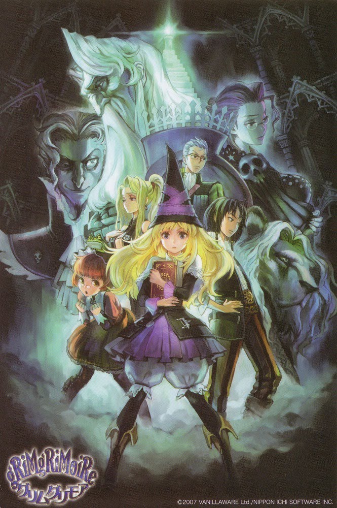
Note: I'm aware that I left GrimGrimoire out of my list of games, but that was only because I was running short on time writing this OP and don't find its art style to be different enough from Odin Sphere's to warrant its own write-up. Feel free to nominate it as your favorite, however, if that's how you feel.
Edit: D'oh! Looks like I also left out Grand Knights History, which some of you might have played despite it not having been released outside of Japan.
Since I've been on a traditional 2D animation kick (inspired by my recent playthrough of Rayman Legends), I have been revisiting some Vanillaware games and marvelling at their artistry. Interestingly enough, all of their games manage to have their own aesthetic identity despite certain elements of Kamitani's artwork being unmistakable. All of their games are unequivocally gorgeous and largely unmatched in the 2D realm, but I'm interested to hear which of their games' art styles appealed to people the most.
I'll post a few pics of their most widely known games below to help refresh the memories of those of you who haven't played a Vanillaware game in a while.
Princess Crown (Sega Saturn)
-14.jpg)
-1.jpg)
-6.jpg)
This is the only Vanillaware game that I never got the chance to play, but I've see enough of it in motion to know that it was a gorgeously animated game for its time. Combining traditional pixel-art sprites with some 3D background elements, Princess Crown looks quite different from the Vanillaware games that would follow because they would go on to use hand-drawn artwork as opposed to pixels for all of their visual assets. This lends the game a very unique look that I can see fans of pixel art preferring over Vanillware's other offerings.
Odin Sphere (PS2)
_(En,Ja)-3.jpg)
_(En,Ja)-4.jpg)


This was my first exposure to Kamitami's exquisite hand-drawn artwork, and man did it leave an impression on me. As a fan of 2D gaming that lamented its decline in the face of 3D dominance, this game was like a dream come true. It's clear that this was a passion project for Kamitani, and its success allowed him to continue operating independently with his team and making the type of games that only they can produce. While this game suffered a bit from overuse of the same environments and enemies (as all Vanillaware games do to an extent), I still adored the huge bosses, painterly backdrops, and Kamitani's uniquely Japanese take on Norse Mythology.
Muramasa: The Demon Blade (Wii/VITA)


For some reason, Muramasa didn't click with me when I first picked it up years ago. It must have been the mood I was in at the time, because I recently started a new playthrough and am loving every minute of it. This game was more firmly entrenched in Japanese culture and visual traditions than Odin Sphere, and from what I've seen so far there is already an even greater variety of environments, enemies, and bosses in Muramasa than its predecessor. The animation of the characters seems more energetic and fluid as well. To me, Muramasa represents Vanillaware's maturation and confidence with whatever tools they use in-house in crafting these 2D experiences. That being said, I still find myself preferring some of the character designs in Odin Sphere more. Muramasa wins hands down in the backdrop department, though.
Dragon's Crown (PS3/VITA)


Lastly we have Vanillaware's first foray into HD game development and their most expensive project yet at over $1 million. Summarily, the extra time and budget dedicated to this game is evident right out the gate. The amount of detail on display in crisp 1080p is astonishing at times, and the quantity and quality of animations for the main characters, enemies, and bosses are a clear notch above Vanillaware's previous releases. The boss fights, in particular, look like an animated film come to life at times. Technically, I believe that Dragon's Crown is their greatest achievement in the realm of 2D art.
Stylistically, however, DC is a bit more divisive. With this game, Kamitani was going for his own take on the old-school fantasy designs of yesteryear. This means that men are hulking brutes and women are impossibly endowed and pretty absurdly sexualized. Whether or not that offends you is one thing, but I can see people preferring the look of Vanillaware's previous efforts over this in terms of art direction. Even with all the added detail and resolution, Dragon Crown's divergent art style simply isn't for everyone.
____________
Note: I'm aware that I left GrimGrimoire out of my list of games, but that was only because I was running short on time writing this OP and don't find its art style to be different enough from Odin Sphere's to warrant its own write-up. Feel free to nominate it as your favorite, however, if that's how you feel.
Edit: D'oh! Looks like I also left out Grand Knights History, which some of you might have played despite it not having been released outside of Japan.


 I thought its sprites and background were pretty impressive for the DS:
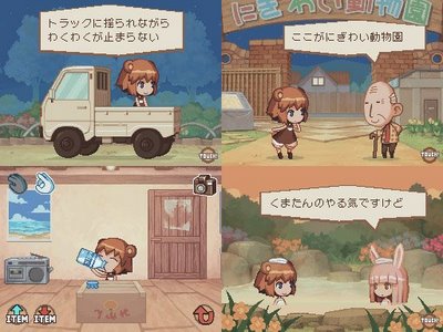
.jpg)