names2hard4you
Member
Mine are a picture of myself with my puppet Snow, and a picture of my fav artist atm Travis Scott.
Mine are a picture of myself with my puppet Snow, and a picture of my fav artist atm Travis Scott.
Gonna need that wallpaper!
Updated my post with the higher quality wallpaper without the watermark.
Awesome. Thanks, my dude!Here's a few of them:
I'm sure I'm in the minority with this, but the lack of home screen customization is one of the main reasons I'm sticking with Android. That said, if you're into jailbreaking, you can get some amazing results on iOS.These threads always make me salty. I wish iOS allowed for custom themes and icon arrangements. It really does seem dated when you see it next to most of these awesome Android home screens.
I dunno. It's a pretty great reason to stick with it. Jailbreaking is too much effort imo :\I'm sure I'm in the minority with this, but the lack of home screen customization is one of the main reasons I'm sticking with Android. That said, if you're into jailbreaking, you can get some amazing results on iOS.
Beautiful stuff.Device: Galaxy A5 (2016)
Launcher: Smart Launcher 3
Icons: Whicons
Where do I get this icon pack?
Here's a few of them:
This looks great.2 screens
Here's mine!
Gonna need that wallpaper!
Here's mine:
- Nova Launcher (setup to be the Pixel Launcher)
- Urman Icon Pack
- Eventflow Widget
]
I have two other swipable docks that include my most used apps, so 15 total I quick access to down there. My other homescreen includes a similarly transparent widget for Talon, an awesome Twitter app.

Nice and clean.
S7 or S7 edge?
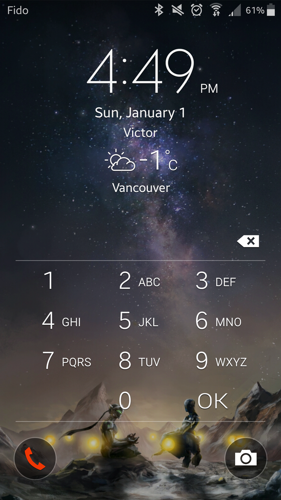
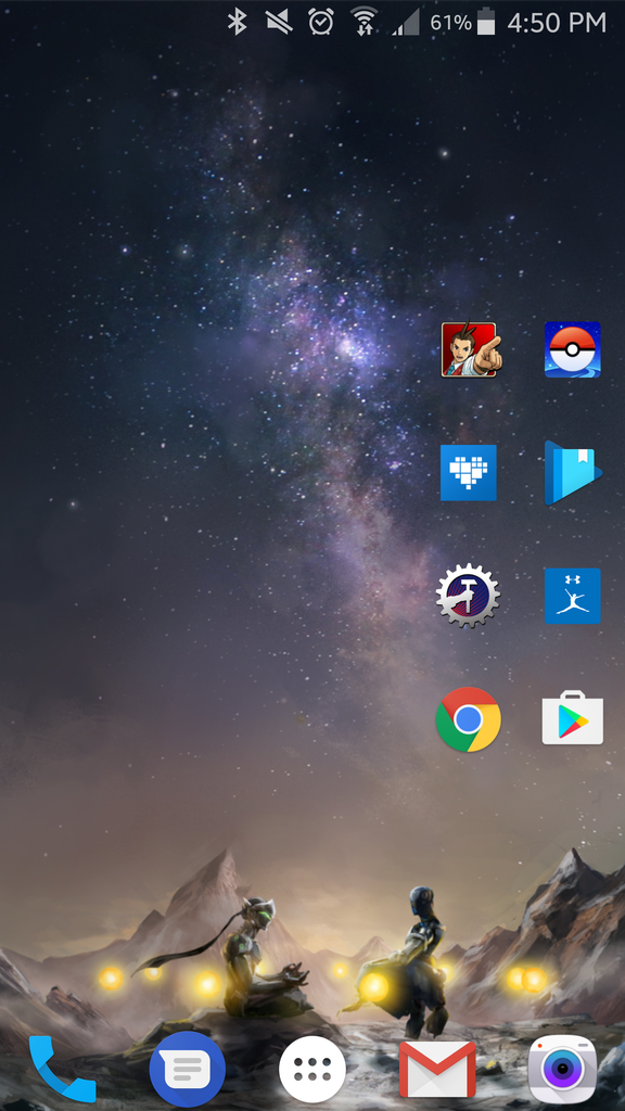
Device: Moto X Play
ROM: CyanogenMod 13 Nightly (changed DPI to 400 to make things more condensed)
Launcher: Nova Launcher (used with no dock)
Icons: Lines Free (Desktop), Iride UI (Rest of the UI)
Wallpaper please?just plain.
Pixel XL here. A couple things:
1. I despise the white circle motif they adopted. It's ugly, unnecessary, and makes the icons stand out like a sore thumb.
2. The wide open space at the top bothers me to no end.
3. The "tab" makes no sense because pulling on it takes you to google now but pressing it takes you to search. UX wise it's a mess.
I've tried Nova and ASAP launchers but they don't improve the experience. ASAP is close but I want to keep the long press feature of the Pixel Lquncher.


")


