Hey, great work Maldo! Are you making this re-texture mod for practice and portfolio work?
I wonder how you get higher resolution versions of pretty much the exact same textures Crytek used in some of those picures?
I guess Crytek's art team likes to visit CGTextures.com just as much as any other studio.
Man, I love that site.
----------------
I hear your always looking for some honest critique, and I see a few places you could improve.
It seems that you sometimes leave the specular or lighting/shadow from your photosource in the diffuse for some of your retextures.
like this one for example:
It's higher res, but that's not all there is to texturing, as you know from your material adjustments.
I am curious as to how you go about remaking some of the normal maps, especially for some of your man-hole covers and tiling stone textures.
A few of them can look kinda blobby like the photosource was just put through CrazyBump/nDo/etc with very few adjustments.
Have you tried using zbrush/mudbox and sculpting over a height map (generated out of Crazybump/nDo/etc as a starting point)?
You can really give your normals a lot more depth and fix some issues that come with photo-generated normals.
Some of your tiling textures are very noticeably repeating.
Some detail normals textures are unnecessarily uniformly too strong and could be toned down a bit and varied.
The plaster detail textures all over the warehouse map (probably a lot of others as well, that's the only one I got to play) for example make a lot of the indoor sections look bad.
You can avoid this by minimizing the contrast in your brightness channel in HSB mode.
The human eye is far more sensitive to changes in brightness/intensity of light than it is to Hue and saturation.
Color can be a more interesting area to put detail, and let your normals and lighting do the rest of the work.
Also, I am in the process of downloading the mod right now and I haven't seen any of this on your blog, so I don't know, do you ever work with Gloss/SpecularExponent maps?
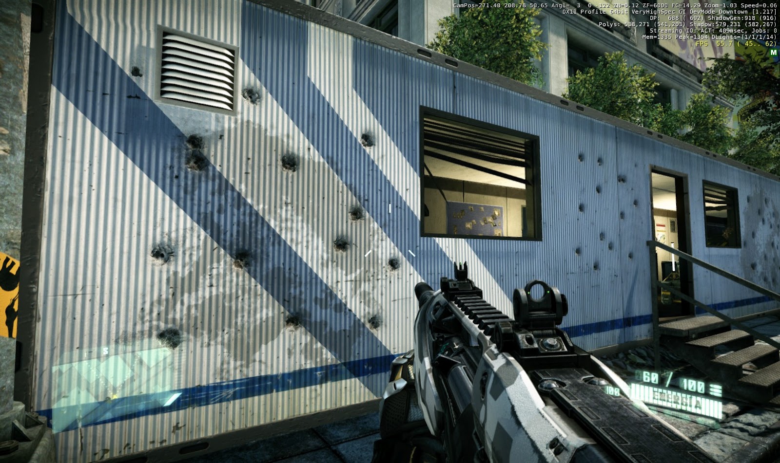
EDIT: I just played it, I notice a lot of specular maps are missing.
The oil stains that are placed on asphalt for example look like they are now only in diffuse which looks really wonky.
Again, your doing awesome work Maldo, these are just some things I noticed as I was looking over your work.
Hi, thank you for your comments. I try to answer some of them now. Maybe you can talk a bit more about the rest because I don't understand some things XD
First of all, if you have downloaded MaLDoHD, that must be version 3.0, and a lot of stuff there are the first textures I created in my life. So, a lot of bad textures. I'm learning while developing and the future 4.0 is way better.
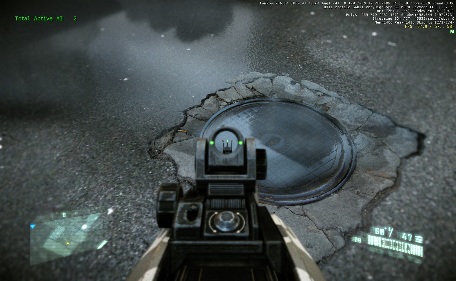
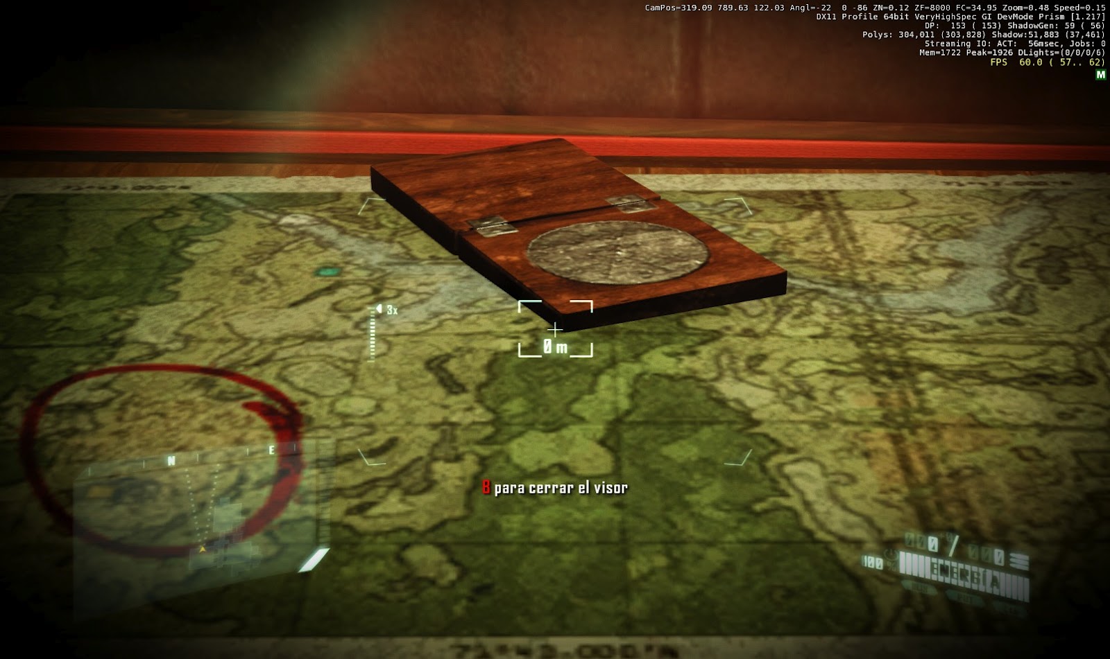
About creating bump maps I'm learned a lot. I don't like too much automatic tools, I prefer to combine details and a final touch by hand. Don't look to some horrible bumps in 3.0. But you can criticize what you see can be improved in the last shots. For example, here you can see a manhole bump map
http://maldotex.blogspot.com.es/2012/04/new-manhole-ingame.html
there are the diffuse, bump and displacement and not the specular but you can note the specular looking at screenshots ingame. There is a bright touch in the metal.

And a decal combination here.
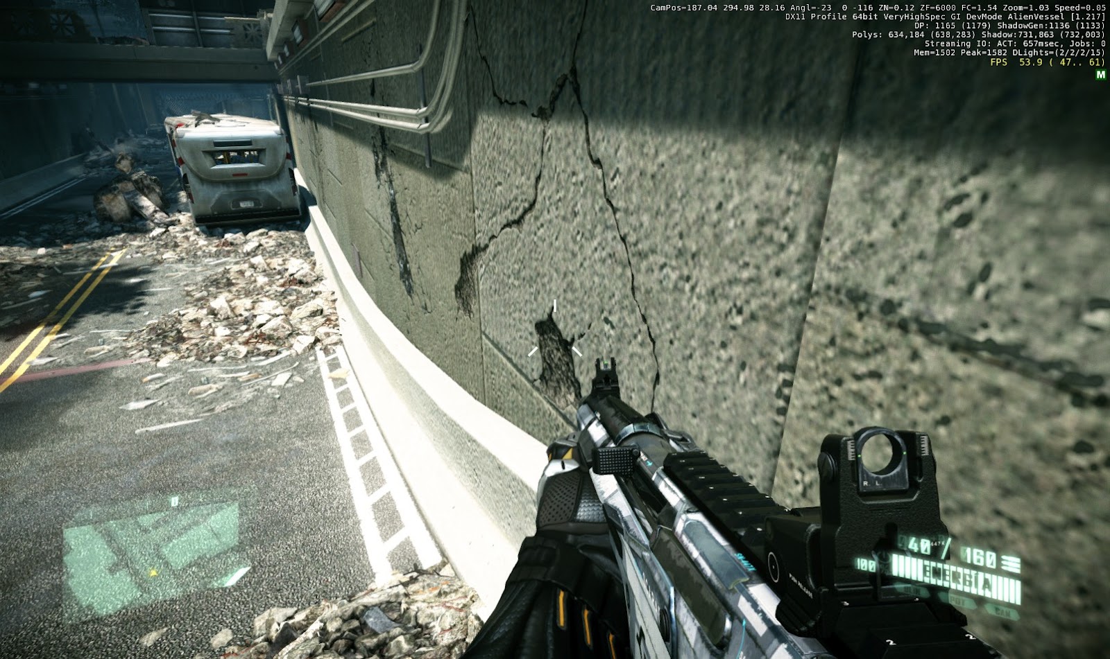
I've make bump modifications because I need to show that broken concrete borders are inclined so I first created a hires displacement map and then created a few bumps to combine with by hand details.
I have not done any course or tutorial on textures and bumps, so I do not know more than the basics learned by trial and error (each color in the bump map represents the angle at which light incides)

with this manhole ingame the result is almost identical to the sensations of seeing in reality. I was a long time taking pictures and looking like responding to light in the street.
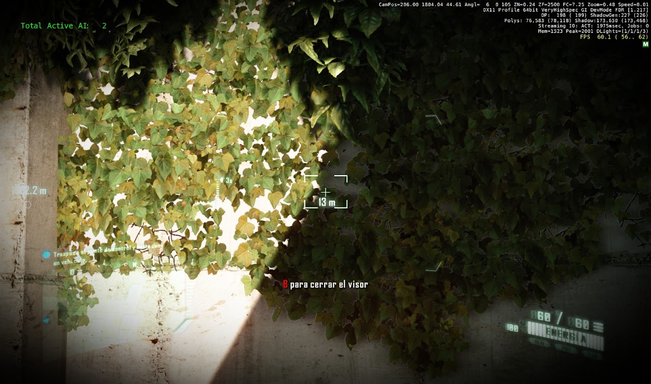
About the ivy diffuse, it's not the final version of the texture but I prefer some real light touch in some diffuse (not all) depending of what use they have into the game. I will put screenshots of how original and new look ingame.
About speculars, I try to add speculars when necessary, please put an example.
And about patterns sensations, I'm learning a lot too, but always with by hand modifications, I've tried some photoshop filters and don't like the result. Can you explain a bit how to "minimizing the contrast in your brightness channel in HSB mode". I use photoshop but only know very very basic about it (normal pencil, stamp, bright/contrast, saturation and copy paste all are I use usually) XD


") !
!

