• Hey, guest user. Hope you're enjoying NeoGAF! Have you considered registering for an account? Come join us and add your take to the daily discourse.

Final Fantasy XV Boxart

wmlk

Member
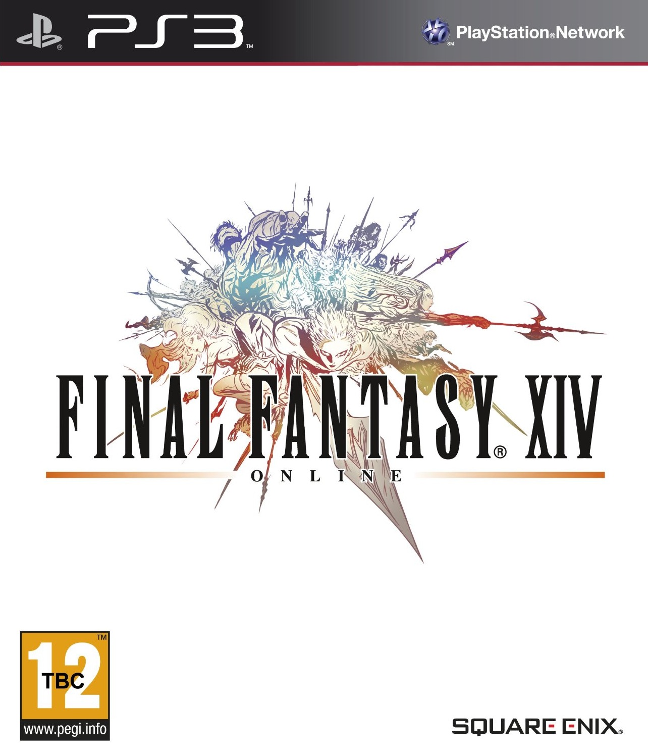
The standard cover is great. Probably a little mundane for how they want this to sell in the west, in particular. Curious if they'll change it.

It's perfectly communicative of the game and its tone. Would be a shame if they changed it. I'm glad it's not Noctis holding a sword or something.
 

sappyday

Member
Are we even sure that the standard one is what we'll get in NA/EU? Amazon and Gamestop have the standard as just the logo and title with a black background. I think that one is just for JP.
 
Also, count me in the group that loves the US FFXII cover. It looks really nice and I have no clue why people dislike it. That said, I still prefer the minimalistic style we get in the EU.
 

Ydelnae

Member
Are we even sure that the standard one is what we'll get in NA/EU? Amazon and Gamestop have the standard as just the logo and title with a black background. I think that one is just for JP.

We still don't have the standard and day one covers for both EU and NA. The logo on the black background is just provisional.
 
Definitely gonna shoot for the deluxe edition. That cover alone looks great.

I've never seen so many threads about one game before.

Aw you should have been here when Street Fighter V came out. That's the most recent one I remember people making threads nonstop.
 

Kagari

Crystal Bearer
Hoping someone makes a HQ version of this:

3QBJehN.jpg
 

Kaname

Member
Deluxe box art is the best. Fuck that road trip shit.

From an artistic perspective I agree, completely...but I also think that it's so contrasting with the actual style direction of the game that it's a terrible fit :(
 

Kudo

Member
Love that road trip cover, is it only for Japan or confirmed for EU/US standard edition cover too?
 

KiraXD

Member
bought deluxe... wanted collectors but that was too expensive for me... though i should have just bought it when i could though... oh well... deluxe is fine... hope i can just buy Noctis PAK figure separately though.
 
Deluxe is just so beautiful, amazing art. As expected from Amano. Busy cover isn't always a bad thing guys, this is the good busy, Imo.
 

Wagram

Member
I do think they need to change the font color on the Deluxe Edition. It's incredibly hard to read the actual title.
 

Byvar

Member
I'm probably getting the normal edition just because I don't like the deluxe box art. I usually like Amano's art but this looks terrible to me. The normal edition looks alright.
Though for both covers it looks like they just splashed the logo on top of existing artwork not originally made for the cover and called it a day. :/
 

Servbot24

Banned
I actually think the standard cover is great. It's fairly minimal in its composition and gives you a nice feel for the mood of the game.

Deluxe cover seems pretty rough. Not sure if that's in a good way or not.
 

Kazuhira

Member
Well,they still have time to come up with a better boxart,deluxe ver is the best but i still don't like it completely.
 
5A3Ehzt.png


Hello there, friends.
Never been a fan of Amano's art. Ever notice how some other artist always had to go back and completely redesign his characters so that they make sense?

I can't tell what's going on in either box art but for different reasons.

Logo on plain white for me please.
 
Hope the reversible cover is like this:


Got the deluxe edition for that amazing art but what are they thinking with the title colour.....you can't even see the words -___-

The words probably have a sort of blue metallic shine effect.

Breaking the Japanese cover tradition? Interesting

The "logo on white background tradition" has only been a tradition since FFVII:


Prior to that you had the title(sometimes including a logo) and colorful artwork accompanying it on the cover:

Traditions come and go and maybe it's time to change things up a bit. The white background+logo tradition had a good run(1997-recent), which was longer than the Famicom/Super Famicom cover traditions(1987-1994).
 

deriks

4-Time GIF/Meme God
The original cover is not bad, but boring. I mean, they took a screenshot from the video and put the logo on it.

Talking about the Deluxe... Is too much just for a box cover. They could do this as a poster or something bigger.

A fine box art for this game should have a original thing with the four characters. Like they on the car with a huge monster by side, or even fighting a huge monster
 
I actually kind of like the standard box art for the game. It sets the mood of what the game is (some
Bros on a road trip) and its not noctis looking down holding his sword like it easily could have been. Of course the amano art is way better. But the cover looks great
 

JBwB

Member
They both look good.

I like the standard cover but I personally would've preferred a plain white background with just the logo.
Similar to how to they did the previous covers in the past.

This would be perfect:

Hoping someone makes a HQ version of this:

3QBJehN.jpg
 

Despera

Banned
They both look good.

I like the standard cover but I personally would've preferred a plain white background with just the logo.
Similar to how to they did the previous covers in the past.
A black background would fit this game more though.
 
The "logo on white background tradition" has only been a tradition since FFVII:


Prior to that you had the title(sometimes including a logo) and colorful artwork accompanying it on the cover:
.

Meh, FF4-6 were kinda already there and the others got the logo treatment in the re-releases :D

But as long as they include the reversible cover it's fine (hopefully it's not black like in the placeholder and it's not japan-only)
 
Ignis betrayal confirmed.

Look at how distant he looks in that boxart. Keeping that watchful eye over the squad. Plotting all sorts of terrible things - they have no idea what's coming to them.
 
Top Bottom