Here is some stuff I did recently, tips and criticism would be welcomed.

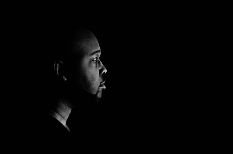
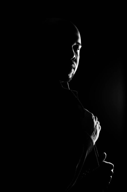
I'm not the biggest fan of black/white pictures in general, so read at your own risk:
Your first picture seems rather busy and it's hard to make out finer details in the background, especially when only viewing at a size that fills my screen. Perhaps leaving it coloured offers a benefit. As of now due to rather similar brightness many things just flow into one another a bit.
The fish... hm... is it part of a fountain or something? It might be more satisfying to show more of the water splashing down and perhaps cut a part of the fish of.
I think the most interesting part of your "selfie" is the girld with the dogs and backpacks and (your) reflection. And they end up coming a bit short I feel. Then again, without the rest of the arch and the upper part of the window, which in itself has some interesting reflections it might be a bit nondescript. Perhaps looking for a window with similar reflection but without a person and all those other things in front of the window it would be better? especially seeing that the person and her belongings are somewhat blurry as well.
The Subway picture I like quite a bit at first glance.
No Trespassing: Perhaps a bit more of the harbour in the background inside the frame?
Final picture: The lights are really interesting, the scale is too, as is the steel construction and overhang. I'm undecided whether a different frame or just focussing on one of the elements might work better for me. Perhaps just framing the two people that are walking away from you and roughly the lower quarter of your picture? I think that might work better, convey the scale of the steel construction, having a clear focus (the people that would fill a third of the frame instead of 1/6th as now) and removing the half shadowy guy that's coming up to you and whose clothes and shadowy half merge with the steel beams.