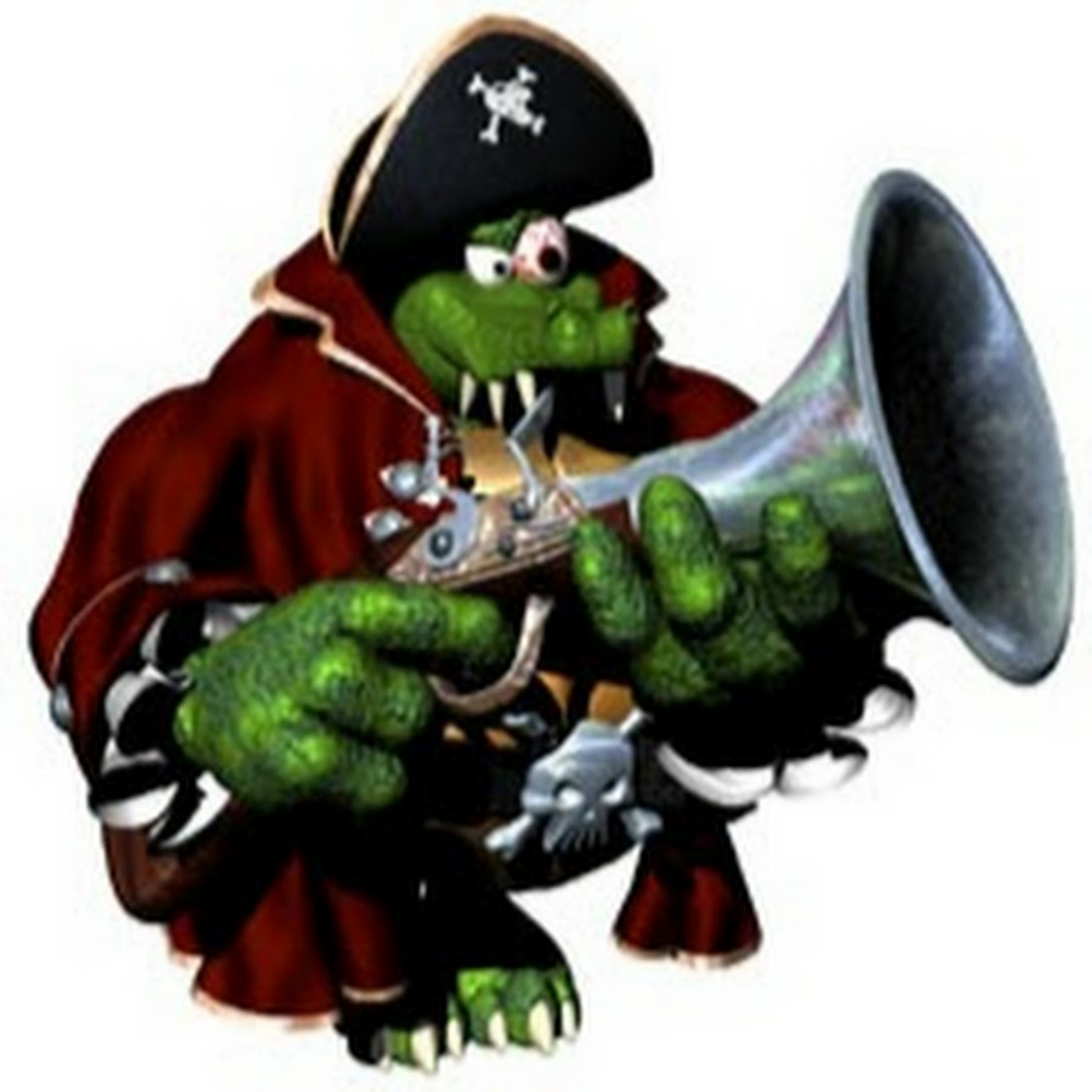
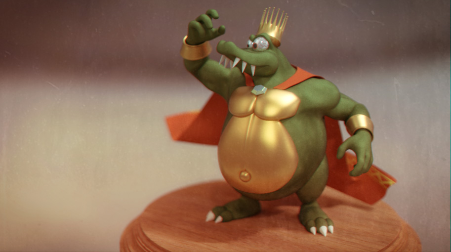
I like K. Rool, but I do think Rare set out to make him sort of unappealing and ugly...after all, he was a villain, and unlike Japanese media which tends to make good-looking or cute villains, Western media tends to be more willing to make them ugly.

I mean, he's got a really weird eye that's pulsing red, a comically fat and disproportionate body with moobs and an outie-belly button, and I always thought as this pose demonstrates he was also intended to come across as a bit effeminate (the television show played this up even more), which is a common othering element applied to a lot of villains since the average heteronormative audience finds that an undesirable trait. Of course, disliking K. Rool doesn't mean you hate fat people or are homophobic---Rare designed the character using stereotypical elements in mind to be off-putting, and finding that off-putting doesn't mean you think the groups it stereotypes are off-putting themselves. It's actually why I don't get Gonzo why you think people disliking K. Rool means they hate fat people, since it doesn't seem like Rare intended him to be a body-positive character. Troff and Scoff seems to suggest they just see "fat" as an easy off-putting characteristic to give to a villain, or use as a comedic element, which happens often throughout their games.
I'm mixed on some of Nintendo's post-Rare designs of the DK crew, but I think they actually made K. Rool far more aesthetically pleasing without totally betraying the original design. I forgot where this design comes from...his appearance in Mario Baseball wasn't this one, and I found that one actually pretty poor, but this one is good and I'll be pleased to see something like this in possibly Retro Donkey Kong or Smash in the future:
His eye has been toned down, and overall he's still round without being grotesquely disproportionate and awkward looking. Also a far more inviting color-scheme.


")