ha yeah most of them, thanks for the hard work!inthegray said:did you just grab all those images from my wii fanboy post? i spent hours finding and resizing those -- glad they could be of use to someone else!
much better!
-
Hey, guest user. Hope you're enjoying NeoGAF! Have you considered registering for an account? Come join us and add your take to the daily discourse.
You are using an out of date browser. It may not display this or other websites correctly.
You should upgrade or use an alternative browser.
You should upgrade or use an alternative browser.
Nintendo of America: Your Boxart is Rubbish
- Thread starter VOOK
- Start date

PowerSmell
Member


Miniboss1232
Member
I AM JOHN! said:

(Lol c wut Ninty did thar?)
:lol That one just kills me!
edit: Though I wouldn't have minded have the green tophat Kirby instead. Perhaps with a monocle.
Tenbatsu said:


Oh... my... god...
If I get this game I'll get myself the Japanese cover cause the US one BLOWS.
I AM JOHN!
Banned
Zek said:To be fair, our box art is pretty awesome except for the anger.
I AM JOHN! said:It's cool, but I actually prefer the US version's abstract art and color cacophony. Only thing wrong with it is, well, you know.
")
Dear god
Normally I like to make fun of obsessive compulsive box condition/greatest hits type nerdery, but *jesus* there are some horrible, horrible, awful, inexcusable rapings of great art in the transition.
What the hell possesses these companies to do that sort of butchery consistently, year after year.
Normally I like to make fun of obsessive compulsive box condition/greatest hits type nerdery, but *jesus* there are some horrible, horrible, awful, inexcusable rapings of great art in the transition.
What the hell possesses these companies to do that sort of butchery consistently, year after year.
Righto:Miniboss1232 said::lol That one just kills me!
edit: Though I wouldn't have minded have the green tophat Kirby instead. Perhaps with a monocle.

OH GOD THE DIFFERENCES ARE KILLING ME!

Anakinsella
Banned
omg that had me laughing out loudWindu said:
:lol kirby is angry/happy in these too. :lol
Laurent said:Here's another classic:


Wow, the US box art is a joke.

Look, the red one and the green one seem angry on the JP version, but not on the US version :lol Does anyone know the reason for this switcheroo?I AM JOHN! said:
(Lol c wut Ninty did thar?)
Zoramon089 said:

Truly one of the best boxarts EVER.
crispyben said:Look, the red one and the green one seem angry on the JP version, but not on the US version :lol Does anyone know the reason for this switcheroo?
if you look closely pink one and red one were changed, they are pixel-perfect copies with diferent colors
Holy fucking fuck, that's...PowerSmell said:
I'm speechless.
:lolnoire said:Reggie is taking this thread to heart. He's now tailoring his look for the North American and Japanese markets.


Yoboman said:
They're both bad and it's a shitty game anyway so you shouldn't care.
AniHawk said:They're both bad and it's a shitty game anyway so you shouldn't care.
Correct.
:lolnoire said:Reggie is taking this thread to heart. He's now tailoring his look for the North American and Japanese markets.
Worm_Buffet
Member
MidiSurf said:Why do we have this dull and lame standard spine text ?
With inconsistent capitalization to boot!
Dunno, but if it bothers you so much, import the Australian Wii games, they have PAL discs, but a lot of them use the US version boxart. For example, our WarioWare Smooth Moves has the pink box.MidiSurf said:BTW is there explanation for this -->
US:
vs
EU:
Why do we have this dull and lame standard spine text ?
Goldrusher
Member
MidiSurf said:BTW is there explanation for this -->
...
Why do we have this dull and lame standard spine text ?
Same goes for PlayStation games.
Dunno, but if it bothers you so much, import the Australian Wii games, they have PAL discs, but a lot of them use the US version boxart, including the spine. For example, our WarioWare Smooth Moves has the pink box.MidiSurf said:BTW is there explanation for this -->
US:
vs
EU:
Why do we have this dull and lame standard spine text ?
hirokazu said:Dunno, but if it bothers you so much, import the Australian Wii games, they have PAL discs, but a lot of them use the US version boxart. For example, our WarioWare Smooth Moves has the pink box.
Are you crazy ! Games cost like zillions of dollars in Australia, even the euro versions are too expensive in my opinion. But i will import Wii from US soon as the Wii madness fades away and you can actually buy one with reasonable price.
I sold my euro wii just few days ago and started buying US-games for my future US Wii <3. NMH + Zack & Wiki + Ghost Squad = 81
In europe the same set cost well over 100 (160 in Finland), so i will get cheaper games and cooler boxs.
Oh and same set in Australia is like one million dollars.
... And would it be crazy to just order the JP-version of NMH just for the manuals
? They are soooo coool.EDIT:
81 = 118 $
160 = 233 $
NekoFever
Member
Yeah, and DS games as well. Since they use those fat cases for UK DS games (I assume to accommodate the multilingual manuals) as well as the plain text it makes my shelf look weird.Goldrusher said:Same goes for PlayStation games.
I was going to post a picture of my mixed-region PS2 collection. The Japanese and US ones all look different, while the PAL ones are just black Arial text on a white spine. I only have one PAL PS3 game (Resistance) and that seems to be splitting the difference by having the plain text but with the artwork wrapping around from the front in the background.
This doesn't just happen with Wii games, but with games on most other consoles as well, like the PS2.MidiSurf said:BTW is there explanation for this -->
US:
vs
EU:
Why do we have this dull and lame standard spine text ?
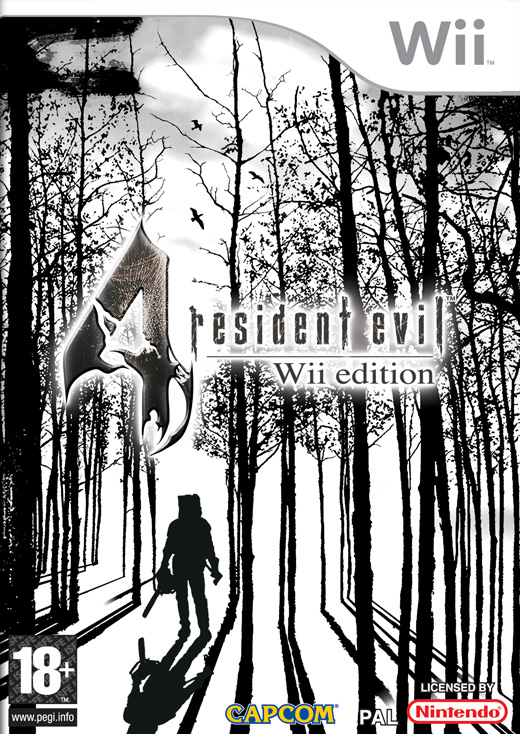
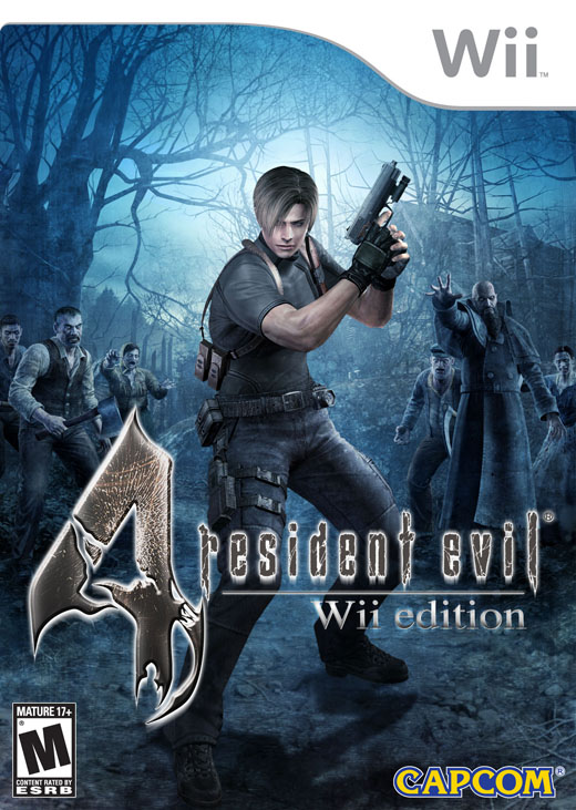
Mesijs said:RE4 Wii has a GREAT PAL boxart. Happy I'm no yank.
http://www.tothegame.com/res/game/6558/boxshot_uk_large.jpg[IMG] [IMG]http://www.tothegame.com/res/game/6558/boxshot_us_large.jpg[IMG][/QUOTE]
Americans love their shitty render covers you know...:lol
I am glad most of the time we get the original cover in the EU. Even Zelda: PH has the Japanese cover.
itsinmyveins
Gets to pilot the crappy patrol labors
AniHawk said:They're both bad and it's a shitty game anyway so you shouldn't care.
You know, you shouldn't say stuff you know is wrong. The game is great and the Jap/EU-cover looks great. So there.


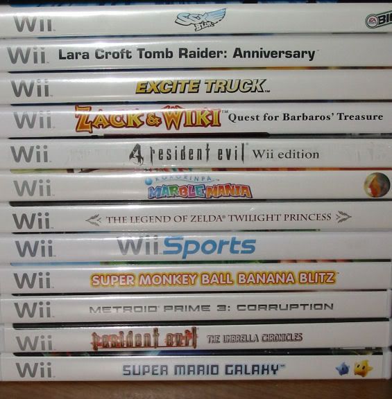
(oh, look at my Wii games. ...reminded me I have to get Zack and Wiki..or Whack Nazi Kid, as I like to call it now). Anyway, I like the PAL spine text...with the exception of the random capitalization. I like the sober way the games look when in a shelf, like the PS2 games do.
come on! :lol :lol
noire said:
come on! :lol :lol
Nuclear Muffin
Banned
The Plain Text on the EU spines, is because of the amount of languages they need to translate for. They obviously don't make international horizontally designed logos in different languages.
the year 20XX
Member
shidoshi said:Randomly toss a bunch of characters onto an image, and call it a good box art? Completely ugly.
The US boxart did the same thing, except the characters were all Samus.
speedpop said:I dunno about Nintendo, but I sure know that Sony fuck up horribly at times.
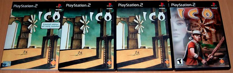
Pick the odd one out.
I can remember looking at that box art back in the early launch drought of PS2 when there was nothing out there for games. I kept thinking that it was probably the stupidest looking box art I've ever seen. Still haven't ever played it but I'd like to some day.
Stupid Sony
What really annoys me is that the majority of PAL Xbox 360 games have the proper logo and background on the spine, but EA and Ubisoft (could be others as well) insist on crappy plain black text on a white background. Why?MidiSurf said:Why do we have this dull and lame standard spine text ?
Kyuuketsu_Night
Member
Oh. My. God.
That Shiren US boxart has the be the most gut wrenchingly horrible thing I've seen all year.
Jesus Christ.
Did they hire some crappy DA high school kid who specializes in drawing crappy Inuyasha fan art to do that boxart? =/
It seriously looks like someones really crappy fan art.
That Shiren US boxart has the be the most gut wrenchingly horrible thing I've seen all year.
Jesus Christ.
Did they hire some crappy DA high school kid who specializes in drawing crappy Inuyasha fan art to do that boxart? =/
It seriously looks like someones really crappy fan art.
thebagofsand
Member
Siren box art is not going to stop me from purchasing the game.
dragonlife
Member
I actually don't like the Japanese one. I think our cover is better, personally.
sublime085 said:At least our No More Heroes box is better.


No it's not.
The Japanese boxart projects this nice movie-poster vibe. A dude with shades (with a lightsaber, no less) and a hot chick posed against a West Coast backdrop, in these affectedly 'cool' poses that give it a slightly over-the-top feel. Like a poster for some tongue-in-cheek action flick.
I look at the other one and think, 'OMG, some guy's trying to kill me with a fluorescent bulb!'