Always-honest
Banned
I don't like new logo. Companies change logo's way too often.
I don't like new logo. Companies change logo's way too often.
So they can use the icon on its own instead of having the whole logo everywhere.What's the point of the logo change? It just makes it wider.
edit: actually you're right, was thinking of the mobile app iconsIt's been the same for 12 years.
I think this is actually the first time they've updated it.

That's pretty bad looking.
People are usually hyperbolic about logo redesigns, but this one actually sucks.
That's pretty bad looking.
I'm at work so I can't test/see, but did they update the Xbox or PS4 apps as well? I know there were a lot of requests for those to be updated with modern underpinnings (higher frame rate/resolution support, etc). Can anyone check/ see? Thanks!
Vertical videos are the future, sorry grandpa.
They're harder on your eyes.
Try looking left and right without moving your head. Now try up and down.
Things are things for a reason.
This is the dumbest argument ever. These vertical video's are not shown on a giant cinema screen.
I hate change!
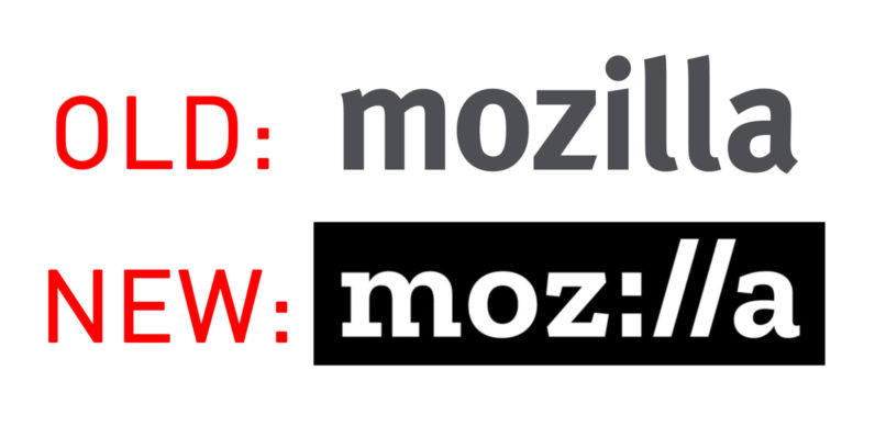
Not a fan of the new logo. It is now wider... This trend of changing logos every 2 years or so and making them worse needs to stop. The only exception of a new logo actually being better than the old one is Mozilla's
https://cdn0.tnwcdn.com/wp-content/blogs.dir/1/files/2017/01/Mozilla-New-Logo-Comparison-1-796x398.jpg[IMG]
Brilliant![/QUOTE]
This is the first time YouTube changed their logo.
This is hilariously wrong.meet the new boss
same as the old boss
minimalism is a cancer on art design
When was the last time YouTube changed their logo?Not a fan of the new logo. It is now wider... This trend of changing logos every 2 years or so and making them worse needs to stop. The only exception of a new logo actually being better than the old one is Mozilla's
Brilliant!
Sweet! Dark theme is in!
doesnt seemo so, which is a shame since the ps4 app has a bug with 60fps videos
Megaton right here for me.
it's the fucking worst. on Android TV at least, it went from a native app with 4K HDR support and a decent interface to a web wrapper for www.youtube.com/tv that maxes out at 1080p60 with no HDR support. I had a dedicated Android TV device that I depreciated when I got a UHD TV, the same day I unboxed it is the day they "updated" the Android TV app. Just the worst.
Not a fan of the new logo. It is now wider... This trend of changing logos every 2 years or so and making them worse needs to stop. The only exception of a new logo actually being better than the old one is Mozilla's
Brilliant!
The Verge is reporting that the mobile version has dark mode.
But I can't find the setting (yes I'm running the new update, on iOS)
When was the last time YouTube changed their logo?
Yep. And it's eye-scorchingly badDid they change the shade of red used on the front page? I swear I feel like it's a brighter hue than before.
How do you get to this setting in mobile or desktop? It feels un-intuitive.
edit: Found it on desktop. Should be in settings though..
the logo reminds me of pornhub
")
Damn right on the two years.Looks like 2015, but most of the changes have been to flatten the colors and remove the shine effect:
http://logos.wikia.com/wiki/YouTube
They did and it looks cheap.Did they change the shade of red used on the front page? I swear I feel like it's a brighter hue than before.
meet the new boss
same as the old boss
minimalism is a cancer on art design